Overview
Forms, as one of the primary Designer Elements, are constructed within the Form Designer accessed by editing or creating a new Form.
Within the Form Designer, Designers may access a plethora of Form controls via the Toolbox to populate their Form as well as Form/Form control settings within the Properties, Info, Explorer, and Tab Editor tabs. The following document discusses each of these tabs and how they can be utilized to configure a Form.
Default Designer View
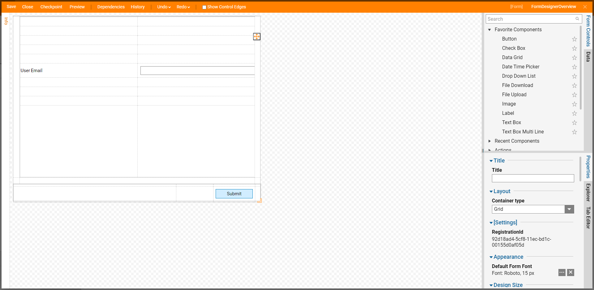
Upon launching the Form Designer, the tab window on the left-hand side of the window is set to the Toolbox tab. The Toolbox houses, organizes, and searches for Form controls. The Toolbox consists of the following sections:
- The Favorites menu contains the controls saved as a favorite. To save a control as a favorite, hover over the desired control and select the star on the right side. An Add Form Control Favorite dialog appears and prompts options to change the name and who sees the control as a favorite.
- The Recent menu holds the most recent controls used.
- Finally, the hierarchical drop-down menu lists every control, searchable or otherwise, available for a Form.
At the center of the screen resides the primary workspace. The default Form uses Grid Layout that users may fill with controls.
On the right-hand side of the screen, Designers may configure the Properties tab. By selecting the checkered space in the Form, the Properties tab defines and edits the Form's Layout, Appearance, Form Size, Background settings, additional Form Rules, and more. Selecting the Form and/or a control then populates the Properties tab with settings specific to the selected item.

Top Action Bar
The following chart provides information on the Actions provided by the Top Action Bar in the Form Designer. Additionally, some of these Actions can be performed using the notated keyboard shortcuts.
| Action Name | Definition |
|---|---|
| Save | Saves the Form without closing the Designer. This action includes a window to write notes for the current Save State if needed. |
| Close (X) | Closes the Form Designer; upon Close users are provided the option to also Save the Form and provide Notes. |
| Checkpoint | Creates a Backup of the Form at the particular place where the checkpoint is saved, then stores it in the History Folder. This is useful when making drastic changes that could affect Form functionality and design. |
| Preview | Provides a preview of the Form and how it will appear at runtime. |
| Dependencies | Offers a breakdown of which Designer Elements the Form depends on, as well as which Elements depend upon the Form. |
| History | Opens a new tab lists all previous versions of the Form that can be removed, restored, and exported. |
| Undo (CTRL + Z) | Reverses the last design change. |
| Redo (CTRL + Y) | Re-applies the previously undone design change. |
| Show Control Edges | Toggles hiding/showing Control Edges; the Control Edges refer the edges of each control on the Form. |
Form Properties
Upon selecting the Properties tab, the following settings are available to customize the Form.
| Setting Name | Description |
|---|---|
Defines the visual structure of a Form. Layouts can be used in conjunction with one another; for example, putting a Grid Layout inside a stack panel or a Grid inside a Grid. The default layout is the GridLayout. Layouts are designed to be resizable for both browser and mobile platforms. | |
| Design Size | Sets the size of the Form. This setting can also be set through the Flow Designer. |
| Templates used to create Forms with a uniform look and feel. Forms that use a specific Form Background are automatically update once the background is updated. | |
| Allows the Form to be set up to navigate down a specified outcome path when the Enter key is selected at runtime. | |
| Cascading Style Sheets (CSS) can be applied to all Forms using custom-defined classes or pre-defined classes to change Forms' overall look and feel. | |
| Adding Key Triggers can customize the Form to jump to a control, trigger an action, run a validation, run a Data Flow, or run an Active Form Flow when a certain key is selected. |
Additional Tabs
The following chart provides descriptions of the functions of the rest of the tabs that can be found in the Form Designer.
| Tab | Description |
|---|---|
| Info | Allows the user to rename the Form, provide a Description, and view some additional information regarding the Form. If Tags are configured in the Decisions environment, they can be applied or added, via this tab. Additionally, Comments and Files can be added associated with the Form |
| Data | Adds desired pieces of data to the Form. The data is presented in a Folder Tree format. Additionally, this tab provides access to the Edit Form Input Data button to add additional data. |
| Explorer | Explores the different layers of the Form. Selecting each layer highlights it in the Form Designer and navigates to its respective Properties tab. |
| Tab Editor | Assigns the behavior exhibited when a user tabs through objects on the Form. Objects can be included or removed from the tab order and can be ordered by assigning a numerical value. |
.png)