- 01 Sep 2022
- 1 Minute to read
-
Print
-
DarkLight
Form Control Behavior Overview
- Updated on 01 Sep 2022
- 1 Minute to read
-
Print
-
DarkLight
Form Control Behaviors include configuration options for appearance and functionality.
Behavior
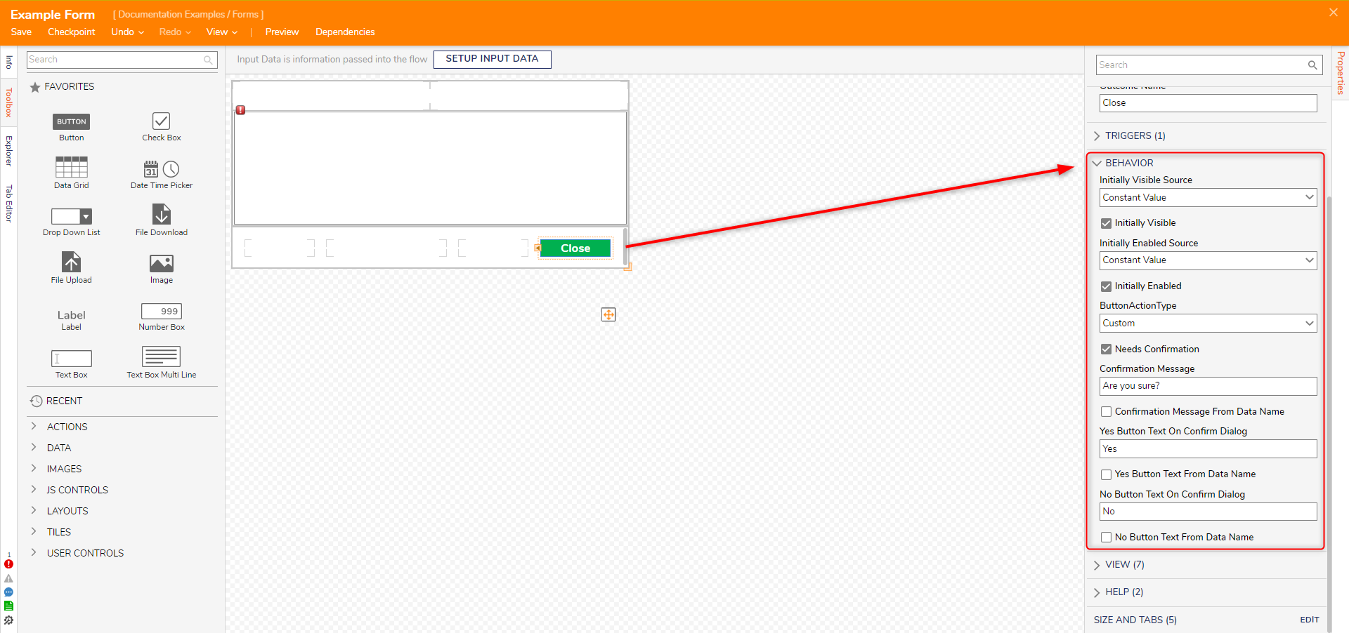
Needs Confirmation: If checked, a popup message with Yes and No buttons will appear when a user clicks the button on the Form.
View
The View category allows users to customize the appearance of a Form control after applying a stylesheet to the Form. To see the list of properties that can be applied to a control, see CSS Properties on Form Controls.
Configuring Form Control View and Behavior
- Navigate to the Toolbox, and add a Button and a Textbox to the Form.
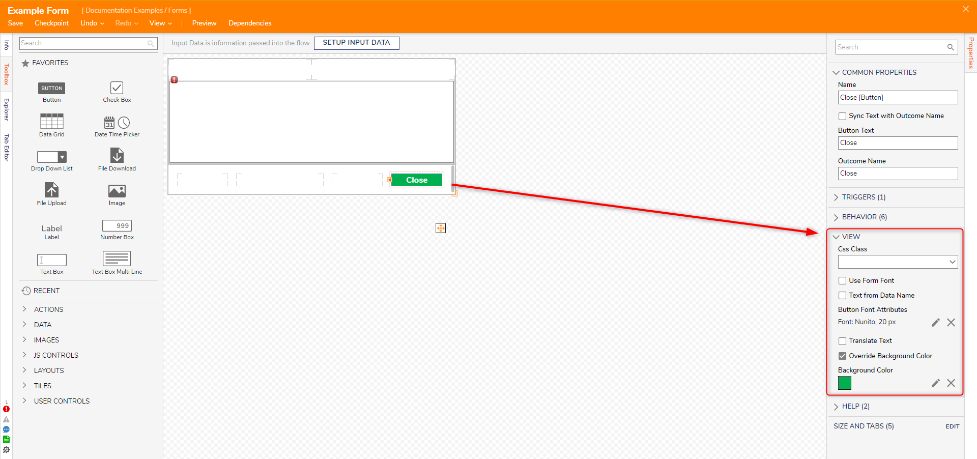
- Select the button control, navigate the Properties panel, and expand the VIEW category. Uncheck Use Font Form and click the pencil icon to edit the text. Set the Button Font Attributes to 20px, bold, and white font color.
- Check Override Background Color and set the Background Color to green.

- Expand the BEHAVIOR category.
- Select Needs Confirmation. Under Confirmation Message enter, "Are you sure?". For the Yes Button Text On Confirmation Dialog field, enter "Yes". For the No Button Text On Confirmation Dialog field, enter "No".

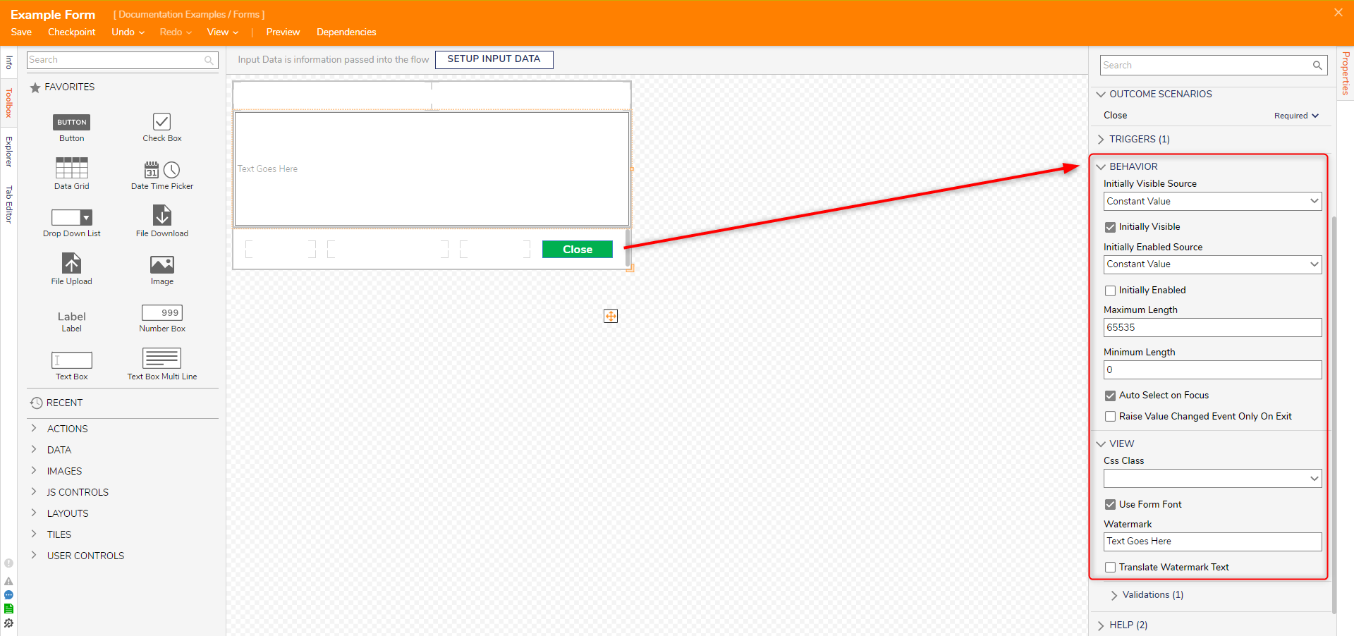
- Select the TextBox Form Control. In the BEHAVIOR category, uncheck Initially Enabled. Under VIEW, enter "Type Here" in the Watermark field. With this feature, users create custom text that will be reflected on the TextBox as a watermark.

Debug
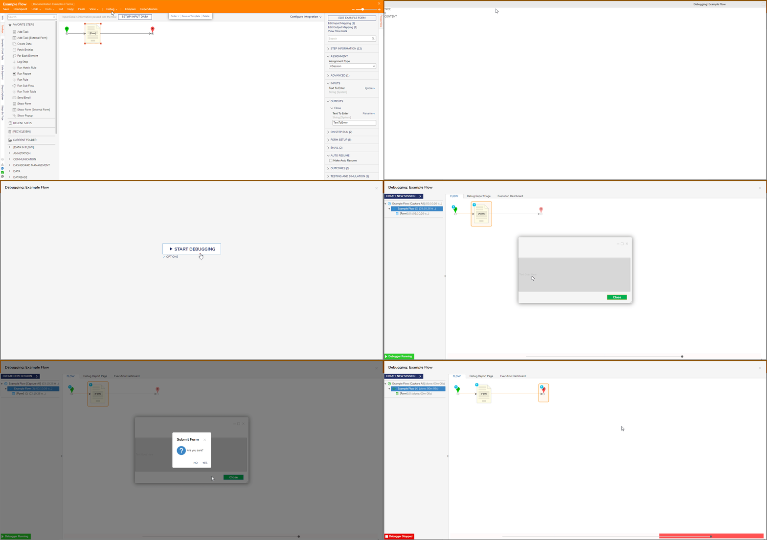
- Add the Form into a Flow and click Debug from the top action bar.
- Click START DEBUGGING.


