Overview
This article demonstrates the process of adding graphical charts to a Report to represent the data visually. A column in the Report must be grouped to add Charts to a Report. Grouping allows users to organize data more effectively and perform aggregate calculations on grouped data.
This article includes the following sections.
- Steps to add Charts to Report
- Available Charts
- Chart Configurations and Settings
- Calculating Values in Percentage on Charts
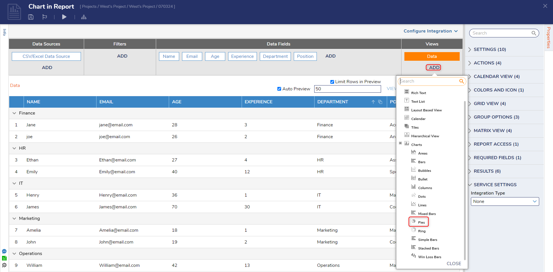
Steps to add Charts to Report
The following section gives a step-by-step guide on how to group and add a Chart to a Report.
- Create or Open an already created Report.
- Hover the Mouse over the Data Field header row and select the Group icon. The Data gets grouped according to the data within the column. Refer to the following GIF for reference.
- Navigate to the Views and click on Add. A list of all the charts will populate to add.
- Select the Type of Chart. Give a Chart Title in the new dialog box. Click Ok. The Chart will be added.
- All the configurations of the Chart are provided in the further section of the article.
Available Charts
The following table includes all the charts available to add to the Reports.
| Chart Type | Description | Chart |
|---|---|---|
| Area | A chart that displays data as filled areas between the data points and the axis suitable for showing trends and patterns over time or continuous data. | 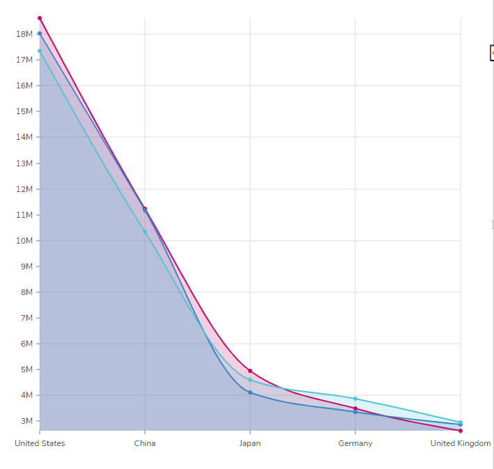 |
| Bars | A chart type with vertical or horizontal bars representing data values suitable for comparing individual items or categories. | 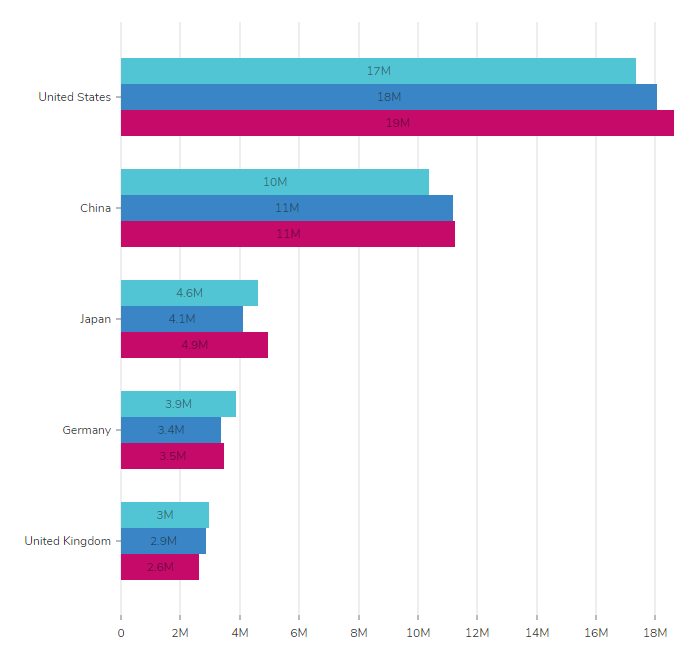 |
| Bubbles | Circular markers representing data with two numerical dimensions help display relationships between variables. | 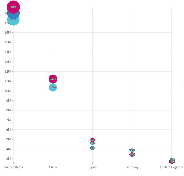 |
| Bullet | A specialized chart type designed to display progress toward a goal or target. | 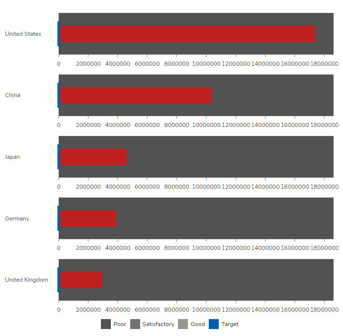 |
| Columns | Similar to bars, but with vertical orientation, commonly used for the same purposes as bar charts. | 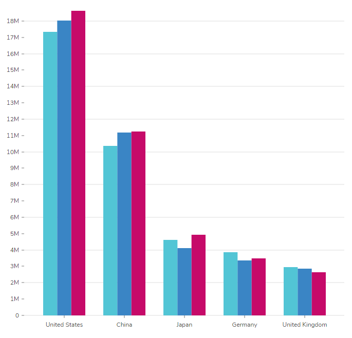 |
| Dots | Data points are represented as individual dots, helpful in visualizing discrete data. | 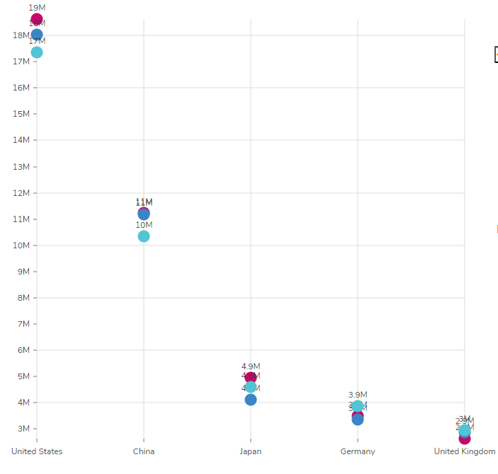 |
| Lines | A chart with points connected by lines shows trends or patterns over time or continuous data. | 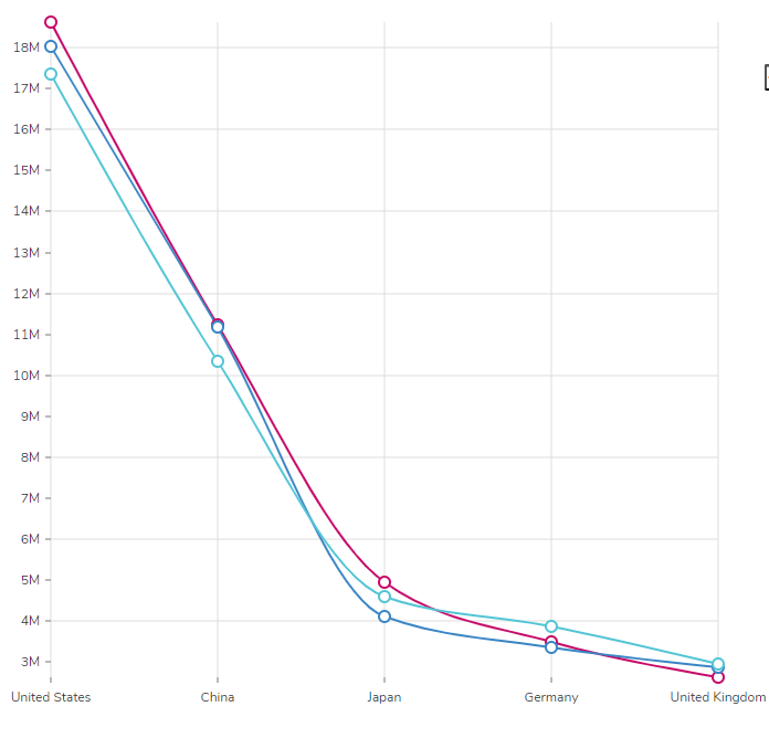 |
| Mixed Bars | A combination of bar and line charts allows simultaneously comparing categorical and continuous data. | 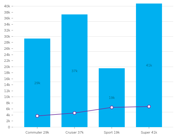 |
| Pies | A circular chart that divides data into slices, showing proportions of a whole, ideal for displaying percentage-based data. | 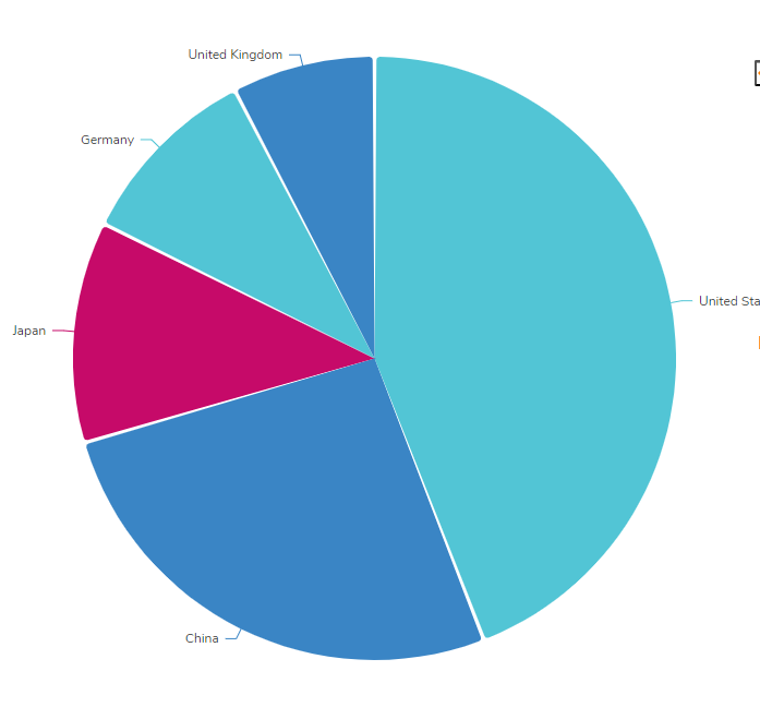 |
| Ring | Similar to pie charts, but with a hole in the middle, suitable for displaying data about a total value. | 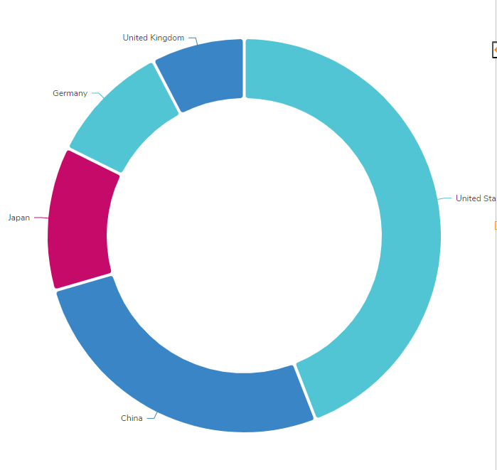 |
| Simple Bars | Basic bar charts with no stacking or grouping, useful for straightforward data comparisons. | 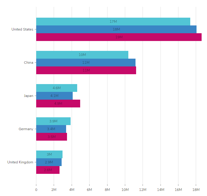 |
| Stacked Bars | Bars stacked on each other represent multiple categories' values as a whole. | 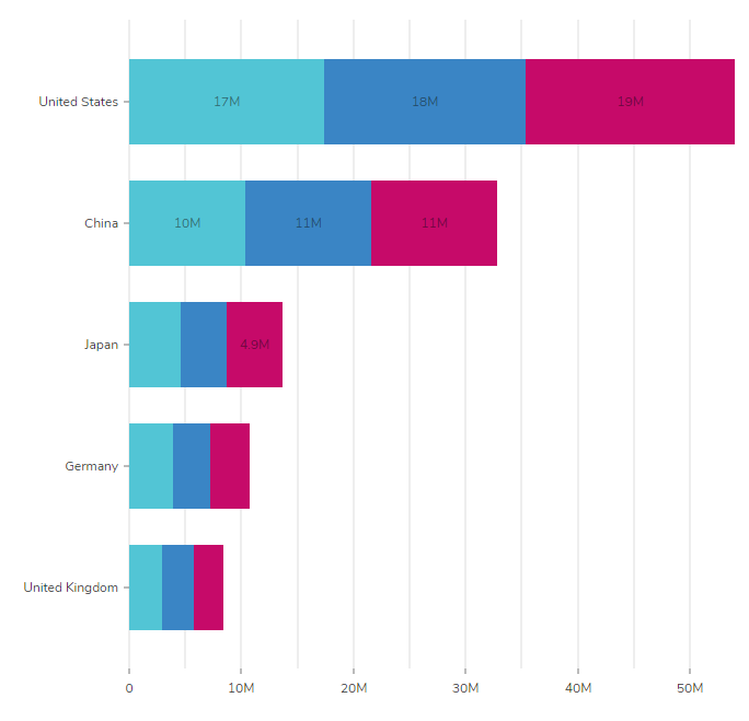 |
| Win-Loss Bars | Bars representing positive and negative values are commonly used to compare wins and losses or gains and losses in a competition or financial context. | 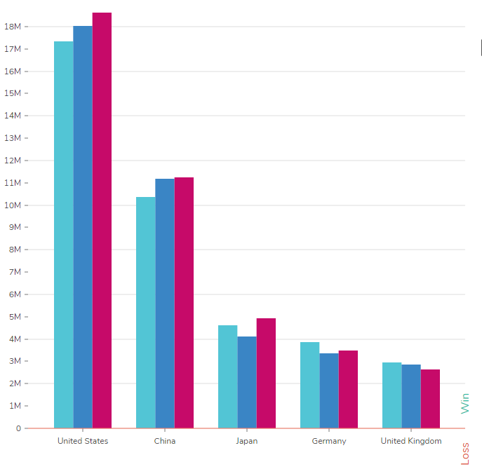 |
Chart Configurations Settings
Upon adding charts to the Reports, the right-side properties panel automatically opens up, facilitating the configuration of the reports. The following sections describe all the configuration settings available for all the Reports.
Chart Data
| Setting Name | Description |
|---|---|
| Series 1 | The Series is what the Chart will be grouped by. If a Report has multiple groupings, they will be available to choose from in this drop-down. As well as adding a series to the Chart to make a Multi Series Chart. |
| Use Subgroups | When "Use Subgroups" is enable, stacked charts will reflect the subgrouping that the data view shows with the Results breakdown of each group. |
Chart Settings
| Title | Name of the Chart | |||
| Show Title | When selected, this adds a Title above the Chart | |||
| Chart Labels | ||||
| Name and Value | Displays both the name and value of the corresponding data as the label | |||
| Name | Displays only the name of the corresponding data as the label | |||
| Value | Displays only the value of the corresponding data as the label | |||
| None | Removes the label | |||
| Series Name | Only available on Multi Series Charts | |||
| Area Series Name | Allows to pick the Series for an additional Area chart, which will be shown on the Bar chart | |||
| Line Series Name | Allows to pick the Series for an additional Line chart, which will be shown on the Bar chart | |||
| Show Data Button | Displays a button  in the upper right corner of the Chart that will open a Report showing the data sets. This is to be used on Pages. in the upper right corner of the Chart that will open a Report showing the data sets. This is to be used on Pages. | |||
| Put any group over X into 'Other' category | Groups data into an 'Other' column if the value exceeds a specified amount. | |||
| Specify Step Value | Step value is the frequency at which the values on the X-axis are divided.' When Enabled, it will allow users to specify the interval between the values on the X-axis of the chart. | |||
| Shorten Long Axis Labels | Shortens the labels to a maximum length. | |||
| Use Custom Colors | ||||
| User Defined Colors | ||||
| Name | Must specify the exact name of the corresponding data field | |||
| Color | Allows color customization for the data field | |||
| Base Colors | Allows color customization for the data set | |||
| Show Tooltips | Allows information to be displayed while hovering over data sets within the Chart | |||
| Tooltip Type | ||||
| Name and Value | Displays the name and value of the corresponding data while hovering over a Chart. | |||
| Name | Displays the name of the corresponding data while hovering over a Chart. | |||
| Value | Displays the value of the corresponding data while hovering over a Chart. | |||
| Stack Display | Used on Multi Series Charts to stack data. | |||
| Set Minimum Value | Sets a minimum value for the Chart. | |||
| Set Maximum Value | Sets a maximum value for the Chart. | |||
| Change Label Orientation | Change the angle of a label by a specified degree. This assists in making room for more extended labels. | |||
| Show Element Labels | The total count/avg/sum of the data set on the corresponding column, pie slice, etc. | |||
| Sorting | ||||
| None | The Chart does no additional sorting of original results from the Data Source. | |||
| Value Ascending | Data sets will be displayed by value, smallest to largest. | |||
| Value Descending | Data sets will be displayed by value, largest to smallest. | |||
| Label Ascending | Data sets will be displayed by label, alphabetically ascending (A-Z) | |||
| Label Descending | Data sets will be displayed by label, alphabetically descending (Z-A) | |||
| Large Data Render Threshold | Specify the number of data points that will switch the Chart from SVG to Canvas. This will turn off specific animations and limit label axis ticks and gridlines to provide a quicker rendering of large charts. The default value is 200. | |||
| Take First Count | Limits the data groups displayed to the specified number. The default is All or 0. | |||
| Entries Axis Legend | Provide a name for the Entries axis (Example: Department). | |||
| Values Axis Legend | Provide a name for the Values axis (Example: Count of Employees). | |||
| Download > Show Data Table | ||||
| Bubbles Settings | Only Available on Bubbles Charts. | |||
| Minimum Point Size | The minimum pixel size of bubbles. | |||
| Maximum Point Size | The maximum pixel size of bubbles. | |||
| Legend Settings > Legend Position | Displays a Legend of the Chart in the Chart's North, South, East, or West sections. | |||
| Number Formats | ||||
| Label Format | Changes the format of the number displayed on the chart label. | |||
| Fixed | Shows the value as it is without any formatting. | |||
| Number | It adjusts the decimal place in a numeric value to represent it in thousands (K) and millions (M) only when the number contains more than three digits. | |||
| Percent | Converts the value into percentages by multiplying it by 100. It does not calculate the actual percentage based on Overall data. To calculate the percentage, refer to the next section of the article. | |||
| Currency | Adds the "$" dollar sign and adjusts the decimal place in a numeric value to represent it in thousands (K) and millions (M) only when the number contains more than three digits. | |||
| Precision | Precision allows to define the accuracy of the numerical value to be shown on a label. The accuracy of the numerical values is affected based on the selected Format and the Precision Value. By default, the Precision value is set to 2. The higher the precision, the more accurate the number will be shown on the chart before rounding it off. Note: A table with examples of various "Precision" settings is provided below. | |||
| Tooltip Format | A Tooltip is a graphical user interface element that shows a small display with information when the mouse is hovered over the chart. The settings mentioned for the Label Format are also included here. | |||
| Bullet Settings | Only Available on Bullet Charts. | |||
| Target Value | Defines the Target value to the Chart. | |||
| Ok Value | Defines a fair value to the Chart. | |||
| Good Value | Define the acceptable value on the Chart. | |||
| Bullets Type | ||||
| PositiveMore | This is a standard Bullet chart. | |||
| PositiveLess | Inverts the axis, and the color of the Chart also throws validation at Ok Value to set more than Good Value and less than the Minimum Value. | |||
| NegativeMore | This inverts the PositiveMore chart. The Chart should be read from right to left. | |||
| NegativeLess | This inverts the PositiveLess chart. The Chart should be read from right to left. Reverses the Chart's color and throws validation at the Ok Value to set more than Good Value and less than the Minimum Value. | |||
| Bullet Label Format | Changes the format to the number or percentage displayed on the label. | |||
| Bullet Layout | Changes the Layout of the Bullets to Horizontal or Vertical. | |||
| Bullet Title Position | Sets the Title Position to the left or the right side of the Chart. | |||
| Range Colors | Allows color customization to Ranger bars. | |||
| Measure Colors | Allows color customization to Data bars | |||
| Marker Colors | Allows color customization to Target bars. | |||
| Win Loss Settings | Only Available on Win Loss Charts. | |||
| Threshold Value | Differentiates between Win and Loss. | |||
| Win Label | Displays the Name of the Win Label. | |||
| Loss Label | Displays the Name of the Loss Label | |||
The following table showcases the example of the "Precision" Setting under the Number Format.
| Fixed Number | Precision Value | Result |
|---|---|---|
68 | Default | 68 |
| 0 | 70 | |
| 1 | 70 | |
| 2-9 | 68 | |
| 736 | Default | 740 |
| 0 | 740 | |
| 1 | 740 | |
| 2 | 740 | |
| 3-9 | 736 | |
| 8672 | Default | 8.7K |
| 0 | 9K | |
| 1 | 9K | |
| 2 | 8.7K | |
| 3 | 8.67K | |
| 4-9 | 8.672K |
Calculating Values in Percentage on Charts
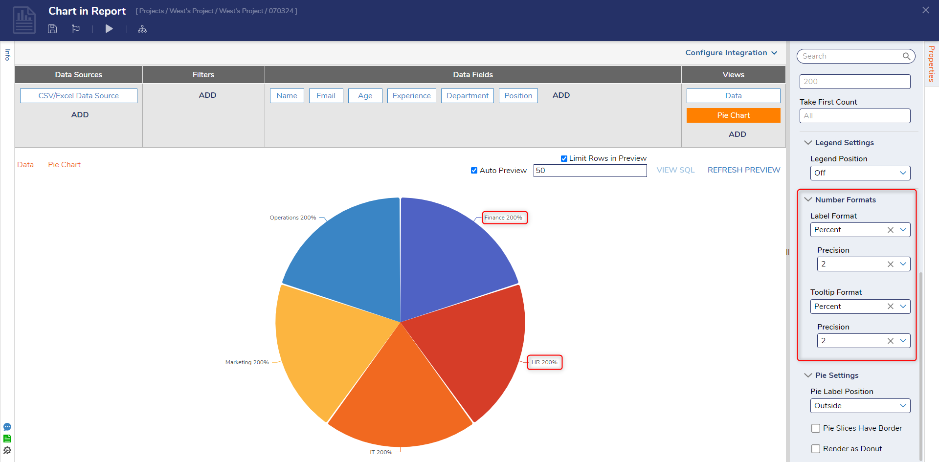
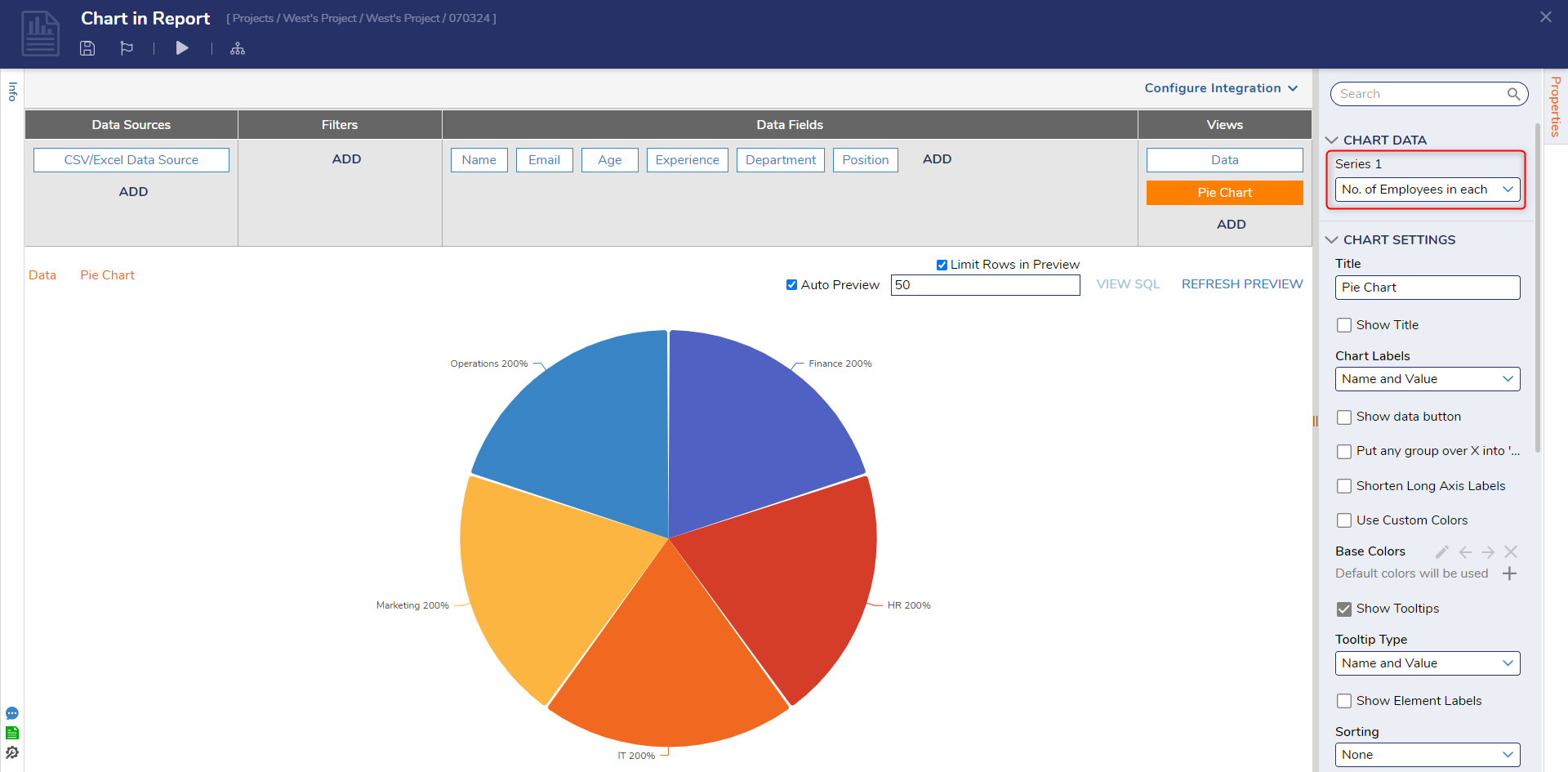
In the properties panel of the Charts, the Number Formats settings offer the option to display values as percentages. When you select the percentage format, the Chart will automatically multiply the underlying numerical values by 100 to represent them as percentages. For instance, if there are two equal groups, each with a count of 2 rows, the total count will be displayed as 400%, and each group will be represented as 200%. Refer to the image below for a visual reference of this behavior.
Configuration
Users must generate a new Series in the Reports to calculate the percentage by adding a Sub Total. Follow the steps mentioned below to calculate the data in percentage.
- Navigate to the Report where the charts are added. Under the Views header, click on Data.
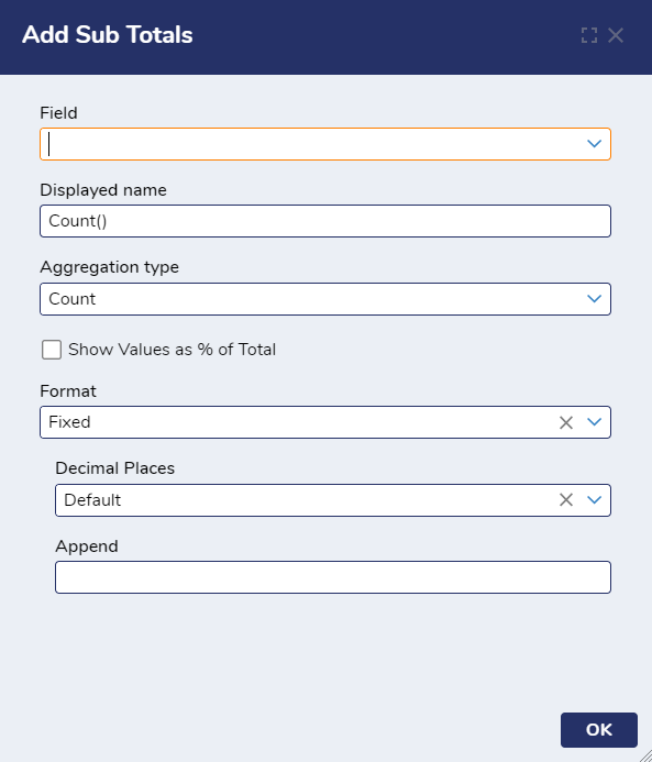
- From the Properties Panel > Results > Sub Total. Click on Add.
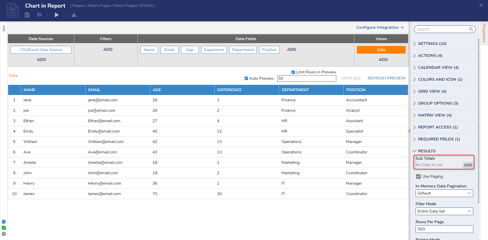
- Add Sub Total dialog box will open. Configure the settings based on the following table.
Setting Name Description Field Allows to select the column of the Report Displayed Name This will be shown as the Series name on the Chart Properties Panel Aggregation Type The method used to aggregate data that will be used to generate the Chart.
Note: Sum, Average, Minimum, Maximum, and Median only work when the selected Field has numerical data.Count Counts the number of rows under the group Sum Adds all the values under the group Average Calculates the average of values in the group Minimum Retrieves the maximum value from the group Maximum Retrieves the minimum value from the group Median Calculates the median value in the group Show Value as Percentage This is a compulsory field to show the data in percentage. Enabling this option will calculate the percentage equating the total to 1. Thus, if there are 2 equal groups, the total count will be equated to 1%, and each group will be equated to 0.5%. The percentage values will reflect the aggregation type chosen for the Series. For example, if the aggregation type is set to 'Sum,' the percentage will be calculated based on the sum of the values. Format Changes the format of the number displayed at the end of the group header row. A group header row is a common row across all the columns displaying the Group name. Decimal Places Specify the number of decimal places for numeric values Append Allows to append the calculated data by a constant number - After configuring the Sub Total Settings. Click on Ok to save. Refer to the following image for reference.
- Above the Report Header. Click on the Refresh Preview. This will populate the calculated data on the group header row.
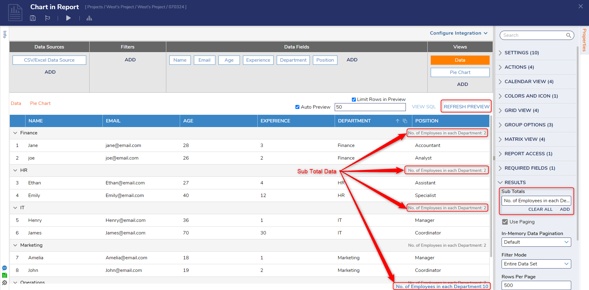
- Under Views, select the Chart to add Sub Total data as a new Series.
- From the Chart Properties Panel > Chart Data. Under Series 1, pick the newly created Series. This will populate the Chart with a percentage label.
- Under Chart Settings > Chart Label > Pick Name and Value. Scroll down to Number Format > Label & Tooltip Format > Pick Percentage for both. This will multiply the percentage value by 100.
Feature Changes
| Description | Version | Date | Developer Task |
|---|---|---|---|
| Added the ability to display a calculated percentage value on Charts | 8.13 | September 28, 2023 | [DT-038119] |
| Charts can now use Subgroups for stacked charts | 9.15 | September 2025 | [DT-043212] |