Overview
Within a Report, a Series represents a set of values derived from the subtotals of grouped data fields. Each series corresponds to a specific grouping or calculation and can be displayed as its own line, bar, or segment within a chart.
When a Report contains more than one grouped data set, a Multi-Series Chart can be used to display multiple series in the same visualization. This allows users to compare related values side-by-side or in stacked form, making it easier to identify trends, relationships, and differences across categories.
Not just any type of chart view can have multiple series. Multiple Series are available for Areas, Bars, Bubbles, Columns, Dots, Lines, and Stacked Bars.
To enable multiple series in a chart view, one of the following must be configured:
- Report Subtotals: Define subtotals on the grouped data fields to be added as individual series.
- Use Subgroups: Automatically generate series based on subgroups within the main grouping.
Configuration
Using Report Subtotals
- Create a Report and add Data Sources/Columns to populate it.
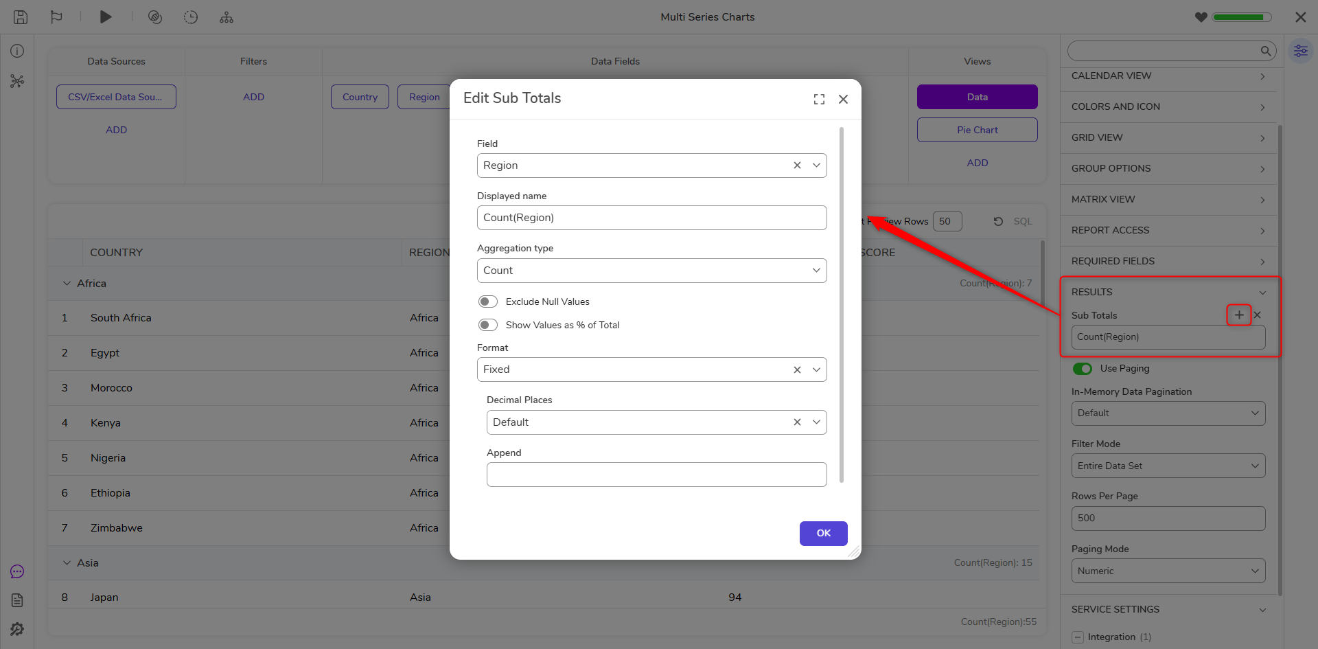
- Group the Report by the desired field (e.g., Region).
- In the Properties panel, expand Results and select Add under Sub Totals. Configure the subtotal as needed (e.g., Count, Sum, Average).
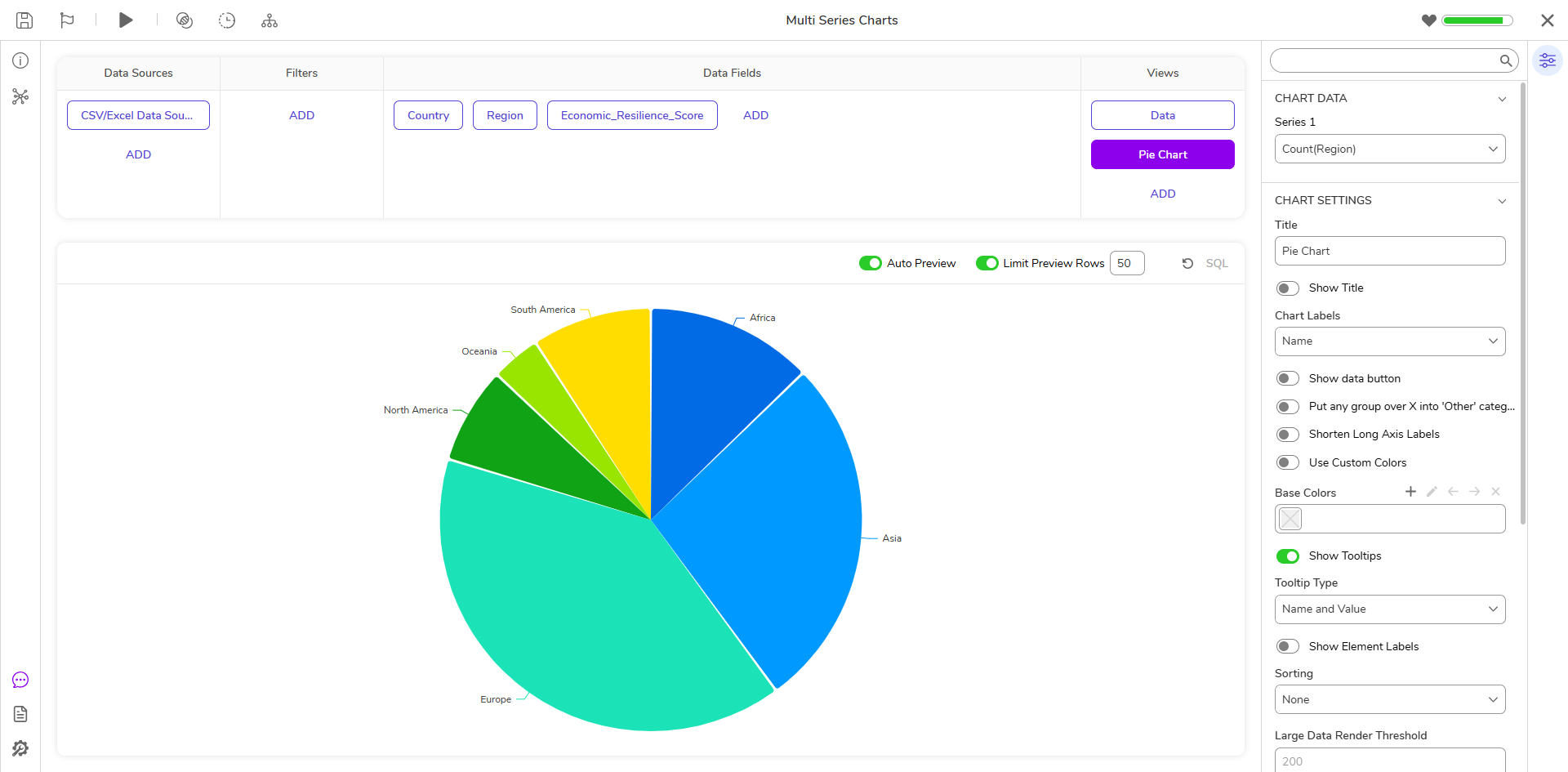
- Add a chart view by selecting Views > Add and choose a supported chart type (e.g., Stacked Bars).
- In the chart’s configuration dialog, Series 1 will be prepopulated with the grouped column.
- Select Add Series to include additional subtotals as Series 2, Series 3, etc. (custom colors may also be applied).
- Save the chart. The selected series will display together in the visualization and can be further customized in the Properties panel. Refer to the Adding Charts to a Report Chart Settings information.
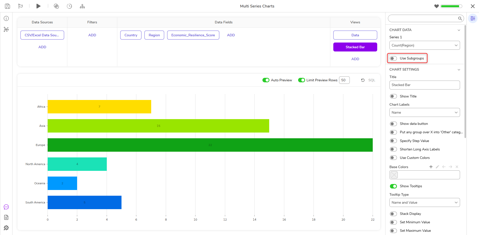
Using Subgroups
- In the chart’s Properties panel, under Chart Data, enable Use Subgroups. This setting is only available if there is one series as the Sub Groups will create the other series.
- When enabled, each subgroup within the main grouping is automatically displayed in the chart as its own section.
- This allows a single grouping to produce multiple series without configuring individual subtotals.
Troubleshooting
| Tip | Screenshot |
|---|---|
| When using the Sub Total function, if there are fields with null results this will produce incorrect results. Be sure to check the Exclude Null Values box to prevent this from occurring. | 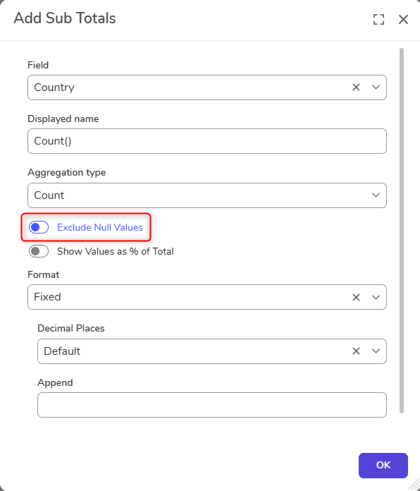 |
| When using Multi-Series Charts, the tooltip may display only the main grouping rather than the subgroup (series) name. To provide context for each section, add a Legend to the chart so users can identify which subgroup each series represents. A fix for this behavior is planned for an upcoming release. | 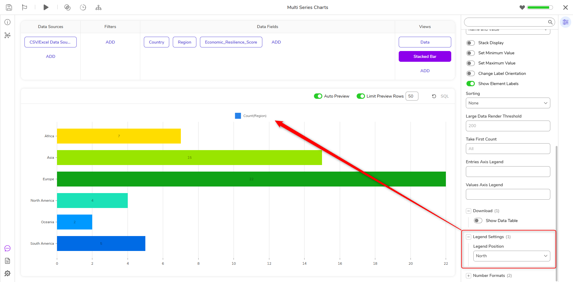 |
Feature Changes
| Description | Version | Release Date | Developer Task |
|---|---|---|---|
| Added the "Exclude Null Values" setting to the Add Sub Totals screen. | 9.4 | November 2024 | [DT-040681] |
| Use Subgroups property added. | 9.15 | September 2025 | [DT-043212] |