Overview
The Multi Select Drop Down control is a Form Control designed to facilitate the selection of multiple items from a list of objects. It serves as an essential component in various web and application forms where users need to make multiple selections conveniently.
- User-Friendly: The control allows users to select multiple items from a drop-down list intuitively. Users can click on individual items to include them in their selection, making it easy to pick desired options.
- Flexible Customization: Developers have the option to customize the appearance, styling, and behavior of the Multi-Select Drop Down control to align with the application's design and user experience requirements.
- Dynamic Data: The control is data-driven and can efficiently handle dynamic changes to the underlying list of objects. As the data source updates, the drop-down list automatically reflects the changes, providing users with up-to-date choices.
Configuration
Input Data
| Setting | Description |
|---|---|
| List Input Source | Choose the source for the items displayed in the Flow, Static, and DataName drop-down list. Flow: Populate the drop-down list with items from a predefined list created within the control's settings. Static: Provide a list of static items that will appear as options in the drop-down menu. Optionally, set a Static Default Item to pre-select an item when the Form loads. DataName: Populate the drop-down list with items from an existing list of data within the associated Flow. - Can utilize an AFF |
| List Items | When using the Static List Input Source, provide a list of static items to appear as options in the drop-down menu. |
| List Items DataName | When using the DataName List Input Source, specify the DataName of a List of Data within the Flow to populate the drop-down menu. |
| Type | Specify the data type of the items that will be available in the drop-down menu. For example, choose String, Int32, or any other Data Structure. |
| Display Field | When dealing with data structures like Account or Folder, choose the specific field that will be displayed in the drop-down menu. For instance, the Display Field could be Email Address if working with an Account data structure. |
| Flow Output Data Name | |
| Pick / Create / Edit Flow ID | Choose from Pick or Create Flow options. This allows developers to either select an existing Flow to source the drop-down list or create a new Flow. The Flow can also be edited after selection, giving you the flexibility to fine-tune its behavior. |
| Flow Input Data | The control can dynamically populate the list based on various inputs provided to the Flow. These inputs can come from Typed Text, From Form Control, or Expose as Form Input sources, making the drop-down list adaptable to user interactions. |
Output Data
| Setting | Description |
|---|---|
| Output Only | When set to true, the Selected Item(s) Data Name will not be available as an input to the Form, and the selection list will not be pre-populated. This setting is useful when you want the drop-down list to be entirely driven by user selections. |
| Output Member Only | Outputs the Display Field value only, for example, the Email Address of an Account instead of the entire Account. |
| Selected Item(s) Data Name | Provide a Data Name for Selected Items; this captures the selected items in the Form. Additionally, this Data Name can be used as input on the Form to pre-populate the selection list with objects that are mapped to the Data Name within the Parent Flow. Dynamic Multi-Select Drop Downs |

Related Information
Example Labs:
Account Drop Down List
Dynamic Multi-Select Drop Downs
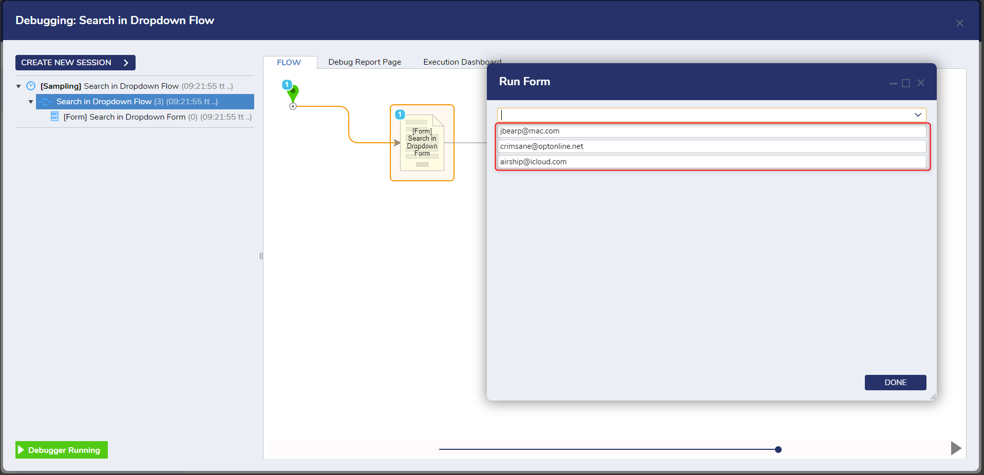
Searching a Drop Down List