Feature Addition in v8.15
Since the capability to load the container in a collapsed state for end users was not available in v8.13 & v8.14, it has been introduced in v8.15. This new feature includes the addition of a "Initially Collapsed" setting within the properties.
Overview
The Header Container Layout serves as a Form Control that empowers designers to incorporate additional Form controls or Form layouts inside it. It also provides the flexibility to collapse or expand, accompanied by its own title header.
Designer users can drag and drop Form controls within the container, treating it as an independent Form Layout.
Advantages of using Header Container
| Advantages | Description |
|---|---|
| Enhanced User Experience | Header Container Layouts improve user interaction by offering a structured and organized interface, making it easier for users to access information, making it easier for users to access information. |
| Space Efficiency | Collapsible sections save screen real estate, allowing users to expand and view only what's relevant at any given time. This works well on mobile devices. |
| Ease of Maintenance | Developers can manage and update content within collapsible sections more efficiently, enhancing the scalability of applications. |
Business Use Cases
| Example Use Cases | Description |
|---|---|
Loan Application Form | Financial institutions often require customers to fill out extensive loan application forms. Using collapsible sections, applicants can easily navigate through sections like Personal Information, Financial History, Collateral Details, and Loan Terms. |
| Healthcare Patient Intake Form | In a medical clinic, patient intake forms can be extensive. These forms can be made more user-friendly by dividing them into sections such as Medical History, Insurance Information, and Emergency Contacts. |
The following video demonstrates the core functionality of Header Container, where the users click on the plus icon to expand the headers and the minus icon to collapse.
Following is an example lab article for reference,
Configuration
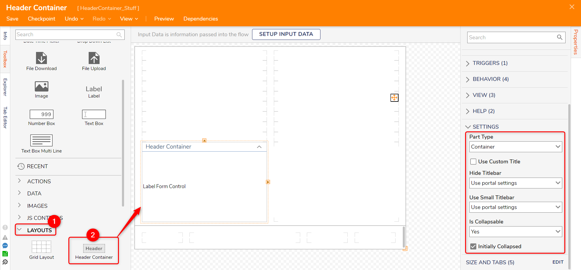
The Header Container Layout control is located in the Toolbox panel under the LAYOUTS category. In the Properties panel for the Header Container, users can find various customization options for the Header Container.
| Properties | Description | |
|---|---|---|
| Title | This will be the Header's Title that will be visible to the end users. | |
| BaseContent | Header Container is its own distinguished section of the Form or Page. | |
| Container | It makes the Header Container transparent. | |
| Child | Shrink the title bar to make it appear secondary to the default BaseContent setting. | |
| Chromeless | It makes the Header Container transparent and strips away the Header so the Container renders as it doesn't have any appearance-related properties. | |
| Use Custom Title | Toggles use a custom title format for the Header and prompts for which Folder this format is located when enabled. | |
| Hide Titlebar | Allows selection to hide/unhide the title by directly choosing those options or choosing according to the Portal settings. | |
| Use Small Titlebar | Allows selection to use a small title bar by directly choosing those options or choosing according to the Portal settings. | |
| Is Collapsible | Allows selection for the Header to be collapsible by directly choosing those options or choosing according to the Portal settings. If selected "Yes," it populates another setting for "Initially Collapsed". | |
| Initially Collapsed | If Marked True, this will make the Container load in a collapsed state for the end users. | |

Feature Changes
| Description | Version | Date | Developer Task |
|---|---|---|---|
| Removed the bug that allowed the users to load the control body in a collapsed state. | 8.13 | September 28, 2023 | [DT-038111] |
| Added the ability to load the Header Container in an initially collapsed state. | 8.15 | October 12, 2023 | [DT-038448] |