Overview
There are multiple Layout options available to aid users in creating and designing their Forms, each with their own benefits and use cases. Of these Layouts, one such type is the Stack Layout; Stack Layouts have the benefit of automatically aligning objects that are added to the Form workspace side by side. This can be helpful for cases that involve a need to display information of one type or in a list format, one after the other.
Stack Layouts exist in two forms, either Horizontal or Vertical, each of which changes the direction that the information follows across the Form. The following document discusses the settings and options available for users that choose to create a Form that uses a Stack Layout.
Form Design
Stack Layouts can be created via the Horizontal Stack Layout or Vertical Stack Layout option found after selecting the CREATE FORM button in a Designer Folder.
Once in the Form Designer, navigate to the Properties tab and select a Stack option via the Container type dropdown. Alternatively, Stack Layouts can be added by dragging one of the Layouts from the Layouts category in the Form Controls tab into the workspace.
.png)
.png)
After selecting a Stack Layout, components can be added by dragging and dropping them into the workspace. The added components will display differently depending on the type of Layout selected.
The Horizontal Layout allows for components to be set one after another, horizontally. Each added component automatically resizes to the height of the workspace; the width measurement of a component can be manually adjusted.
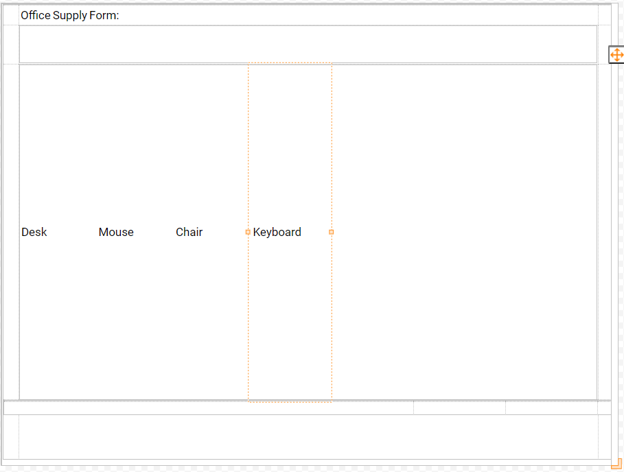
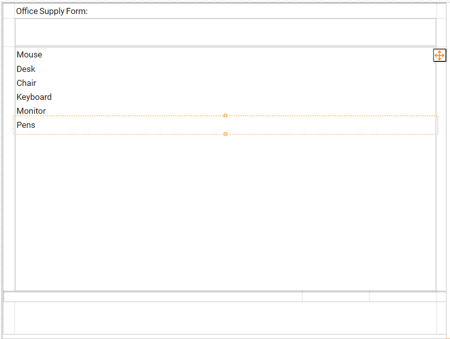
The Vertical Stack Layout allows users to set components one after another, vertically. Each added component will automatically be resized to the width of the workspace. Designers must manually resize the height of a component.
Layout Benefits
By using a Stack Layout, Designers can add elements to a Form sequentially without having to add any additional parameters to the Layout. Depending on the selected display mode, information can be displayed all at once on the Form, or in the Form of a scrolling list. The list displays added elements in parallel aligned with even spacing between each Row or Column. This eliminates the need of having to make any additional size adjustments, as is common with some other Layout Types such as a Grid Layout.
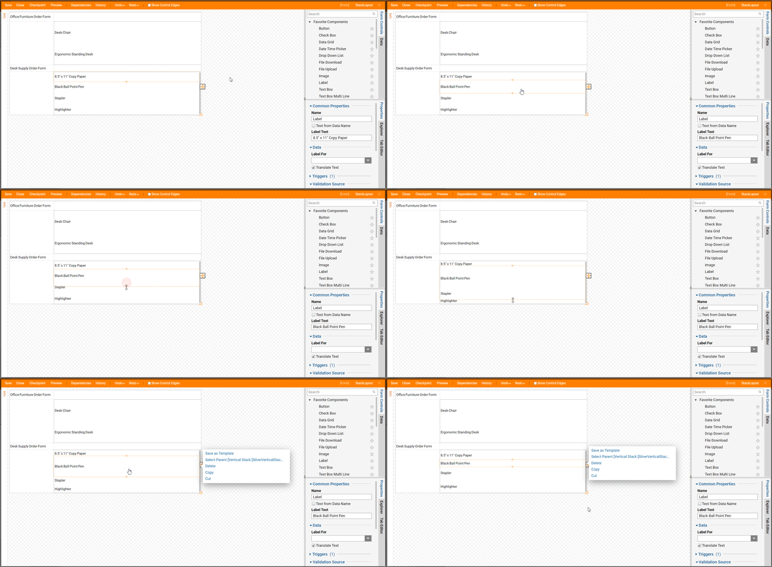
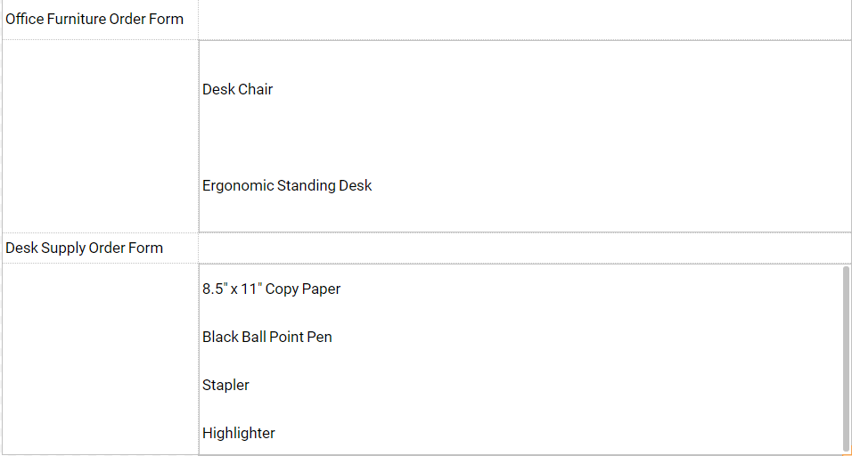
Dropping a Stack Layout into a larger Form (such as a multi-category order Form) can add an element of uniformity to what could potentially end up being a difficult to follow document.
Common Properties
The Common Properties panel is the panel in the Properties tab of a Stack Layout that is used to define the Name of the component as well as the way that the Stack Layout behaves.
The method by which the Layout behaves is defined in and referred to as the Children size mode. This mode is defined by selection via dropdown menu.
There are three options for Children size mode, Scroll, ExpandChildrenThenScroll, and FitChildren.
The default selected option is Scroll; in Scroll mode, when Form components are greater than the Form's size, a scroll bar appears.
A Horizontal Stack with Scroll mode selected displays as follows:
.png)
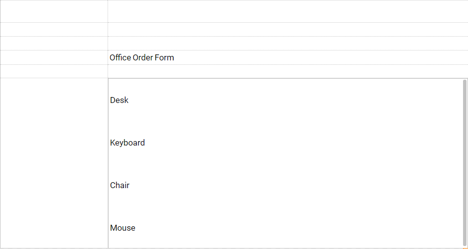
A Vertical Stack Layout with Scroll mode selected displays as follows:

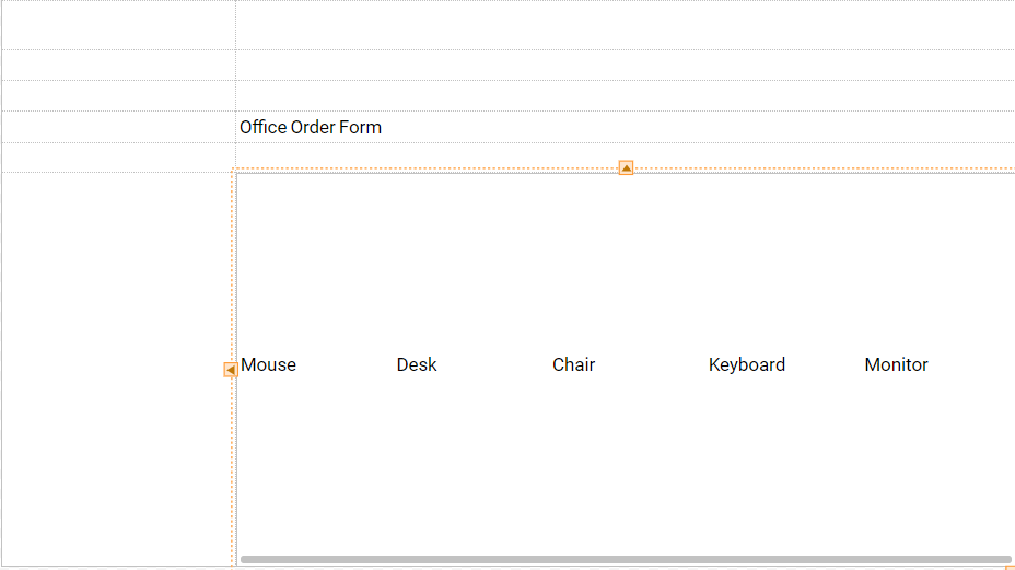
If the ExpandChildrenThenScroll option is chosen, Form components will be spread evenly until Form Size is exceeded.
A Horizontal Stack with ExpandChildrenThenScroll mode selected displays as follows:
A Vertical Stack with ExpandChildrenThenScroll mode selected displays as follows:
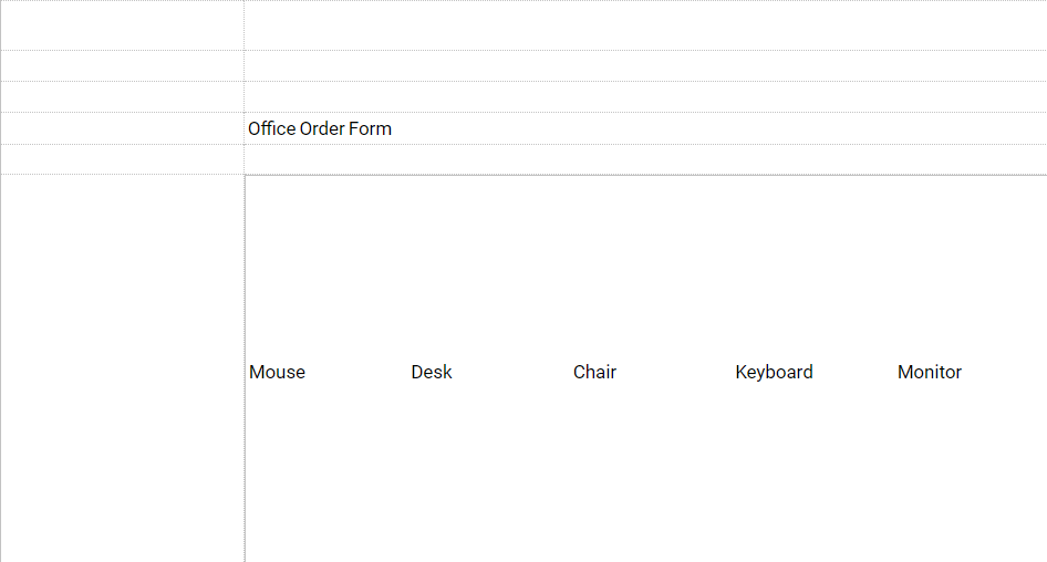
If the FitChildren option is selected, Form components will be resized to spread evenly on the Form.
A Horizontal Stack with the FitChildren option mode selected displays as follows:
A Vertical Stack with the FitChildren option mode selected displays as follows:
