Overview
The Header Container Layout acts as a Container its with own title Header. The controls and other Layouts may be added inside the Container's workspace; however, the Header cannot will stay static.
Use this for differentiating instructions for a Form or for highlighting a "fine print" inside of a Header Container that is collapsed by default.
Configuration
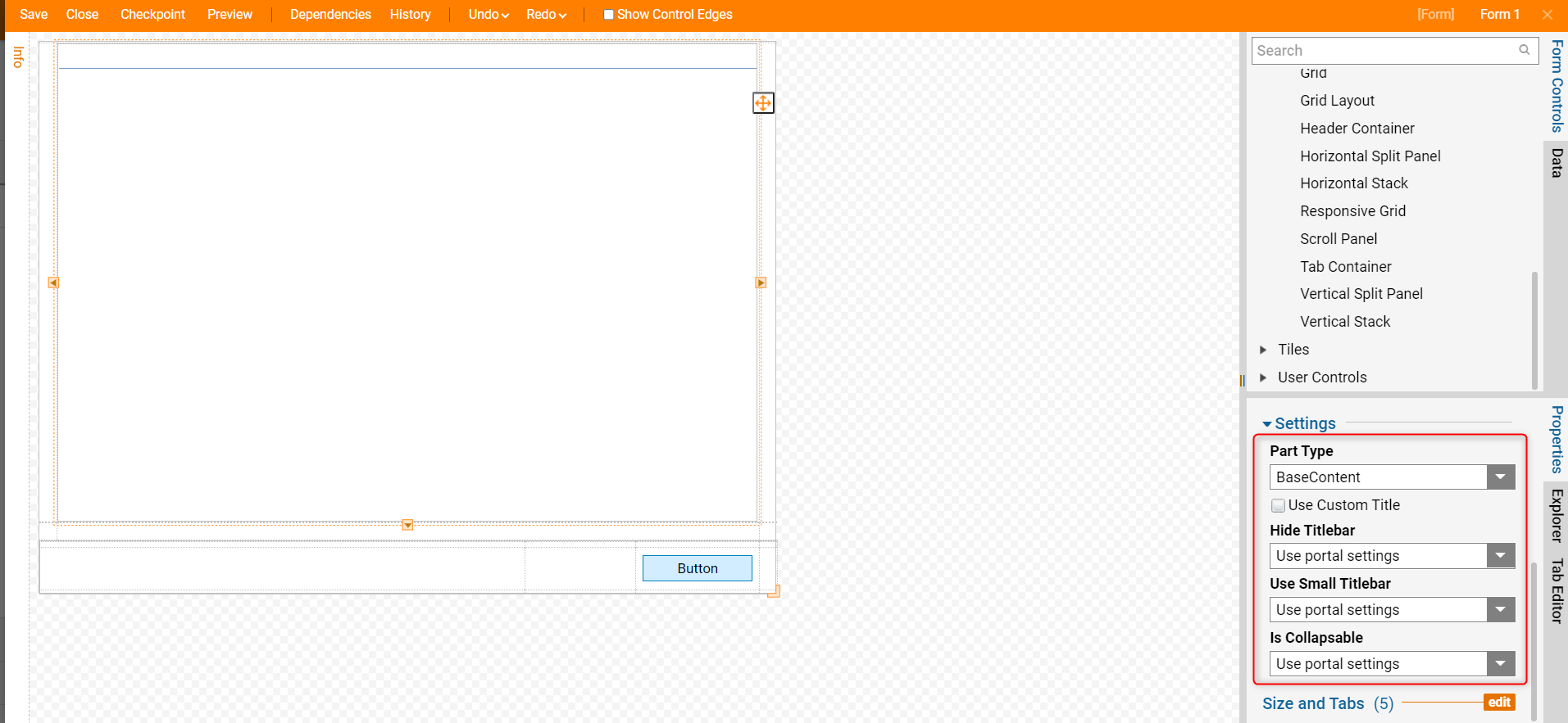
In the Properties panel for the Header Container, under Settings, the Part Type drop-down list offers the following options:
| Part Type | Description | |
|---|---|---|
| BaseContent | Header Container is its own distinguished section of the Form or Page. | |
| Container | Makes the Header Container transparent. | |
| Child | Shrinks the title bar to make it appear secondary to the default BaseContent setting. | |
| Chromeless | Makes the Header Container transparent, and strips away the header so the Container renders like it doesn't have any appearance-related properties. | |
| Use Custom Title | Toggles use of a custom title's format for the Header, prompts for which Folder this format is located when enabled | |
| Hide Titlebar | Allows selection to hide/unhide the title by directly choosing those options or choosing according to the Portal settings | |
| Use Small Titlebar | Allows selection to use a small title bar by directly choosing those options or choosing according to the Portal settings | |
| Is Collapsible | Allows selection for the Header to be collapsible by directly choosing those options or choosing according to the Portal settings | |