Supported Controls and Layouts Glossary
The following list consists of the Controls and Layouts supported in Simple Forms as well as their available CSS classes for further customization.
Controls appearing next to the gray column are child controls of the next above parent control. To access these child controls, change the control's Control Type (v7.9+) or Look and Feel (7.8-). These settings are discussed further in the following subsections.
| Directory Location | Name | Description | CSS Classes Available | |
|---|---|---|---|---|
| Layouts | Preserve white space but hide components if necessary, can stack controls vertically | CSS | ||
| Fixed containers to house form controls, can be stacked upon each other | CSS | |||
| Controls > Action | Standard interactable button Available Display Type: Button, Link and Image | Control | ||
| Open URL | Opens the specified URL link once clicking the control | Same as parent | ||
| Event | Triggers an event once clicking the control | Same as parent | ||
| Previous | Reverses Flow to previous steps; stops reversing when a Form with an Outcome Behavior Type Button is selected; when used in combination it can create a loop | Same as parent | ||
| Post Back | Resets all entries in the Form | Same as parent | ||
| Copy Text | Copies the text string value of the specified Textbox | Same as parent | ||
| Data Repeater Add/Remove | Respectively adds or removes a row to its attached Data Repeater | Same as parent | ||
| Sub Dialog | Runs a sub dialog Flow that can house a Form to pops up in front of the current Form | Same as parent | ||
| Data Grid Add/Remove | Respectively adds or removes a row to its attached Data Grid | Same as parent | ||
Controls > Data | Check Box | Create checkboxes for user selection |
| |
| Switch | Displays a toggle button switch | Same as parent | ||
| Data Grid | Displays an Excel-like view of an Entity | Control | ||
| Data Repeater | Places a Simple Form within a Simple Form as a repeatable list of the same data type(s) |
| ||
| Allows the user to choose a date and time |
| |||
| Date | Allows the user to choose a date | Same as parent | ||
| DateTime | Allows the user to choose a date and time | Same as parent | ||
| Time | Allows the user to choose a time | Same as parent | ||
| Calendar | Interactive Calendar where end user and select a date and/or time | Same as parent | ||
| Image | Displays an image |
| ||
| Label | Displays non-interactive text |
| ||
| Rich Text | Displays inputted text with options to change font format, style, color, size, alignment, copy, paste, insert image, create a table, create hyperlinks, etc | Same as parent | ||
| Latitude and Longitude | Displays the latitude and longitude of the specified location by working alongside Geolocation API | Control | ||
List | Displays text as a list; contains Single Select and Multi Select options for user selection |
| ||
| Combo Box | Displays drop down list items of the specified Data Type with Single Select and Multi Select options for user selection |
| ||
| Check Box List | Creates a list of checkboxes for user selection; contains only Multi Select behavior | Same as parent | ||
| Radio Button List | Creates a list with the ability for users to make a selection via radio buttons; contains only Single Selectbehavior | Same as parent | ||
| Shows the progress of data being input, allows the designer to set a minimum and maximum number for the bar | Control | |||
Signature Pad | A signature can be drawn with a mouse or touch screen if applicable |
| ||
| Text Area | Displays static or input data with a built-in label |
| ||
Text Field | Users can input string |
| ||
| AutoComplete | Creates an auto-complete search bar | Same as parent | ||
| Currency Box | Number box that inputs and outputs currency | Same as parent | ||
| Masked Text Box | Allows designer to give the text a format value type: General, Number, Decimal, Currency, Email Address, SSN, Custom, Phone Number. | Same as parent | ||
| Number Box | Only takes in and outputs a number | Same as parent | ||
| Number Spinner | Only takes in and outputs a number with up and down arrows for inputs | Same as parent | ||
| Password Text Box | Hides text with bullet points and allows the designer to create a minimum and maximum length | Same as parent | ||
| Text Box | Users can input string text | Same as parent | ||
| Upload a video file or input a video URL to display on the Form |
| |||
| Controls > Data > Validation | Validation Display | Shows validation messages for the Form | Control | |
| Controls > File | File Download | Allows download of one designated file |
| |
| File Upload | Allows upload of one user-specified file |
| ||
File Upload Area | Allows user to upload a file via drag-and-drop into area |
| ||
Files Download | Allows download of multiple designated files |
| ||
Files Upload | Allows upload of multiple user-specified files |
| ||
| Files Upload Area | Allows user to upload multiple files via drag-and-drop into area |
| ||
Changing a Control's Look and Feel
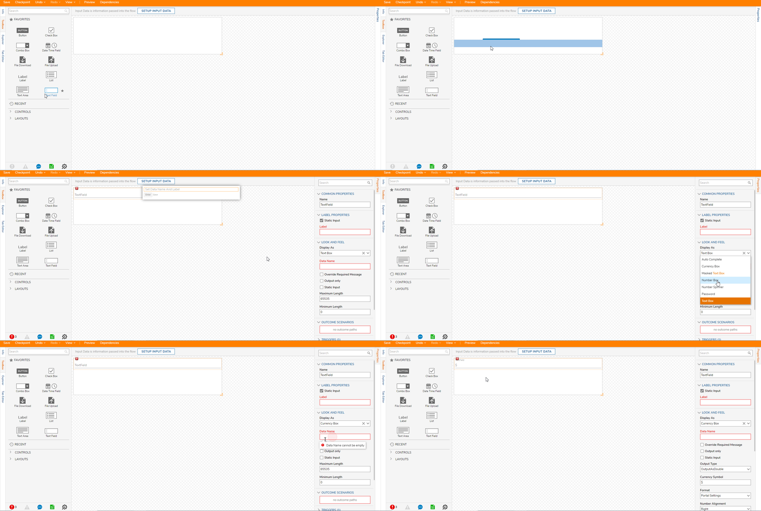
Configuring certain control's Look and Feel allows it to change into one of its child controls. To accomplish this, drag a parent control into the Simple Form's workspace. For this example, a Text Field is used. Notice how the Look and Feel Properties changes to the child control selection.
Changing a Control's Control Type
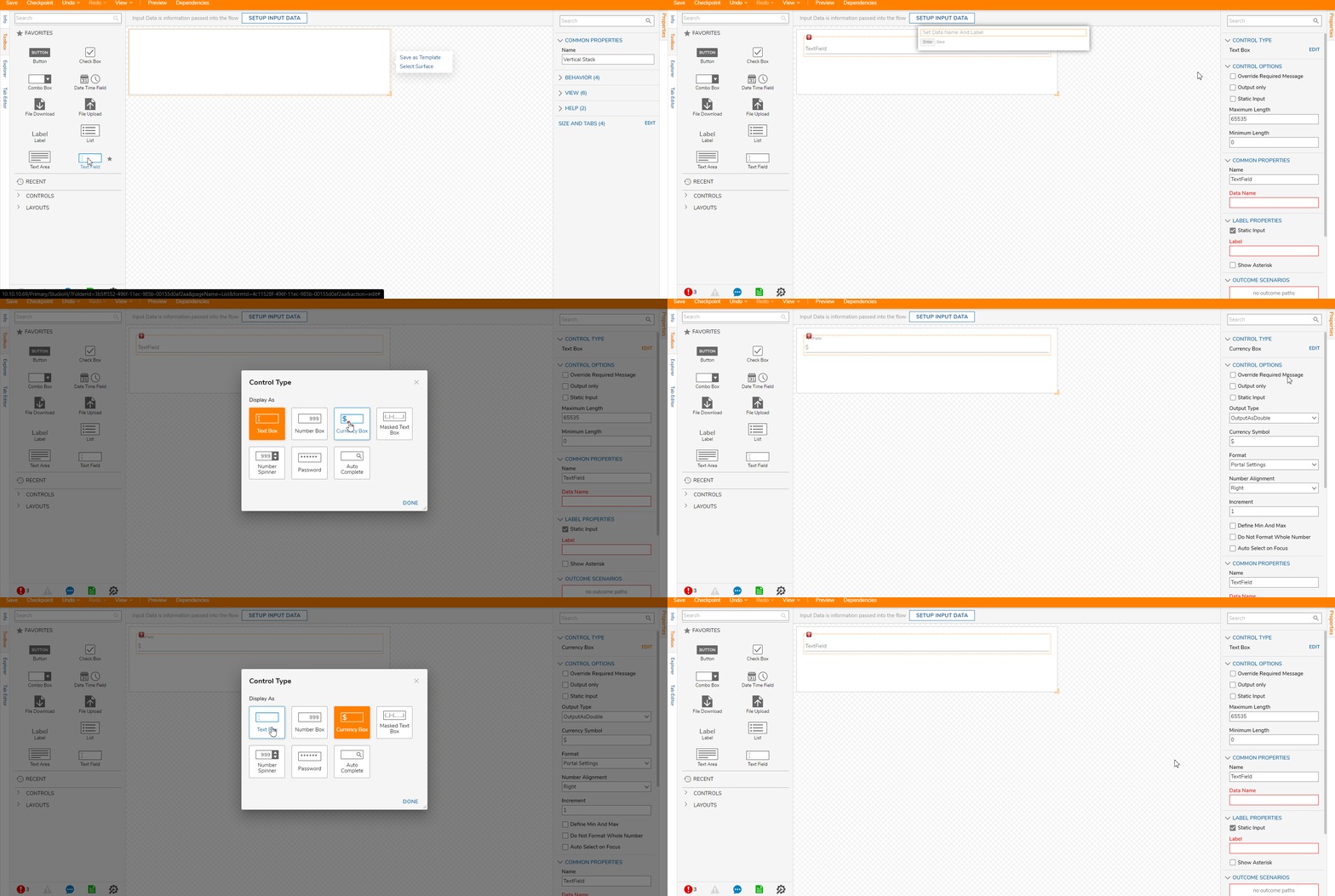
The Control Type setting configures the appearance and functionality of a Simple Form control. To accomplish this, drag a parent control into the Simple Form's workspace and click the Edit button under Control Type. The following example uses a Text Field that once changing the control also changes its Properties.

Note On Upgrading to 7.7+ Instances
The following changes affecting the below Simple Form controls occur in v7.7 instances.
Currency and Number Boxes
Currency and Number Boxes designed in 7.6- and then imported into a 7.7+ version Form may produce the following errors:
| Error Result | Potential Issue(s) |
|---|---|
| Value as blank |
|
| Value as null | User previously set Outcome as optional |
| Validation error | User previously set value as required |
Number Spinners
Number Spinners designed in 7.6- instances and then imported into a 7.7+ version Form >may produce the following errors:
| Error Result | Potential Issue(s) |
|---|---|
| Value as blank | Default issue due to Static Input, a new property in 7.7+ instances, being false upon upgrade |
| Value as null | User previously set Outcome as optional |
| Validation error | User previously set value as required |
| Flow does not complete | User previously provided data to value, which is blank by default upon upgrade, thus blocking the Flow's completion |