Overview
Pages are one of the many Designer Elements utilized throughout the Decisions environment. They are used as a visual showcase for data and components in Decisions. Pages can be used to do many things, including but not limited to:
- Embed an external Web Page
- Provide detailed views/information regarding Process Tracking
- Display Reports and user-created Forms
- Act as a User Dashboard.
As the name suggests, users can create and design Pages through use of the Page Designer via the Page Elements, Info, Explorer, Tab Editor, and Properties tabs.
The following document delves into the various tabs and functions provided by the Page Designer.
Designer Default View
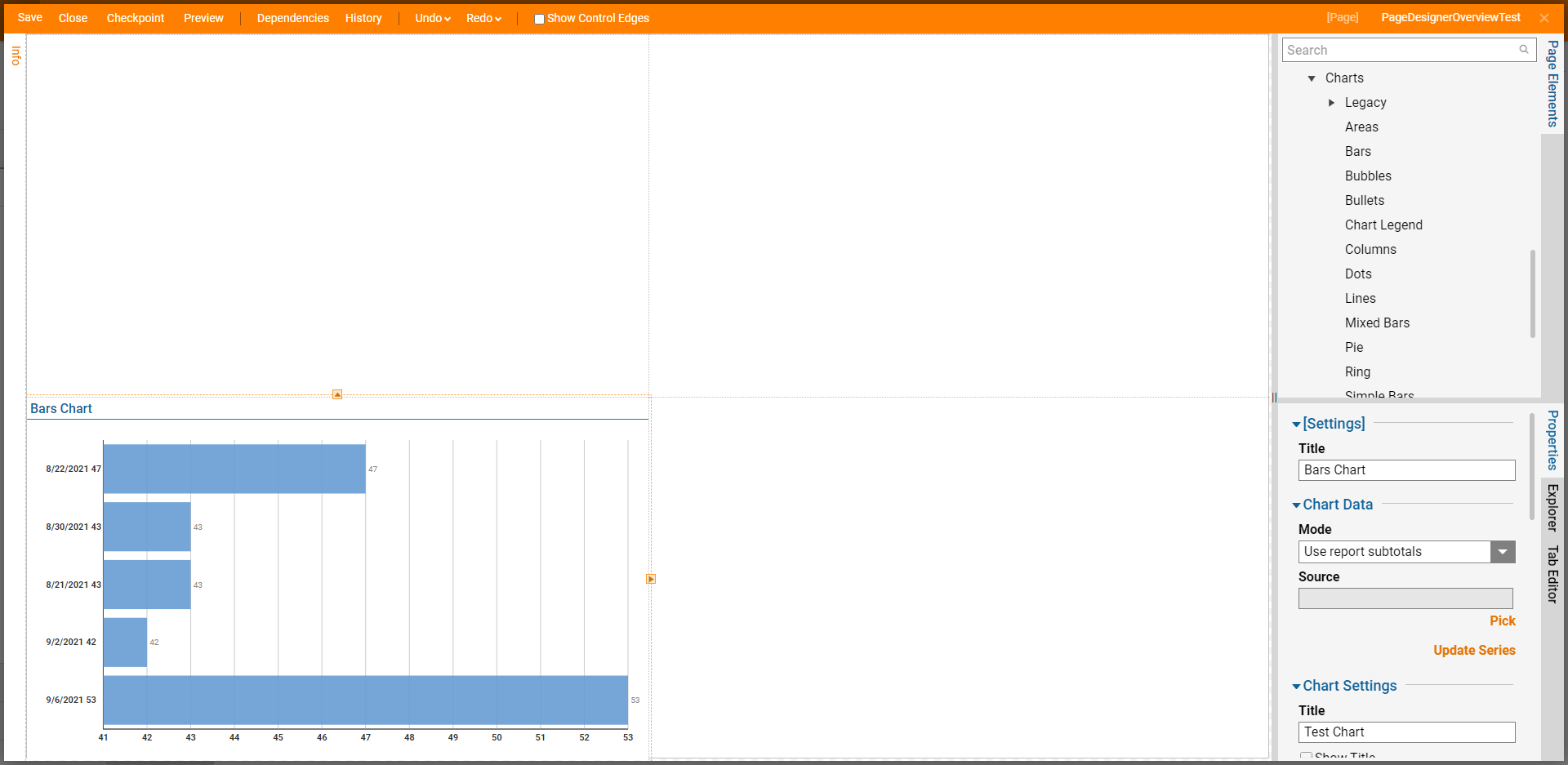
When the Page Designer is first launched, the Page Elements tab (located on the right) is populated with all the available Page Components that can be used to design a Page.
The default format for the blank Page is set up in a Grid format that is evenly divided into four separate cells.
Without selecting anything on the Page, the Properties tab (located below the Page Elements tab on the right) can be used to adjust the size of the Page's Rows and Columns, and to adjust additional visible aspects such as Background settings, and the application of CSS sheets.
Additionally, the Properties tab is also used to edit/define values and Properties for the added Page Components. 
Additional Tabs
In addition to a Page Elements and Properties tab, the Designer offers three additional tabs. These are as follows:
| Tab | Function |
|---|---|
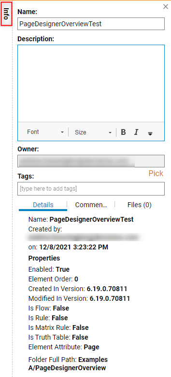
| Info | This tab allows the user to rename the Page, provide a Description, and view some additional information regarding the Page. If Tags are configured in the Decisions environment, they can be applied or added, via this tab. Additionally, Comments and Files can be added associated with the Page as well. |
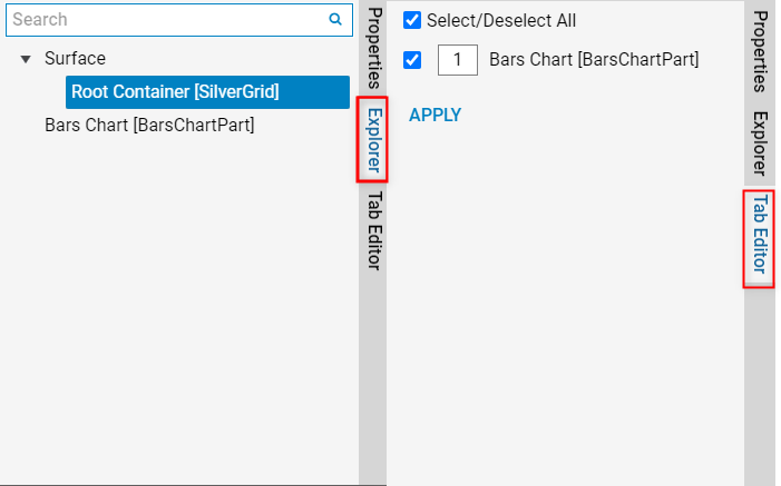
| Explorer | This tab is used to explore the different layers of the page. Selecting each layer highlights it in the Designer and navigates to its respective Properties tab. |
| Tab Editor | This tab is used to assign the behavior exhibited when a user tabs through objects on the Page. Objects can be included or removed from the tab order and can be ordered by assigning a numerical value. |


Top Action Bar
The following chart provides information on the Actions provided by the Top Action Bar in the Page Designer. Additionally, some of these Actions can be performed using keyboard shortcuts (as notated).

| Save | Saves the Page without closing the Designer. This action includes a window to write notes for the current Save State if needed. |
| Close | Closes the Page Designer; upon Close users are provided the option to also Save the Page and provide Notes. |
| Checkpoint | Creates a Backup of the Page at the particular place where the checkpoint is saved, then stores it in the History Folder. This is useful when making drastic changes that could affect Page functionality and design. For more information, please visit the Creating Checkpoints article. |
| Undo (CTRL + Z) | Reverses the last design change. |
| Redo (CTRL + Y) | Re-applies the previously undone design change. |
| Show Control Edges | Allows the user to Hide/Show Control Edges; the Control Edges refer the edges of each Component on the Page. Toggled via Boolean. |
| Preview | Provides a preview of the Page and how it will appear at runtime. |
| Dependencies | Offers a breakdown of which Designer Elements the Page depends on, as well as which Elements depend on the Page. For more information on Dependencies see Dependencies Overview. |
| History | Navigates to the History and Documentation page. This Page provides a view of all the Versions/Backups of the Page. The Page also allows users to perform additional Management tasks on the Page and relevant Tasks, Links, Documents, and Comments. |