Overview
A Pie Chart is a graphical demonstration of "parts per whole" relationships through division of a circle (pie) into separate slices for an at-a-glance comparison between the pieces. When added to Diagram Tiles, Reports, and Pages, Pie Charts provide data visually while reducing verbiage.
Similarly, Ring Charts serve the same purpose but display the data in the form of a ring, providing a more side by side view of the data.
The example below demonstrates how to create and use a Pie chart applied to a Diagram Tile on a Page in Decisions.
Example
Pie Charts
This example demonstrates how to create a Pie Chart that can be viewed from a Dashboard Page via Diagram Tile.
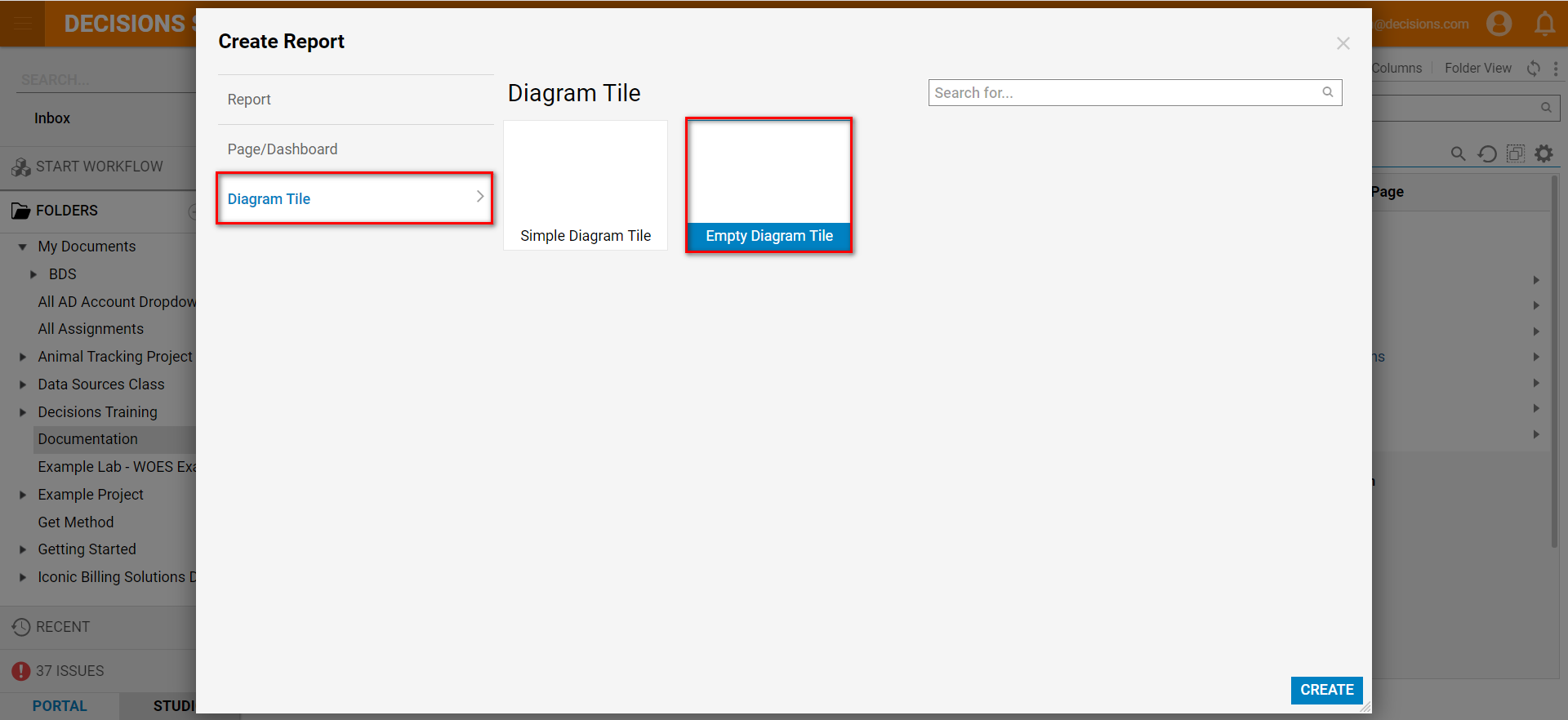
To create one, navigate to a Designer Folder, and select Create Report form the bottom toolbar.
.PNG)
Select Diagram Tile > Empty Diagram Tile, and click CREATE; name the tile, and then click CREATE once more.
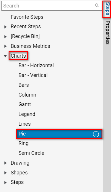
Next, add the Pie Chart to the Diagram Tile by navigating to Steps > Charts > Pie, and dragging a dropping it into the Designer.
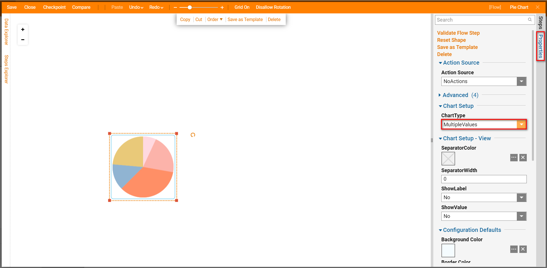
Select the Pie Chart to reveal the Properties tab. Under Chart Setup, click the drop down arrow for ChartType and select Multiple Values. This ChartType allows the ability to input more than three values on the chart.
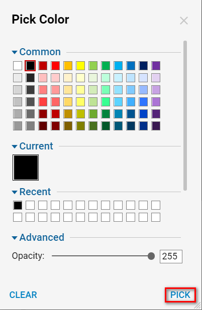
Click the ellipses (3 dots) next to SeparatorColor to define a a color for the line the separates each segment of the chart. Select the desired color and click PICK to define the Separator's color.
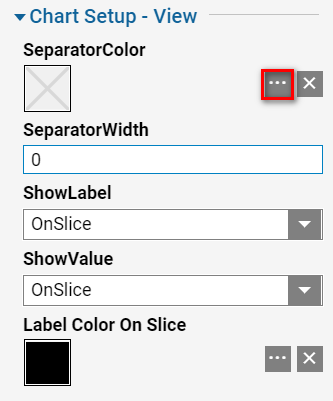
Once a color has been selected, set both down arrows for ShowLabel and ShowValue to OnSlice; this will display these values on each corresponding segment of the chart, making it less ambiguous and easier to read/understand upon first glance.
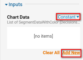
Next, scroll down to the the section labeled Inputs, to define the data displayed by the Pie Chart.
For the Input called Chart Data, select Constant, and then Add New to statically map data to each segment.
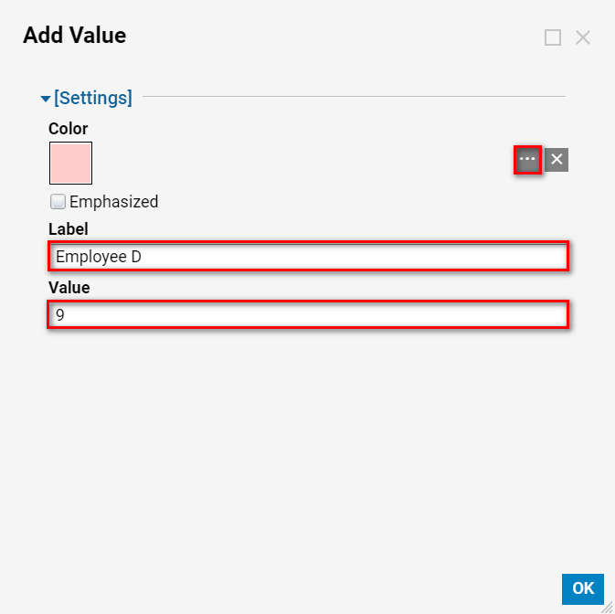
From the Add Value panel, select the ellipses beside Color. Afterwards, select a color and then Pick to determine the color of each slice on the Pie Chart.
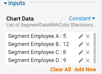
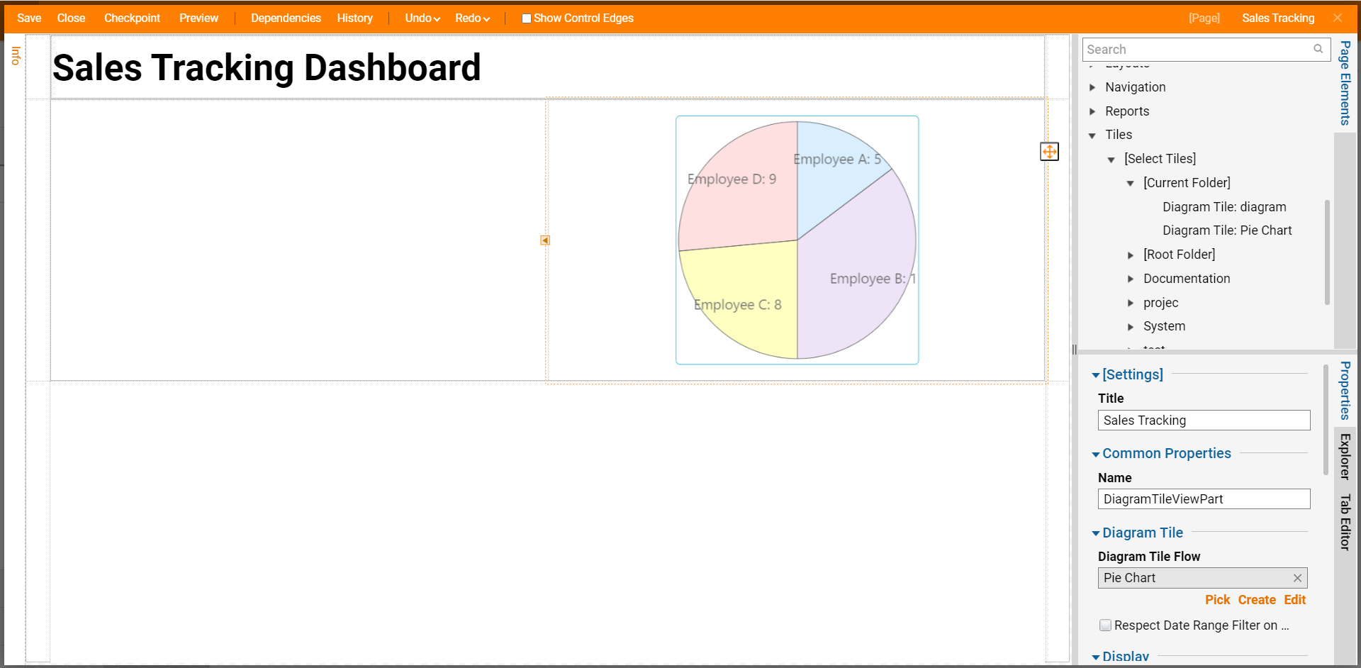
In the Label box, define an input for each segment. In this example, define the segment labels as: Employee A, B, C, and D.
After defining the Label input, enter a numerical value into the Value input box. This chart is used to demonstrate the number of sales that have been closed by employees; the values for this example will be 5, 12, 8, and 9.
After configuring the Input values, select Ok to close and save.
After configuring the Chart Data, Save and Close the Designer, via the buttons on the top toolbar.
Next, attach the Pie Chart to the associated Dashboard Page. See, Creating Dashboard Pages for more information on how to create Pages.
Begin by navigating to the associated Page, and navigate to the Page Elements tab located on the right hand side of the screen. From here, navigate to Tiles > [Select Tiles] > [Current Folder] (or the folder containing the Tile), and drag the Diagram Tile onto the Page.
The Tile will display as configured on the Dashboard Page.

Ring Charts
If a user wishes to display similar types of data on a Report or Dashboard Page, they may opt to use a Ring Chart instead.
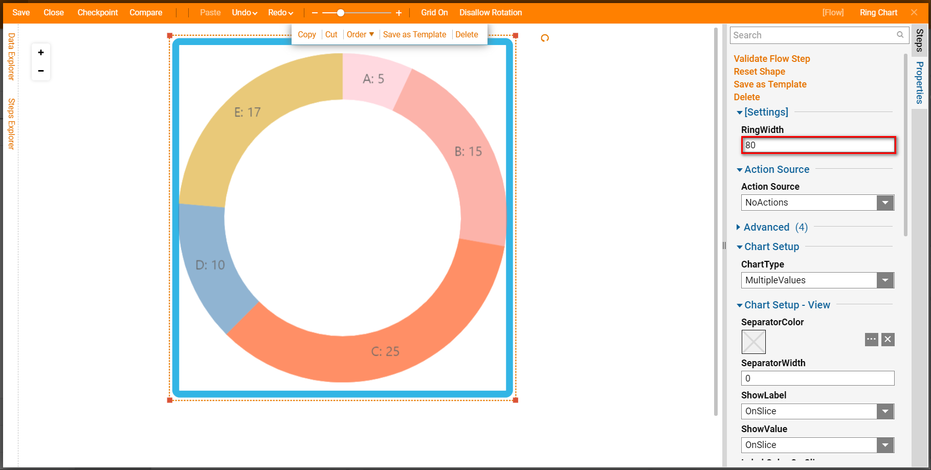
Ring Charts are used the same way as Pie Charts, but display the data side by side rather than in a Pie shape. This can be beneficial as it allows the chart to take up less space, displays percentages in terms of parts of the whole circle. and allows for additional information (such as labels) to be added to the center of the circle.
Ring Charts contain the additional property RingWidth, which is used to adjust the width of each ring segment.
.png)
Using More Than One Chart
If a user wishes to display more than chart within a Diagram Tile, they may do so by dragging in additional charts into the Diagram Tile Designer.
Charts maybe displayed alongside one another within the tile, or may be overlapping.
To adjust the overlap settings, enter a numerical value into the Property Z-Order; overlap is determined by which object has the higher Z-Order value.
For example, in an overlap of three charts, where the Z-Order values are 1-3, Z-Order 1 will be overlapped by both 2 and 3, 2 will be displayed under 3 but over 1, and 3 will display over 1 and 2.
.png)
.png)
.png)