Overview
Users can quickly see their assignments on a specialized Dashboard. The Inbox is available to all users.
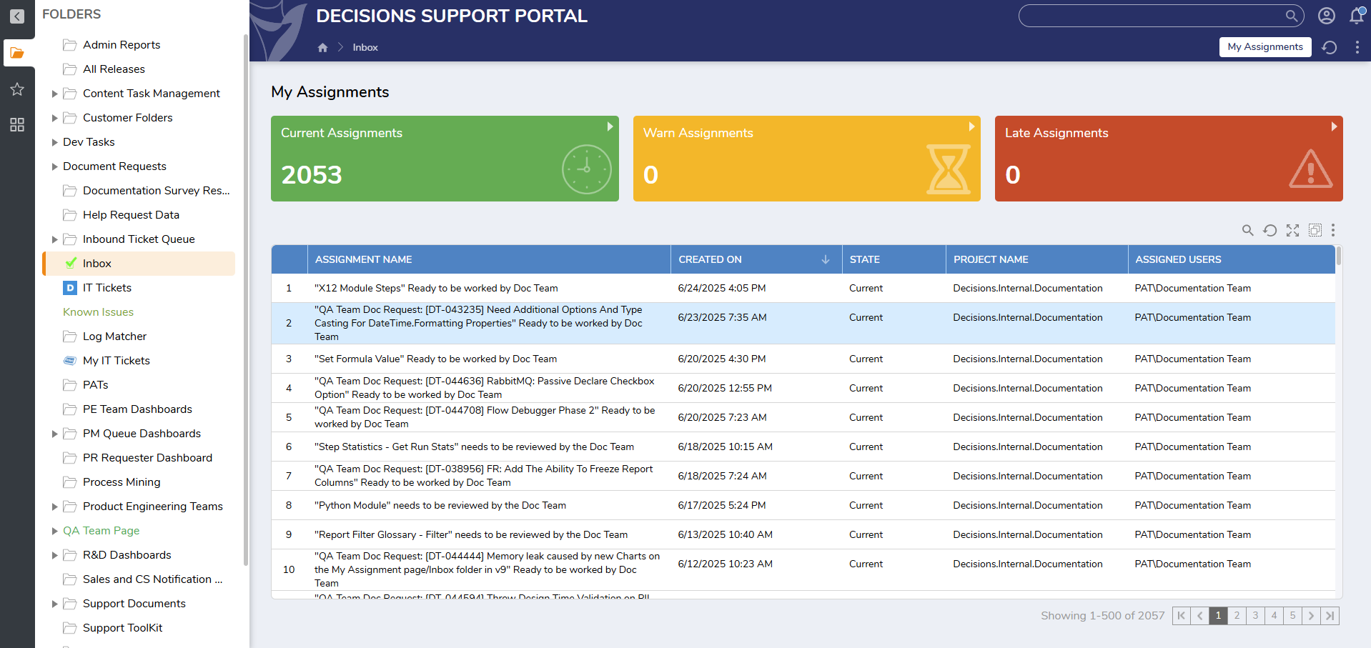
The Inbox is located under Folders > Inbox. Users will see all of their Assignments listed in the center of the Dashboard. Surrounding the Dashboard are metrics showing different information about the Assignments.
The Report in the center of the screen shows a complete list of every open Assignment. In the top right corner of the Report, just below the Late Assignments Tile, are tools that can be used to search through the Report, refresh it, expand, and group.
Like any Report, this can be filtered on each of the columns.
My Assignments
The status of open Assignments is displayed in the three tiles across the top. Assignments that are current are displayed in the green box. Assignments that are getting close to their due date are in the yellow box in the middle. And Assignments that have passed their required date are in the red box on the right. Clicking on any of the tiles will filter the Report in the center to only show the Assignments that share that status.
Assignments Per Project

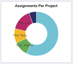
Assignments are shown broken up by the Project that they originated from. Clicking on any piece of the ring will pull up a Report showing the relevant Assignments. Hovering on the top right corner will pull up a menu with more controls. This graph only appears in v9.11 and below.

- Clicking this icon pulls up the Filters menu. Users can change colors, sorting, and which labels appear on the Tile.
- This pulls up the configuration menu. Users can change the chart type from the default.
- This opens up the Report and allows Users to customize the data being displayed. This is not recommended.
- This will expand the Tile to fill the entire screen.
Assignments Created Per Month

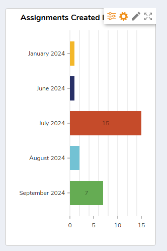
This tile displays the number of Assignments that were created in a range of months. Hovering over the top right corner will bring up more options. Clicking any month will pull up a Report showing all of the relevant Assignments. This chart only appears in v9.11 and below.

- Clicking this icon pulls up the Filters menu. Users can change colors, sorting, and which labels appear on the Tile.
- This pulls up the configuration menu. Users can change the chart type from the default.
- This opens up the Report and allows Users to customize the data being displayed. This is not recommended.
- This will expand the Tile to fill the entire screen.
Feature Changes
| Description | Version | Release Date | Developer Task |
|---|---|---|---|
| Updated the Inbox to include tiles. | 9.1 | July 2024 | [DT-040604] |
| Removed the Assignments Created per Month and Assignments Per Project charts. | 9.12 | June 2025 | [DT-044444] |