Overview
| Feature Details | |
| Introduced in Version | 9.12 |
| Modified in Version | --- |
The Custom Actions Field (Calculated Column type) enhances the user experience within Advanced Data Grids by allowing Decisions developers to configure multiple row actions as clickable icons in a single column. Currently this is only available on Advanced Data Grids, will be coming soon to Reports.
Each icon triggers a configured Flow that can interact with:
- Selected row data
- Parent form data
- Flow session data
This setup supports dynamic behavior like updating rows, triggering notifications, or toggling states (e.g., marking a row as “Favorite”).
Async logic is not supported. Assigned Forms will not work inside Custom Action Flows.
Custom Action Field must be AFTER any column it is evaluating or the action and any conditional formatting will not work as expected.
Custom Action Field must be AFTER any column it is evaluating or the action and any conditional formatting will not work as expected.
Configuration
- On a Form with an Advanced Data Grid, open the Advanced Data Grid Source. Add a new Calculated Column and select the type CustomActionsField.
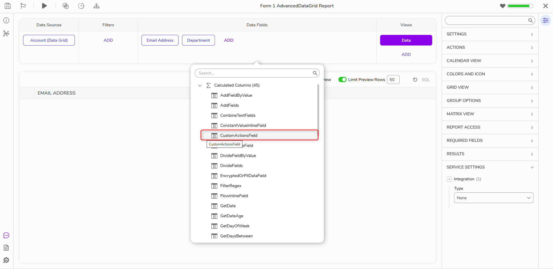
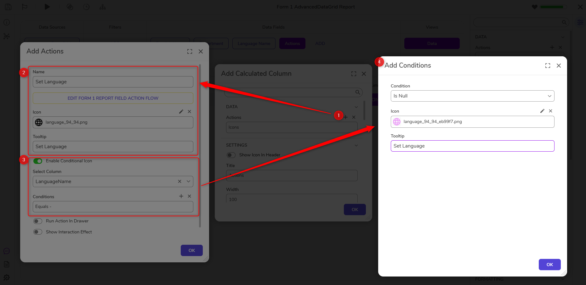
- In the Add Calculated Column dialog, all column properties are available. To configure the actions, open Data > Actions select the plus icon to add an action.
- For each action:
- Provide a name.
- Define the Flow to execute.
- Select or upload an icon (upload image file, URL, or pick from the Decisions icon library).
- Add a tooltip for accessibility.
- For each action:
- To provide more dynamic capabilities, icons can be conditional based on column values. Select 'Enable Conditional Icon' to show more configuration settings.
- Select a column to evaluate for the condition(s).
- Select the column to evaluate, then add one or more conditions.
- For each condition:
- Specify the icon, conditional logic, value, and tooltip.
- Note: The same Flow will run regardless of condition. Use logic inside the Flow to branch behavior based on row/form data.
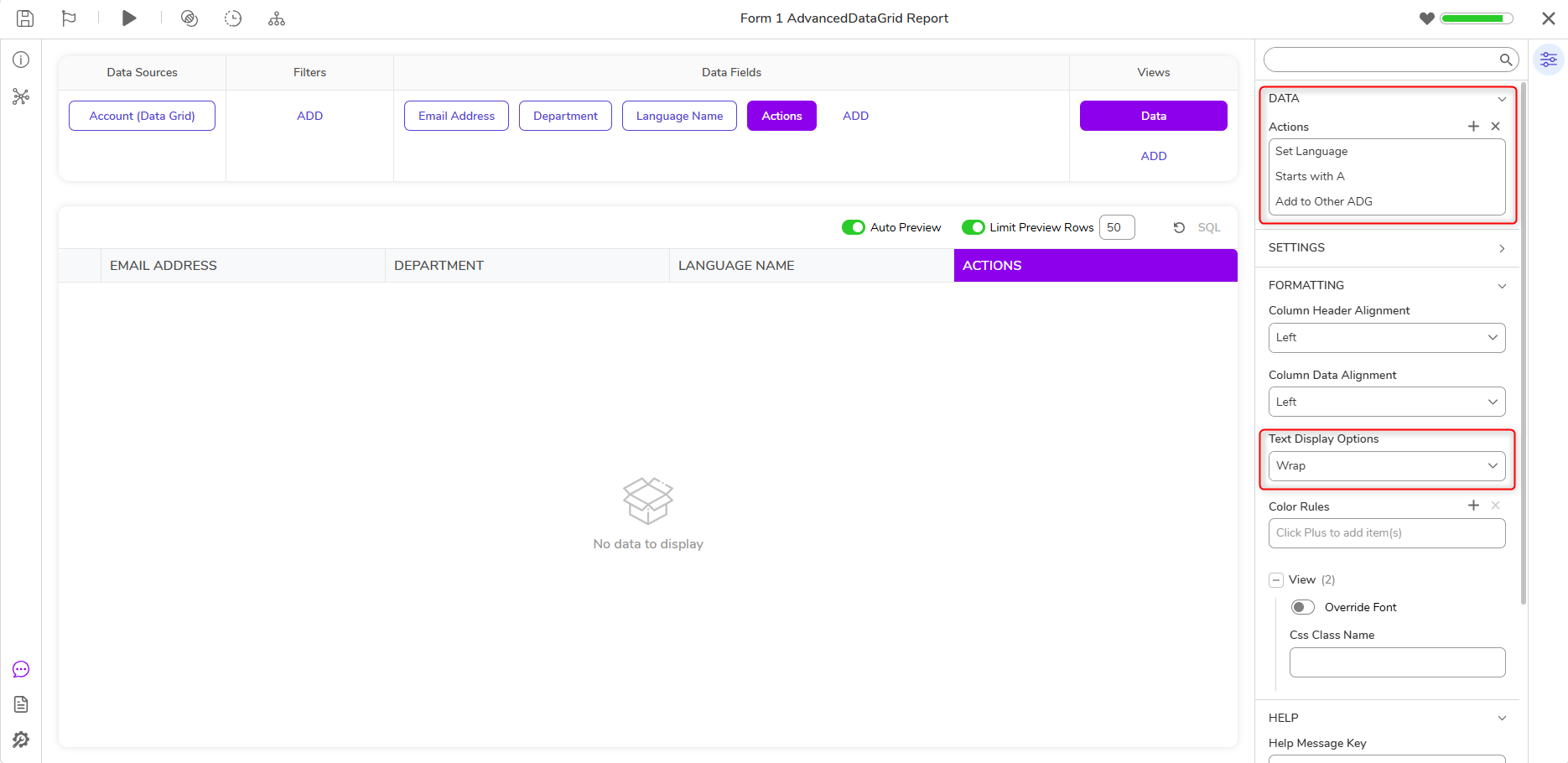
- Configure the order of icons using the up/down arrows within the Actions list.
- If icons exceed the column width, enable text wrap in column settings or expand column width.
Example Scenario
Please refer to our Example lab article for more information on building custom actions fields with Advanced Data Grids: Using the Custom Actions Field on Advanced Data Grids.