Form Control Behavior Overview
- 01 Sep 2021
- 2 Minutes to read
-
Print
-
DarkLight
Form Control Behavior Overview
- Updated on 01 Sep 2021
- 2 Minutes to read
-
Print
-
DarkLight
Article Summary
Share feedback
Thanks for sharing your feedback!
Overview
Form Control Behaviors include configuration options for appearance and functionality.
Behavior
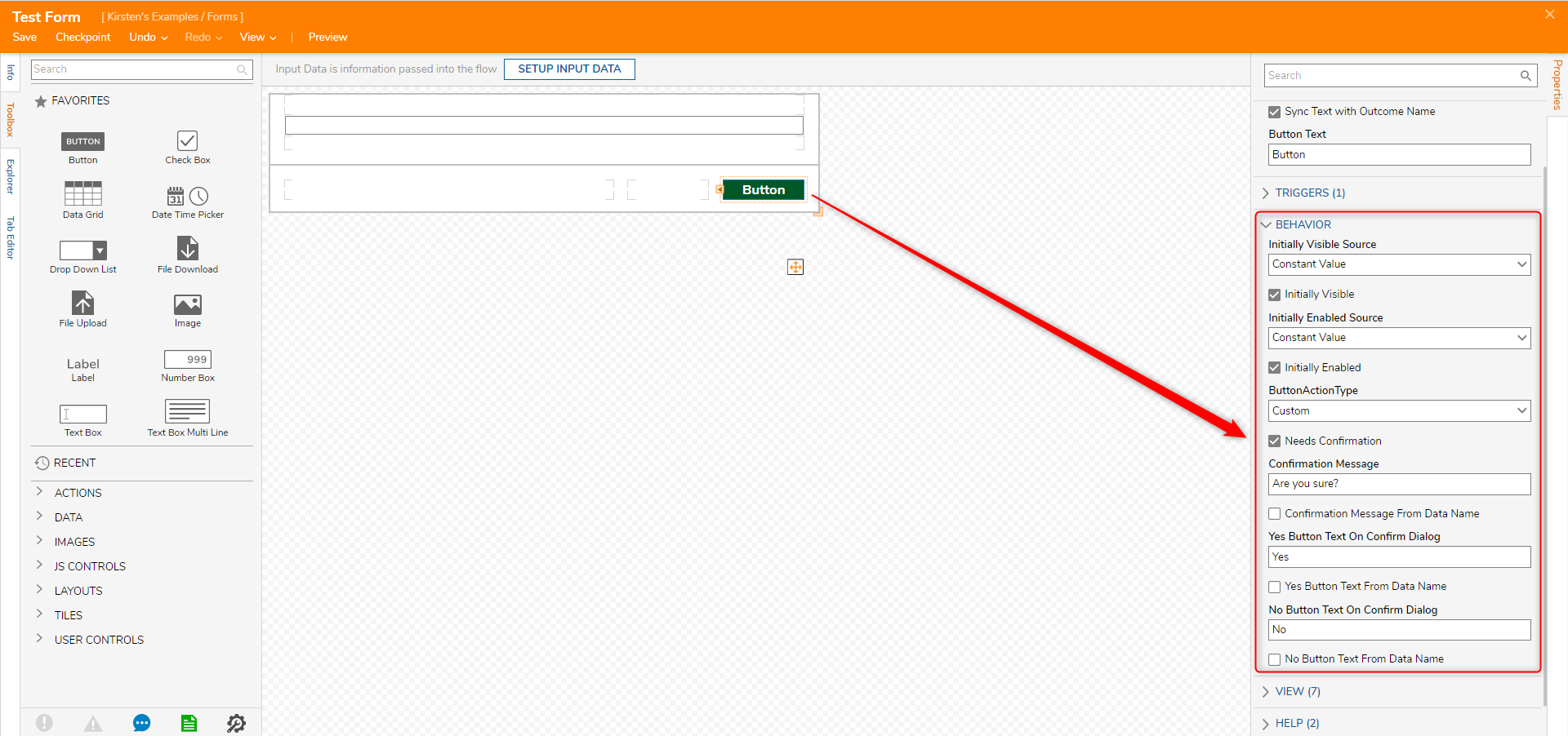
Needs Confirmation: If checked, a popup message with ‘Yes’ and ‘No’ buttons will appear when a user clicks the Button on the Form.
View
In the View section there are the following settings:
| Setting | Purpose |
|---|---|
| CSS Class | Sets a CSS class for the selected Form Control. |
| Use Form Font | Check this setting to use the same font designated for the entire Form. If unchecked, the Font Attribute settings will appear allowing the Designer to define their desired font, font size, and standard typographical emphasis options for the text. |
| Text From Data Name | Check this setting to allow the configuration of a String Variable pulled from the data in a Flow to be used as the text name for this button. |
| Translate Text | Check this setting to allow for text translation. |
| Override Background Color | Check this setting for a Background Color picker to appear in the Properties tab. This color picker allows the Designer to change the background color of the Button. |
Configuring Form Control View and Behavior
- In the Form Designer, navigate to the Toolbox, and add a Button and a Textbox to the Form.
- Select the Button control, navigate to the Properties panel, expand the View section.
- Uncheck Use Font Form and click the pencil icon to edit the text. Set the Button Font Attributes to 20px, bold, and white font color.
- Check Override Background Color, and set the Background Color to green.
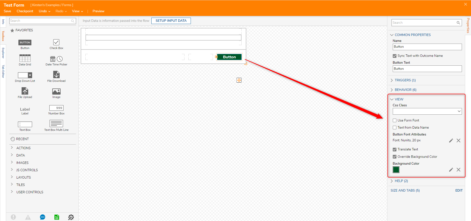
- Expand the Behavior section.
- Select Needs Confirmation. Under Confirmation Message type: "Are you sure?". For the Yes Button Text On Confirmation Dialog type, type: "Yes". For the No Button Text On Confirmation Dialog type, type: "No".
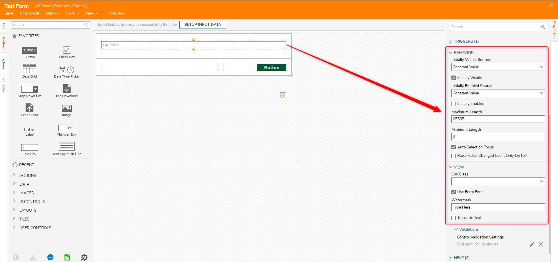
- Select the TextBox Form Control. In the Behavior section, uncheck Initially Enabled. In the View section, type "Type Here" in the Watermark. With this feature, designers create a custom text that will be reflected on the TextBox in the form of a watermark.
Display Behaviors
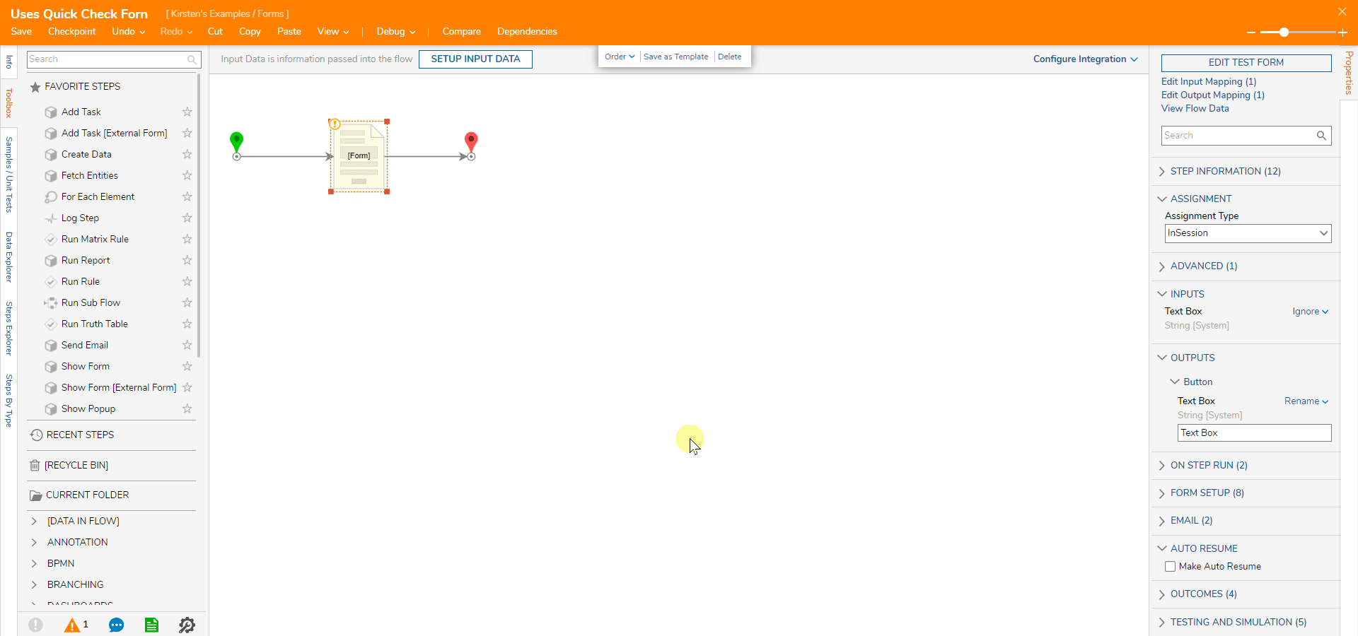
To test Form Control behaviors created in this tutorial, the Form must be added into a Flow.
Debug the Flow to show the Form and its configured behaviors and appearance.
Was this article helpful?