Overview
The Split Panel Layout provides two panels oriented horizontally or vertically by choosing the Horizontal Split Panel or Vertical Split Panel, respectively. Only two Panels are available within the Layout.
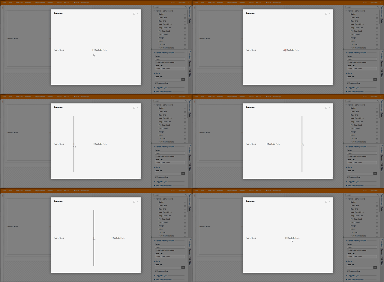
As the name suggests, the Layout presents two divided Panels that Designers may populate with controls to view them side by side. Once the Form runs, the user can move the Divider by clicking and dragging the Divider to get a better view of certain content over others.
This Layout excels when presenting information for comparison. Furthermore, another example may include displaying an order Form beside a list of the items ordered or placing a name value in the first Panel with a more in-depth data value pertaining to the objects in the second panel.
The following document discusses the configurable options and the benefits of using a Split Panel layout in a Form.
Configuration
Split Panel Layouts can be created via the Vertical Split Panel Layout, and Horizontal Split Panel controls found in the Toolbox > Layouts Folder. Once created, the Designer may name the Split Panel as well as configure the Split Container setting panel.
| Setting Name | Default | Description |
|---|---|---|
| Percent of First Panel | 50 | Changes the default sizing ratio of the first panel to the second. Increasing this increases the default size of the first panel and vice versa. |
| Remember Percent | False | Toggles if the control will preserve the adjusted sizing ratio in multiple instances of the Form in its parent Flow |
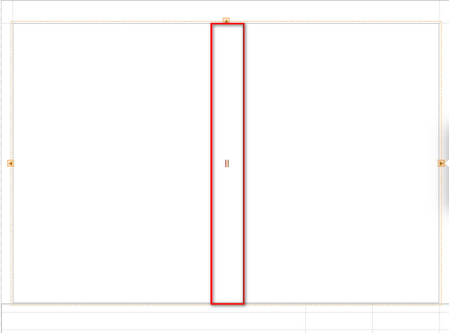
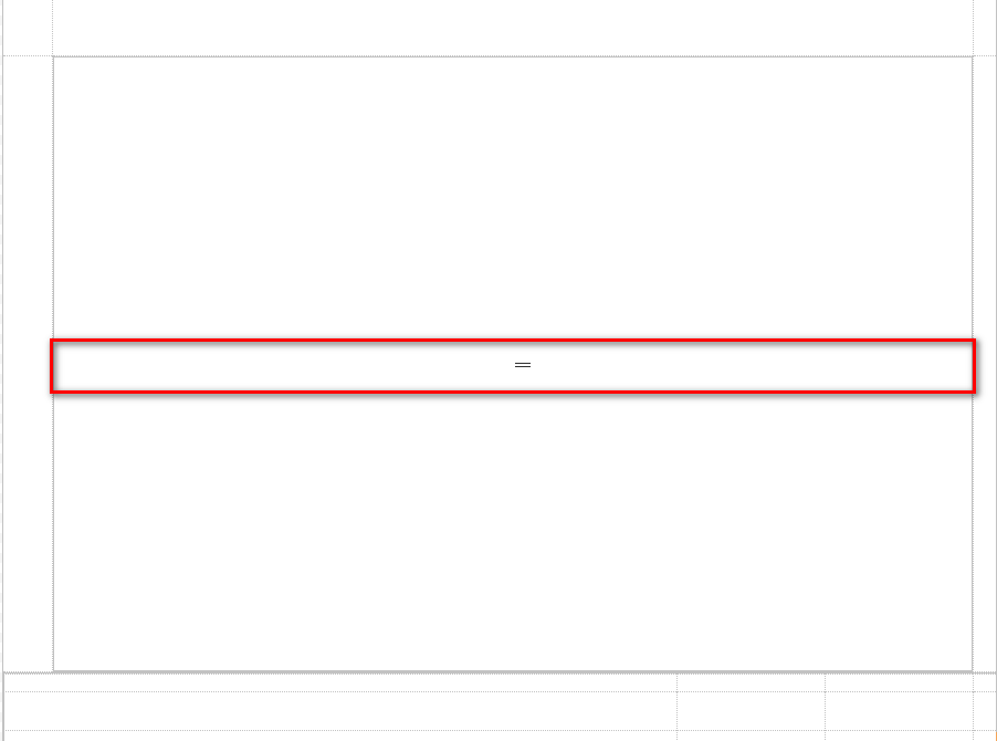
Dragging in either Split Layout component into the Form workspace, by default, will display as follows:
If Horizontal Split Panel Layout is used, the Panels will be split in half vertically with the Divider. Any added control will display horizontally along the same plane.

If Vertical Split Panel Layout is used, the Panels will be split in half horizontally with a Divider. Any added component will display vertically along the same plane.

To aid in the Container's Split Panel function, users have the ability to drag out the Divider between them to expand or decrease either Panel. This feature is helpful when the user needs more space to get a better view of certain content.

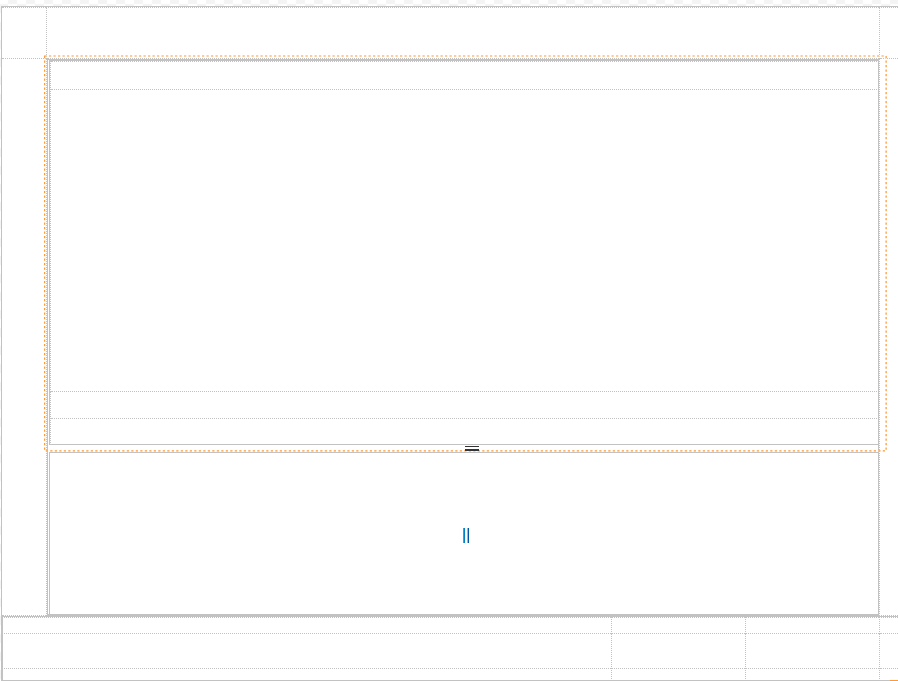
Further customization can be achieved by adding additional Layout components, such as an additional Split Panel Layout, or a Grid Layout, to the Split Panels.
