Overview
The Tabs Containers allow the ability to place controls into navigational Tabs to efficiently display, group, and organize controls.
Clicking a Tab opens its own workspace where controls may be added. A control inserted into the Tab will fit the size of the Tab. It is recommended to add a Layout within the Tab to organize the space to prevent this. By default, the Tabs Layout starts with three Tabs but more can be added to its Properties.
Configuration
Tab Containers may be configured via its Properties > Layout settings panel.
| Setting Name | Default Value | Description |
|---|---|---|
| Tabs | [Tabs A,B,C] | Populates with names of created Tabs. The CLEAR ALL and ADD text deletes all Tabs or add a new tab respectively. |
| Default Tab From Data Name | False | Toggles whether the default tab is chosen based on a data name. Enable this for dynamically changing default tabs |
| Default Tab | [Tab A] | Allows selection of which Tab expands by default upon Form runtime |
| Headers Placement | Top | Allows selection of the Tab Headers orientation between either the Top or Left of the Layout |
Hovering the mouse over a Tab presents icons to execute certain actions. The up and down arrows move the Tab in the Tab order in the respective direction. The X icon deletes the Tab while the pencil icon opens the Edit Tabs window. The Tab may be renamed in this window.
Example
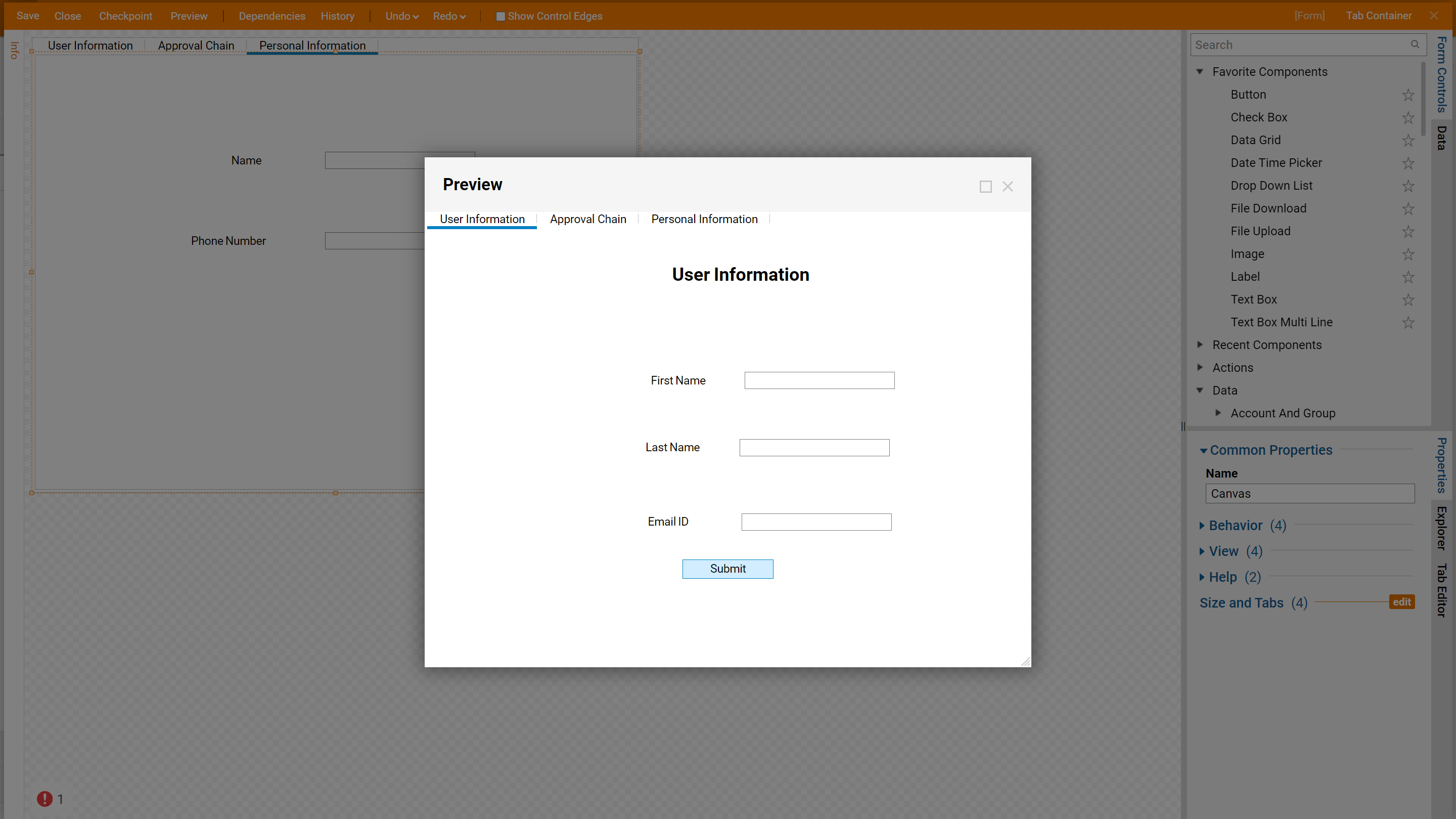
This example Form will accept user information in three sections (e.g. User Information, Approval Chain, Personal Information); each section will have its own tabbed page containing the relevant controls.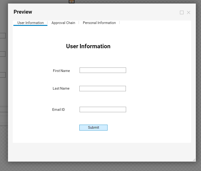
- In the Designer Folder, create a new Form and open it in the Form Designer.
- In the Toolbox, locate the Layout section and drag the Tab Container Layout into the workspace. Alternatively, opening the Explorer tab, selecting Surface, and opening its Properties to change its Container Type to Tabs achieves the same goal without adding a new Layout control.
- Rename the default Tabs to the more descriptive: 'User Information', 'Approval Chain', and 'Personal Information' by hovering over the Tab in the Tabs setting and selecting the pencil icon. Descriptive naming is a best practice.
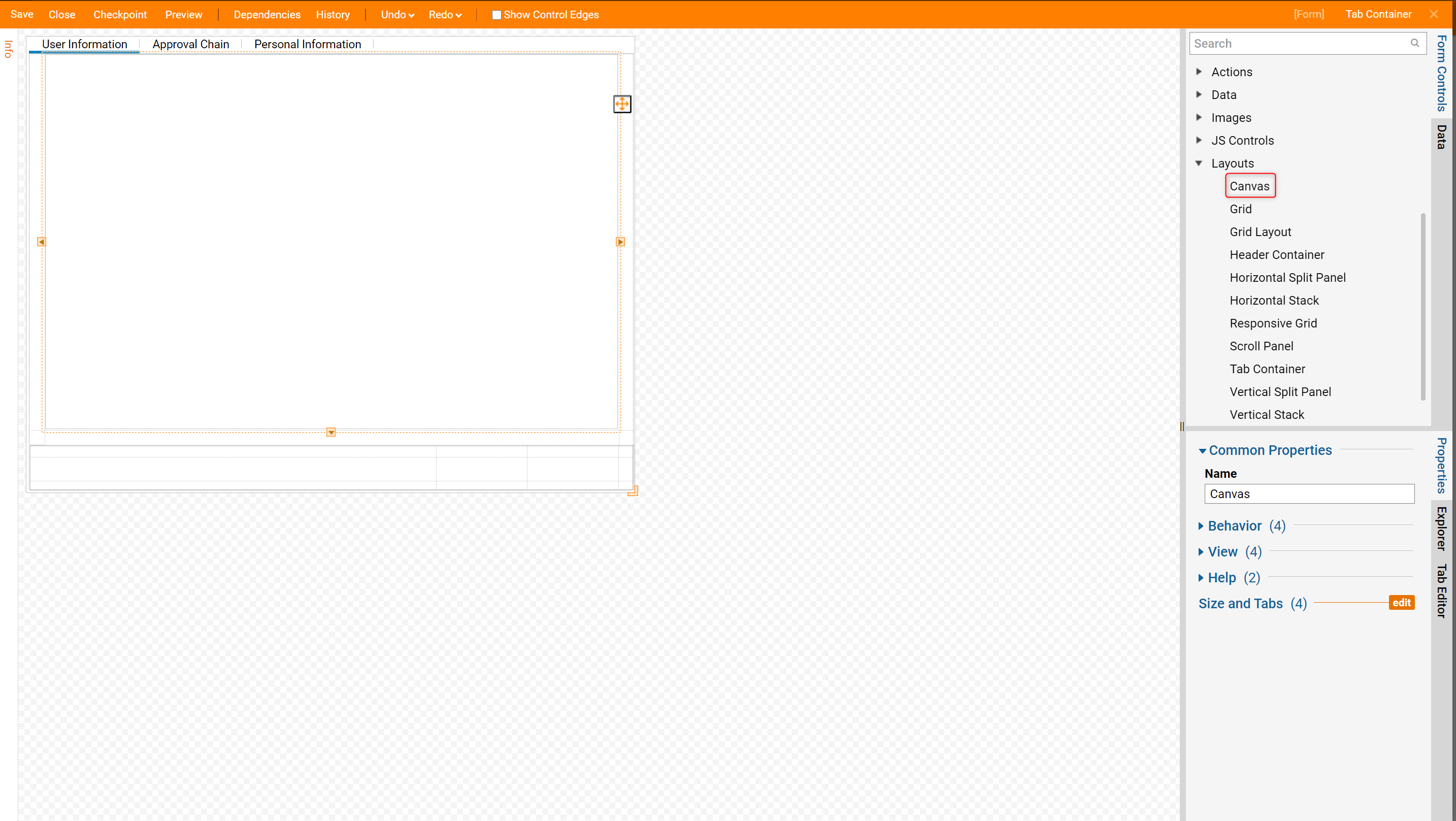
- Select the 'User Information' tab. From the Layouts section, drag a Canvas Layout control to the workspace.
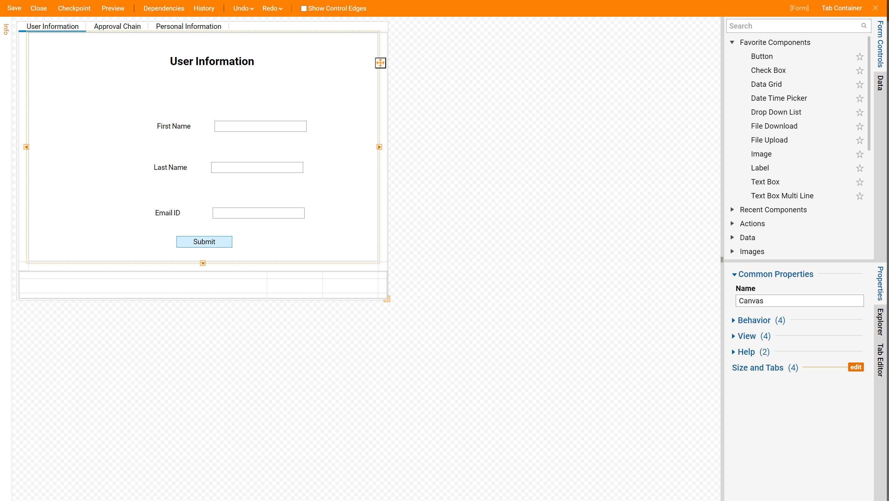
- Drag three Text Box and Label controls into the workspace. Name the controls after the data to gather and place the corresponding Textboxes to the right of the Labels.

- Set an outcome path by including a Button control in the Form. This will resolve the red exclamation errors on the other controls.
- Click on the Approval Chain Tab to edit its contents.
- Drag a Canvas Layout control to the workspace.
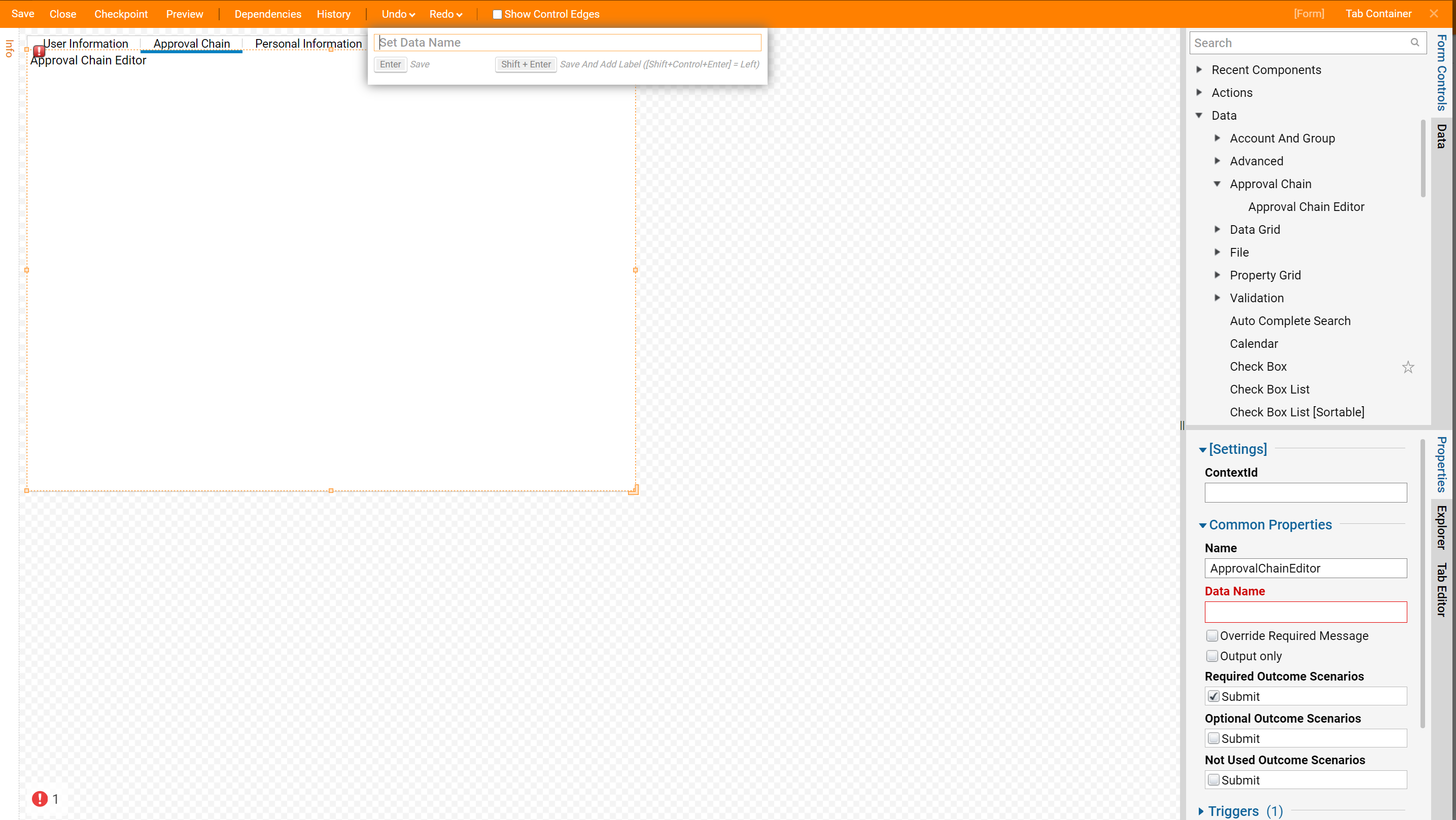
- Under the Approval Chain category, drag the Approval Chain Editor control to the workspace. Name the control.
- Finally, place the controls for the Personal Information tab in the same manner as the User Information Tab as detailed in Steps 4-7.
This completes the Form design, so Save and Preview the Form. Select a tab to navigate to a different section.