Overview
The Theme Editor is a tool featured in Decisions version 6 and above that allows the Designer to edit different elements of the user interface. The changes made in the Theme Editor can be applied right away and does not require writing or changing code on the default LESS files for Decisions. The Designer can select whether they want to edit the User Portal, Designer Studio, or Mobile theme. After the theme is selected, the Theme Editor will display several different UI elements that can be changed.
Example
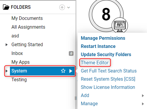
In the Designer Studio, right-click on the ‘System’ folder to bring up the Action Menu, or click the arrow on the right side of the ‘System’ folder name. Once the Action Menu appears, there will be an option to select the Theme Editor from the menu.
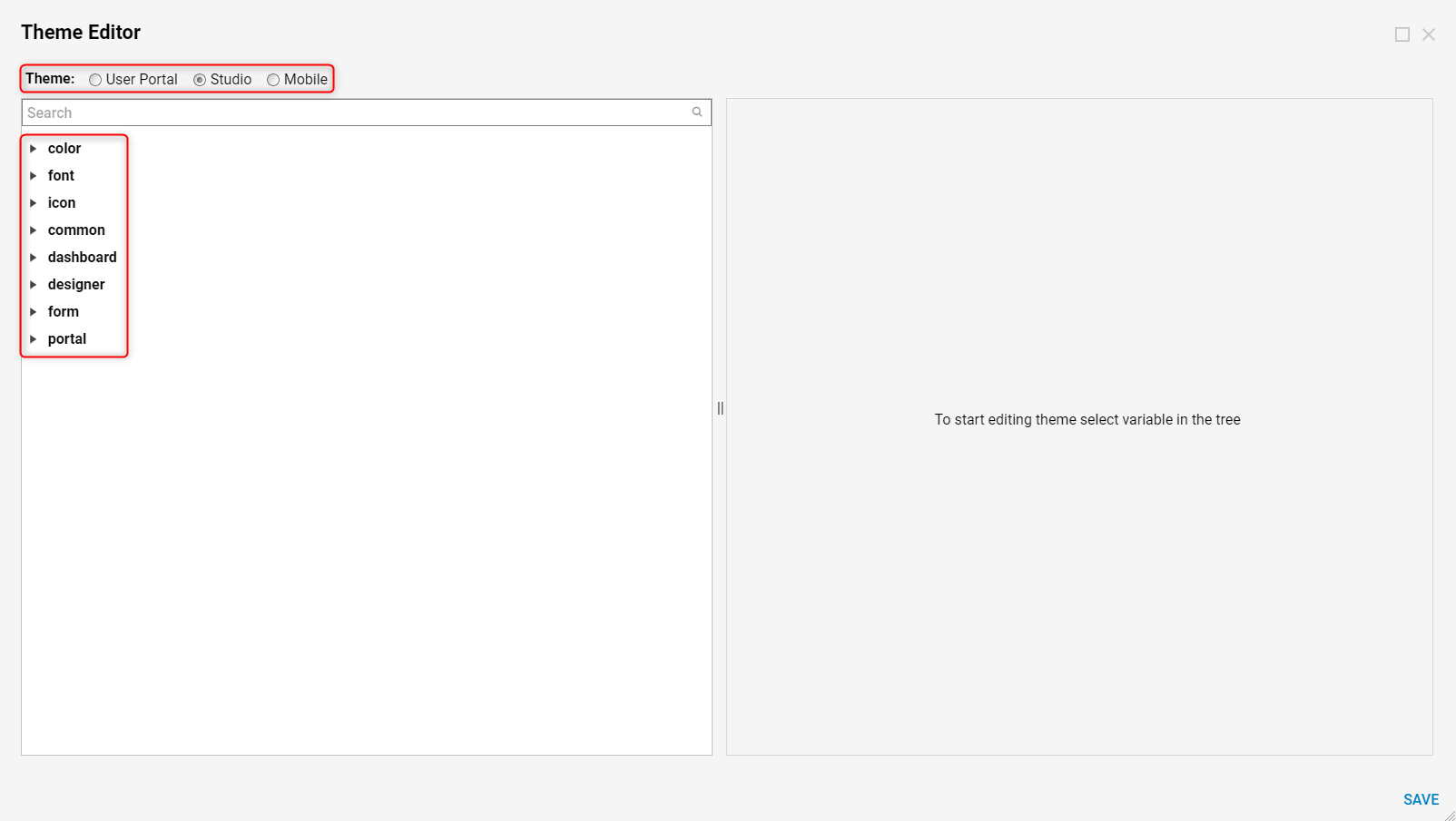
The Designer is now presented with the Theme Editor window. The first section, labeled Theme, allows the Designer to choose which theme to edit of the three available. The panel on the left side shows the different UI elements that are available for modification based on the Theme selected. These elements can be expanded to show a wider range of parameters by clicking the expansion arrow to the left of the element name.
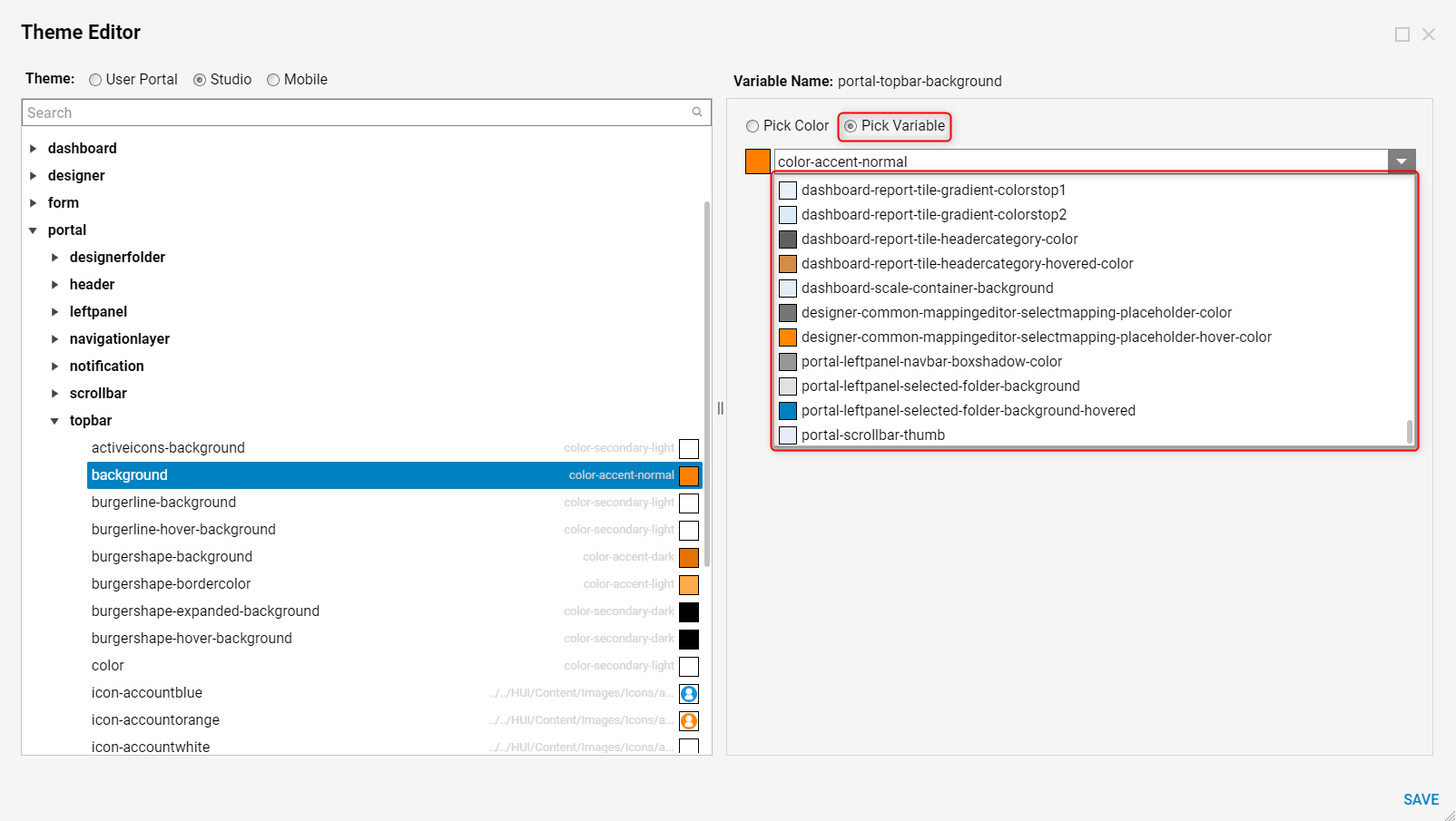
For the purpose of this example, we are going to select the ‘Studio’ Theme and expand the Portal element. Once this element is expanded, the Designer will find multiple different parameters that are used to filter down the precise element that is going to be edited. In this case, we are going to expand Topbar and click on Background.
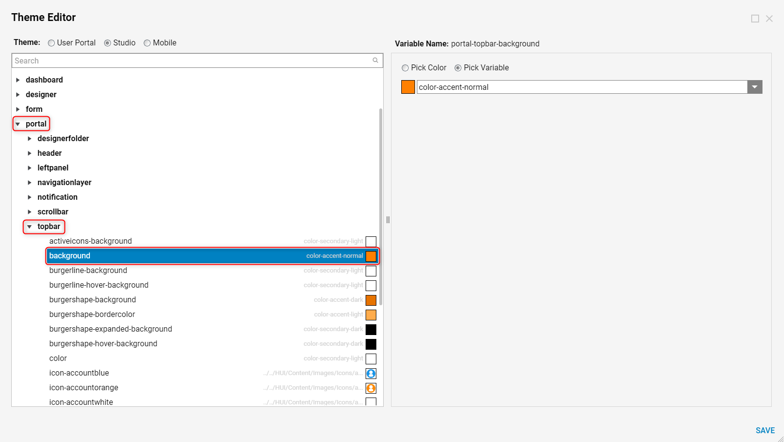
In the panel to the right, we now see a Variable Name label that indicates we have selected the Portal Topbar Background to change. The Designer is presented with two options for the color source of this element; Pick Color or Pick Variable.
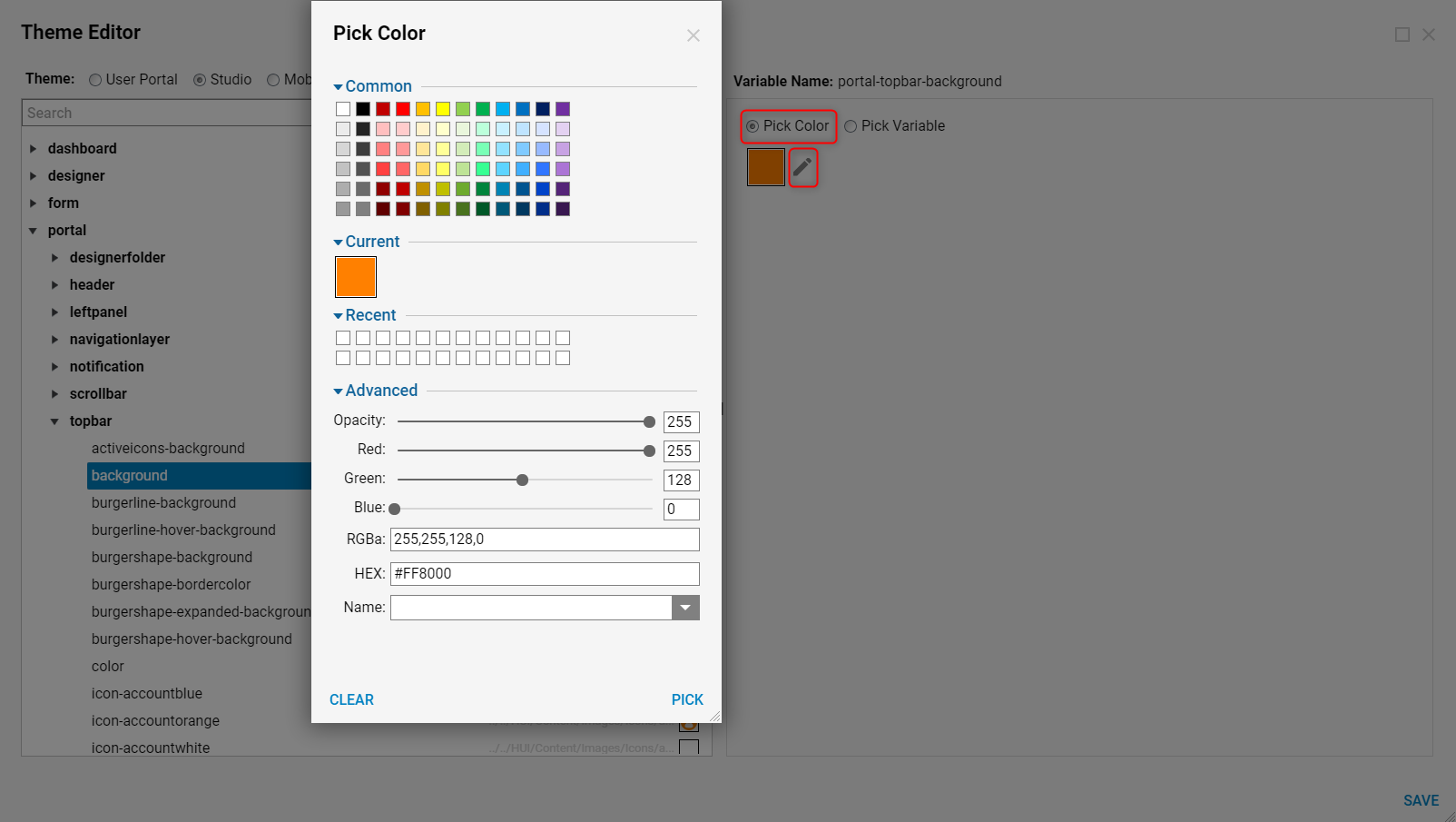
The ‘Pick Color’ option will allow the Designer to access detailed color configurations by clicking on the pencil icon. There are four different sections in the Pick Color window:
- Common: This section will present the Designer with common colors to select from for use as the Portal Topbar Background.
- Current: This section will show which color is currently selected as the Portal Topbar Background.
- Recent: This section will show any recent colors used for the Portal Topbar Background.
- Advanced: This section will allow the Designer to change the color opacity, as well as manually adjust the Red/Green/Blue alpha. In addition, the Designer can enter the HEX code of their preferred color, or browse the name of the colors available for use.
The ‘Pick Variable’ option will allow the Designer to access all of the colors that are currently being used on existing elements in the UI. If a Designer has changed a different UI element to a very particular color and they want to use the same color again, this option would allow them to select the color based on the element it was used on, as opposed to manually configuring the color over and over.
Once the Designer has made all of the necessary changes to the element they are editing, it is now time to save the changes. The change can be initiated by clicking the ‘Save’ button in the bottom right corner of the Theme Editor window. Notice that the Save Theme window has now appeared.
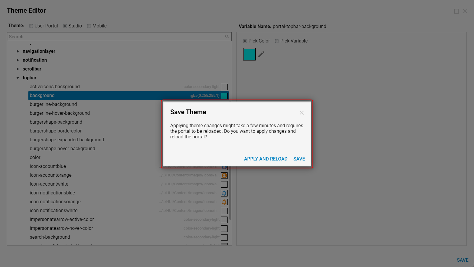
This window is informing the Designer that the changes can be applied right now, but it will take a few minutes since the portal will need to reload. Alternatively, if the Designer is not finished with all of their edits, they can simply save the changes made in this session to be applied at a later time. If the changes are applied now, after a quick UI reload, the Designer can see the effects right away.
