Overview
| Feature Details | |
| Introduced in Version | 9.18 |
| Modified in Version | --- |
| Location | [Project] > Manage > Configuration > Templates > CSS |
Theme Manager provides a simplified way to define consistent styling for applications, without needing to write or edit CSS directly.
Themes apply to colors, limited typography, backgrounds, and component styles for elements placed on the Form or Page surface to maintain a cohesive visual identity throughout the project.
The validation border will not display around certain Form controls when a Theme is applied. Users will still experience the validation message on the outcome button, as well as see the validation pop-up when hovering over the control. The functionality that prevents Users from closing the Form with a validation is not affected.
Configuration
Accessing Theme Manager
- Navigate to [Project] > Manage > Configuration > Templates > CSS.
- Select Create Theme to start a new theme.
- Enter a unique name for your theme.
- Update each section with the preferred styles using the available property editors.
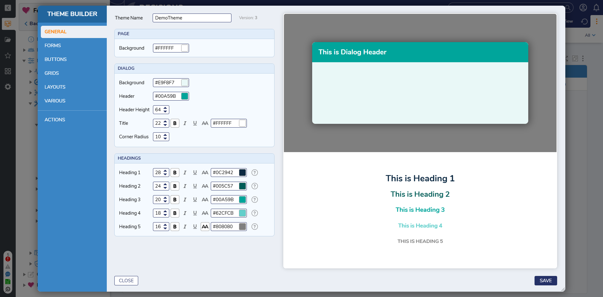
- Available Theme Manager Settings
Property Description Page Background Sets background color of the page area. Dialog Background Background color for dialog body content. Dialog Header Header bar color of dialog windows. Dialog Header Height Pixel Height of the Form Dialog Headers. Dialog Title Font size, weight, and color for dialog titles. Dialog Corner Radius Roundness of dialog corners. Headings (H1–H5) Configures font size, color, and weight for each heading level. *Requires a CSS Class to be applied on the Form Control to apply the theme styling appropriately. Form Background Base background color for forms. Form Label Text style for labels. Link Style Font color and emphasis for hyperlinks. Controls - Default State Define border color and width, background color and corner radius for inputs. Controls - Hover Border and background color when hovering over an input. Controls - Focus Active border color for focused input fields. Box-Like Controls Define border color and width, background color and corner radius for list inputs. Primary Button Main button color scheme for key actions. Secondary Button Alternate button style for secondary actions.
*Requires a CSS Class to be applied on the button to apply the theme styling appropriately.Report Title Defines text color, size, and background for report titles. Grid Background Background color for report header row. Grid Border Border color around the report. Group Background Background color for Grouped rows. Grid Header Defines text color, size, and background for report header rows. Grid Rows Sets text and hover background for grid rows. Tab Container Font and color settings for tab headers. Content Color settings for the content area of tab containers. Header Container Styles for the header and content area of header containers. Panel Base panel background, border, and corner radius. Chart Defines chart title font, background, and border color.
*No Preview AvailableToggle States Colors and sizing for toggle switch ON, OFF, and NULL states. Activity Panel Panel background, border, and rounding for Folder Activity Panels.
*No Preview Available - When completing the Theme configuration the following actions are available to use and apply the theme.
- Publish
- Set Theme as default styles for this project: Apply this theme as the default styling for the project. Doing so replaces any previously set default CSS or theme and applies the new design to all UI elements within the project.
- Save: Save and apply changes.
- Close: Does not save any changes made, closes Theme Builder.
- Export
- Download LESS file: Exports the theme as a .less file. Modify and re-upload it to the CSS folder for further customization.
- Export Theme: Export the theme as a .decobj to be imported into another Decisions environment.
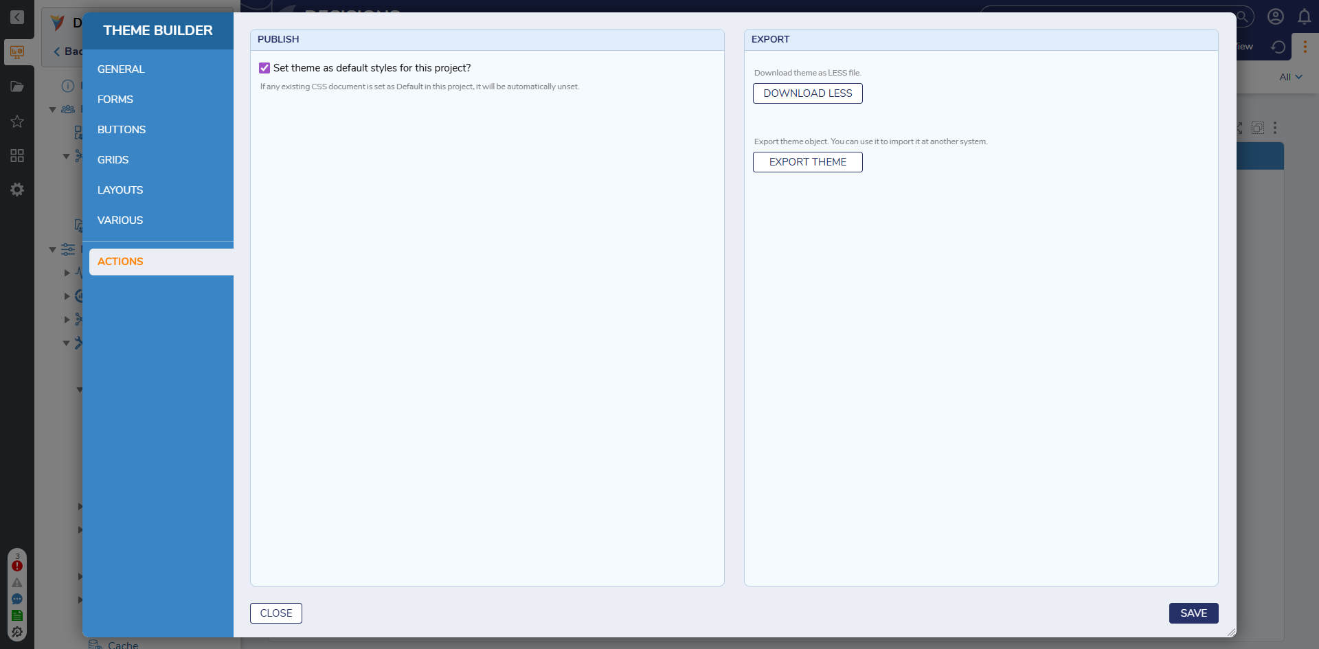
- Publish
Use within Dependent Projects
Themes can be used within dependent projects, but they cannot be set as a dependent project's default theme.
To override the default theme:
- Open the desired Form or Page in the Designer.
- In the Properties panel under Appearance, locate the Theme dropdown. If a default theme is already applied, the Form or Page will display the correct styling, but the Theme dropdown will not show a selected value until manually changed.
- Select a different theme to override the inherited default.
Feature Changes
| Description | Version | Release Date | Developer Task |
|---|---|---|---|
| Theme Manager added to Projects | 9.18 | December 2025 | [DT-044727] |