Overview
The Video Form Control is used to display a video on a Form, along with the following options at runtime if the Show Controls option is enabled: Play/Pause, playback seeking via the video being played, Volume/Mute, Fullscreen, Download, Playback speed, and Picture-in-Picture. By default, the video will automatically play on mute; there is no setting available to control the initial volume of the video. Once the video is started at run-time, it will continue to loop unless manually paused.
Examples
File Data
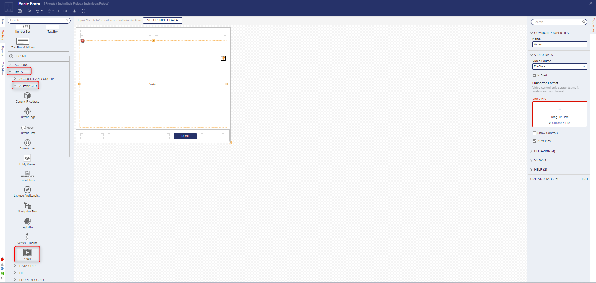
- Create a Form or edit an existing Form.
In the Form Designer, navigate to the DATA > ADVANCED category in the Toolbox panel. Click and drag the Video control to the Form. Set the VideoSource to FileData and upload a video file under Video File. Click Save and close the Form Designer.
URL Configuration
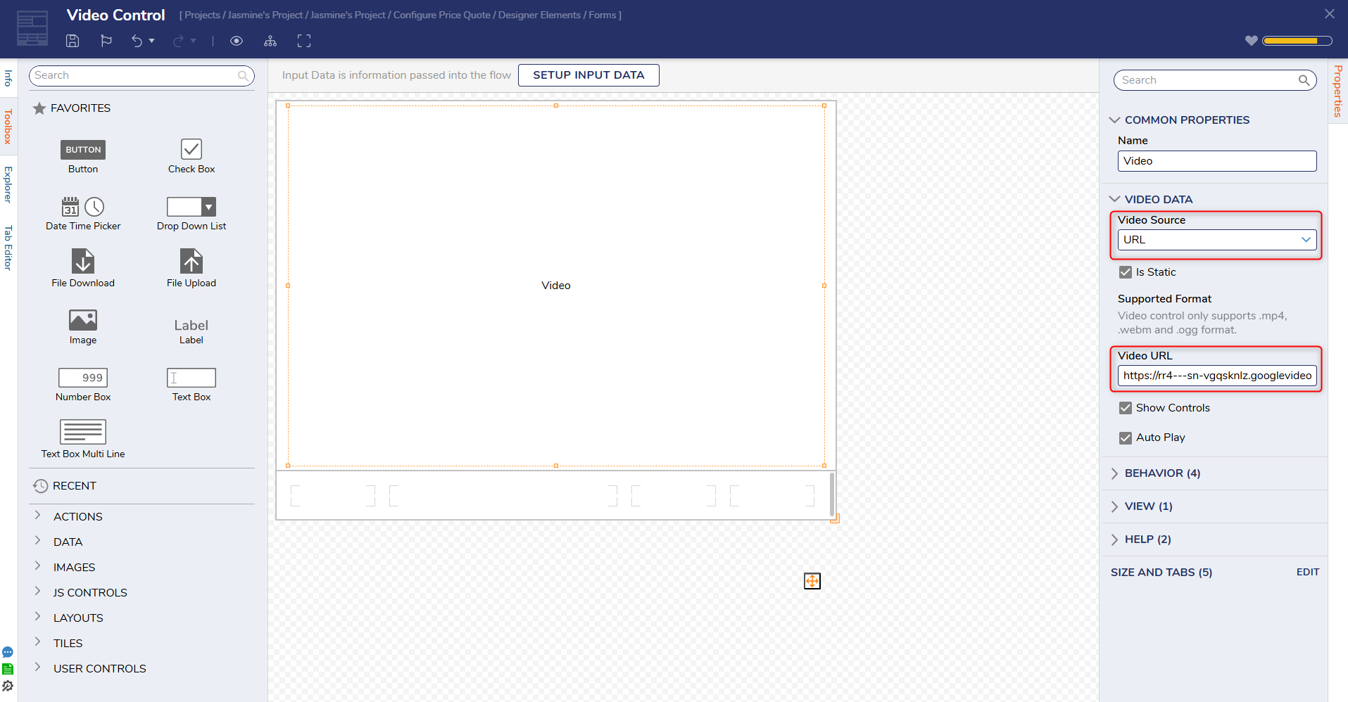
- Create a Form or open an existing Form.
- Instead of selecting File Data from the Dropdown menu. Select URL.
- Users should note that the Video Control only supports .MP4, .webm, and .ogg format.
- Users also can toggle the following features on or off:
- Show Controls
- Auto Play
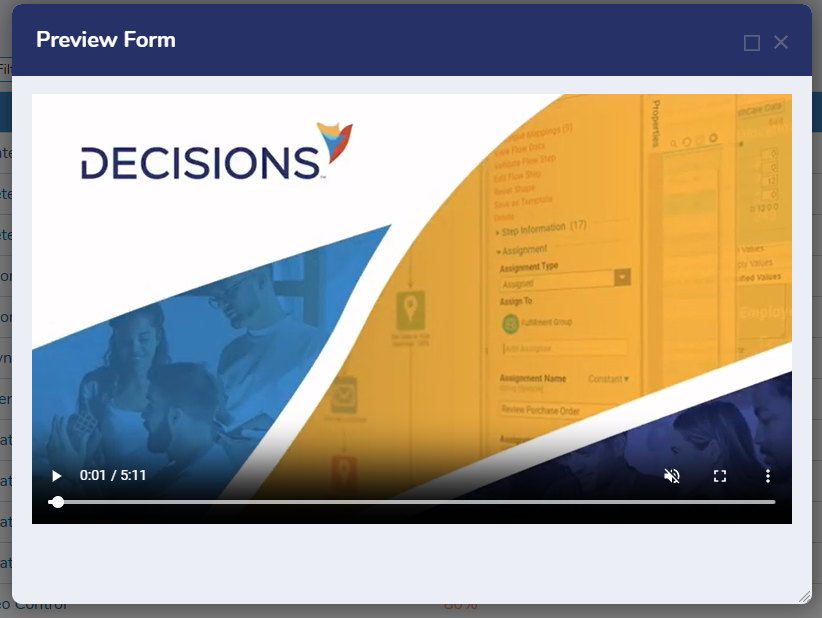
3. Once the Video Control has been configured, click preview to see it in action.
Settings
| Setting Name | Description | |
|---|---|---|
| COMMON PROPERTIES | ||
| Name | Sets the name for the control | |
| VIDEO DATA | ||
| Video Source | Defines the URL or FileData of the video source. | |
| Is Static | Sets whether the video source is a static value or data name. | |
| Supported Format | Defines that the only video sources that are supported are .mp4, .webm, and .ogg format. | |
| Video File/Video URL | Sets the URL or video file. | |
| Show Controls | When enabled, displays video controls when the Form is displayed for the video (Play/Pause, playback seeking via the video played, Volume/Mute, Fullscreen, Download, Playback speed, Picture in picture). | |
| Auto Play | When disabled, the video will not play when the Form is displayed and will require the user to press the Play icon. | |
| BEHAVIOR | ||
| Initially VIsible Source | Sets the initial value source for the control to be a constant value or boolean (From Flow Data option). | |
| Initially Visible | Sets the control to be visible when the Form is displayed. | |
| Initially Enable Source | Sets the initial value source for the control to be a constant value or boolean (From Flow Data option). | |
| Initially Enabled | Sets the control to be enabled when the Form is displayed. | |
| VIEW | ||
| CSS Class | Allows the selection of a CSS class to be applied to the control. | |
| HELP | ||
| Help Message Key | Defines a Tooltip message for the control. | |
| Pick Help Message Key | Displays a list of Help Messages to select for the control. | |
| SIZE AND TABS | Provides options to change the dimensions of the control and tab index. | |