Color Picker
- 03 Oct 2022
- 1 Minute to read
- Print
- DarkLight
Color Picker
- Updated on 03 Oct 2022
- 1 Minute to read
- Print
- DarkLight
Article summary
Did you find this summary helpful?
Thank you for your feedback!
Overview
The Color Picker is a Form Control that allows users to select a color and output its hex code equivalent. Users can also pass in the hex code as a string input. The Color Picker will display that color when the form is run. This Form control can be beneficial for designing colors for a process or using Decisions to write CSS classes with certain color configurations.
Example
- Add a Form to a Flow. To learn how to do this, please navigate to the Create a Form article.
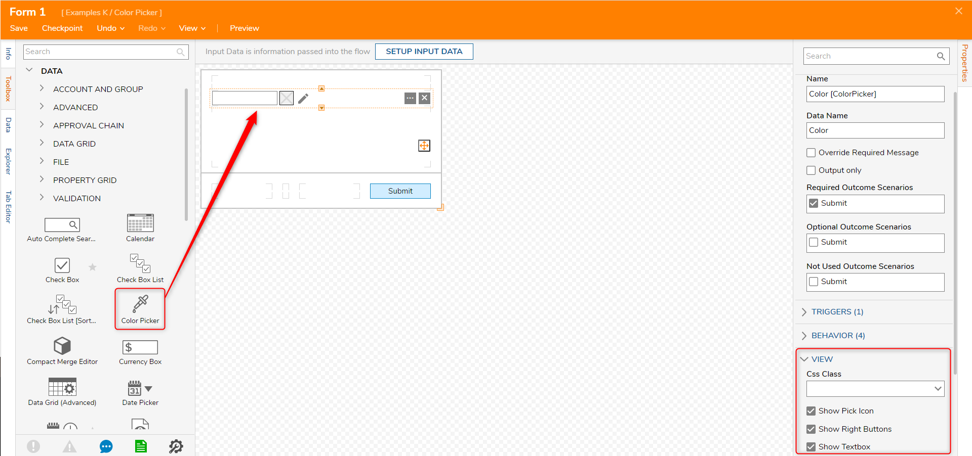
- In the Form Designer, in the Toolbox panel, expand Data, drag, and drop the Color Picker control onto the Form.
- This component has settings that can change the way the Color Picker looks.
- Those settings control the following:
Color Picker Settings Show Pick Icon Removes the pencil icon from the Color Picker Show Right Buttons Removes the 'ellipses' and 'x' from the Color Picker Show Textbox Removes the textbox interface from the Color Picker 
Debug
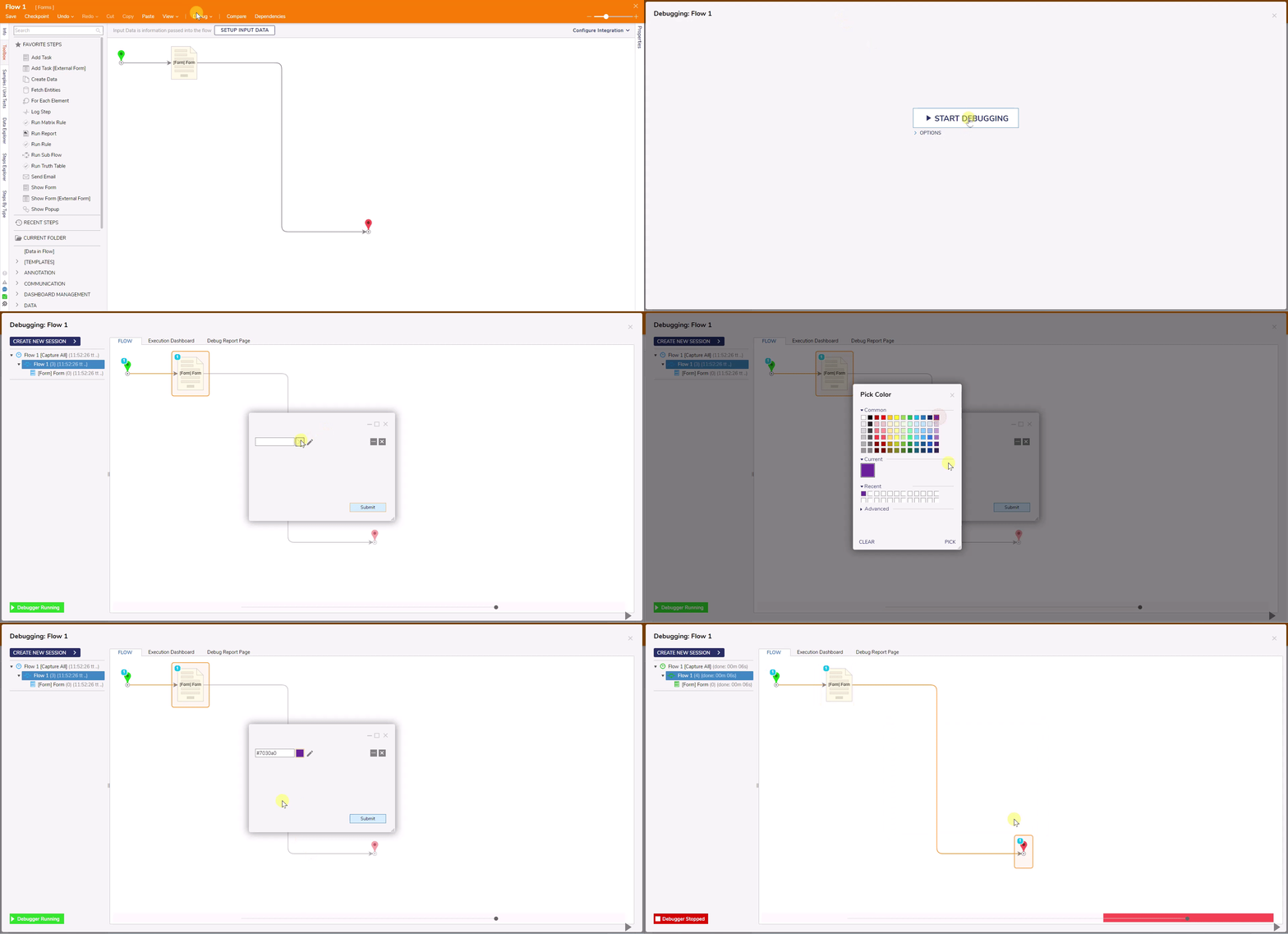
- In the Flow Designer, select Debug in the top action panel. Select START DEBUGGING.
- The Form displays the Color Picker, pick a color and select Submit. The hex code of the color selection will be available to use throughout the Flow.

Was this article helpful?


