Overview
Buttons in Simple Forms are highly flexible. While the normal Form Designer separates Buttons into different controls based on their function, the Simple Forms Button contains all the functionalities of a Button into one, easy-to-configure control. Through a combination of Display and Behavior Type configurations, users may customize a Button to suit a wide variety of needs.
Configuring Control Type
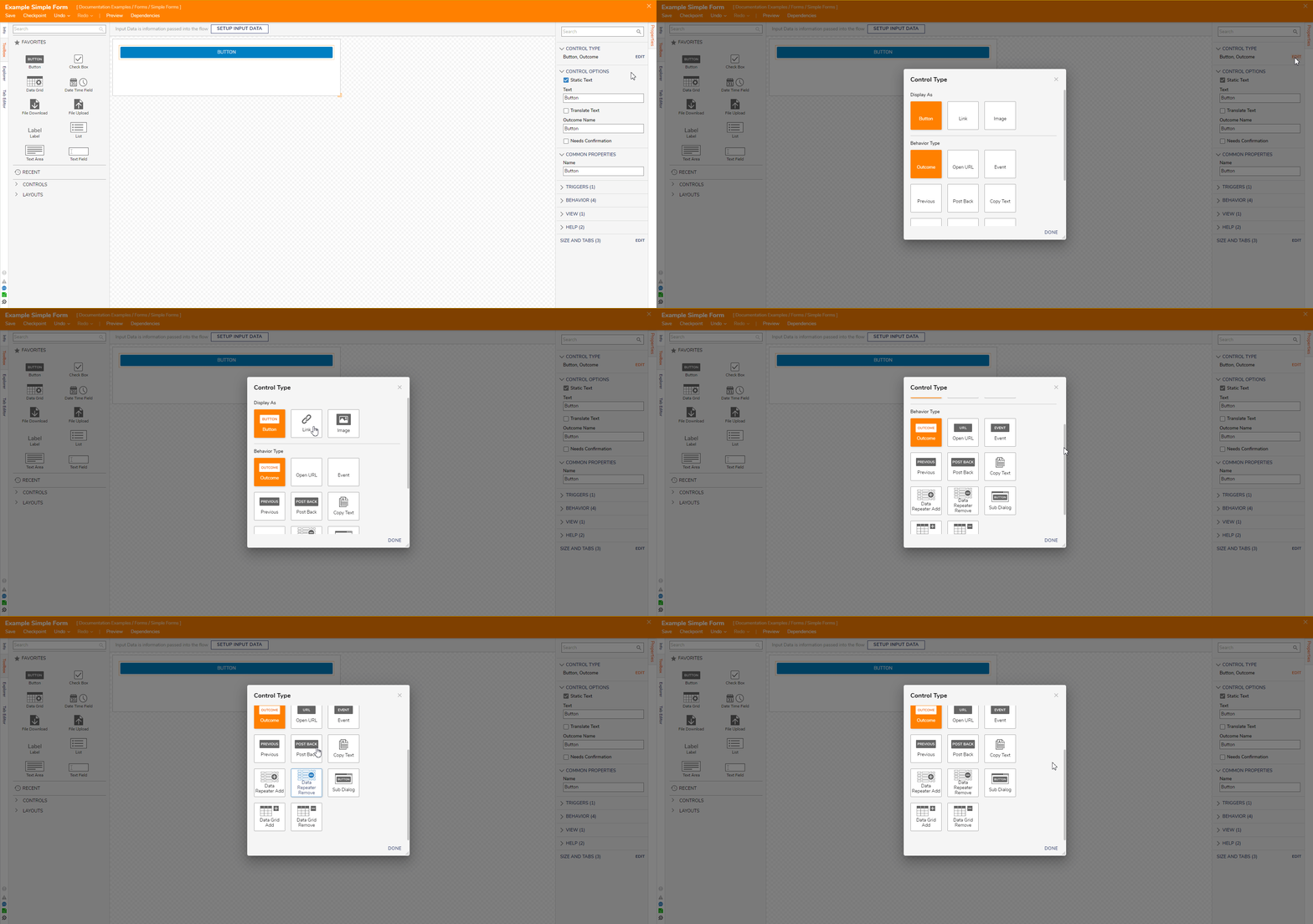
Editing the Control Type allows users to change the appearance and function of a Simple Form Button. Control Type settings are located under the Button's Properties and can be edited by selecting the EDIT button.
The Control Type window comprises of two settings: Display As which determines the appearance and Behavior Type which determines the Button's function. Only one option for each setting can be chosen at a time.
| Setting | Available Options |
|---|---|
| Display As | Button: Changes appearance to a typical Button |
| Link: Changes appearance to mimic hyperlinked text | |
| Image: Changes appearance to a user-specified image chosen from the Decision Image Library | |
| Behavior Type | Open URL: Opens the specified URL link once clicking the control |
| Event: Triggers an event once clicking the control | |
| Previous: Reverses Flow to previous steps; stops reversing when a Form with an Outcome Behavior Type Button is selected; when used in combination it can create a loop | |
| Post Back: Resets all entries in the Form | |
| Copy Text: Copies the text string value of the specified Textbox | |
| Data Repeater Add/Remove: Respectively adds or removes a row to its attached Data Repeater | |
| Sub Dialog: Runs a sub dialog Flow that can house a Form to pops up in front of the current Form | |
| Data Grid Add/Remove: Respectively adds or removes a row to its attached Data Grid |
Examples
Image Data Repeater Buttons
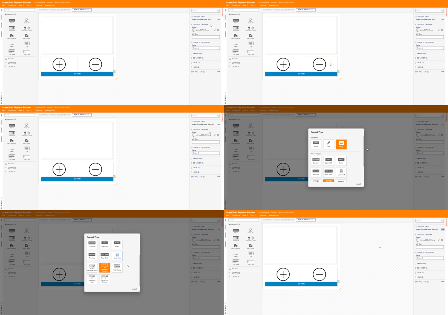
The following Simple Form contains buttons for the Data Repeater Add and Data Repeater Remove behaviors. Under the LOOK AND FEEL category of the buttons, the Display As field is set to image, and the Image field has a .png file as the source. These interactive image buttons will respectively add or remove a data row when clicked.
Below is how the Simple Form appears to the end-user in the Debugger.
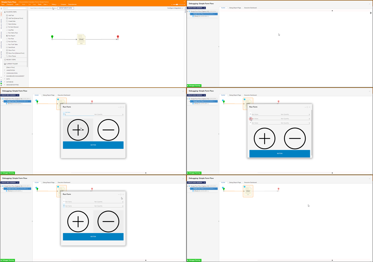
Image Navigation and Link Reset Buttons
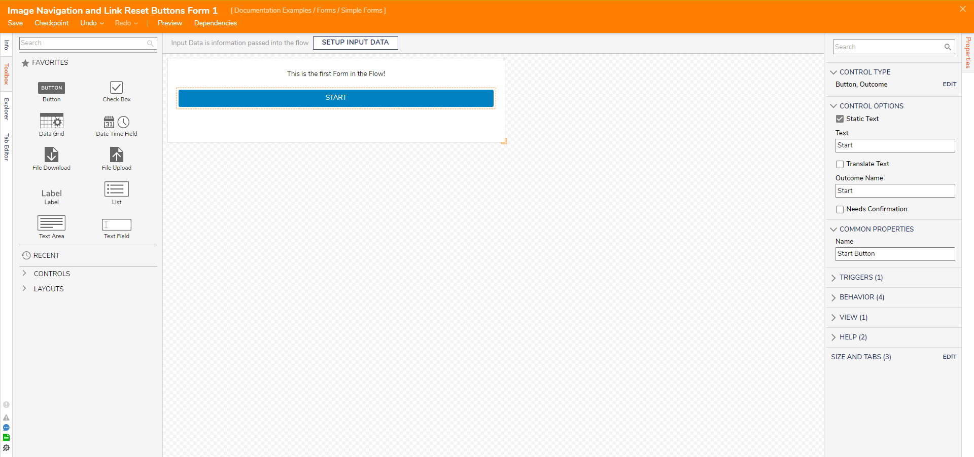
This example uses two Simple Forms. The first contains just a Label and an Outcome Button to demonstrate the Previous Button Behavior in the second Simple Form.
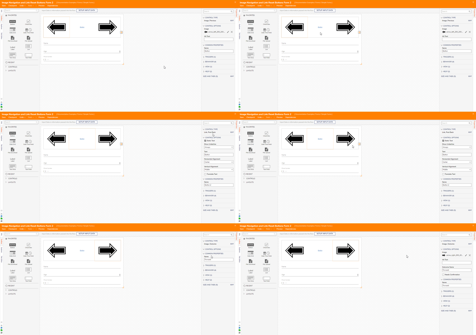
The second Simple Form includes three Buttons: two Buttons set to the Previous and Outcome Behaviors and displayed as an Image, and one Button set to the Post Back behavior and displayed as a Link.
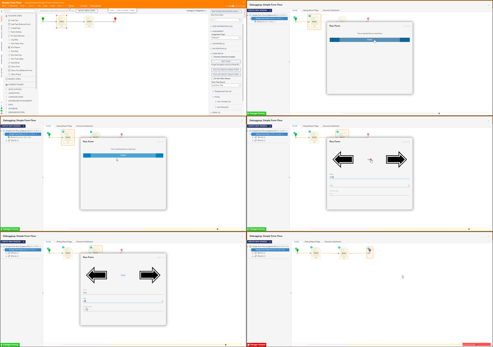
Below is how these Simple Forms are shown to the end-user via the Debugger.
Copy Text Button
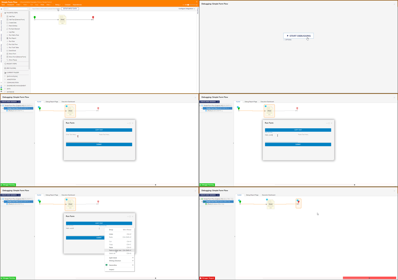
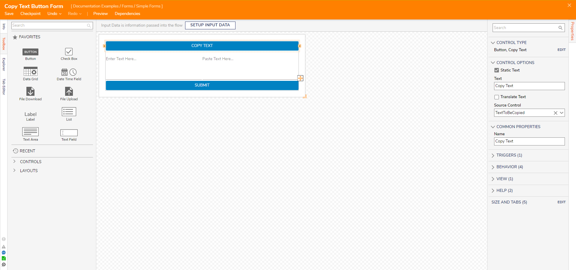
This Simple Form contains two buttons for the Copy Text and Outcome Behaviors and two Text Area controls. After entering text into the first Text Area, selecting the Copy Text Button will copy the text to the clipboard. Notice the Source Control setting for the Copy Text Button for it specifies which control's text to copy.
Below is how the Simple Form will display and behave via the Debugger.
