Form Organization
- 03 Aug 2023
- 2 Minutes to read
- Print
- DarkLight
Form Organization
- Updated on 03 Aug 2023
- 2 Minutes to read
- Print
- DarkLight
Article Summary
Share feedback
Thanks for sharing your feedback!
Overview
In conjunction with Grids, several Form Layout components and Rules may manipulate a Form to suit both aesthetic and functional purposes. This article intends to cover several best practices when organizing a Form with these components.
Components such as Horizontal and Vertical Stacks, Header Containers, Tab Containers, and Split Panels intuitively compartmentalize space into designated sections for a smoother end-user experience. Furthermore, Visibility Rules dynamically manipulate a Form by hiding/showing Form components based on the end user's inputs. Visibility Rules are often triggered by, but are not limited to, Boolean Data Types from components like Checkboxes, Toggle Buttons, etc.
Forms prompting multiple large groups of data from the end-user, such as an Invoice Form prompting data fields such as Personal Information, Shipping Information, Item Order Information, etc., best benefit from these components for they maintain interactional clarity for both Designer(s) as they edit the Form and end-users as they complete it.
Prerequisite:
Reclaiming Space With Collapsible Components
Several Form components allow Designers to arrange information within collapsible fields. Depending on the desired orientation of the reclaimed space (horizontally or vertically), several combinations of these components may achieve this goal.
Vertical Stacks and Header Containers
Vertical and Horizontal Stacks possess the Children Size Mode setting that arranges children components to the following options:
| Option Name | Description |
|---|---|
| Scroll | Components are navigable via a horizontal/vertical scrollbar matching the orientation of the Stack |
| ExpandChildrenThenScroll | Components fit the dimensions of the Stack and can be navigated by a scrollbar matching the orientation of the Stack |
| FitChildren | Components fit the size of the Stack |
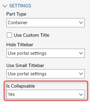
Header Containers may be collapsible by configuring the Is Collapsible option to Yes under the SETTINGS category.
For this example, the use of Header Containers within a parent Vertical Stack grants the end-user to open and close labeled sections of data all within one column. The gif below demonstrates a parent Header Container and a parent Vertical Stack for the vertical organization.
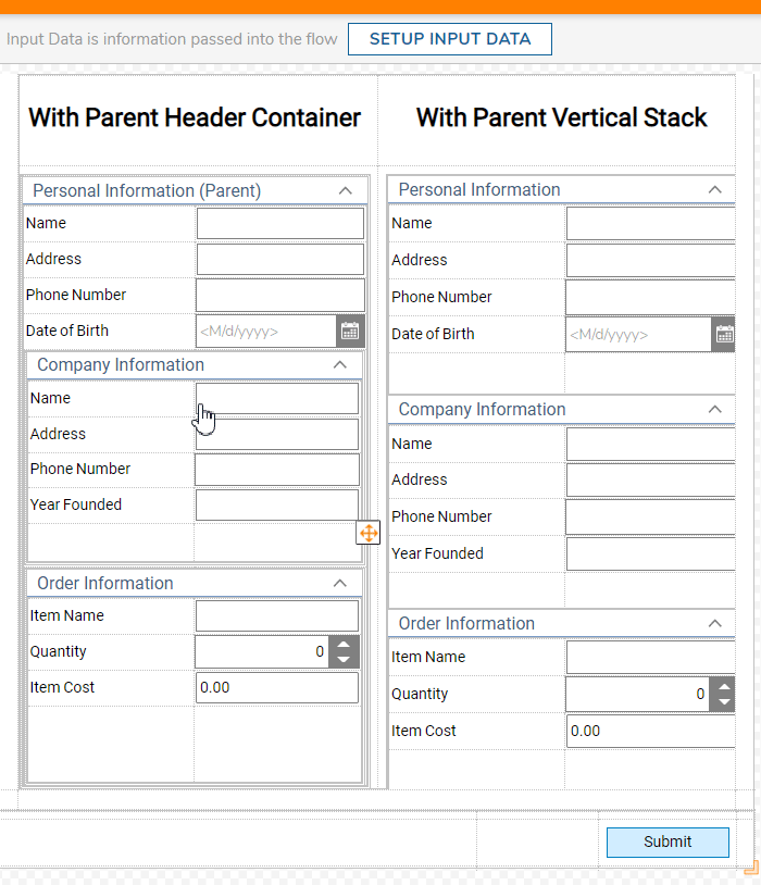
Under the "With Parent Header Container" column, the parent Header Container on the top contains a Grid with Label and Textboxes prompting inputs from the end-user along with another Grid at the bottom containing the child Header Containers. With this setup, collapsing the parent Header Container closes all children Header Containers underneath it.
This is achieved by creating a Header Container and dragging other Header Containers into it thus becoming child components.
For the "With Parent Vertical Stack" column, the Header Containers are placed within a Vertical Stack with its children Size Mode set to FitChildren. When closing a Header Container, the other children Header Containers dynamically resize due to their placement within the Vertical Stack.
This is achieved by creating a Vertical Stack first and then filling the Stack with the Header Containers thus they are the child components.
Need a Downloadable Example?
The following Example Lab covers the use of Vertical Stacks. While Example Lab projects are resources for public use, articles and assets are not actively maintained. Screenshots and features are from the specified version. These references may become dated as new versions are released.
Space Reclaiming Form Using a Vertical Stack
Space Reclaiming Form Using a Vertical Stack
Visibility Active Form Flows
Visibility Active Form Flows in a Form may hide/show Form control(s) based on a designated input, typically a Boolean. Users can apply the hide/show function to the parent component instead of specifying each component.
For further information on Forms, visit the Decisions Forum.
Was this article helpful?