Page Control Glossary
- 19 Jul 2022
- 7 Minutes to read
- Print
- DarkLight
Page Control Glossary
- Updated on 19 Jul 2022
- 7 Minutes to read
- Print
- DarkLight
Article summary
Did you find this summary helpful?
Thank you for your feedback
Overview
The Toolbox tab in the Page Designer provides a host of options for designing and configuring Pages for their environment, as desired.
Through use of Page controls, users are able to facilitate such needs as dynamic data display, brand identity, navigation, and more. The following document serves the purpose of describing each control and category provided to users through the Toolbox tab as well as their location within the Folder Tree.
Favorites
The FAVORITES by default contains eight of the most commonly used Page controls.
If desired this section can be expanded by hovering over any Page Component and clicking the gray star to Add to Favorites.
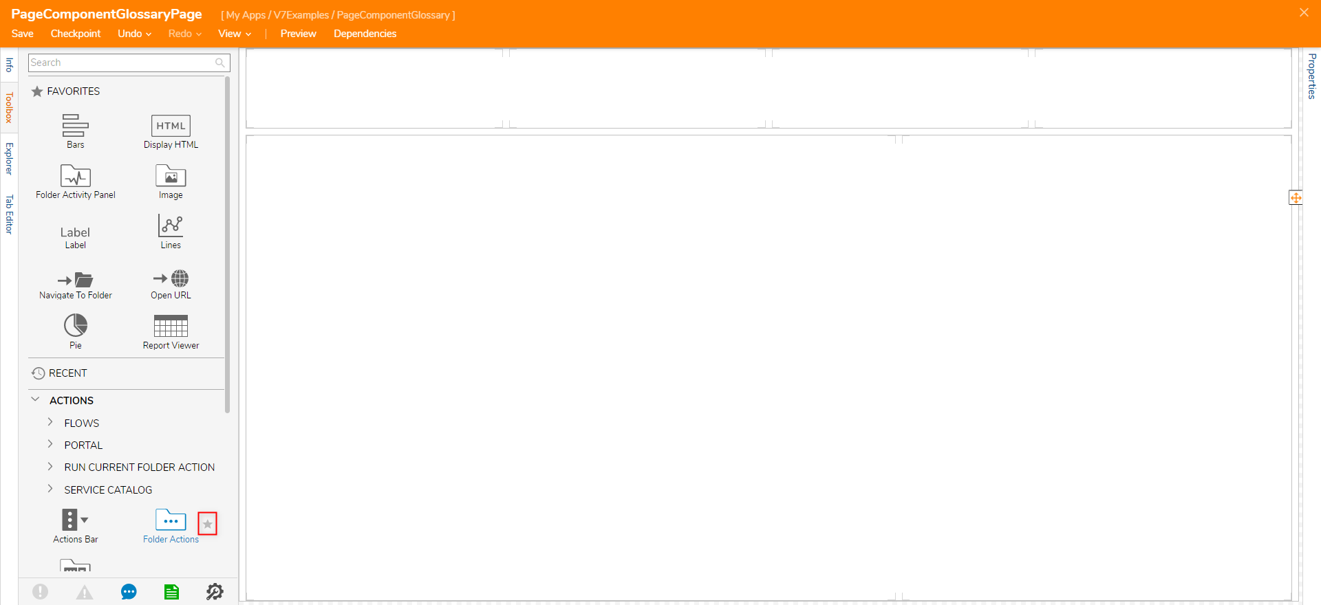
Additionally, components may be Unfavorited or Configured by selecting the star of any component within the FAVORITES category. 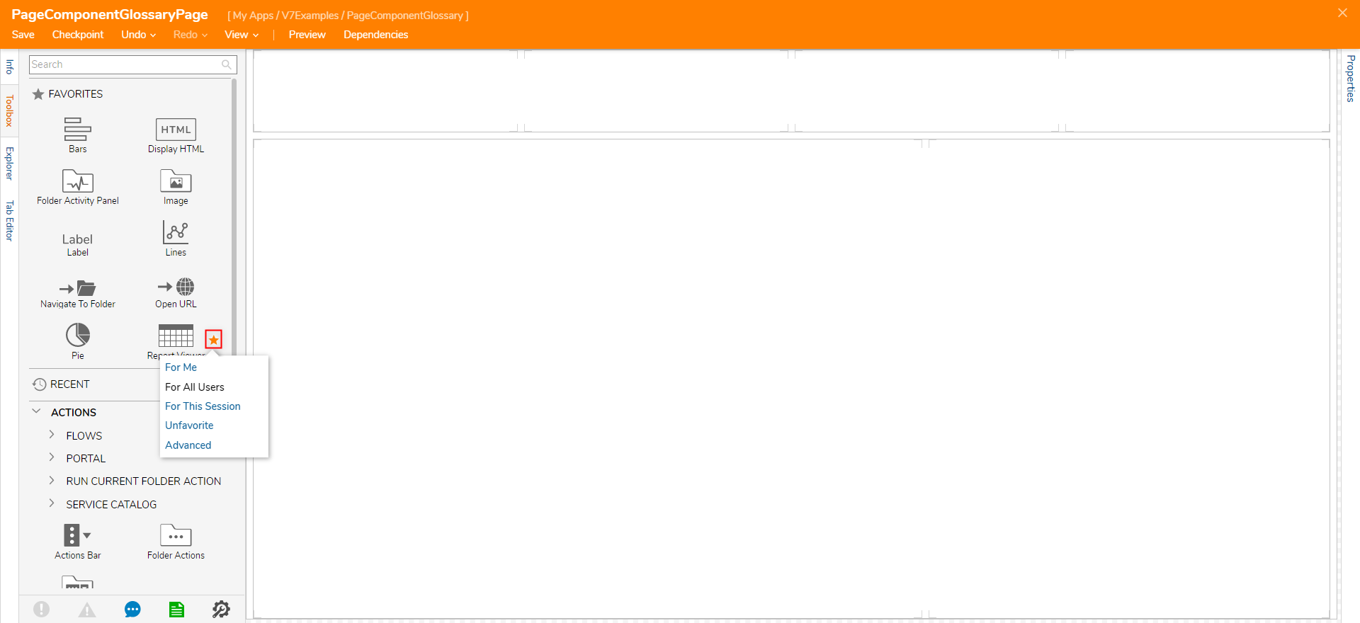
Actions
The ACTIONS category provides controls related to adding Actions to a Page as well as controls pertaining to custom Action Bars and Folder Action Bars.
| Component | Description |
|---|---|
| Flows > Run Flow as Button/Image/Link | Adds a Flow to the Page as a Button/Image/Link. |
| Portal > Run Action as Button/Image/Link | Adds default Portal Actions to the Page. |
| Run Current Folder Action as Button/Image/Link | Adds Current Folder Actions to the Page. |
| Service Catalog | Provides access to the Decisions Service Catalog including the Administration Service, Default, and General services, on a Page. |
| Actions Bar | An Actions Bar contains buttons that perform an action or open a menu. An Actions Bar can be configured with primary and secondary actions. |
| Folder Actions | Shows Actions that are associated with tasks performed in the folder, allowing different button types for styling purposes. |
| Folder Actions Bar | Shows Actions that are associated with tasks performed in the folder. |
Data
The DATA category provides various controls that pertain to adding displaying and adding data to a Page.
| Component | Description |
|---|---|
| Add Comment | Adds a Comment to the Folder the Page is on. |
| Add Document | Adds a Document to the Folder the Page is on. |
| Display HTML | A way to view HTML on a Page. |
| Document Viewer | Shows all files except Microsoft file types (doc, docx, excel, etc). |
| Folder Viewer | Displays Reports within a Folder. |
| Label | A way to put information on a Form that is not interactive. |
| Rich Text Display | Gives the designer the opportunity to change font type, color, size, alignment, copy, paste, insert an image, create a table. |
| Scratch Pad | Gives the end-user the opportunity to change font type, color, size, alignment, copy, paste, insert an image, create a table. Saves as a Comment. |
Advanced
| Component | Description |
|---|---|
| AppStore | Adds the Decisions App Store to a Page |
| Date Range Filter | Applies Date Range Filter to Page |
| Designer Folder Filter | Search filter for the Designer Folder |
| Designer Folder Viewer | Displays everything within the Designer Folder in the Tile Layout. Can sort and search through this viewer. |
| Features | Adds the Features view to the page. Shows Installed and Not Installed Modules. |
| Image Viewer | Displays selected image at runtime. |
| Service Catalog | Adds the Service Catalog to the Page. |
| System Information | Displays System Information: Version number, Portal Base URL, DB name, etc. |
Current
The CURRENT subcategory provides controls related to data for the present Decisions session.
| Component | Description |
|---|---|
| Current Time | Displays the current Time value. |
| Current User | Displays current user's Email Address. |
Data Controls
The DATA CONTROLS subcategory provides controls relating to dynamic data population.
| Component | Description |
|---|---|
| Data Label | Dynamically populate a label using Data Name |
| Image (Folder Data) | Dynamically populate an image using Data Name |
| Rich Textbox | Dynamically populate a Rich Text Box using Data Name |
| Save Button | Saves Folder Data |
| Text Box | Dynamically populate a Text Box using Data Name |
Folder
The FOLDER subcategory provides controls related to providing data pertaining to a specified Folder.
| Component | Description |
|---|---|
| Assignments View | Displays Assignments |
| Folder Activity Panel | Gives users an audit trail of the states and comments a folder has gone through. The folder activity panel can only be used with Flow Execution Extensions, Case Entities, Entities with process folders, and folder extensions. |
| Folder Header Data | Displays the Folder Name and Description. |
| Folder Horizontal Timeline | Shows previous states, current states, and future states of a Folder. Can only be used with Flow Execution Extensions, Case Entities, Entities with process folders, and folder extensions. |
| Folder Timeline Gauge | Shows the percentage complete of a timeline. Can only be used with Flow Execution Extensions, Case Entities, Entities with process folders, and folder extensions. |
| Resources View | Create and display an Entity Report, add resources/documents to the Folder. |
| State Label | Displays Current State |
| State Timeline | Shows previous states, current states, and future states of a process. Can only be used with Flow Execution Extensions, Case Entities, Entities with process folders, and folder extensions. |
| Tag Browser | Shows all items with tags. |
| Tags View | Adds tags to the current page. |
The GOOGLE subcategory provides controls that provides Google search capabilities to the applied to Page.
| Component | Description |
|---|---|
| Google Map Search | Text box with a Search button that opens Google Map Results in a new window. |
| Google Search | Text box with a Search button that opens Google Search Results of the typed text in a new window. |
Page
The PAGE subcategory provides controls related to data of a specified Page.
| Component | Description |
|---|---|
| Page Data Viewer | Displays a Page within a Page via Page Name or Page ID. |
Property Grid
The PROPERTY GRID subcategory provides controls that allow users to add a Property Grid Editor to a Page.
| Component | Description |
|---|---|
| Property Grid Editor | Provides a Property Grid Editor for the Page. |
Data Types
The DATA TYPES category provides controls relating to Case Entities.
| Component | Description |
|---|---|
| Case Editor | Configure states and Flows for the Case Entity process. |
| Runtime Case | Shows all history of the Folder the Page is attached to, also able to add comments to the folder. |
Designer Entities
The DESIGNER ENTITIES > FLOWS category provides controls allow users to implement the use of Flows onto their Page.
| Component | Description |
|---|---|
| Flow Run Part | Allows the user to run a Flow from within the allotted Page space. |
| Run Assignments | Runs and displays Assignments from a selected Report. |
| View Flow | Can only be used on Flow Tracking Folders |
Images
The IMAGES category provides controls that allow users to add images to their Pages; these include preexisting ones within the Decisions Installation as well as by offering the ability to add a custom image.
| Component | Description |
|---|---|
| Image | Allows users to add images from the Decisions Icon library, from a File, or via URL. |
JS controls
The JS CONTROLS category provides users a control that offers the ability to implement custom JavaScript into a Page.
| Component | Description |
|---|---|
| Custom JavaScript Control Name | Custom Page Controls using JavaScript can be created and then loaded into Decisions. |
Layouts
The LAYOUTS category provides users multiple controls that can be used to customize the visual layout of their Page.
| Layout | Description |
|---|---|
| Canvas | Blank Layout, free to place Components on the Page in any place. |
| Grid Layout | Fixed containers to house Page Components, can be stacked upon each other. |
| Header Container | A grid with a header section and a content section is separated by a border. |
| Horizontal Split Panel | Resizable control allows designers to adjust the size of two columns. |
| Horizontal Stack | Preserve white space but hide components if necessary, can stack controls horizontally. |
| Responsive Grid | Allows designers to define max and min widths. |
| Scroll Panel | Creates a scroll bar if the components on the Page are larger than the Page itself. |
| Tab Container | Creates tabs to allow multiple Pages within one Dashboard. |
| Vertical Split Panel | A resizable layout allows designers to adjust the size of two rows. |
| Vertical Stack | Preserve white space but hide components if necessary, can stack components vertically. |
Navigation
The NAVIGATION category provides controls pertaining to navigating both throughout and externally of the environment.
| Component | Description |
|---|---|
| Navigate To as Button/Image/Link | Folder Navigation buttons are interactive actions that will navigate the end-user to the configured Folder contents once selected on a Page/Dashboard. |
| Folders Bar | Allows the ability to add a custom Folders Bar to a Page. |
| Incremental Search | Provides an incremental search bar; this component allows Designers to dictate which DataTypes are searchable on the Page. |
| Navigate To Folder | Navigates to the user designated Folder. |
| Navigate To Parent Folder | Navigates to the Parent Folder of the current Page. |
| Navigate To Parent Process | Navigates to the Parent Process Folder of the current Page. |
| Navigation Tree Part | Provides a copy of the Decisions Studio's Folder Tree. |
| Open Child Tab Button | Provides a Button that opens the Page in separate tab. |
| Open URL | Provides a clickable Button, Link, or Image that opens a designated URL; this URL can be configured to open in a new tab. |
| Refresh Page | Provides a clickable Button, Link, or Image that refreshes the Page containing the component. |
| Run Flow | Provides a clickable Button, Link, or Image that runs a Flow on selection. |
Reports
The REPORTS category provides the ability to implement Reports into a Page.
| Component | Description |
|---|---|
| Entity Scroller | A component that scrolls through a tile view of the selected report. |
| Matrix | Adds a Matrix view of a Report. |
| Report Viewer | Shows a Report. |
| Rich Text Report View | Shows the Rich Text view of a Report. |
| Text Report View | Shows the Text view of a Report. |
Existing Reports > [Folder Name]
Charts will appear here if the Report is configured to have these different views.
| Component | Description |
|---|---|
| Run Report as Button/Image/Link | Will open a report on the selection of the Button/Image/Link. |
| Data View | Adds an interactive view of the selected report to a Page. |
Charts
The CHARTS category provides various Charts that may be applied to a Page.
| Component | Description |
|---|---|
| Area | Adds an Area Chart based on a Grouped Report. |
| Bars | Adds a Bar Chart based on a Grouped Report. |
| Bubbles | Adds a Bubble Chart based on a Grouped Report. |
| Bullets | Adds a Bullet Chart based on a Grouped Report. |
| Chart Legend | Adds a Chart Legend based on a Chart added to the Page. |
| Columns | Adds a Columns Chart based on a Grouped Report. |
| Lines | Adds a Line Chart based on a Grouped Report. |
| Mixed Bars | Adds a Mixed Bar Chart based on a Grouped Report. |
| Pie | Adds a Pie Chart based on a Grouped Report. |
| Ring | Adds a Ring Chart based on a Grouped Report. |
| Simple Bars | Adds a Simple Bar Chart based on a Grouped Report. |
| Stacked Bars | Adds a Stacked Bar Chart based on a Grouped Report. |
| WinLoss Bars | Adds a WinLoss Chart based on a Grouped Report. |
Tiles
The TILES category provides controls relating to Tiles so that a Designer may display dynamic content, and/or other Designer Elements such as Flows, Forms, etc...
| Component | Description |
|---|---|
| Diagram Tile | Diagram Tiles are a way to capture data and present it in an attractive manner using info-graphics. |
| Form Tile | Form Tiles are utilized to leverage Decisions Forms onto a dashboard. |
| Simple Tile | Displays mapped data on a Page with background color and styling. |
| Simple Tiles | Displays mapped data on a Page with background color and styling; this component is for use with multiple Simple Tiles. |
Was this article helpful?