ADA Compliance with Forms
- 09 Apr 2021
- 3 Minutes to read
- Print
- DarkLight
ADA Compliance with Forms
- Updated on 09 Apr 2021
- 3 Minutes to read
- Print
- DarkLight
Article Summary
Share feedback
Thanks for sharing your feedback!
Overview
In Decisions, accessible Forms can be created to meet the Web Content Accessibility Guidelines (WCAG) for Americans with Disability (ADA). The purpose of this article is to demonstrate a starting point for Decisions' capability of achieving the first tier of accessibility with Form creation.
Example
The following example will create a Form that is perceivable, operable, understandable, and robust to reflect the guidelines for Level A compliance for Americans with Disability (ADA).
Note:
Ensure that the Form has a specific level of contrast; the contrast can be tested with various websites, including WebAIM to enable users with color-specific disabilities to successfully access information presented on a Form with CSS.)
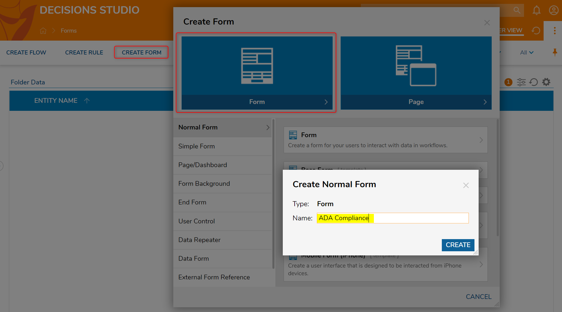
- Begin in a Designer Folder, select CREATE FORM from the Global Action Bar.
- In the resulting Create Form window, select and name the default Normal Form [ADA Compliance]. Click CREATE to enter the Form Designer.
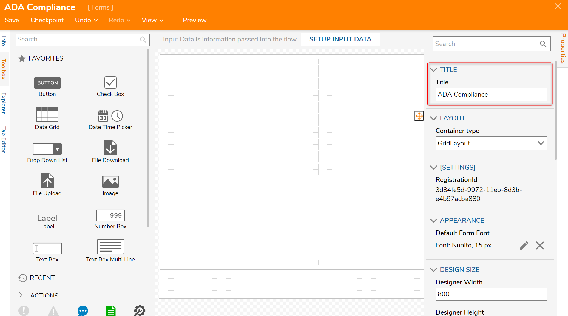
- In the Form Designer, navigate to the Properties panel > TITLE > Tile field and add a relevant title for the Form.All Forms will need the Title specified for Level A compliance.
In this example, the title of the Form will also be ADA Compliance.
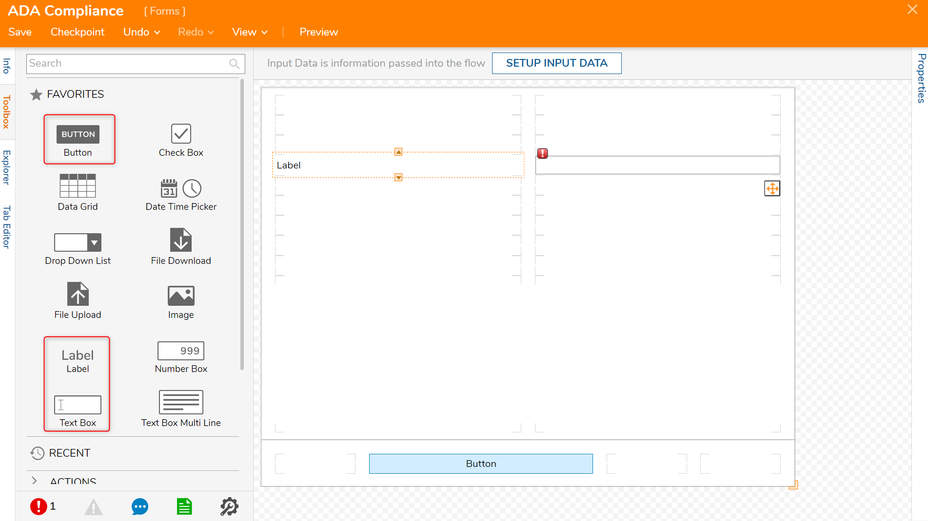
- From the Toolbox > FAVORITES section, drag and drop a Text Box, Label, and Button component to the Form.
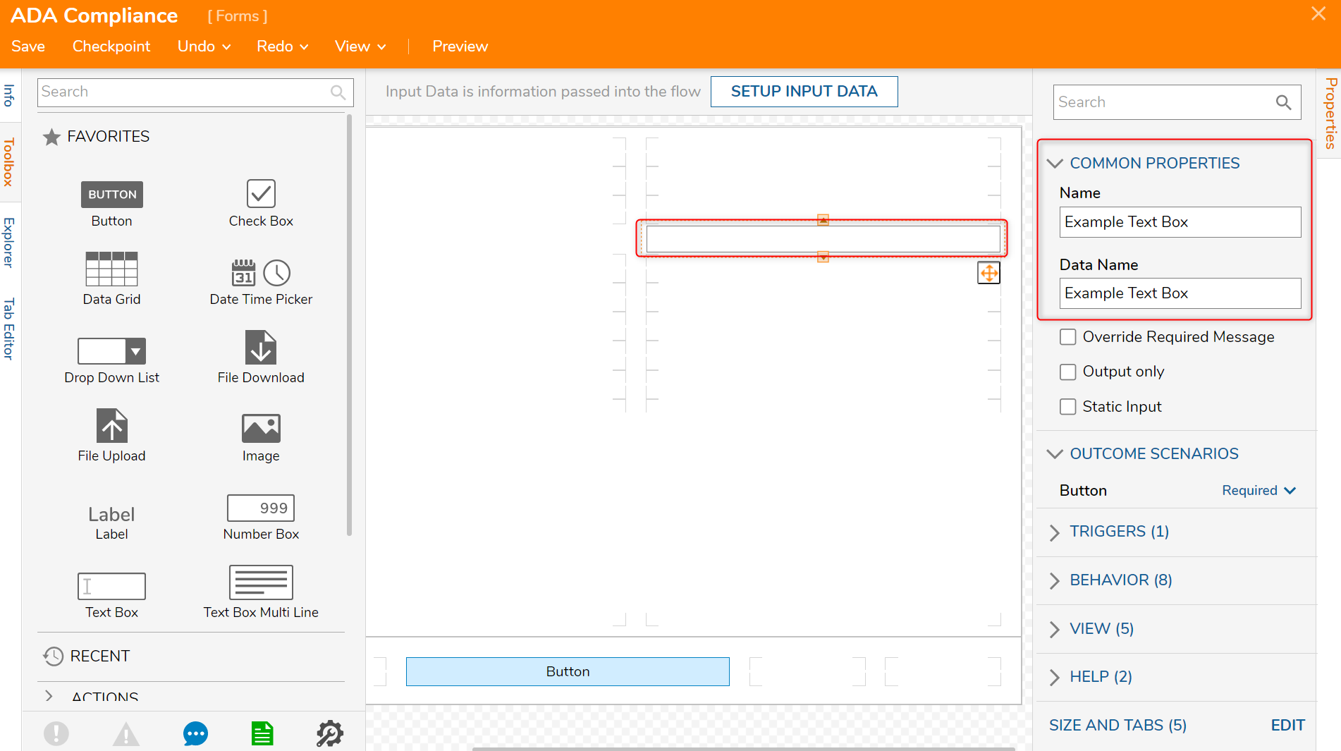
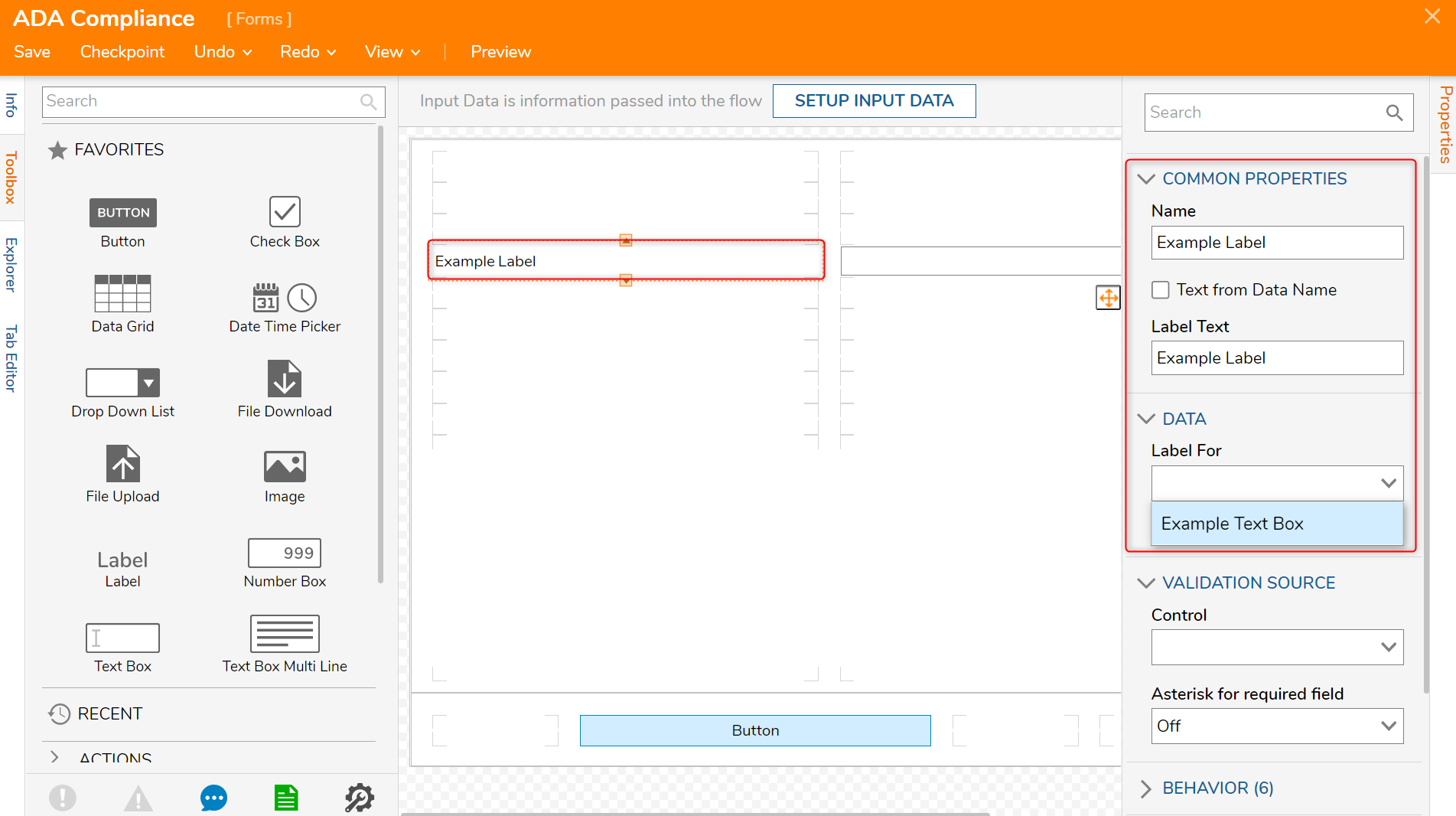
- Select the Text Box component and in the Properties panel > COMMON PROPERTIES > Name and Data Name, create a specific name for the object.
- Repeat the previous step with the Label component selected by navigating to the Properties panel > COMMON PROPERTIES > Name and Label Text.
- Navigate to the DATA > Label For drop down and select the corresponding component associated with the Label.For every Label created, the Label For drop down must correspond to the correct component.
In this example, the Label is named Example Label and the Text Box is named Example Text Box and accurately matched to its Label.
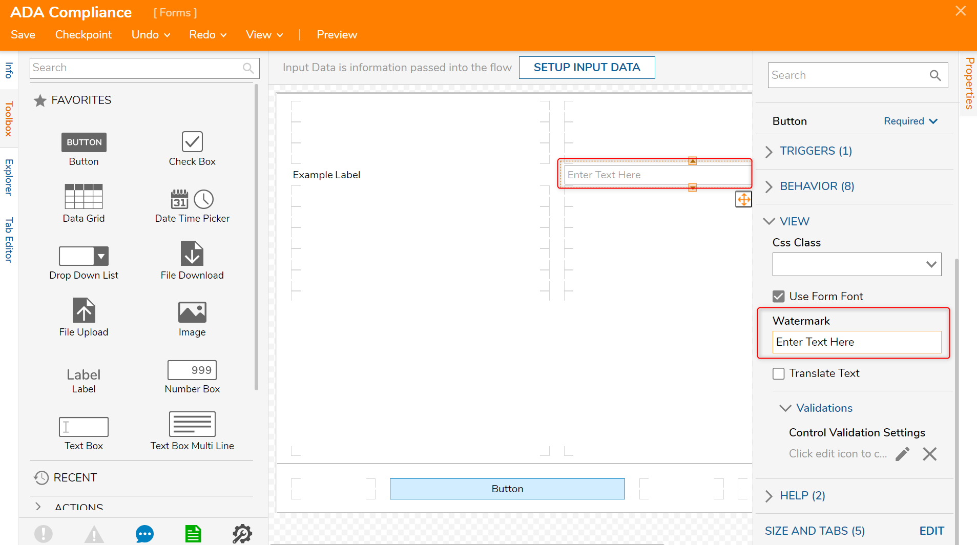
Select the Text Box component and navigate to VIEW > Watermark within the Properties panel and add a relevant name for the Text Box component.
Watermarks can be read by screen readers and should be used frequently to explain what data should exist in which data field.In this example, the Watermark for this Text Box [Example Text Box] is Enter Text Here.
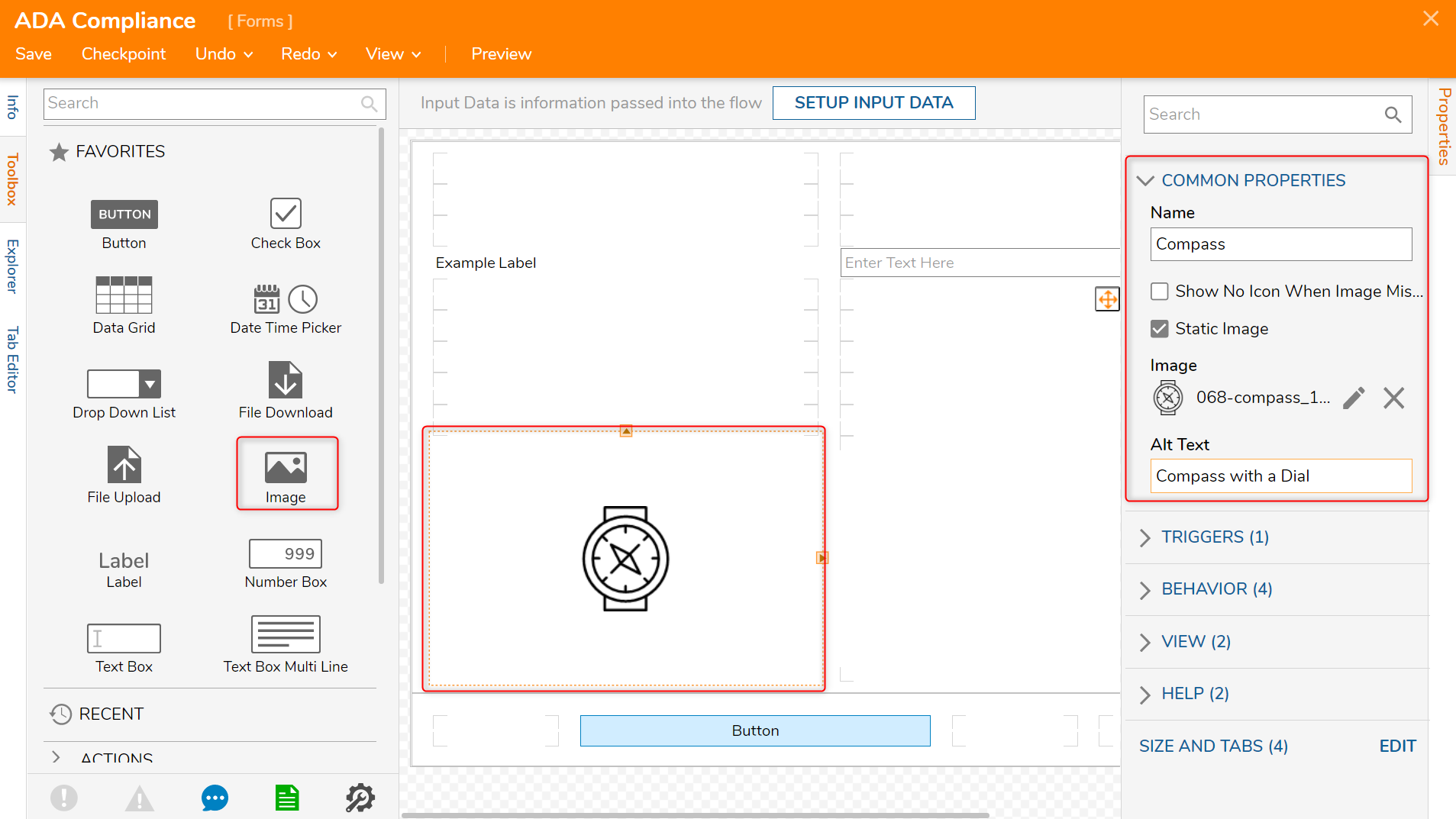
- Next, add an Image component from the Toolbox > FAVORITES section.
- Check the boolean for Static Image under COMMON PROPERTIES > Name and select any image.
- In the Alt Text value field, insert text describing the selected image.Alternate Text should be placed on every image to describe what is being shown.
The alternate text for this image of a Compass is Compass with a Dial.
Another helpful note when creating accessible Forms with images would be to restrict image flashing to less than three times.
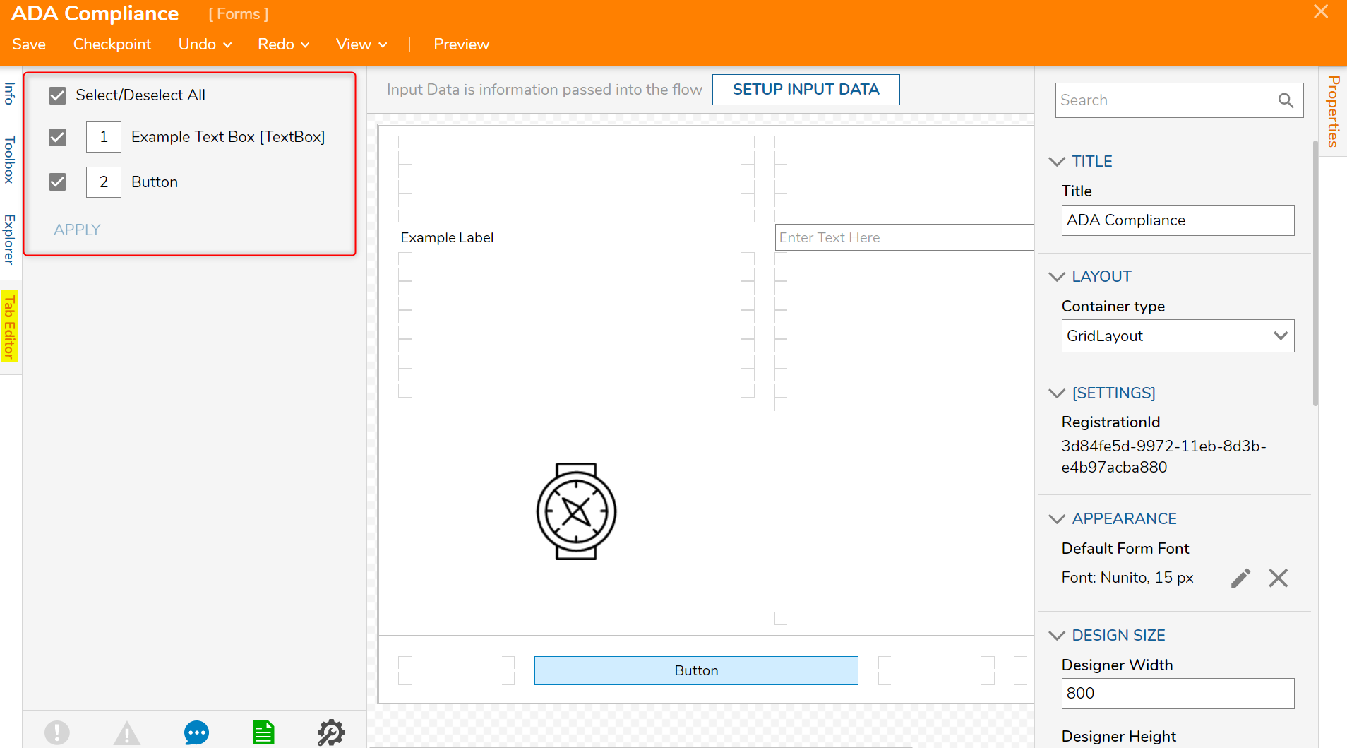
- Next, navigate to the Tab Editor and ensure that all Form components are listed in a logical order (e.g. Text Box before Button).Tab order is important for a focusable Form that can be navigated in a sequence.
Please navigate to Using the Tab Editor to Set Tab Order for more information on how to set up Tab Order.
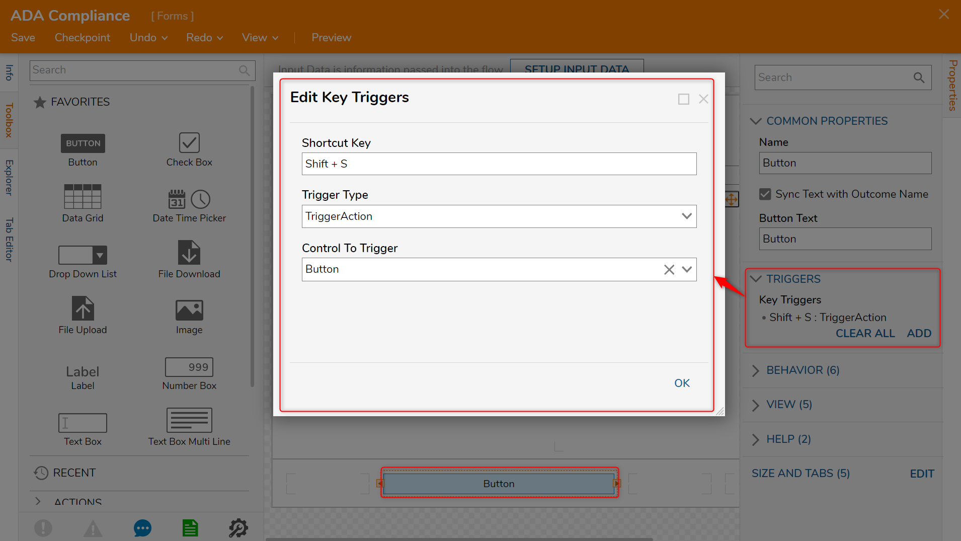
- Select the Button component and navigate to the Properties panel > TRIGGERS > Key Triggers selector and select Add New to create a Key Trigger for Form submission.The Key Trigger function when used with multiple keys as a shortcut will allow the End User to perform an action without clicking a specific component.
Please navigate to Key Triggers on Form Controls for more information on creating Key Triggers.
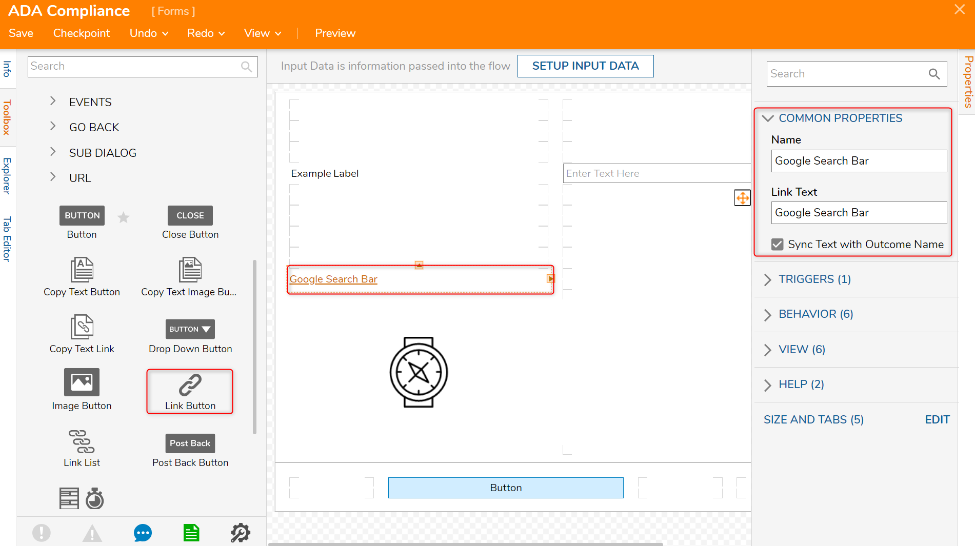
- Lastly, navigate to the Toolbox > ACTIONS and drag and drop a Link Button component to the Form.A Link should have a descriptive name depicting where the link leads to.
In this example, the Link Button component will lead users to a Google Search Bar and that is reflected in Properties panel > Common Properties > Link Text field.


Was this article helpful?