Overview
Responsive Containers help the Designer define the width, length, height, and size of Layout and/or control sections on a Form.
Designers can drop more than one Responsive Container on a Form, and, because it is responsive, it will automatically adjust to fit the screen. When adding a container to the Form, each container will have its own section that can be edited to configure the Form.
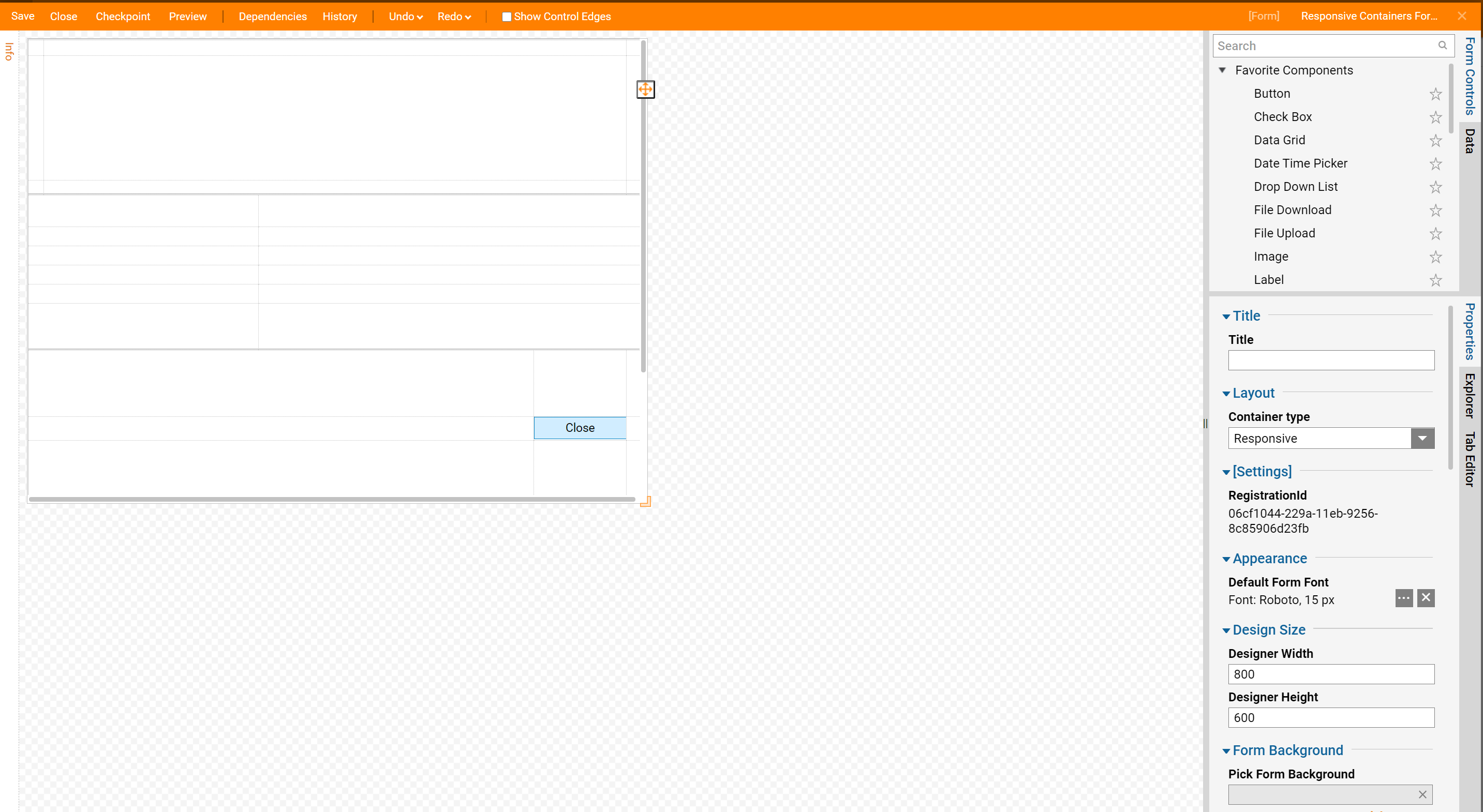
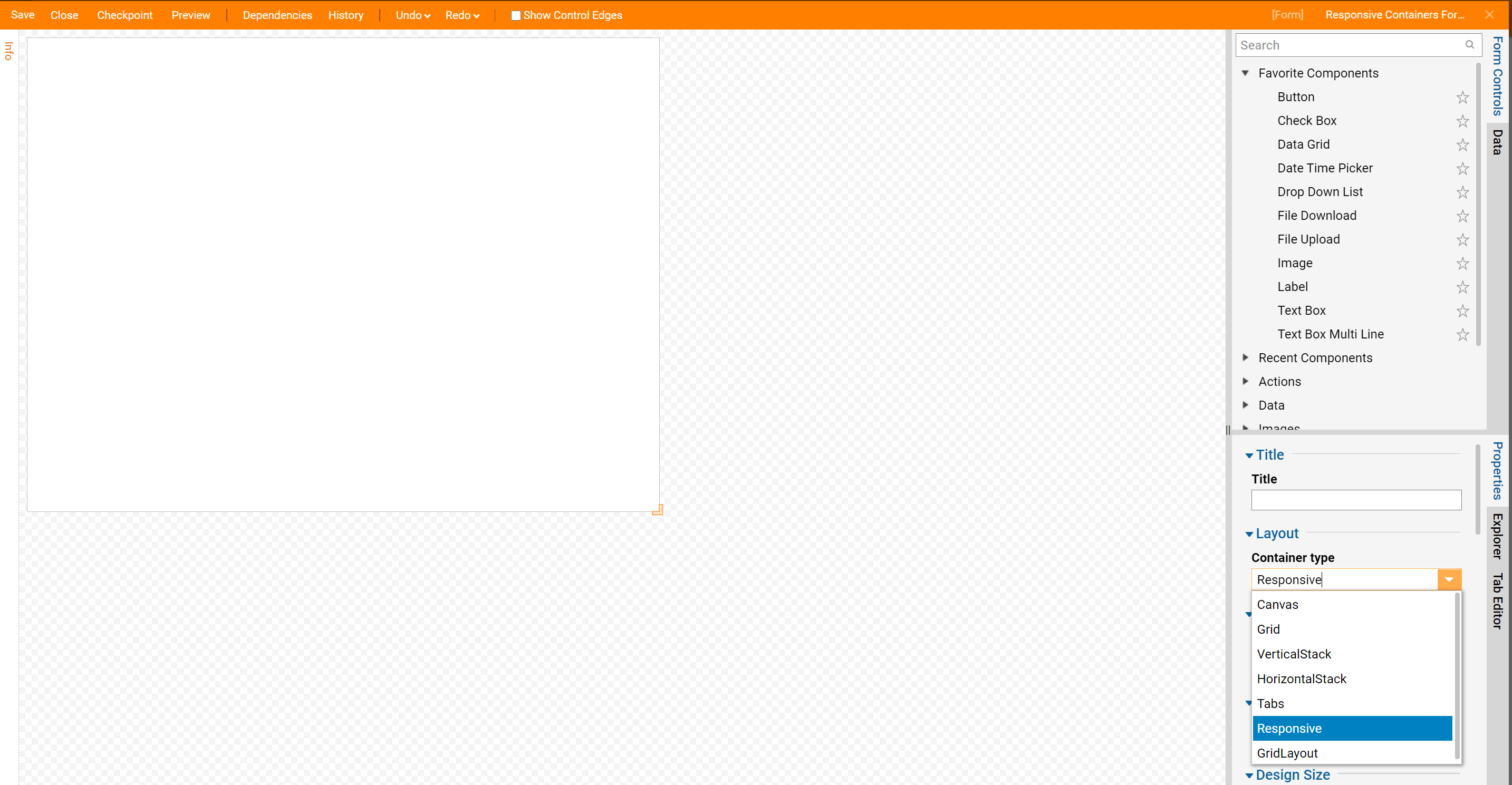
Responsive Containers can be added by either changing the Form's Surface Container Type to Responsive or by adding the Responsive Grid found via Toolbox > Layouts.
Configuration
In contrast to other Layouts which focus on moving and editing controls, Responsive Containers specifies where to place and resize controls as well as Layouts via the Sections settings.
The Margins setting grants pixel space between the Layout/control if present at all.
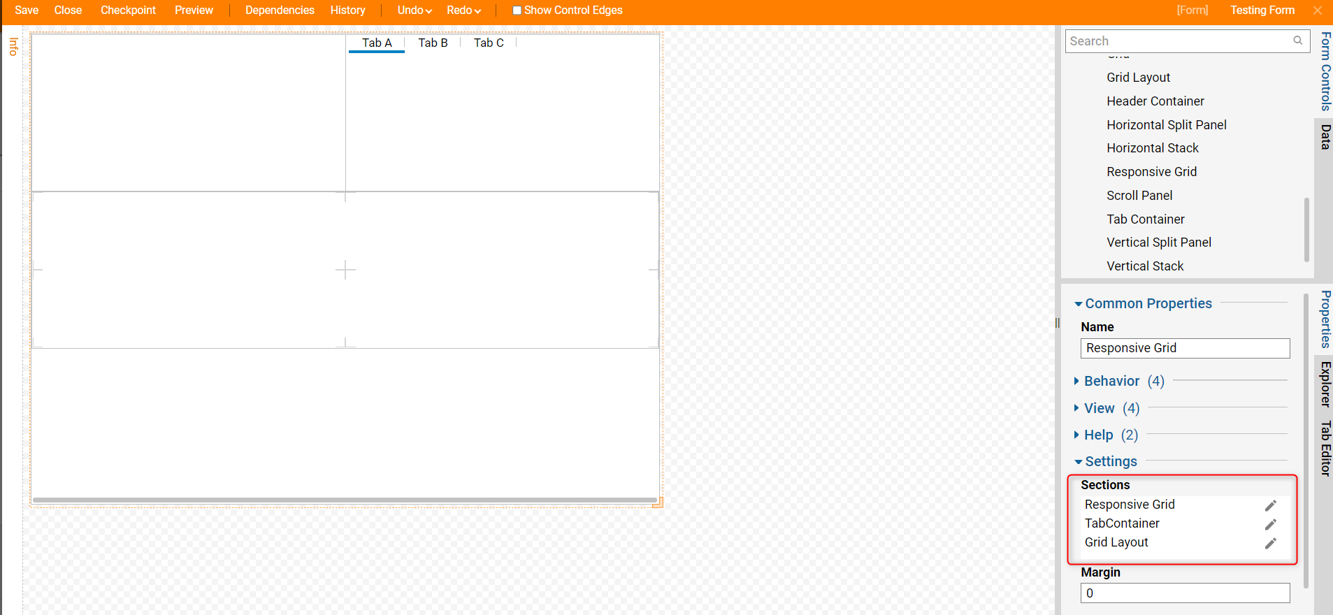
Once a Layout/control populates the Section setting, the Layout/control may be moved up and down the arrangement with its respective arrows or edited by hovering over the Layout and selecting the pencil icon. This will open the Edit Sections window.
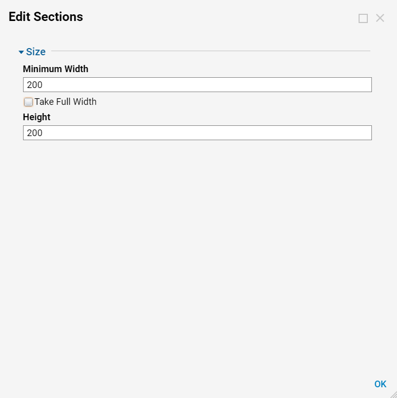
| Setting Name | Default Value | Description |
|---|---|---|
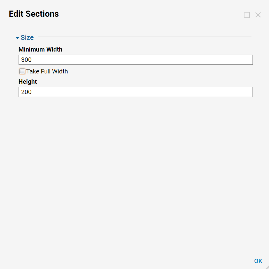
| Minimum Width | 200 | Sets the minimum width of the Layout/control section. |
| Take Full Width | False | Toggles if the Layout/control section expands to the width of the Responsive Container. Enable this to give this Layout section its own 'row'. |
| Height | 200 | Sets the minimum height of the Layout/control section. |
Example
In the example below there will be a demonstration of how to use and edit Responsive Containers with multiple containers.
Start by selecting Create Form in the Action Panel located on the bottom of the Designer Studio.

Choose the template and select Create.
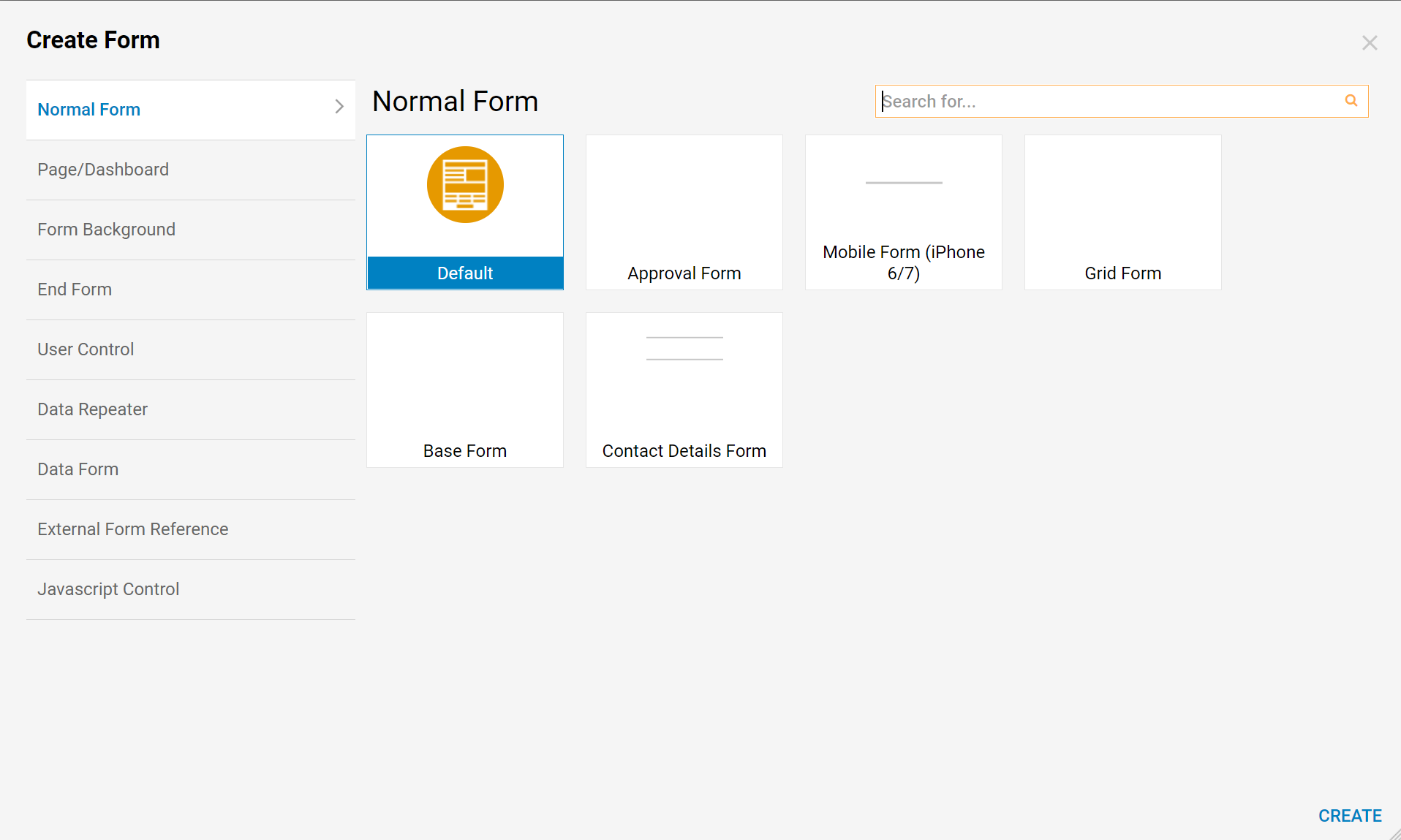
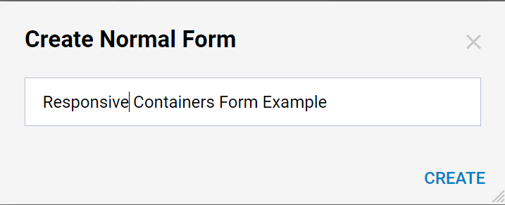
Name the form and select Create.
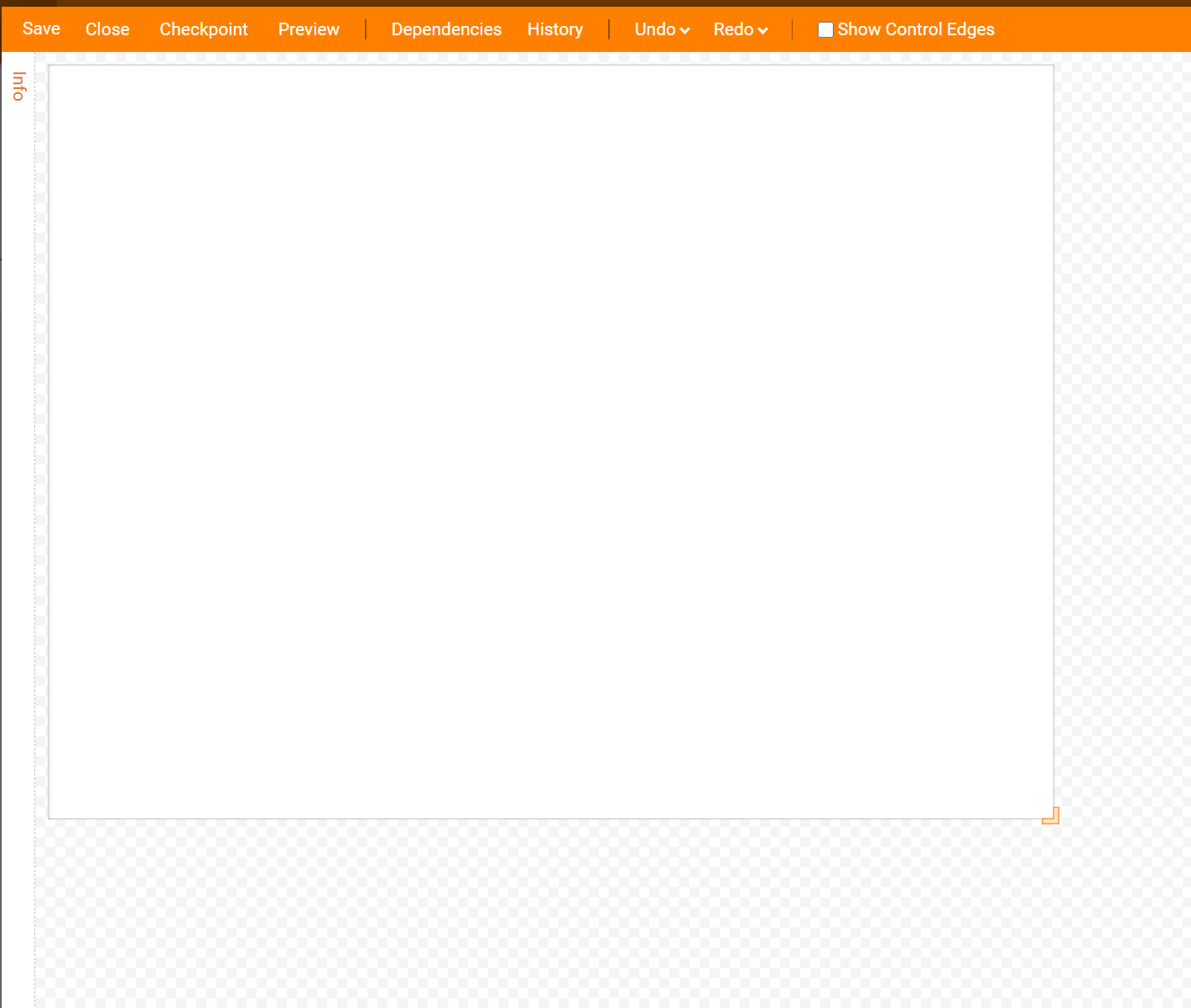
Start with a blank canvas, you may have to delete the grids off of the Form. Select the grid and delete it until the Form is a blank canvas.
Now in the Properties Tab on the right under Layout select the drop-down menu and set the Container Type to Responsive.
Grid 1: Header Grid
Locate the Steps Tab on the right, select Layouts > Grid, drag the Step onto the Form and drop.
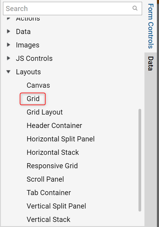
Drag and drop the first Grid onto the blank Responsive Container Form.
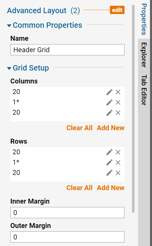
In this example, name four separate Grids and set the dimensions for each. Name the first grid and set the settings using the images below
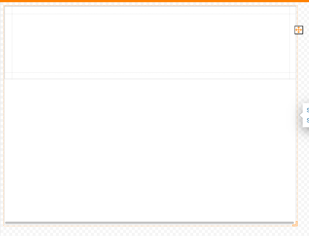
After you set the settings for Grid 1 the Form should look like the image below.
Grid 2: Information Grid
Locate the Steps Tab on the right, select Layouts > Grid, drag the Step onto the Form and drop. Drag and drop your second Grid onto the Responsive Container Form.
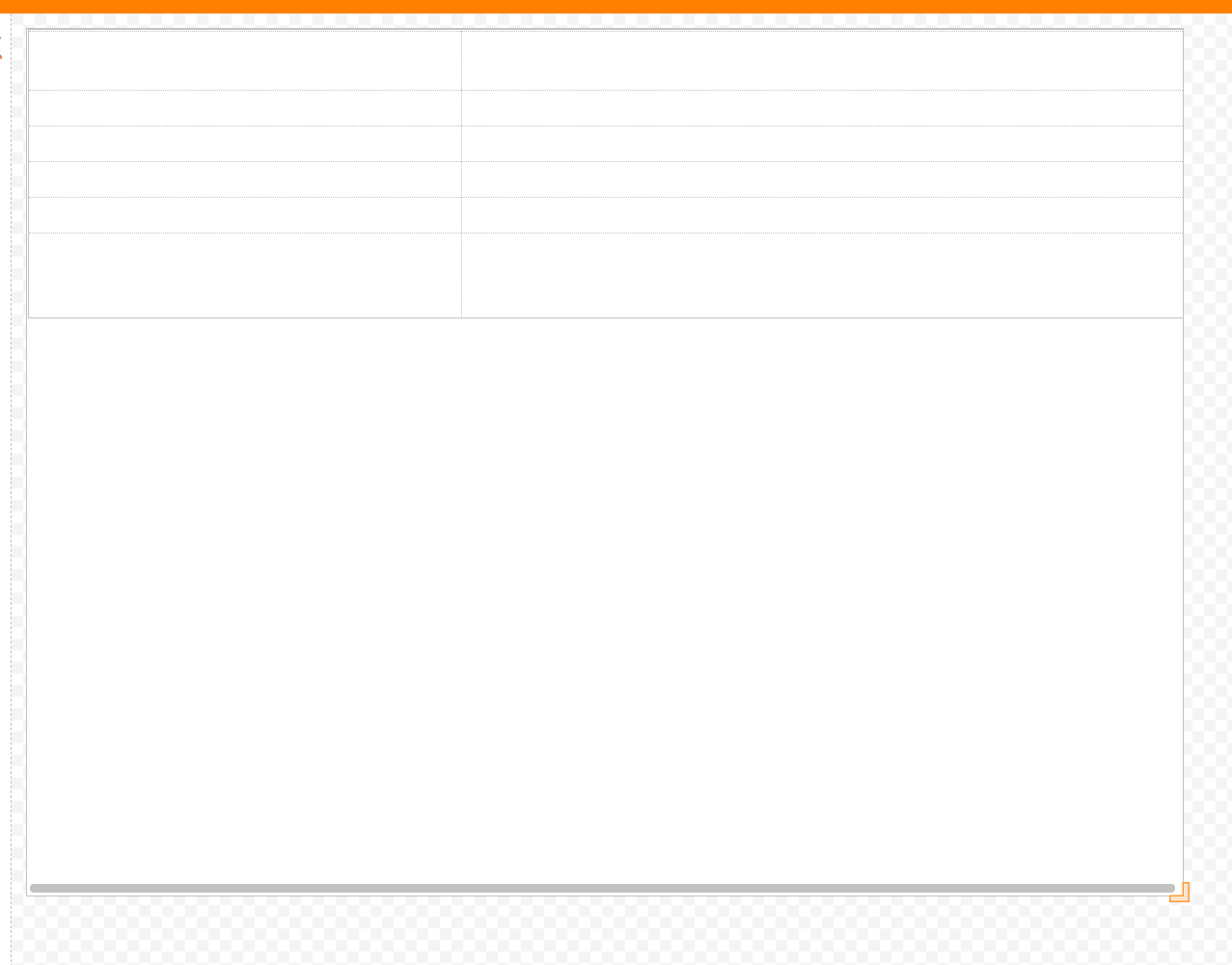
Name the second Grid and set the settings using the images below.
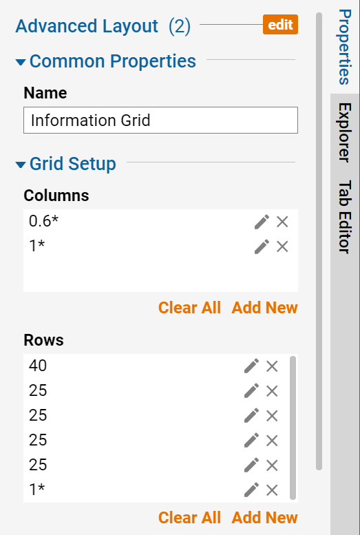
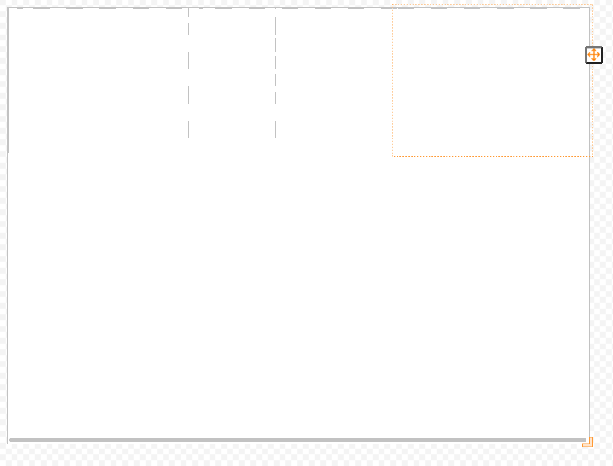
The Form should look like the image below. This Grid did not need any changes in its settings.
.png)
Grid 3: Footer Grid
Locate the Steps Tab on the right, select Layouts > Grid, drag the Step onto the Form and drop. Drag and drop the third Grid onto the Responsive Container Form.
Name the third Grid and set the settings using the images below. When setting the settings notice the asterisk, this shows that a Column or Row has been set to either Resize, Grow or Fix. Make sure that each number has the appropriate asterisk. Select the drop-down menu under Layout to choose the Resize type.
Under Columns, Set 1 to Resize. Select the pencil icon to edit the column size. Choose the drop-down menu and select Resize. Set 120 to Fixed by selecting Fixed in the drop-down menu. Set 20 to Fixed by selecting Fixed in the drop-down menu. Under Rows, set 1 to Resize. Set 30 to Fixed and set the last 1 to Resize.
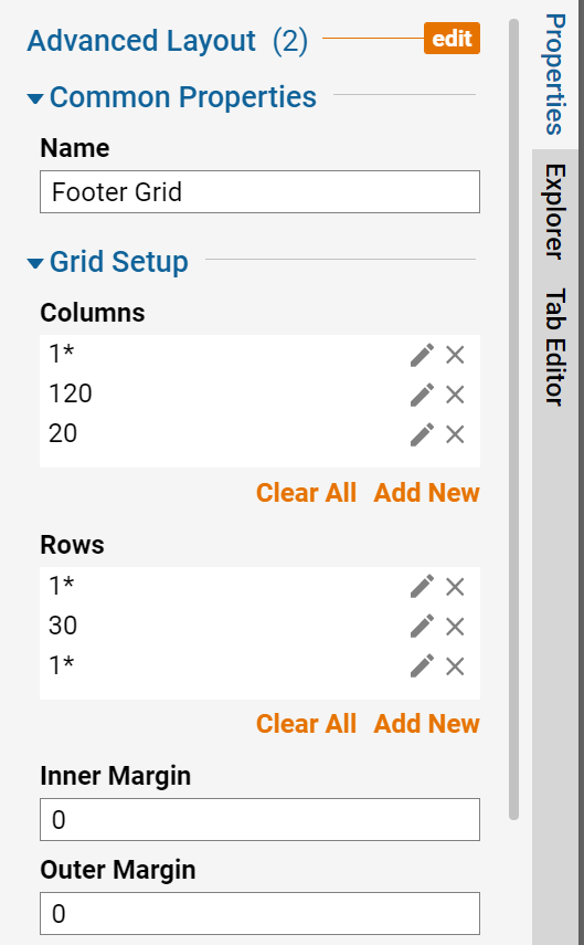
In the drop-down menu choose the Resize Type for each Column or Row.
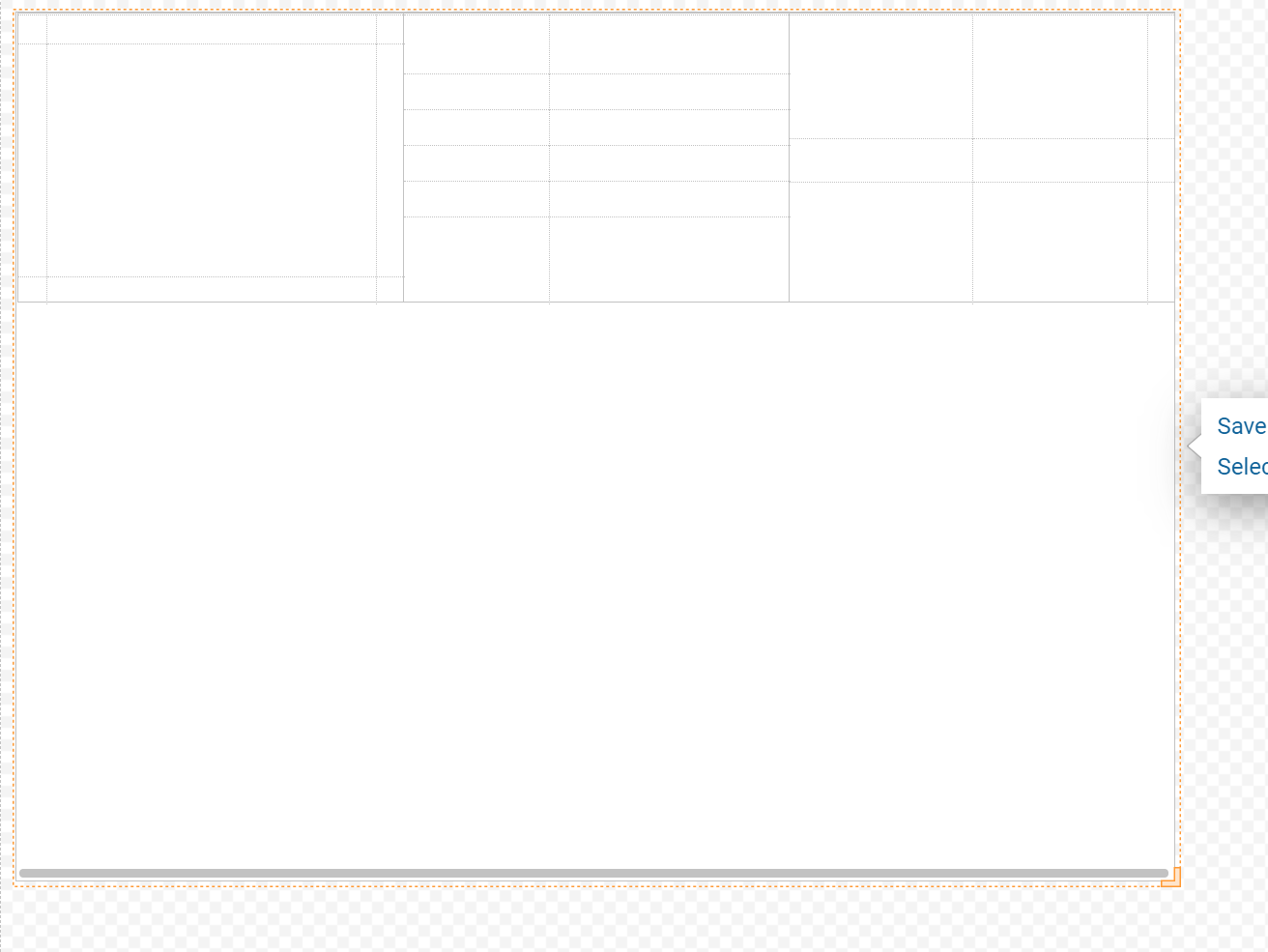
The Form should look like the image below.
Grid 4: Grid
Locate the Steps Tab on the right, select Layouts > Grid, drag the Step onto the Form and drop. Drag and drop the Forth Grid onto the Responsive Container Form.
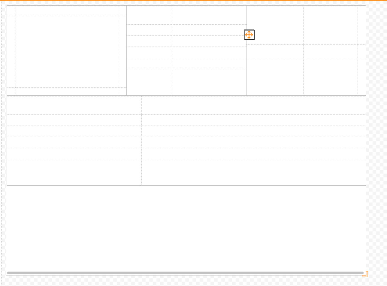
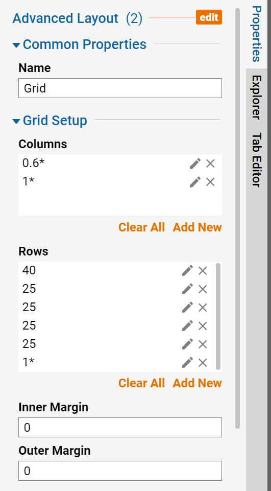
Name the forth Grid and set the settings using the images below.
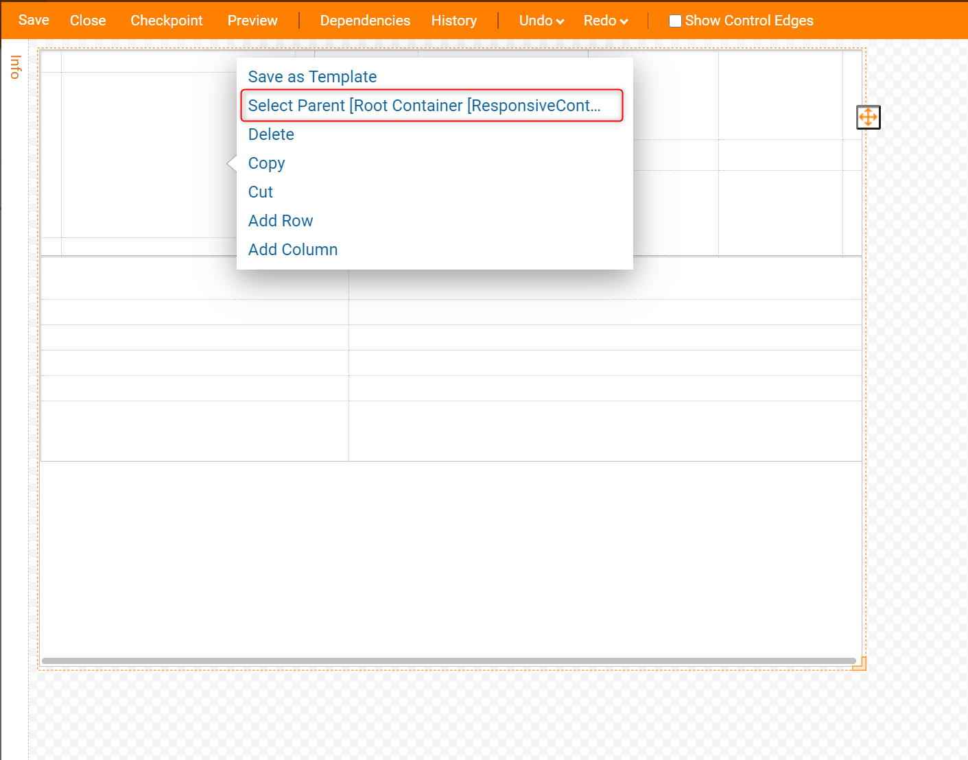
Navigate to the Form, right-click and choose Select Parent Root Container [Responsive Container] to edit sections. Hover over the pencil icon and select to edit sections.
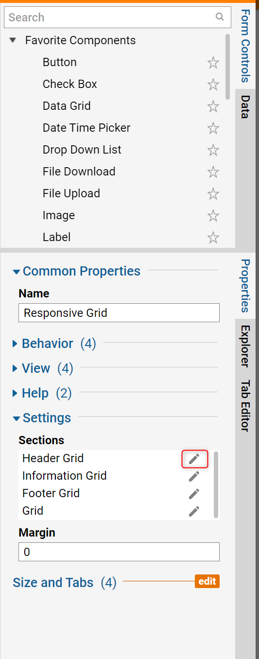
Next on the right in the Properties Panel, Edit sections by selecting the pencil icon. This gives the option to edit Minimum Width and Height of the Form.
Grid 1, Header Grid: Select the box Take Full Width. This selection will cause the Header Grid to always take the Full Width of the form.

Grid 2, Information Grid: Change the minimum width to 100.
.png)
Grid 3, Footer Grid: Select the box Take Full Width. This selection will cause the Header Grid to always take the Full Width of the form.
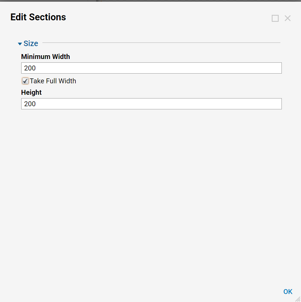
Grid 4, Grid: Change the minimum width to 300.
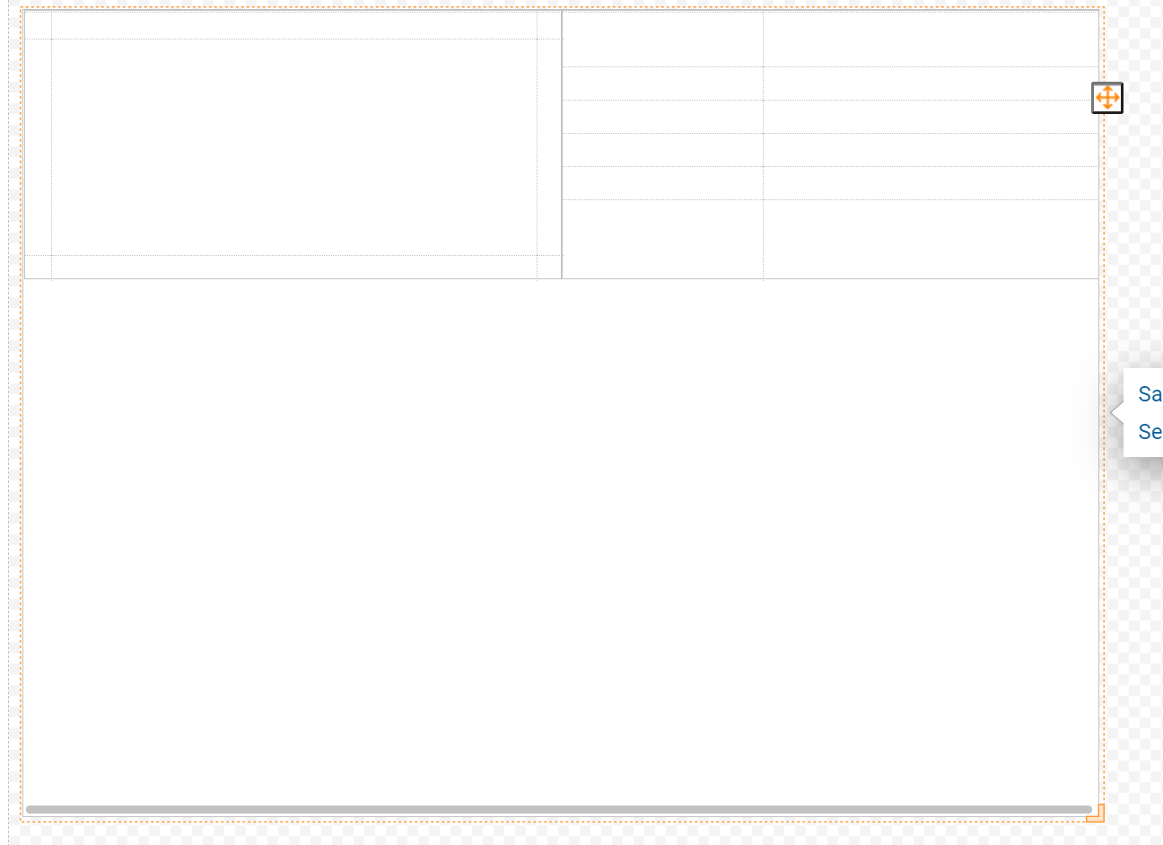
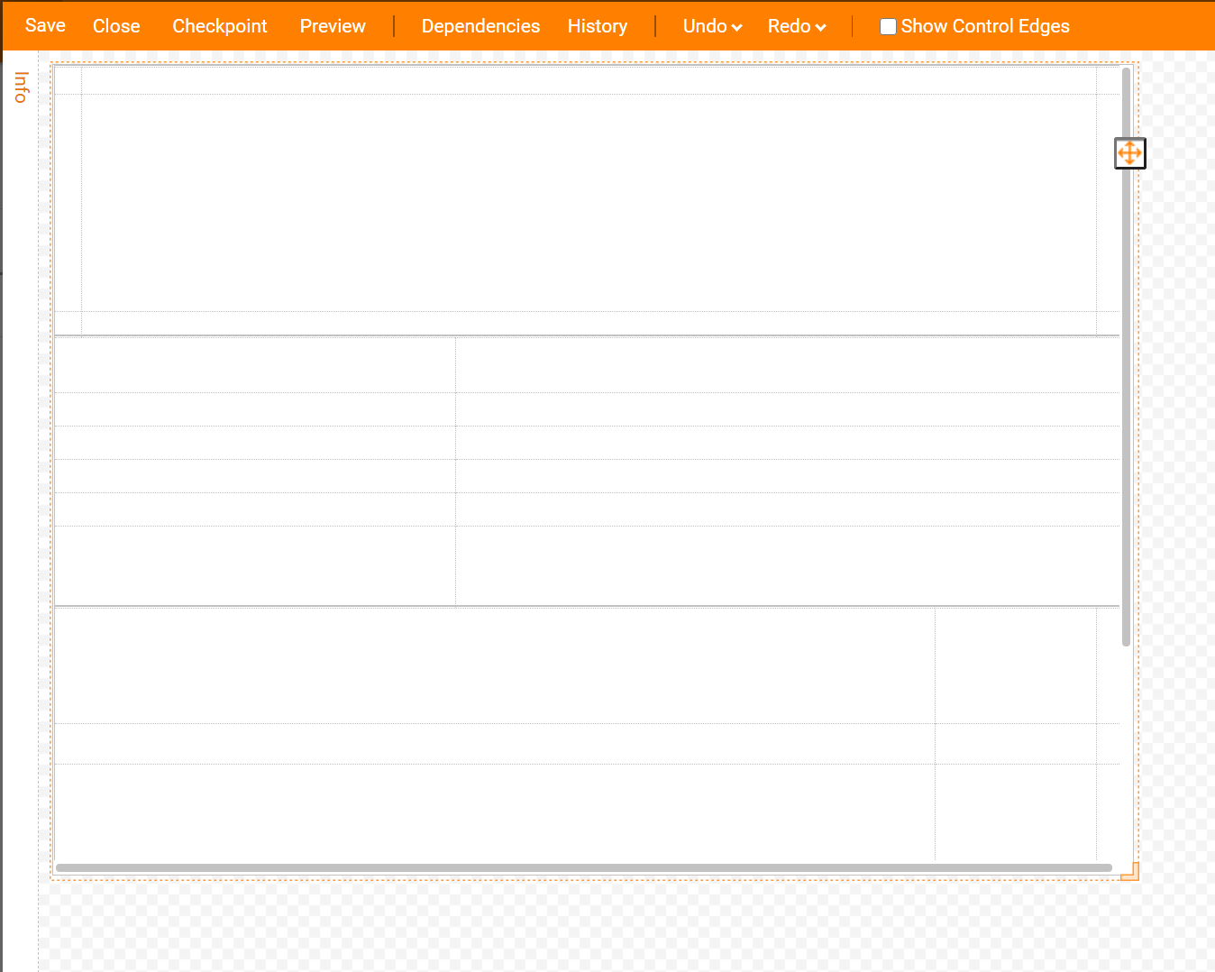
After setting the Width and Heights the Form should look like the example in the image below.
Finally, design the layout with labels and text, add a button and complete the Form. Here is an example of what the form should look like as a Responsive Container using four different Grids.
