Overview
The Grid Layout is the default Layout type for any new Form. Grids organizes space via cells made by manipulating the count, size, and padding of its columns and rows.
Forms presenting a lot of content and/or sophisticated design requirements would benefit most from since the Grid provides uniform placement, spacing, and padding. Controls placed within a cell automatically fit to the size of that cell. Resizing the cell, in turn, also resizes the control, as well as other cells in the same row or column. This allows information to be placed in a precise and deliberate manner.
Grid Layouts can be placed inside each other. Nested Grids provide even more control over the Layout by controlling the size of a child Grid via editing its cell on the parent Grid. Alternatively, Grids can be used in conjunction with other Layouts, such as a Canvas, to add an element of uniformity to an otherwise loose Form Layout.
The following document discusses Grid Layouts features and configuration options.
Configuration
Since Grids consider their controls' sizes and positions as not fixed, their highly flexible Grid Setup settings panel provide options to reformat the Grid.
In the Form Designer, select the Grid Layout to open its Properties tab and view these settings.
Adding, Editing, and Deleting Columns and Rows
When hovering over a column/row, selecting the vertical ellipses icon expands a list of Grid manipulating actions:
| Action Name | Description |
|---|---|
| Add Row Before | Adds a row before the row the user selected |
| Add Row After | Adds a row after the row the user selected |
| Add Column Before | Adds a column after the row the user selected |
| Add Column After | Adds a column after the row the user selected |
| Edit | Opens the Edit Panel for the selected column/row |
| Delete | Deletes the selected column/row |
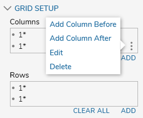
In addition to the above mentioned Add actions, selecting the ADD button link underneath the column/row box creates a new column/row with the Add [Column/Row] window. This panel shares the same settings as the Edit Column/Row window.
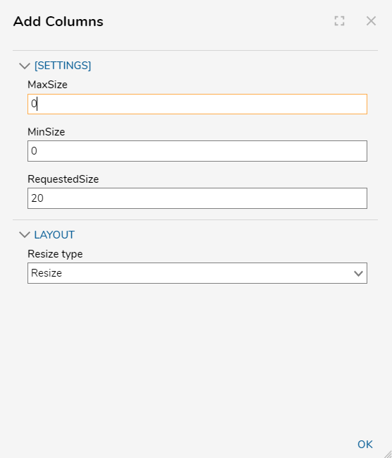
Below the [Settings] options, the MinSize and MaxSize boxes restricts the size of that column or row to that pixel value. The RequestedSize box is used to Input the definite value of that object.
In the Layout settings, the Resize Type drop down menu choose between the following, which affect the Resize behavior of the Row or Column:
- Fixed: The Column or Row is restricted to the defined size.
- Grow: The Column or Row automatically increases in size to fit the space left by Form's other columns/rows. This setting does not allow the Column or Row to decrease.
- Resize: The Column or Row automatically increases or decreases in size relative to its other Column/Row so it may fit the Form. For example, if the Column or Row's size exceeds the size of the Form, then that Column or Row will decrease in size. If the sum of the Rows or Columns does not meet the determined size of the Form, then the Resize set Row or Column will increase in size to fill that space.
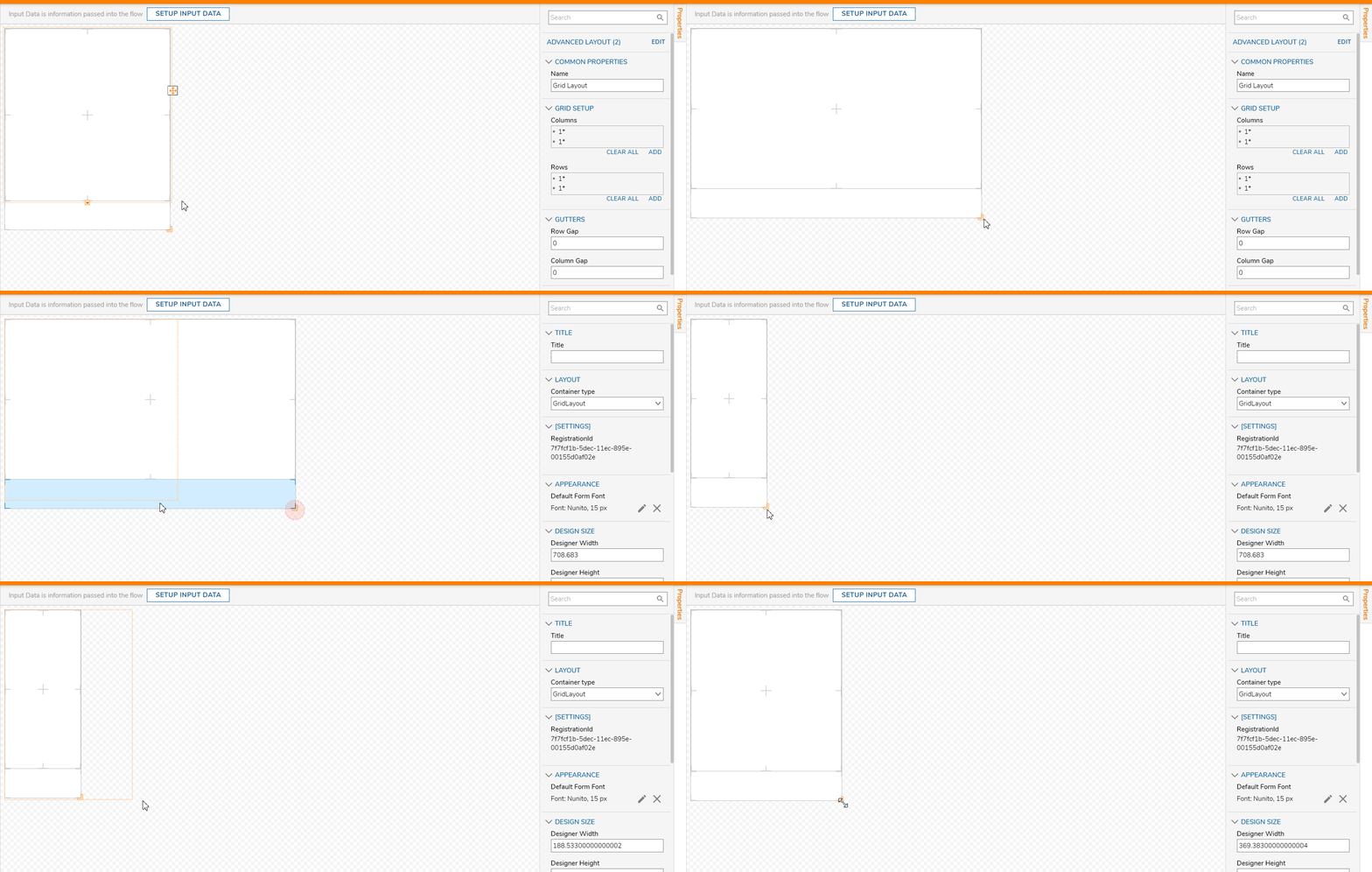
Gutters and Margins
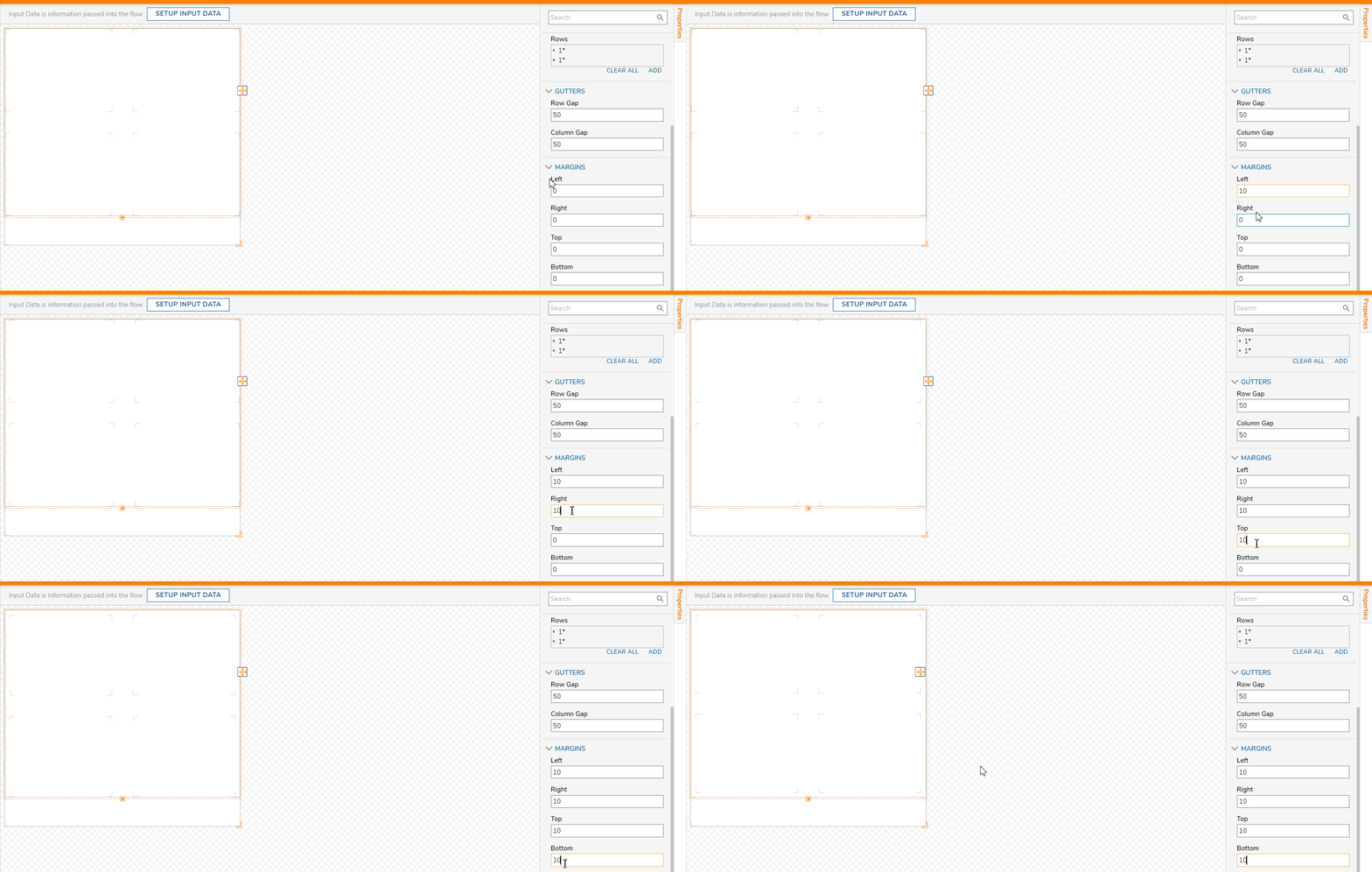
Gutters add gaps between columns/rows for formatting flexibility. The Column/Row Gap settings provide space according to the pixel value.
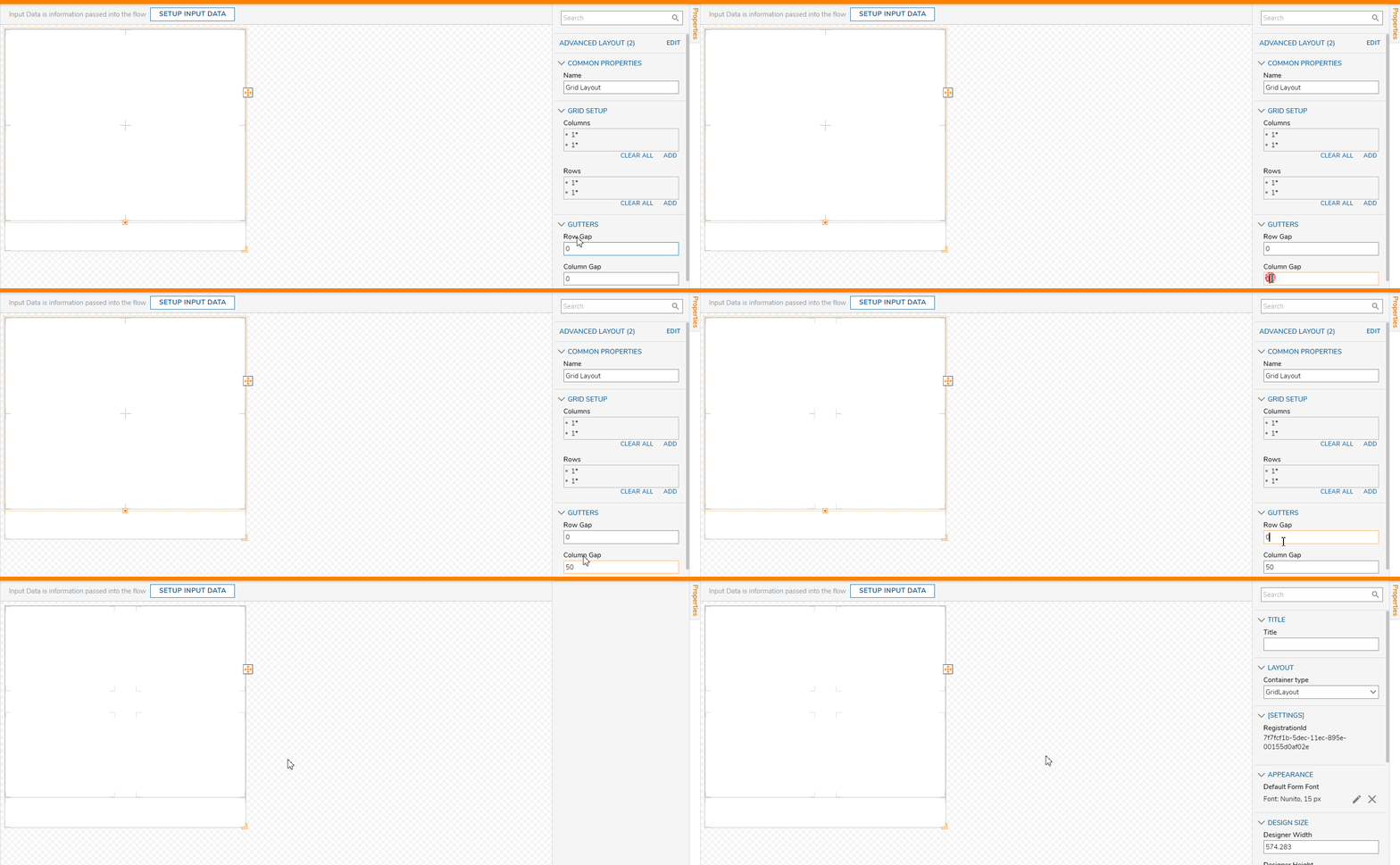
In addition to Gutters, Margins in the Grid Setup panel can define the size of any margins if present at all. Defining Margins adjusts the amount of pixel space between the Grid and the body of the Form.
