Overview
The GridLayout uses a CSS Grid to control its layout. Compared to a regular Grid Layout, a CSS Grid reduces HTML overhead and allows users to author CSS documents to apply CSS to the Form layout. This CSS control ability is particularly useful for creating responsive layouts.
Example
In this example, CSS Media Queries rearrange the Form by changing between o one or two column layouts to tighten spacing based on the browser's size.
This is accomplished by adding CSS class names to the elements to control and then defining different rules for those elements in the CSS document. In broad terms, three things are done:
- Apply class name to root to override its default size behavior
- Apply class names to specific child layouts to override their position as configured in Form Designer
- Apply a CSS class to the Form containing @media breakpoints with rules for the class names above to override certain settings on smaller screens.
- Open the 'Show Responsive CSS Grid Form' Flow from the above example file.
- Select the Form and click EDIT [FORM NAME] to open it in the Form Designer. The Form uses various GridLayouts. One covers the base of the Form with nested Grids to denote sections.
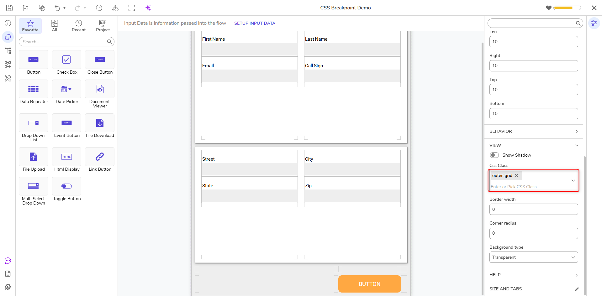
- Open the Form's Properties, and select the CSS file included in the example zip file if not already applied: 'responsive-css-grid-demo.css'. If using only the CSS file, this is named 'ResponsiveGridCSSExample' instead.
- Assign each GridLayout a CSS Class. With a GridLayout selected, in the Properties panel, expand View, and choose the CSS Class.
GridLayout CSS Class Root GridLayout outer-grid First Card GridLayout card-grid one Second Card GridLayout card-grid two First Name GridLayout .input-1-1 {} nothing to define for 1-1. The configured behavior is the same. Last Name GridLayout input-1-2 Email GridLayout input-1-3 Call Sign GridLayout input-1-4 Street GridLayout .input-1-1 {} nothing to define for 1-1. The configured behavior is the same. City GridLayout input-1-2 State GridLayout input-1-3 Zip GridLayout input-1-4 Notice the GridLayout containing the label "Zip" and the Textbox.
The CSS Class is set as "input-1-4". The "Zip” container is in the 2nd row, 2nd column, but in the CSS document, the class input-1-4 is used as a handle to change this element to be in the 1st column, 4th row below a certain screen size.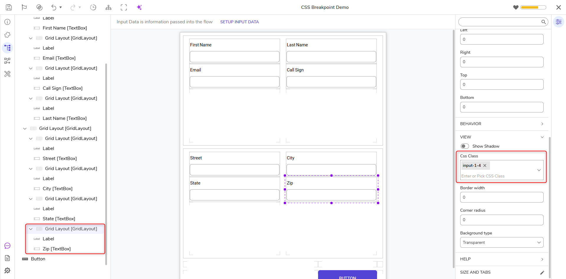
Debug
- Save and exit the Form Designer to return to the Flow Designer.
- At the top right of the workspace, select the Configure Integration drop-down menu. Under Integration Type, choose User Interface. Select DONE.
- Select VIEW to open Integration Details in a separate tab in the browser.
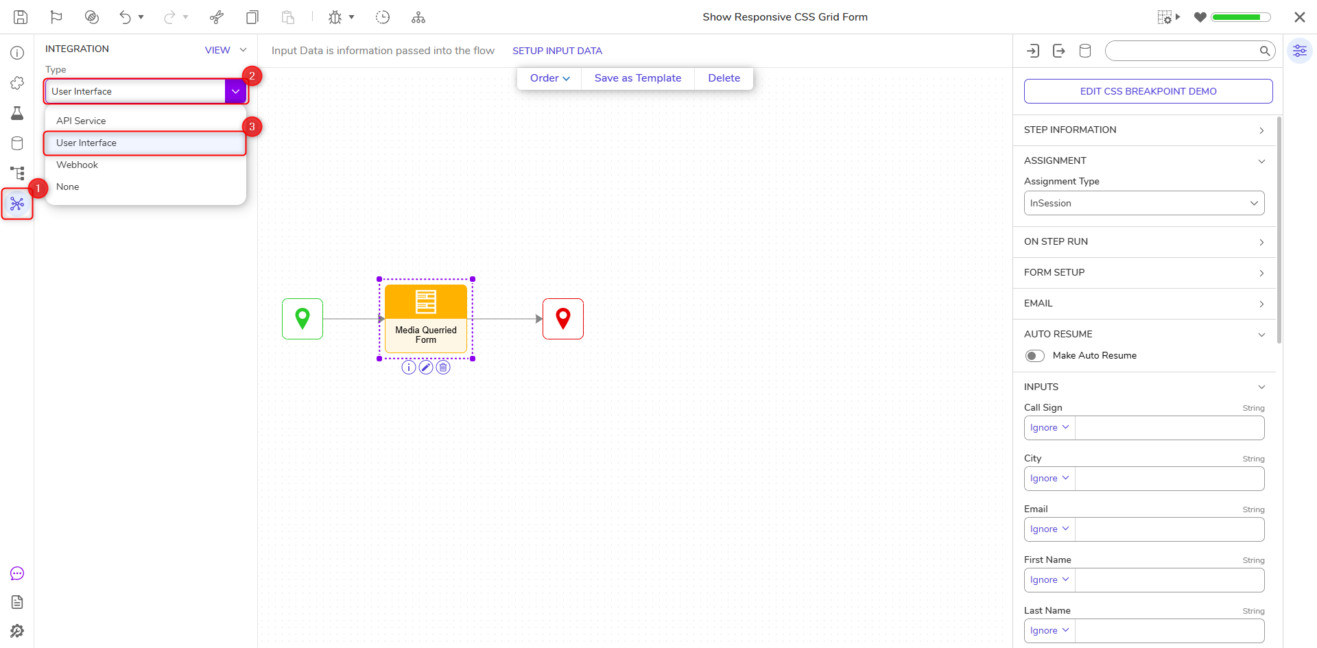
- In the top right column, select Open URL.
- When the Form opens, adjust the browser's size to ensure the CSS works as expected.
Examining the Example CSS
The main blocks are the @media screen blocks.
The first @media screen declares card grid styles for when the screen size is 800 pixels or above.
The second @media screen redefines the CSS Grid positions for the class names associated with those elements on screens below 800 pixels. This will override the original styles created by the Form Designer.
The grid-column and grid-row define the start and end cells of the CSS for each element. Since they are defined by CSS for GridLayout, elements can be modified by CSS.
@media screen and (min-width: 800px)
{
.outer-grid .card-grid
{
border: solid 1px rgba(0, 0, 0, 0.15);
box-shadow: 2px 2px 2px rgba(0, 0, 0, 0.3), 0px 3px 9px rgba(0, 0, 0, 0.2);
}
}

@media screen and (max-width: 799px)
{
.outer-grid
{
padding: 0 0 15px !important;
/* remove outer margin on three sides */
row-gap: 0 !important;
/* remove gutters between the cards */
width: auto !important;
/* allow form to shrink below designed width */
}
.outer-grid .card-grid:nth-child(odd)
{
border-top: solid 1px rgba(0, 0, 0, 0.3);
/* add a border where the row gap gutter was */
}
 .outer-grid .card-grid
{
/* Change to 1 column, 8 rows */
grid-template-columns: auto !important;
grid-template-rows: 92px 92px 92px 92px !important;
}
/* .input-1-1 {} nothing to define for 1-1. The configured behavior is the same. */
.input-1-2
{
/* Moves to column 1, row 2 of the grid */
grid-column: 1 / 2 !important;
grid-row: 2 / 3 !important;
}
.input-1-3
{
/* Moves to column 1, row 3 of the grid */
grid-column: 1 / 2 !important;
grid-row: 3 / 4 !important;
}
.input-1-4
{
/* Moves these to column 1, row 4 of the grid */
grid-column: 1 / 2 !important;
 grid-row: 4 / 5 !important;
}
}