Overview
Feature Details | |
Introduced in Version | 9.13 |
Modified in Version | 9.15 |
The Flex Layout is a responsive layout control that allows designers to build adaptive, cleanly aligned Forms and Pages. It enables responsive design by allowing controls to adapt automatically to both screen size and content length. Unlike traditional fixed grid layouts, Flex Layout gives designers greater control over responsiveness and alignment without needing multiple nested containers. This feature is particularly useful for Forms where labels and inputs must adapt to dynamic content, multilingual support, or varying screen resolutions. It also improves usability by reducing the need for manual grid-based adjustments.
Use Case
Flex Layout is ideal for Forms that must be responsive or dynamically aware of their content. It functions not just as a layout system, but as a behavior engine capable of adjusting to user input, data visibility, and varying screen dimensions.
| Scenario | Why Flex Works Well |
|---|---|
| Optional fields that appear/disappear based on user input. | Flex automatically reflows content when fields are shown or hidden. |
| Forms or Pages are viewed across a range of screens. | Form Controls wrap and scale based on screen width, using justify, wrap and align settings. |
| Inputs are arranged in rows with mixed sizing. | Flex supports equal width and mixed width control configurations using grow and shrink. |
| Clean vertical and horizontal alignment is required. | Flex removes the need for Grid Layouts and nested horizontal/vertical stacks. |
| Scrollable sections should grow naturally without premature scrollbars. | Flexible height settings with min/max ensure scrollbars only appear when needed. |
| The design must support multilingual deployments. | Flex can accommodate longer labels and text without breaking the layout. |
Attached Labels
Additionally, the Attached Labels enhancement introduced in v9.11, provides automatic label placement for input controls, speeding up Form design and ensuring consistent alignment, especially when used with Flex Layout.
When a control (such as a Text Box or Dropdown) is added to a Form:
- The designer is prompted to set both a Label and Data Name via the Quick Add dialog.
- The label is automatically attached to the control and placed according to the selected or default placement setting (e.g., Top, Left).
- There is no need to drag in a separate Label control or manually align it with the input.
This is optimized for Flex Layout, where label and control stay grouped and adjust predictably during resizing or wrapping.
Flex Configuration
Flex Layout Properties
The Flex Layout in Decisions currently uses horizontal (row) direction only. Flex direction cannot be changed.
Properties | Description | Use When | Example | |||
|---|---|---|---|---|---|---|
Flex Setup | --- | --- | ||||
Columns | Defines the number of virtual columns used for layout distribution. Controls can span across these columns. Default is 12. | --- | --- | |||
Height Type | Specifies how the Flex Layout container handles vertical sizing, fixed or flexible values. | --- | --- | |||
Fixed | Sets a constant height for the layout container in pixels. | --- | --- | |||
Fixed Height (px) | Defines the pixel value of the fixed height. | --- | --- | |||
Flexible | Allows the height of the container to adjust based on content. | --- | --- | |||
Min Height (px) | Sets the minimum height the container can shrink to. | --- | --- | |||
Max Height (px) | Sets the maximum height the container can grow to before adding scrollbars. | --- | --- | |||
Position Children | Controls how child components behave within the layout, including whether they wrap to new rows and how they are aligned and spaced. | --- | --- | |||
Allow Wrap | Determines if child controls should wrap onto the next row when there is insufficient space. If set to 'False', items will not drop to the next line, they will overflow or compress, depending on child shrink settings. | Use when the number or size of child controls may exceed available horizontal space. |  | |||
Justify Content | Determines how child elements are distributed horizontally. | --- | --- | |||
Left | Aligns items to the start of the main axis (left). | Use for left/top-aligned content where items should not spread out. | 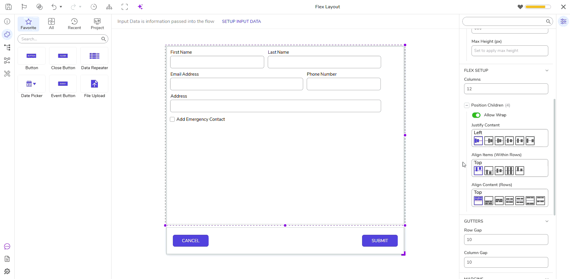 | |||
Right | Aligns items to the end of the main axis (right). | Use when items should align to the right or bottom of the container. | ||||
Center | Centers items horizontally. | Use for symmetrical layout where centered alignment is desired. | ||||
Space Evenly | Distributes items with equal space between and around them. | Use when aligning first and last items to the edges is important. | ||||
Space Around | Distributes items with equal space around each. Outer spacing is half the size. | Use when visual balance and even gaps around each item is desired. | ||||
Space Between | Distributes items with equal space between them, but no space at edges. | Use when consistent spacing throughout is important. | ||||
Align Items (Within Rows) | Controls how child components are aligned vertically within a row. | --- | --- | |||
Top | Aligns child items to the top of each row. | Use for top-aligned or default layout alignment. | 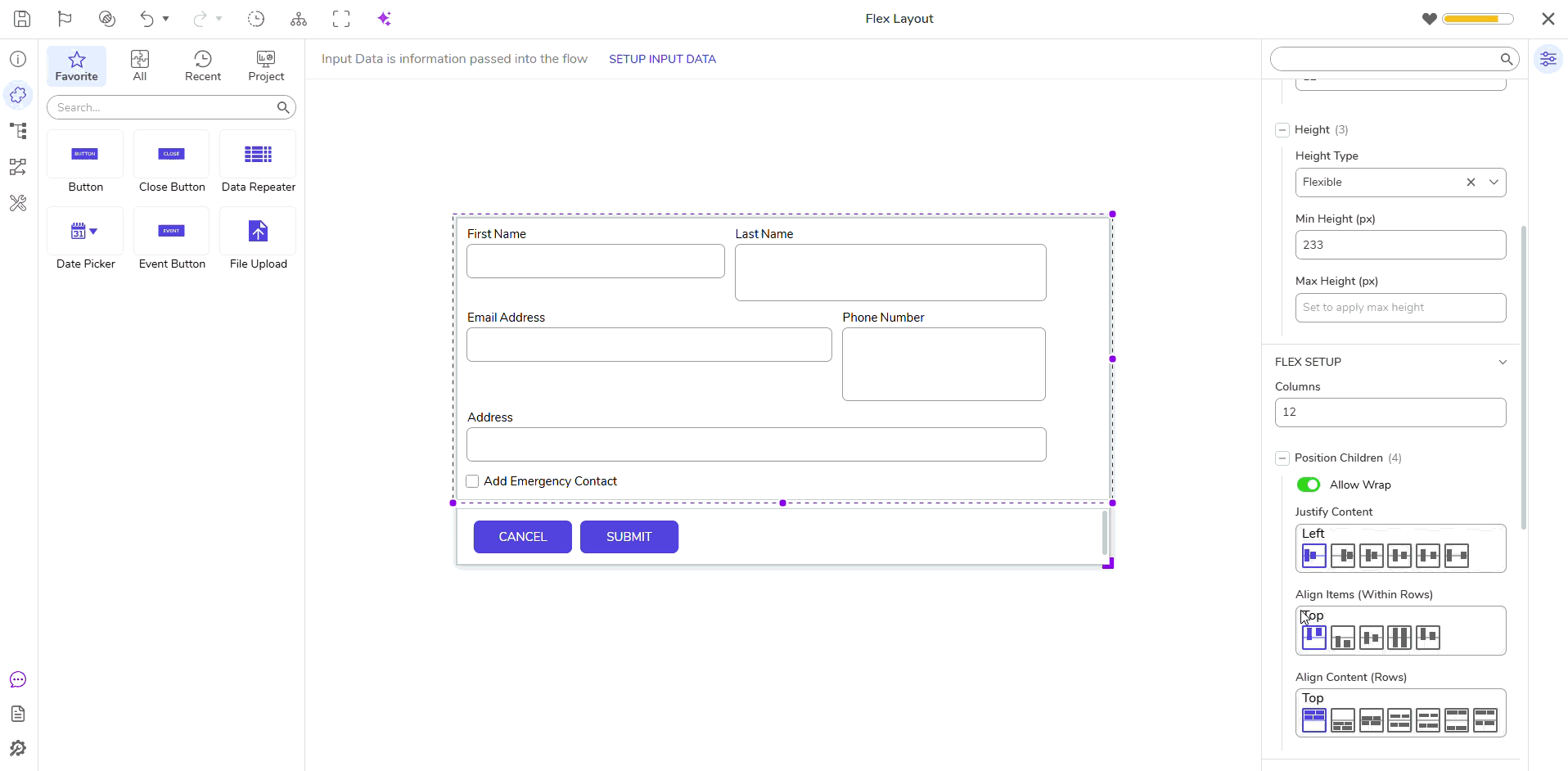 | |||
Bottom | Aligns child items to the bottom of each row. | Use when aligning items to a bottom edge of the container. | ||||
Center | Aligns child items to the vertical center of the row. | Use for balanced vertical alignment within each row. | ||||
Stretch | Stretches child items to fill the height of the row. The height of the row is determined by the maximum height of the tallest control within the row. This is most noticeable when a growing control like a multi-line text box or multi-select dropdown is placed beside fixed-height fields. | Use when uniform height is needed for a clean, grid-like appearance. | ||||
Baseline | Aligns items according to their text baselines. | Use when text alignment across multiple controls is a visual priority. | ||||
Align Content (Rows) | Manages vertical alignment and spacing of all rows within the Flex Layout container, impacting overall flow and structure. | --- | --- | |||
Top | Aligns rows to the top of the container. | Use for top-aligned multi-row layouts. | 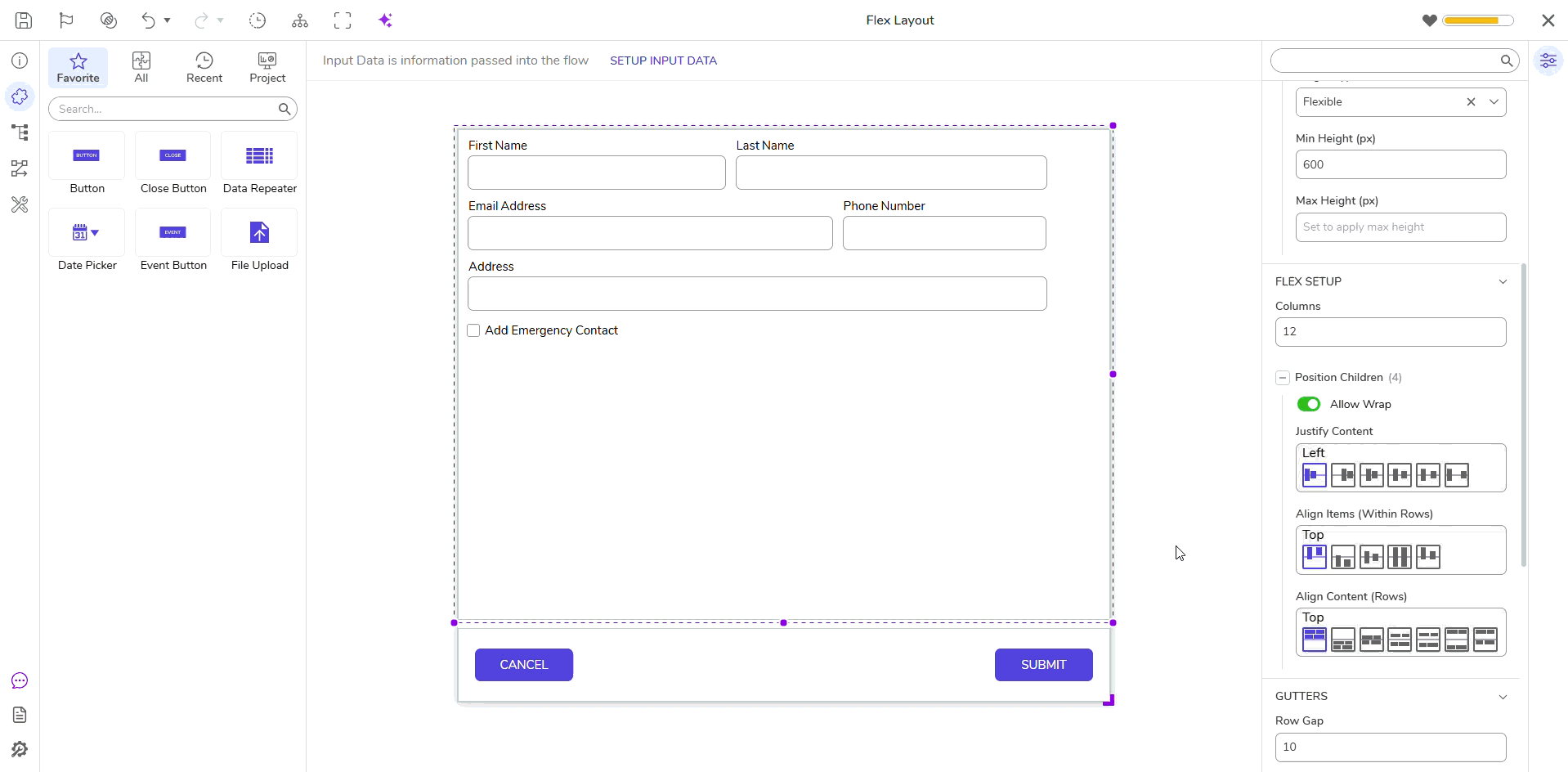 | |||
Bottom | Aligns rows to the bottom of the container. | Use to anchor content to the bottom of the available vertical space. | ||||
Center | Centers rows vertically in the container. | Use for vertically centered content in multi-row layouts. | ||||
Space Evenly | Distributes rows with equal spacing above, between, and below. | Use when perfectly uniform spacing is desired. | ||||
Space Around | Adds equal spacing above and below each row. | Use for soft visual separation of rows with consistent padding. | ||||
Space Between | Distributes rows evenly from top to bottom with no extra space at the edges. | Use when full vertical space should be used efficiently. | ||||
Stretch | Stretches rows to evenly fill the vertical space available. | Use when you want to fill all available vertical space without gaps. | ||||
Child Control Properties
| Properties | Description | Use When | Example | ||||
|---|---|---|---|---|---|---|---|
| Flex Size > Width | |||||||
Width Type | Defines how a control’s width is calculated within the Flex Layout container. Choose from column-based, fixed pixel values, or flexible widths that grow/shrink based on available space. | --- | 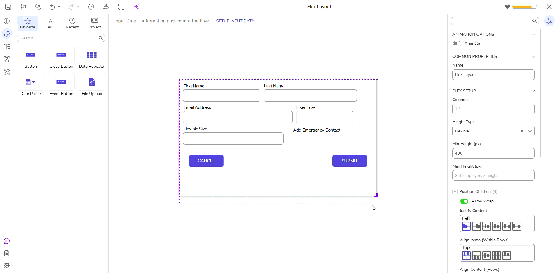 | ||||
Column | Uses Flex Layout columns to determine control width. Set how many columns the control should span. | Use when you want to control layout width with proportional spans across the row. | |||||
| Columns | Specifies the number of columns (out of the layout's total) the control should occupy. | --- | |||||
Fixed | Sets an exact width for the control in pixels. | Use when the size must remain constant regardless of container width. | |||||
| Width (px) | Defines the fixed width value when “Fixed” width type is selected. | --- | |||||
Flexible | Allows the control width to adapt dynamically within the available space, using a base width and optional grow/shrink factors. | Use when controls should scale with container or adjust with layout. | |||||
| Base Width (px) | The default starting width of the control before growth or shrink is applied. | Use when you want a predictable starting size that can expand or contract. | |||||
| Min & Max Widths | |||||||
| Min Width (px) | Optional: Defines the minimum width the control can shrink to. Can be used with Shrink Ratio to prevent the control from becoming too small under layout constraints. | Use when the control should not shrink below a certain size, even in tightly constrained layouts. | |||||
| Max Width (px) | Optional: Defines the maximum width the control can grow to, even if extra space is available. | Use when you want to limit how large a control can become when space is abundant. | |||||
| Grow & Shrink Ratios | |||||||
Grow Ratio | Determines how much a control can expand when extra space is available, relative to sibling controls. Grow lets a control expand to fill extra space. Controls with equal grow values divide extra space evenly. A Grow of 2 will get twice as much extra space as a sibling with Grow = 1. | Use when control should consume available space relative to siblings. | |||||
Shrink Ratio | Determines how much a control can contract when space is constrained, relative to sibling controls. Shrink allows it to compress when space is limited. Controls with equal shrink values reduce their width proportionally when space is limited. A Shrink of 2 will contract twice as much as a sibling with Shrink = 1. | Use when control should reduce size under layout pressure. | |||||
| Flex Size > Height | |||||||
Height Type | Controls the vertical sizing of a control. Height can be set to a fixed pixel value or allowed to expand/shrink with content using flexible options. | --- |  | ||||
Fixed | The control maintains a constant height regardless of content. | Use when the height must remain consistent, such as for buttons. | |||||
| Height (px) | Defines the specific height in pixels when using fixed height. | --- | |||||
Flexible | Enables the control to grow vertically based on content. | Use for content that grows (e.g., text areas or dropdowns). | |||||
| Min Height (px) | The minimum height of the control. | Use when the layout should not collapse below a readable or usable height. | |||||
| Max Height (px) | The maximum height the control can grow to. When exceeded, the control becomes scrollable. | Use to cap the growth of expanding controls like text areas. | |||||
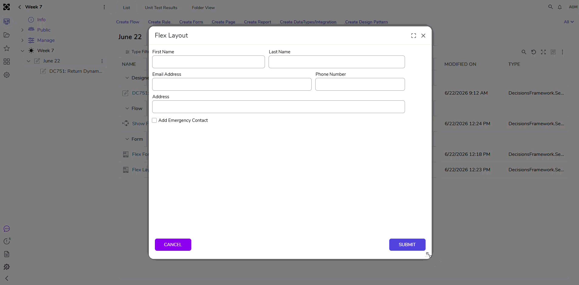
Build a Responsive Form Using Flex Layout
This example Form demonstrates how the Flex Layout responds to user interaction and screen resizing. It showcases dynamic control visibility (fields that appear/disappear based on user input), consistent alignment across varying control sizes, section-based grouping using Header Containers, and flexible controls that expand or wrap as needed. The below file contains the elements created in this example.
- Start with a Flex Layout Form
- Open a new Form.
- In Explorer > Surface, set the Container Type to Flex Layout.
- Remove any existing Grid Layouts from the surface.
- Note: In future versions, Flex will be the default layout.
- Add a Button Panel
- Add a nested Flex Layout to act as the button row.
- Width Type: Column (12)
- Height Type: Fixed (60px)
- Justify Content: Space Between
- Add two Button controls:
- Labels: “Cancel” and “Submit”
- Width: Flexible (Base: 120px, Grow: 0, Shrink: 1)
- Height: Fixed (36px)
- Add a nested Flex Layout to act as the button row.
- Add Name Fields
- Add Text Boxes for: First Name, Middle Initial, and Last Name.
- Set Flex properties:
- First Name: Flexible (Base: 200px, Grow: 1, Shrink: 1)
- Middle Initial: Fixed (80px)
- Last Name: Flexible (Base: 300px, Grow: 2, Shrink: 1)
- Add Preferred Name Option
- Add a Checkbox labeled “Preferred Name?”
- Width: Column (12)
- Add a Text Box labeled “Preferred Name”
- Width: Flexible (Base: 250px, Grow: 1, Shrink: 1)
- Initially Visible = False
- Toggle visibility using an Active Form Flow linked to the checkbox
- Add a Checkbox labeled “Preferred Name?”
- Add Contact Information
- Add Text Boxes:
- Email: Flexible (Base: 280px, Grow: 2, Shrink: 1)
- Phone: Flexible (Base: 220px, Grow: 1, Shrink: 1)
- Add a Checkbox: “Do you have another number?”
- Width: Flexible (Base: 280px, Grow: 2, Shrink: 1)
- Add Secondary Phone Number Text Box
- Width: Flexible (Base: 220px, Grow: 1, Shrink: 1)
- Initially Visible = False
- Show/Hide via Active Form Flow based on "Do you have another number?" checkbox
- Add Text Boxes:
- Add Address Section
- Add a Flex Layout inside a Header Container.
- Add address fields:
- Street: Column (12)
- City: Flexible (Base: 200px, Grow: 1, Shrink: 1)
- State: Fixed (100px)
- Add a Checkbox: “Have you moved in the last 12 months?”
- Width: Column (12)
- Add previous address fields (Initially Visible = False):
- Street: Column (12)
- City: Flexible (Base: 200px, Grow: 1, Shrink: 1)
- State: Fixed (100px)
- Show/Hide via Active Form Flow based on "Have you moved?" checkbox
- Add Emergency Contact Section
- Add a Checkbox labeled “Add Emergency Contact?”
- Width: Column (12)
- If checked, reveal:
- Header Container with Flex Layout
- Width: Column (12); Height: Flexible (Min: 50px, Max: 100px)
- Multi-Select Dropdown:
- Width: Column (12); Height: Flexible (Min: 50px, Max: 100px)
- Grows with selections; scroll appears after 100px
- Add a Checkbox labeled “Add Emergency Contact?”
Debug
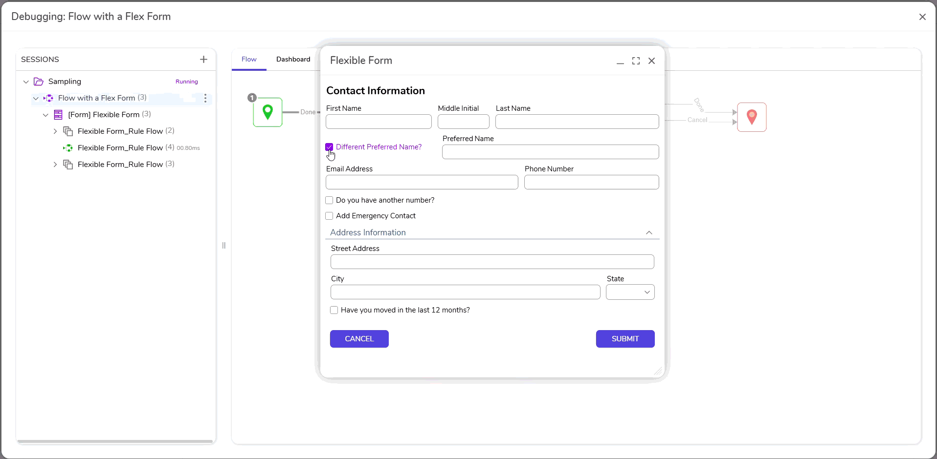
To validate the responsive behavior of the Flex Layout Form, run a Flow containing the Form and interact with it in a variety of ways. Resize the window to see how fields grow, shrink, and wrap automatically. Toggle checkboxes to reveal or hide sections such as Preferred Name, Secondary Phone, or Emergency Contact. These dynamic changes cause surrounding controls to reposition. This confirms that grow, shrink, and wrap properties are functioning as expected.
Best Practices
| Guidance | Details |
|---|---|
| Start with a plan. | Define how many columns the layout needs before building. 12 is the default and works well for most use cases. |
| Use Flexible width settings to allow responsiveness. | Apply Grow and Shrink ratios thoughtfully to distribute space proportionally across inputs. |
| Stretch for clean alignment. | When Align Items is set to Stretch, rows will align to the tallest control, which is useful for consistent vertical alignment. |
| Label placement affects layout. | Labels placed on the Left or Right should account for additional horizontal space. Adjust column spans or enable Flexible Label Width as needed. |
| Use nested Flex Layouts for control groups. | For form sections with internal structure (e.g., Name or Address blocks), nesting a child Flex Layout helps manage alignment and spacing. |
| Combine Column and Flexible widths. | Mixing column and flexible width types can balance layout precision with adaptability. |
| Use Attached Labels for accessibility | Ensures labels are associated with inputs and adjust with layout. |
| Avoid setting all Shrink values to 0. | Controls with Shrink = 0 will not contract when space is limited, which can break the layout or cause overflow. |
| Mixing Fixed and Flexible Heights can cause uneven rows. | Use Stretch alignment or match height strategies to prevent uneven rows. |
| Columns do not add spacing automatically. | Add margin and/or gap values to separate controls, especially when using full-width settings. |
| Avoid setting all Grow values to 0. | When no control is allowed to grow, available space will not be distributed, and controls may not align evenly. |
| Scrollbars may not appear when expected. | If Max Height is not configured on a flexible height control, the container may continue to grow rather than trigger a scrollbar. |
| Avoid over-nesting Flex Layouts | Excessive nesting can make the Form harder to manage. Only nest when alignment (e.g., Align Items, spacing, or wrapping) differ meaningfully from the parent layout. |
Templates
The below file contains Template Forms that utilize Flex Layout. After importing, open each template in the Form Designer and preview in runtime to observe responsiveness.
| Name | Description | Screenshot |
|---|---|---|
| Header + Body Footer Flex Layout | A vertically stacked layout with fixed-height header and footer, and a flexible scrollable content area in the middle. Great for full-screen forms with persistent action buttons. | 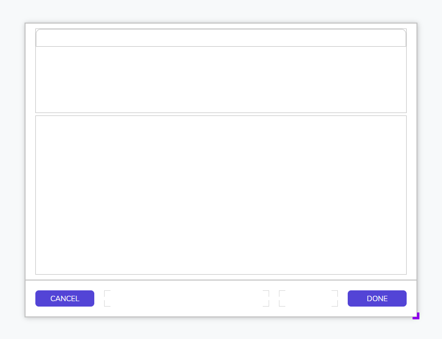 |
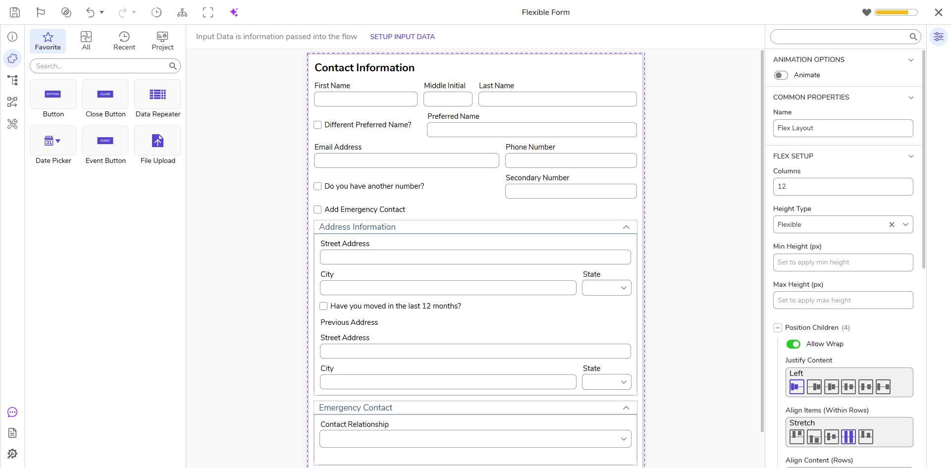
| Header Sections with Nested Flex Layouts | Divides the form into visually distinct sections (e.g., Name, Contact, Address), each with its own nested flex layout. Ideal for long forms that benefit from modular groupings and responsive behavior. | 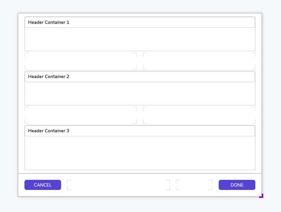 |
| Two Column Flex Layout | A classic form layout with two even columns that wrap on smaller screens. Great for standard data entry forms with side-by-side inputs (e.g., First/Last Name, Email/Phone). | 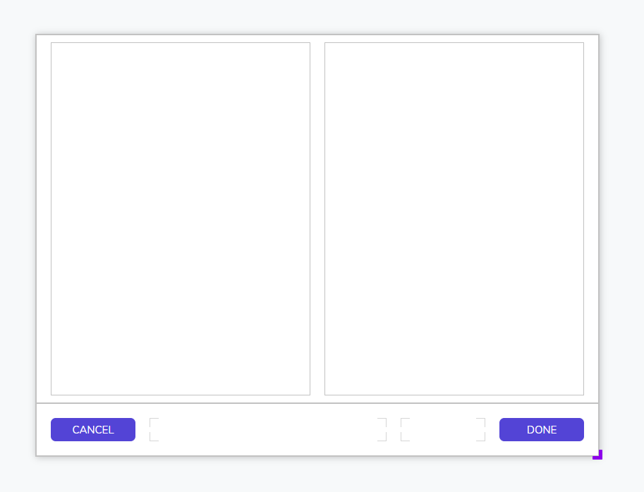 |
Feature Changes
| Description | Version | Release Date | Developer Task |
|---|---|---|---|
Flex Layout for Normal Forms | July 2025 | [DT-043602] | |
| Flex Layout for Pages | September 2025 | [DT-045121] |