Responsive Containers and Grids
- 30 Oct 2023
- 2 Minutes to read
- Print
- DarkLight
Responsive Containers and Grids
- Updated on 30 Oct 2023
- 2 Minutes to read
- Print
- DarkLight
Article summary
Did you find this summary helpful?
Thank you for your feedback
Feature Elimination
As of version 8.13, this feature has been deprecated and subsequently removed from the platform. It is no longer supported, and users are advised to avoid its usage.
Overview
Responsive Containers help the Designer define the width, length, height, and size of Layout and/or control sections on a Form.
Designers can drop more than one Responsive Container on a Form, and, because it is responsive, it will automatically adjust to fit the screen. When adding a container to the Form, each container will have its own section that can be edited to configure the Form.
Responsive Containers can be added by either changing the Form's Surface Container Type to Responsive or by adding the Responsive Grid found via Toolbox > Layouts.
When you resize your Form, the Responsive Containers shifts dynamically as the device changes. If the Form is displayed side by side on a computer screen and then opened in a mobile phone, the Form will shift changing the Responsive Containers to display vertically instead of horizontally.
Configuration
In contrast to other Layouts which focus on moving and editing controls, Responsive Containers specifies where to place and resize controls as well as Layouts via the Sections settings.
The Sections settings contains a list of all of the Layout/controls residing in the Responsive Grid. If the control/Layout's size is small enough, it will move beside the another; however, if the control/Layout's size is too large, the it will move to the next row below.
The Margins setting grants pixel space between the Layout/control if present at all.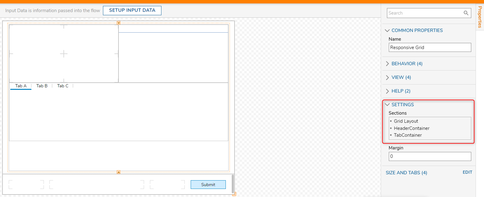
The Margins setting grants pixel space between the Layout/control if present at all.

Once a Layout/control populates the Section setting, the Layout/control may be moved up and down the arrangement with its respective arrows or edited by hovering over the Layout and selecting the pencil icon. This will open the Edit Sections window.
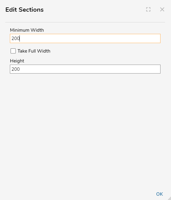
| Setting Name | Default Value | Description |
|---|---|---|
| Minimum Width | 200 | Sets the minimum width of the Layout/control section. |
| Take Full Width | False | Toggles if the Layout/control section expands to the width of the Responsive Container. Enable this to give this Layout section its own 'row'. |
| Height | 200 | Sets the minimum height of the Layout/control section. |
Example
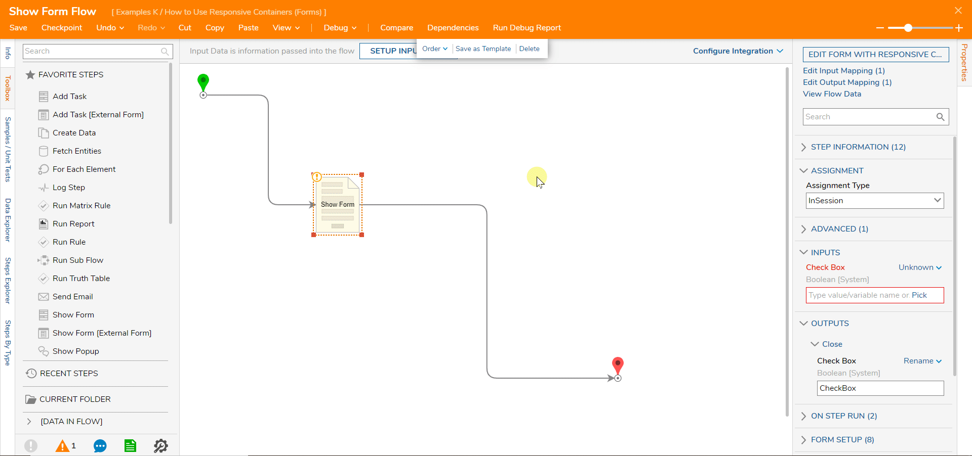
- Begin with creating a new Flow in the Designer Folder. Name the Flow and select CREATE to proceed.
- Add a Show Form step, select the PICK OR CREATE FORM button, and build a new Form.
- Select Explorer in the left panel. Select Surface. In its Properties > Layout panel, choose Responsive as the Container Type.
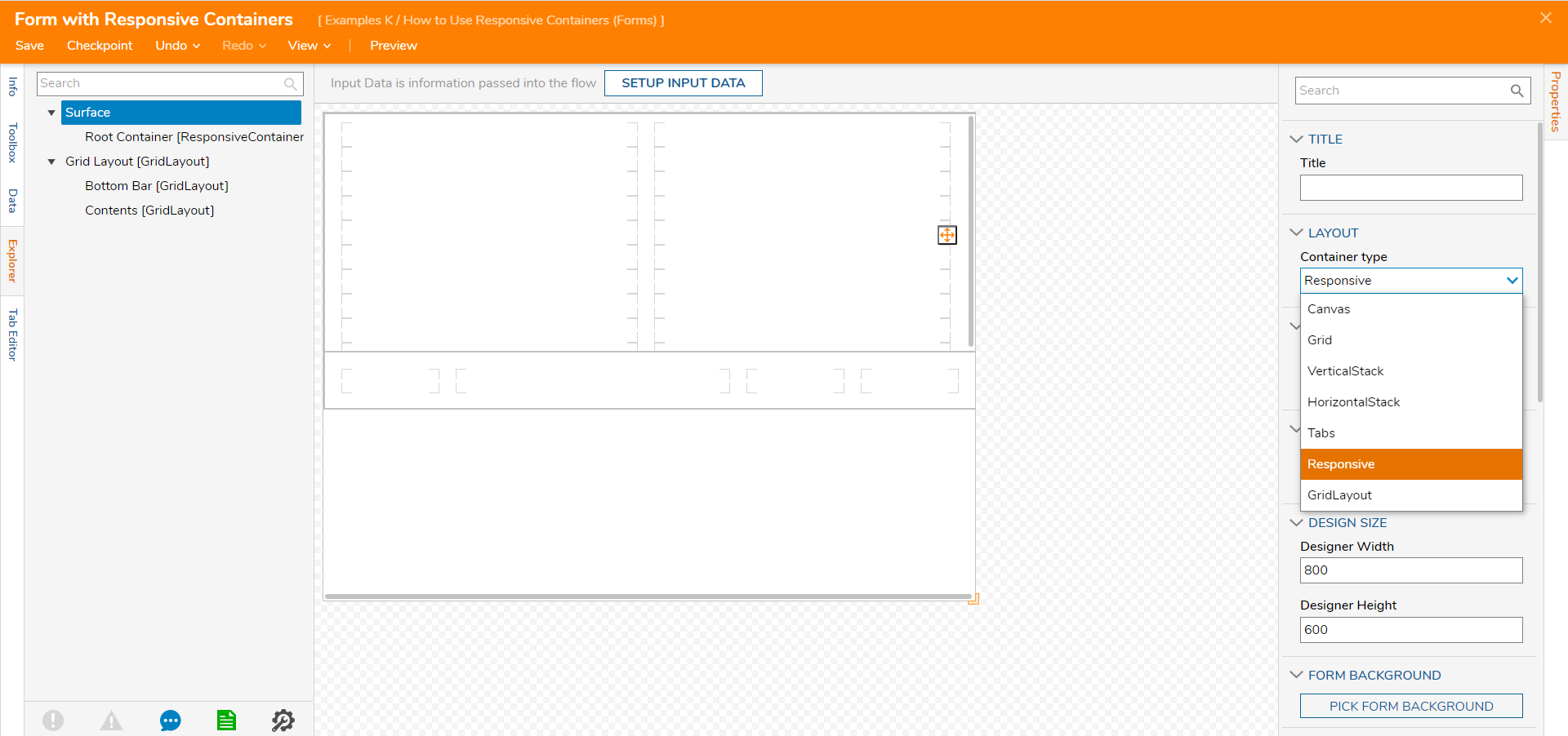
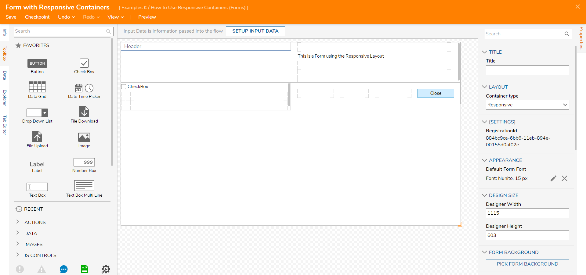
- Add multiple Layouts to create the Form. This example adds a Header Container, three Grid Layouts: one with a Label, one with a Check Box, and one with a Button.
- Select Explorer in the left panel. Select Root Container[ResponsiveContainer].
- Open the Responsive Container's Properties and navigate to Settings > Sections. All of the Layouts and Containers added to the Form are listed and available to edit their order, size, and if the layout will take up the full width of the Form.
- Save and close the Form Designer.
.png)


.png)
Debug
- In the Flow Designer, select Debug.
- In the Debugger, the Form will display, resize the Form to see the Responsive behavior.

Feature Changes
| Description | Version | Date | Developer Task |
|---|---|---|---|
| Removed the Responsive Containers and Grid Layout | 8.13 | August 11, 2023 | [DT-038308] |
Was this article helpful?