Overview
A Pie Chart is a graphical demonstration of "parts per whole" relationships through division of a circle (pie) into separate slices for an at-a-glance comparison between the pieces. When added to Diagram Tiles, Reports, and Pages, Pie Charts provide data visually while reducing verbiage.
Similarly, Ring Charts serve the same purpose but display the data in the form of a ring, providing a more side-by-side view of the data.
The example below demonstrates how to create and use a Pie chart applied to a Diagram Tile on a Page in Decisions.
Pie Charts
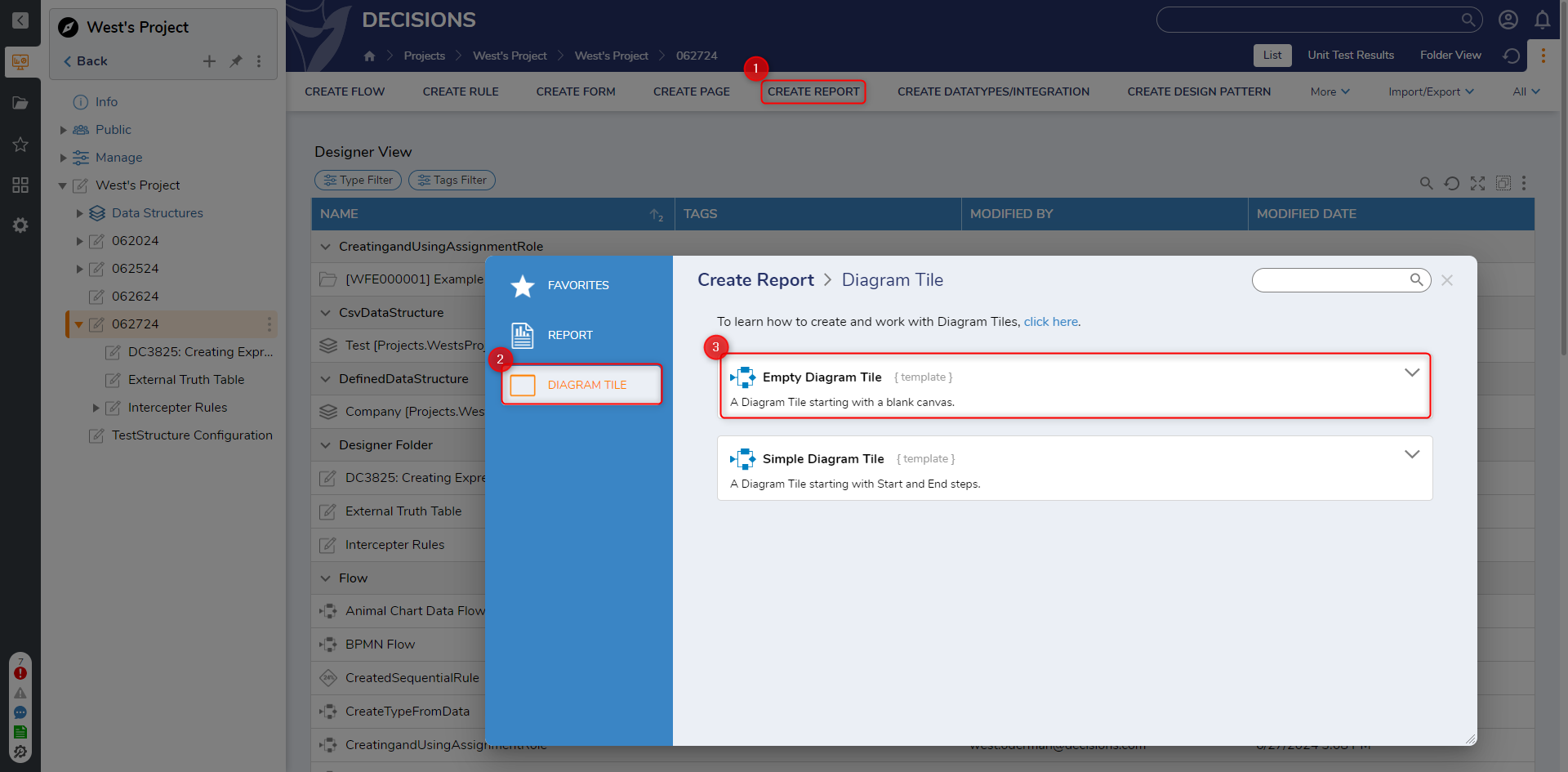
- In a Designer Project, and select the CREATE REPORT button on the Global Action Bar. Select Diagram Tile > Empty Diagram, provide a Name, then click CREATE.
- From the Toolbox tab under CHARTS, add a Pie chart to the design space.
- Navigate to the Properties tab; under CHART SETUP > ChartType, click the drop down arrow for ChartType and select Multiple Values. This ChartType allows the ability to input more than three values on the chart. Under SeparatorColor, select the Edit icon then PICK the desired Color.
Once a color has been selected, set both ShowLabel and ShowValue to OnSlice. If desired, change the Color for the Label on slice via Label Color on Slice.The Advanced properties drop-down of the Pick Color panel allows users to adjust the separator's opacity. This is adjusted via a slider that alters the amount of opacity.
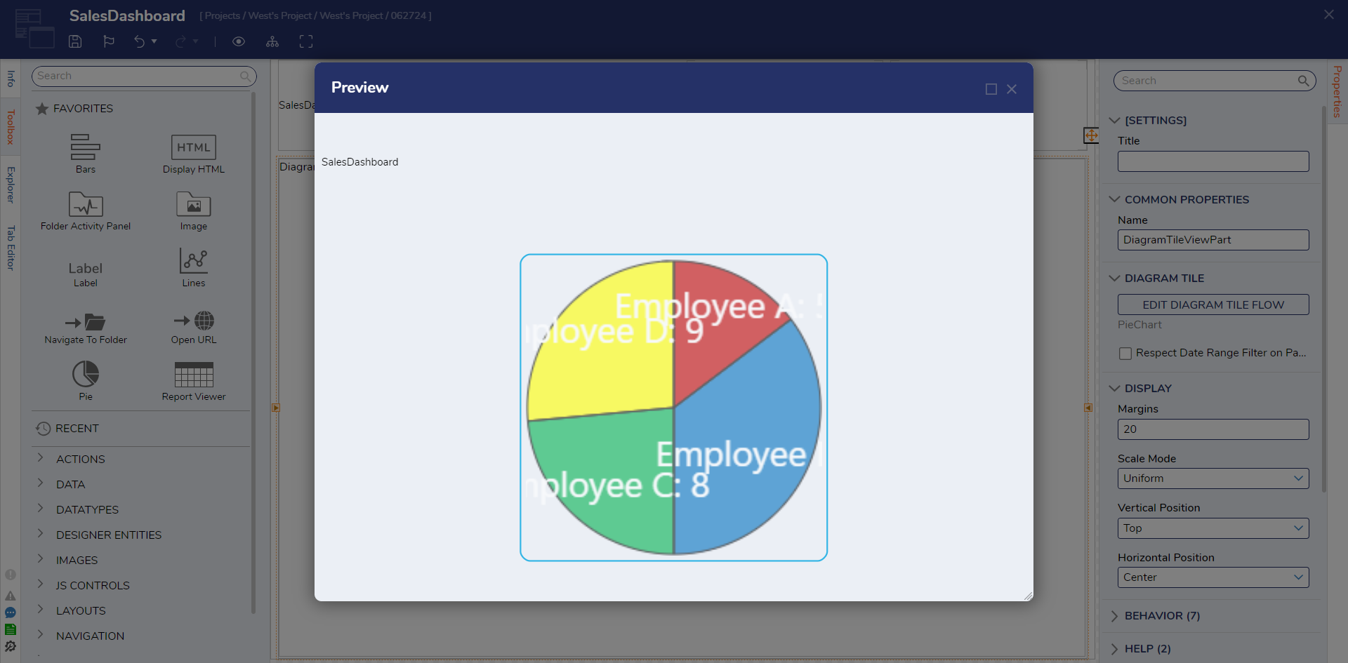
The OnSlice option will display the configured value on the Pie chart slice rather than beside it. This helps reduce ambiguity about the amount of each value on the chart.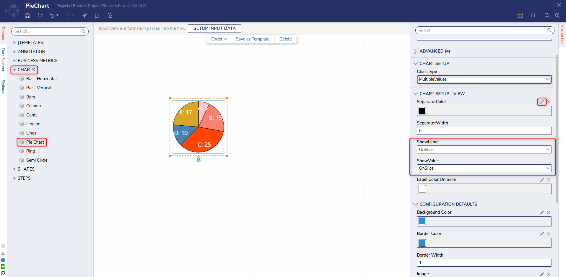
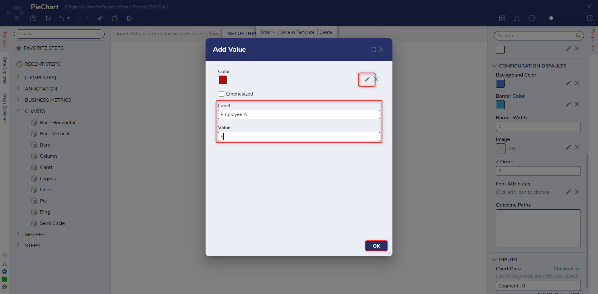
Scroll down to INPUTS > Chart Data; change the mapping to Constant then click ADD. From the Add Value screen, PICK the desired slice Color. Provide the Label "Employee A"; under Value, input the corresponding numerical value. For this example, input "5". Once configured, click OK.
Repeat the process 3 more times for Employee B, C, D. Set their respective Values as "12, 8, and 9."
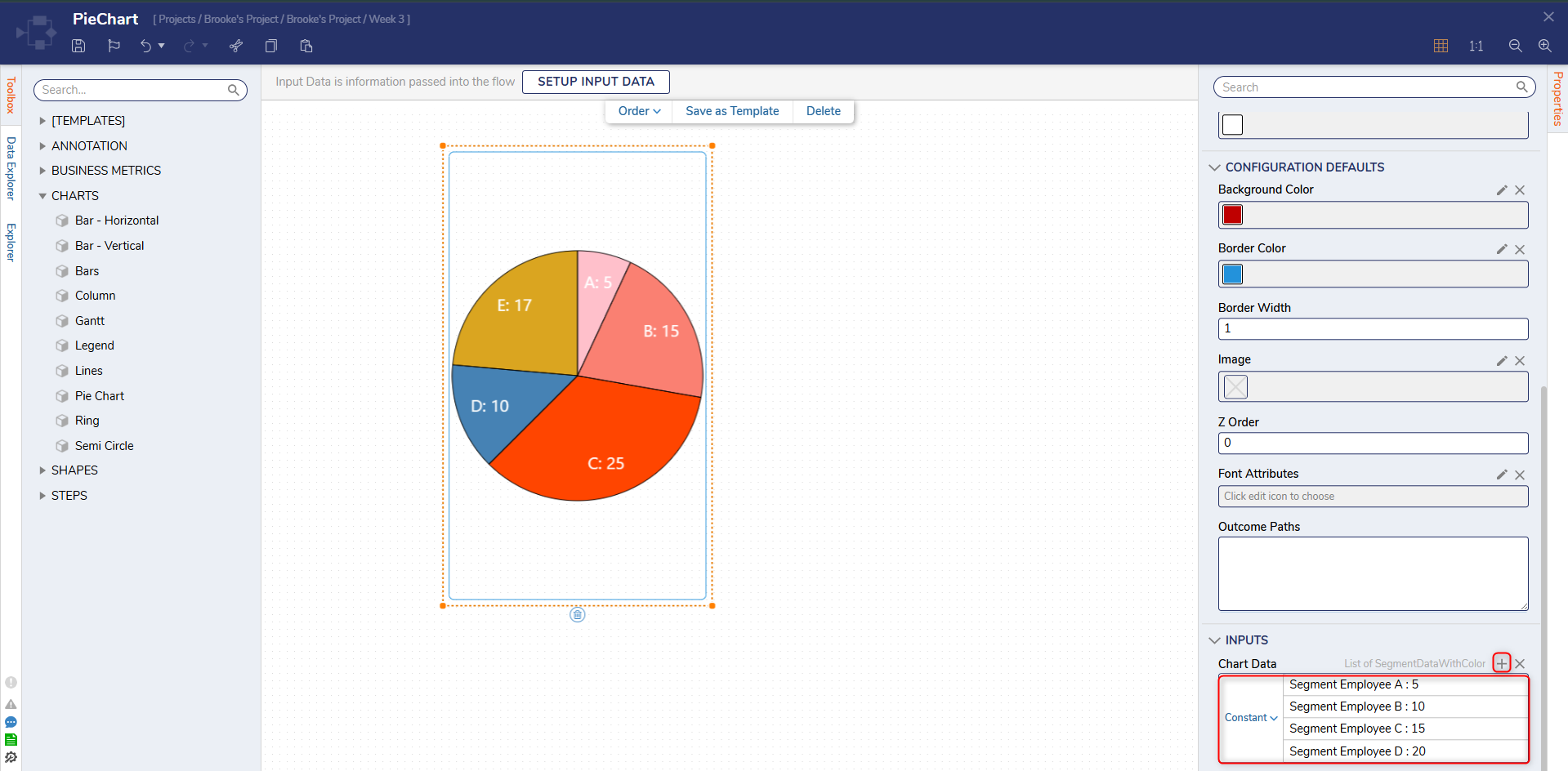
Once configured, Save the Diagram Tile, then close via X.
Either open the associated Dashboard Page, or create a new one.
For more information regarding Dashboard Pages, see Create a Page and Dashboard.From the Page Designer, navigate to Toolbox > TILES > [SELECT TILES] > [CURRENT FOLDER], and drag the Diagram Tile onto the Page.
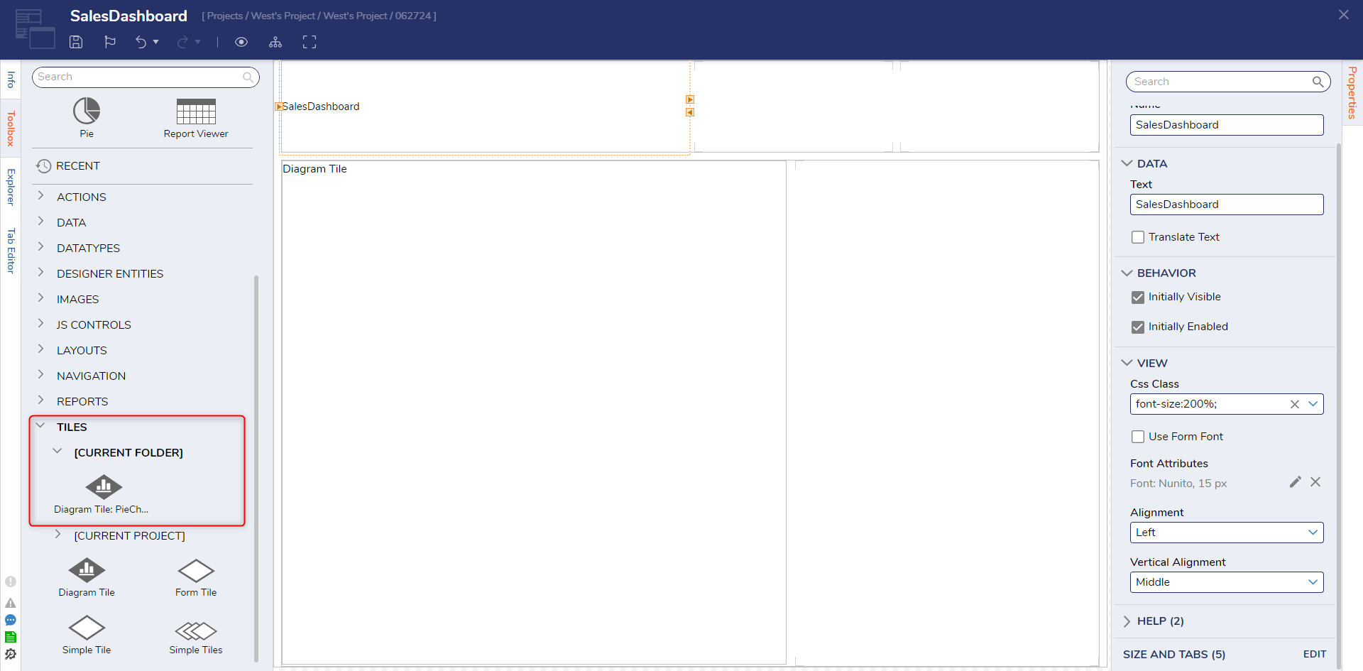
Once the Tile is added and the Page is configured as desired, Save the Page, then click Preview to view the Page and the Pie Chart.
Pie Settings
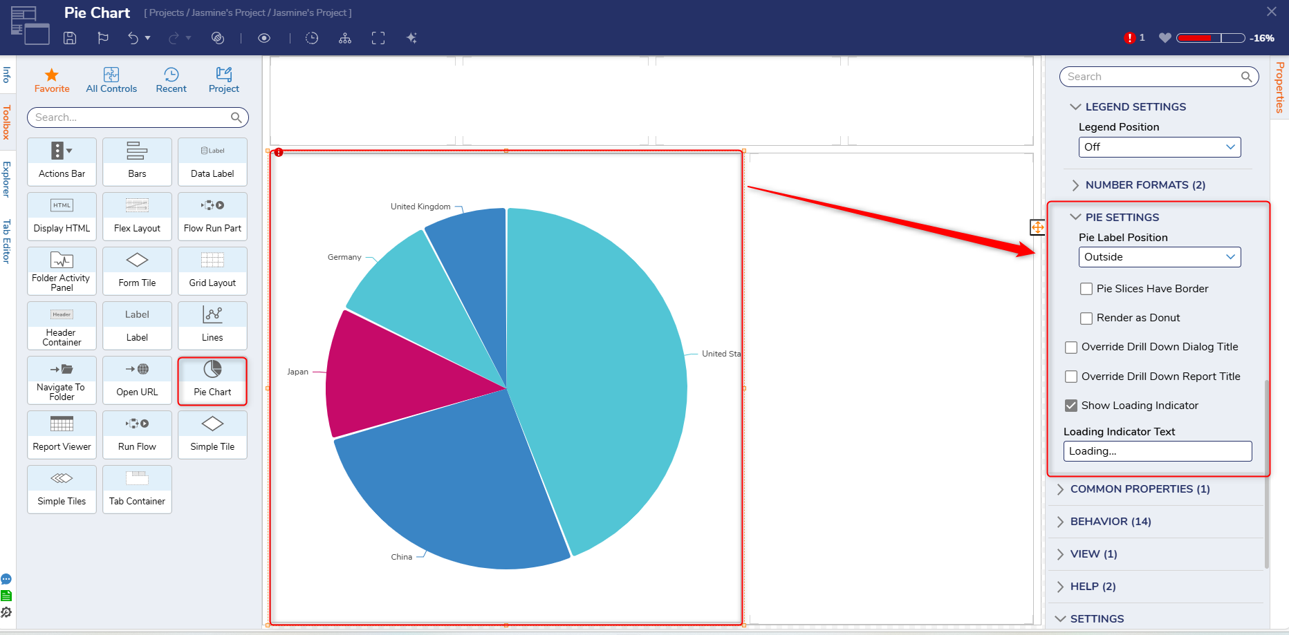
The Pie Settings category will be displayed whenever Users create or select a Pie Chart on a Page, and include the following settings:
| Setting Name | Description |
|---|---|
| Pie Label Position | Allows Users to select whether the pie label position will be on the inside or outside. |
| Pie Slices Have Border | Allows Users to select whether pie slices will have a border. |
| Render as Donut | Allows Users to select whether the pie chart should be in the shape of a donut instead of a circle. |
| Override Drill Down Dialog Title | Allows Users to override the Drill Down Dialog Title. |
| Override Drill Down Report Title | Allows Users to override the Drill Down Report Title. |
| Show Loading Indicator | Allows Users to show or hide the loading indicator. |
| Loading Indicator Text | Allows Users to specify a message for the loading indicator. |
Ring Charts
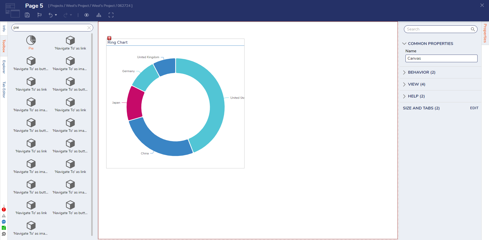
If a user wishes to display similar types of data on a Report or Dashboard Page, they may opt to use a Ring Chart instead.
Ring Charts are used the same way as Pie Charts, but display the data side by side rather than in a Pie shape. This can be beneficial as it allows the chart to take up less space, displays percentages in terms of parts of the whole circle. and allows for additional information (such as labels) to be added to the center of the circle.
Ring Charts contain the additional property RingWidth, which is used to adjust the width of each ring segment.
Editing at Runtime
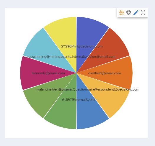
The Report that provides data to the Chart can be edited in Runtime. Hover in the right hand corner to bring up the options menu and then select the pencil icon.
Feature Changes
| Description | Version | Release Date | Developer Task |
|---|---|---|---|
| Added the option of editing charts in run time. | 9.6 | January 2025 | [DT-042443] |