Overview
A Chart is a type of Page Component that is used to graphically represent Report Data on a Page/Dashboard. Similar to other Page components, Charts can be accessed by expanding their respective Toolbox category (REPORTS > CHARTS).
When a Report is used to source a Chart, it typically contains some grouping on one of the data fields as the visual representation basis.
For example, a purchase request Report might be grouped by the State of Pending, Approved, or Denied requests. The following document demonstrates how to utilize some of the common Properties of Charts to customize Charts on a Page.
Adding Charts
- From the Page Designer, navigate to Toolbox > REPORTS > CHARTS.
- Click and drag the desired Chart option into the workspace.
- From the Properties tab of the newly added Chart, under CHART SETTINGS, provide a Title for the Chart. If desired, enable Show Title.
- Under CHART DATA > Source, PICK the desired Report. Chart Source Prerequisites
Grouping Required- Only Reports with Group By settings applied can be used as a data source for Charts. To apply Grouping:
- Open the Report in the Report Designer.
- Select a DataField and apply a GroupBy condition.
- In order for the Chart to respect a Date Range Filter applied on the Page, the underlying Report must also have a Date Range Filter.
- Charts are sourced from a single Series of data; therefore, if a Multi-Series Chart is used as the Source, users must select a specific Series via the respective Property on the Chart.
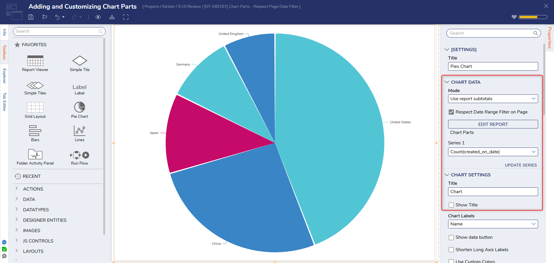
- Only Reports with Group By settings applied can be used as a data source for Charts. To apply Grouping:
Design Time Customization
The following example shows some of the methods for customizing Charts at Design Time. For this example, each Chart is sourced from a Report that utilizes and Groups a different Data Field in the Account Data Source. These are as follows:
- a Pie Chart that is grouped by Created on Date
- an Areas Chart that is grouped by Created By
- a Bubbles Chart that is grouped by Can Use Portal
- a Simple Bars Chart that is grouped by Department
To customize Charts at Design time:
- Select the desired Chart (for example Pie Chart).
- From the Chart's Properties tab, under CHART SETTINGS > Base Colors, click the Add icon. Then, PICK the desired Colors. Color PriorityAdding Base Colors to a Chart will apply the selected Colors to different sections of the Pie Chart.
Colors, including Base Colors are applied in the following order:- Series Colors - when more than one series is visible.
- User-Defined Colors - where they match particular element labels, and only one series is visible
- Base Colors - as a list applied ahead of default colors in the order of element appearance.
- The default Colors - as a repeating fallback; there is currently a set of 12 default Colors that based primarily on Decisions branding.

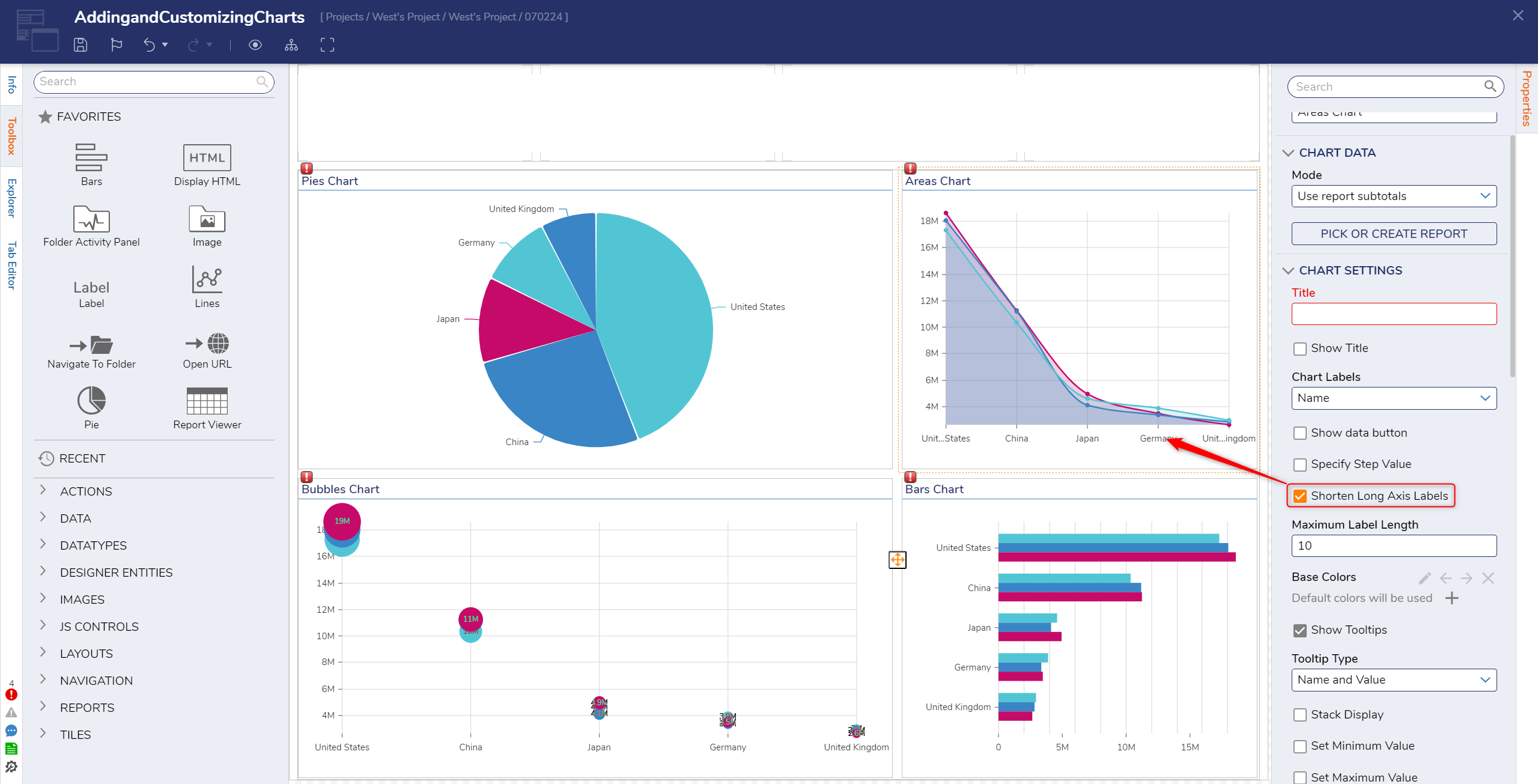
- Select the Areas Chart; from its Properties tab, under CHART SETTINGS, enable Shorten Long Axis Labels
- Under Maximum Label Length, indicate a number for the desired character length. Verify that the Axis Labels will adjust to the Maximum Length.
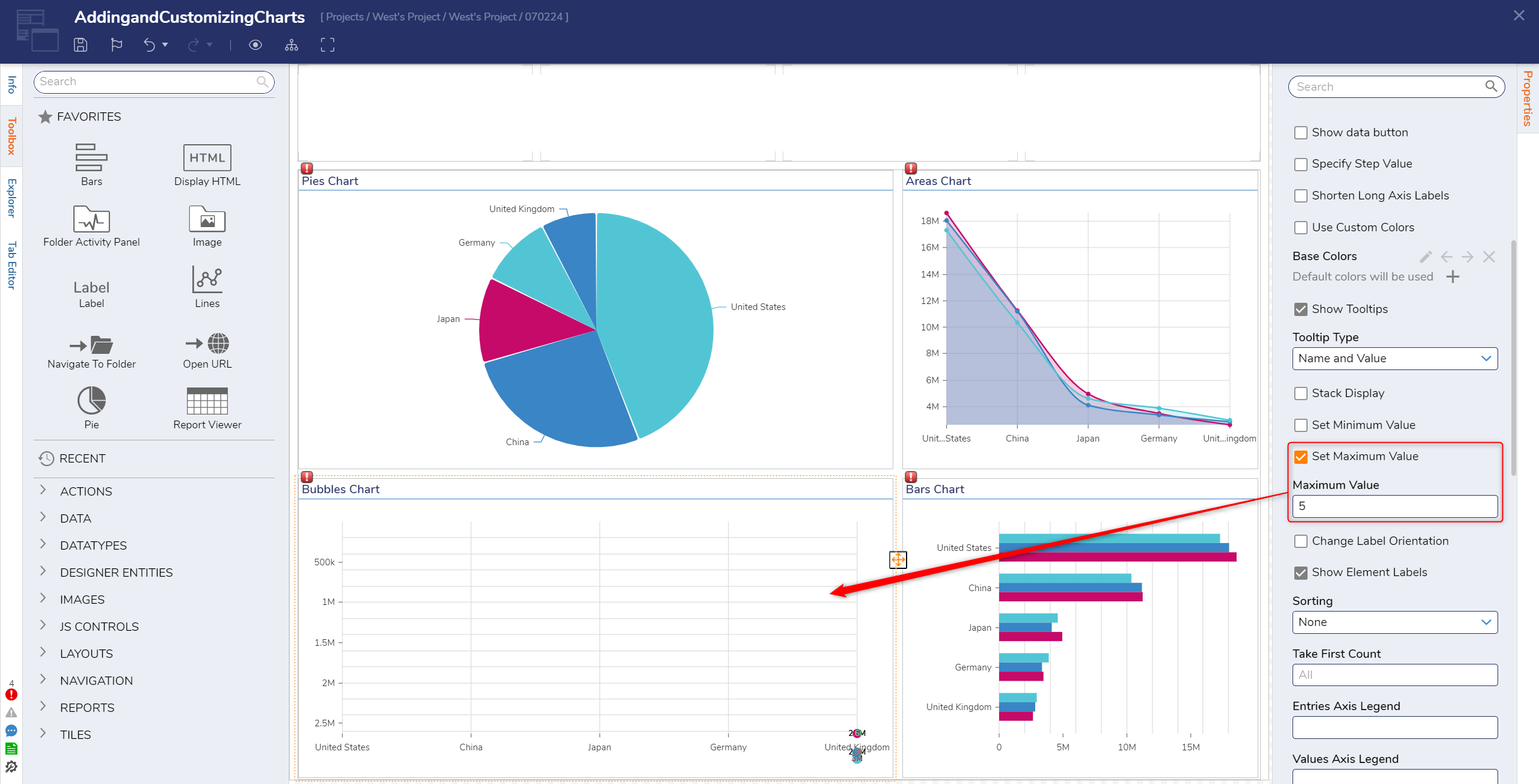
- Navigate to the the Bubbles Chart's Properties tab. Under CHART SETTINGS, enable Set Maximum Value. Then, provide the desired max numerical Value.
Runtime Editable Charts
Runtime Editable Charts are Charts that provide users additional options for customization at Runtime. Hovering over a Chart at Runtime will provide access to the Personalization icons (when applicable); when Personalization is active for a specific category, it's respective icon will display as orange.
Personalization is applied in two layers, one for managing entries/Data Filters and the other for managing the look & feel Configuration of the chart. Additionally, changes during Runtime can be applied to the Session, the current User, or All Users.
Filter Layer
The Charts Filter provides an Appearance category. From here, Labels along the non-value Axis of a Chart, as well as Series visibility, can be toggled, display Labels can be modified, and entries can be reordered (via Sorting).
Further, related Chart entry Labels can also be grouped, entry Colors can also be modified here, and configured Colors for particular Labels from the User Defined Colors can also be overridden.
Configuration
Chart Configuration options vary by Chart Type.
For example, some Charts Types can toggle between other Types; for example, Pie Charts can be changed to Ring Charts at Runtime. Where applicable, Titles can be changed, Tooltips may be configured, Legends and Number formatting may be adjusted, and Export/Import Personalizations may be applied.
Runtime Editable Example
To use some of the Runtime Editable Chart features:
- View the Page on a Dashboard. Hover over a Chart to display the Filter and Configuration icons.
- Select the Filters icon. Toggle the Labels on or off as desired.
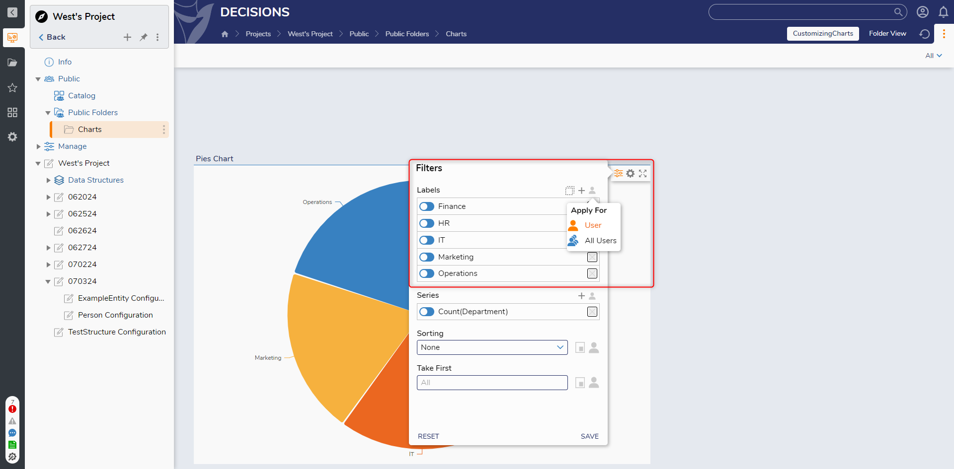
- Hover over the Areas Chart, choose the Filter icon, select the Grouping icon (series of cascading squares), choose two different Labels, then select Group.

- Name the new grouped "Label" and select SAVE.
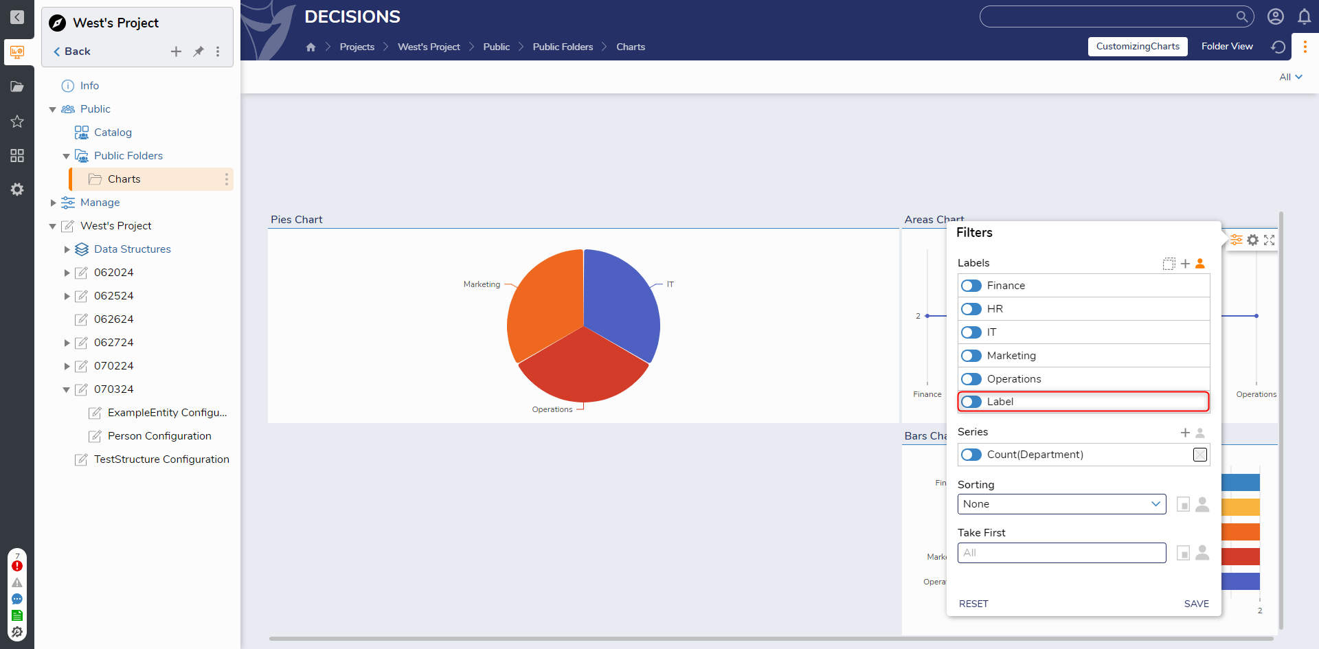
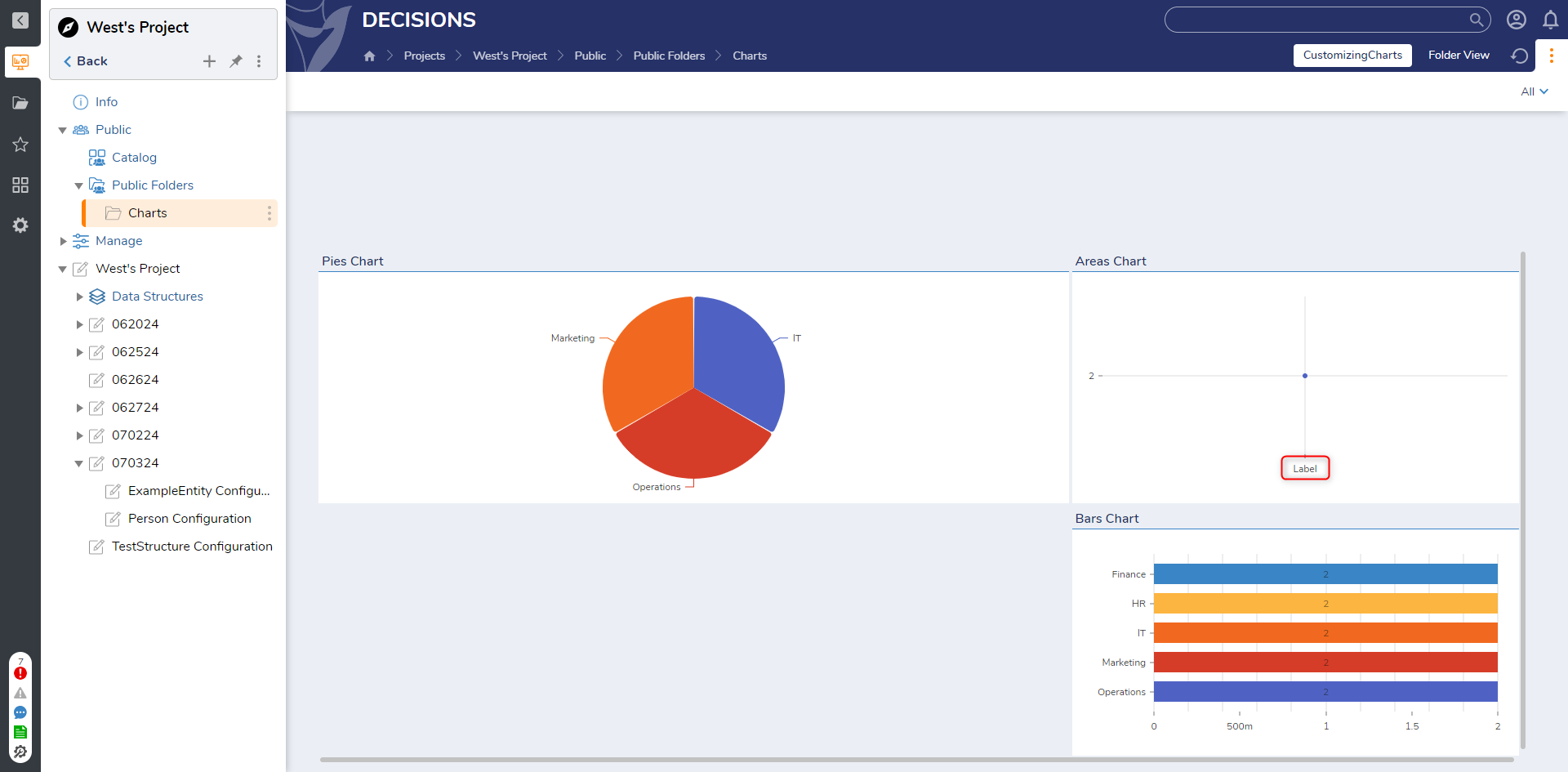
- Verify that the selected Labels and Values are grouped within the designated Group Name.
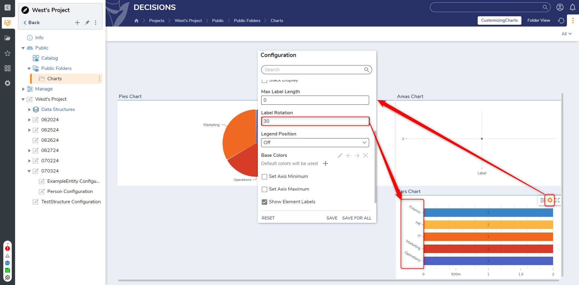
- Hover over the Bars Chart, select the Configuration icon, change the Label Rotation, then click SAVE.
- After observing the rotation of the Labels, from the Configuration category, select RESET and verify that the Chart reverts to its original Label orientation.
Feature Changes
| Description | Version | Release Date | Developer Task |
|---|---|---|---|
| Chart Parts: Add Respect Page Date Filter Setting | 9.10 | May 2025 | [DT-040187] |