Overview
If users wish to further customize their Page/Dashboard, they may do so by utilizing an Image component within the Page Designer. This component, in turn, allows the user to apply their desired image to their Page/Dashboard. This can be used to apply relevant images, such as a company's logo, to the Dashboard to provide a more personal and custom user experience. The following document demonstrates adding and formatting images in a Page/Dashboard via the Image component.
Example
- From the Decisions Studio, either Open a preexisting Page/Dashboard or select CREATE REPORT from the Global Action Bar, then CREATE a new Page.
- From the Page Designer, drag an Image component into the desired section of the workspace by dragging and dropping the component from Toolbox > FAVORITES onto the Page.
- Select the Image component on the Page, then under Properties > COMPONENT SETTINGS > Image, select the Edit (denoted by a pencil icon) button.
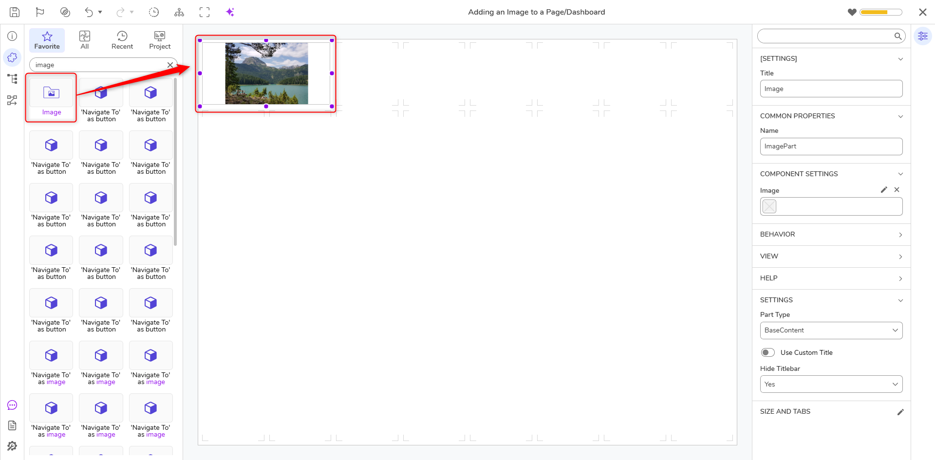
- Select the Pick Image window, then PICK the desired Image. Additional Information on Pick ImageUsers are provided three separate methods for selecting images from the Pick Image window.
- The From Library window allows users to select an Image from the default Image Library in Decisions. These Images are sorted into their respective categories on the left.
If desired, users may control the Color of the Image via the Color Picker. Additionally, they may provide an enlarged image view via the Zoom control. Depending on the size of the Image and the space it is being placed into, Zooming may be required to reduce the blurriness/pixelation of the Image. - The From File option allows users to Constant map their desired file via the File Picker. Images may be added by clicking CHOOSE FILE or dragging the file into the Drag file.
- The From Url option allows users to add an Image by providing a valid URL for an Image file. Additionally, users may embed the Image via the Embed Image Boolean.
- The From Library window allows users to select an Image from the default Image Library in Decisions. These Images are sorted into their respective categories on the left.
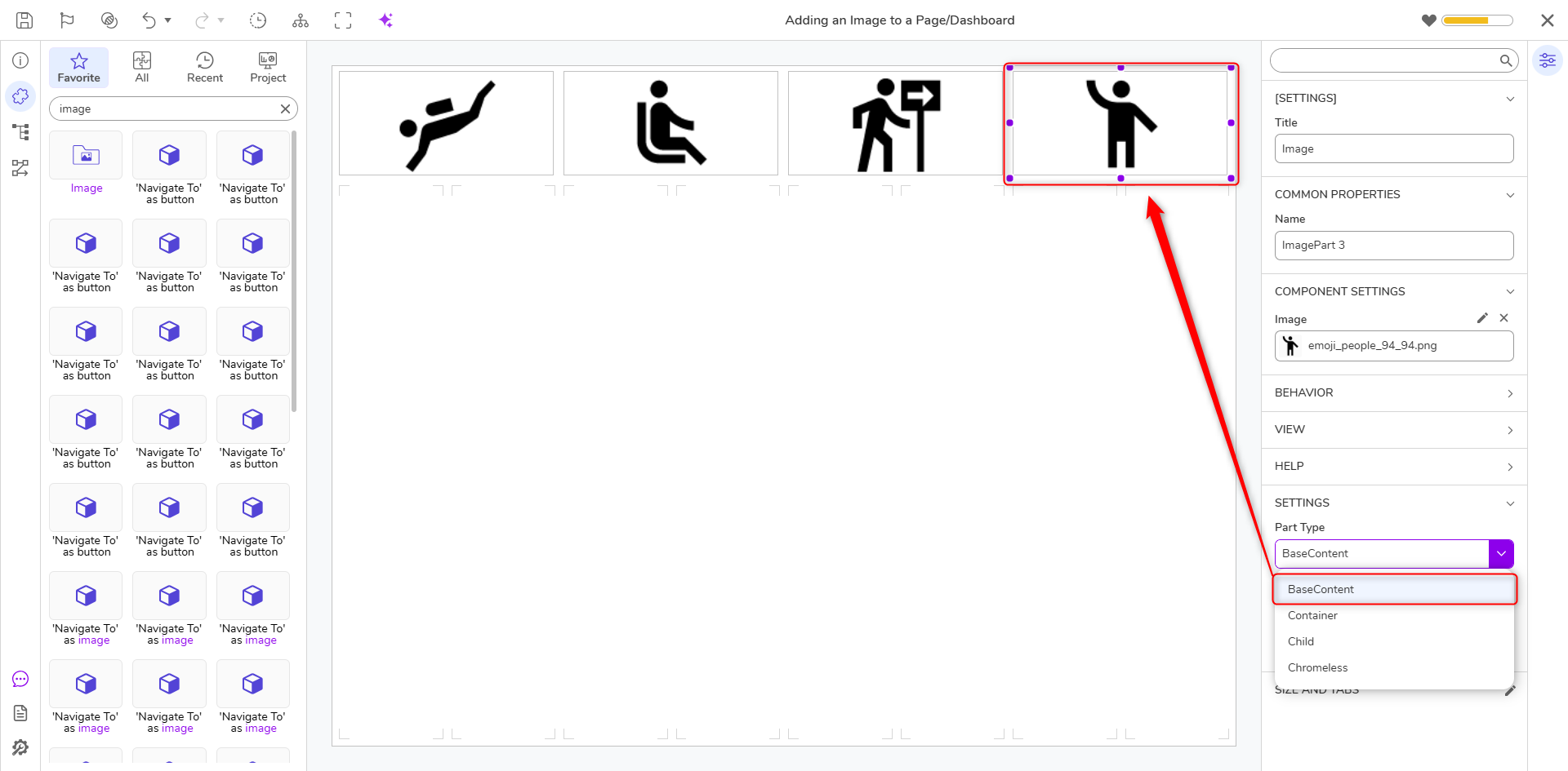
- After the Image is added, additional parameters may be adjusted via Properties > SETTINGS. Under Part Type, select the desired option. Additional Information on Part Type SettingsThe Part Type drop-down allows users to dictate how to display the Image. The options are as follows:
- BaseContent: This is the default and gives the appearance that the Header Container is its own distinguished section of the Page.
- Container: Makes the Header Container transparent.
- Child: Shrinks the Title Bar to make it appear secondary to the default BaseContent setting.
- Chromeless: Makes the Header Container transparent and strips away the header, so the Container renders it without any appearance-related properties.
- If desired, select No under Hide Title Bar or Use Small Titlebar.
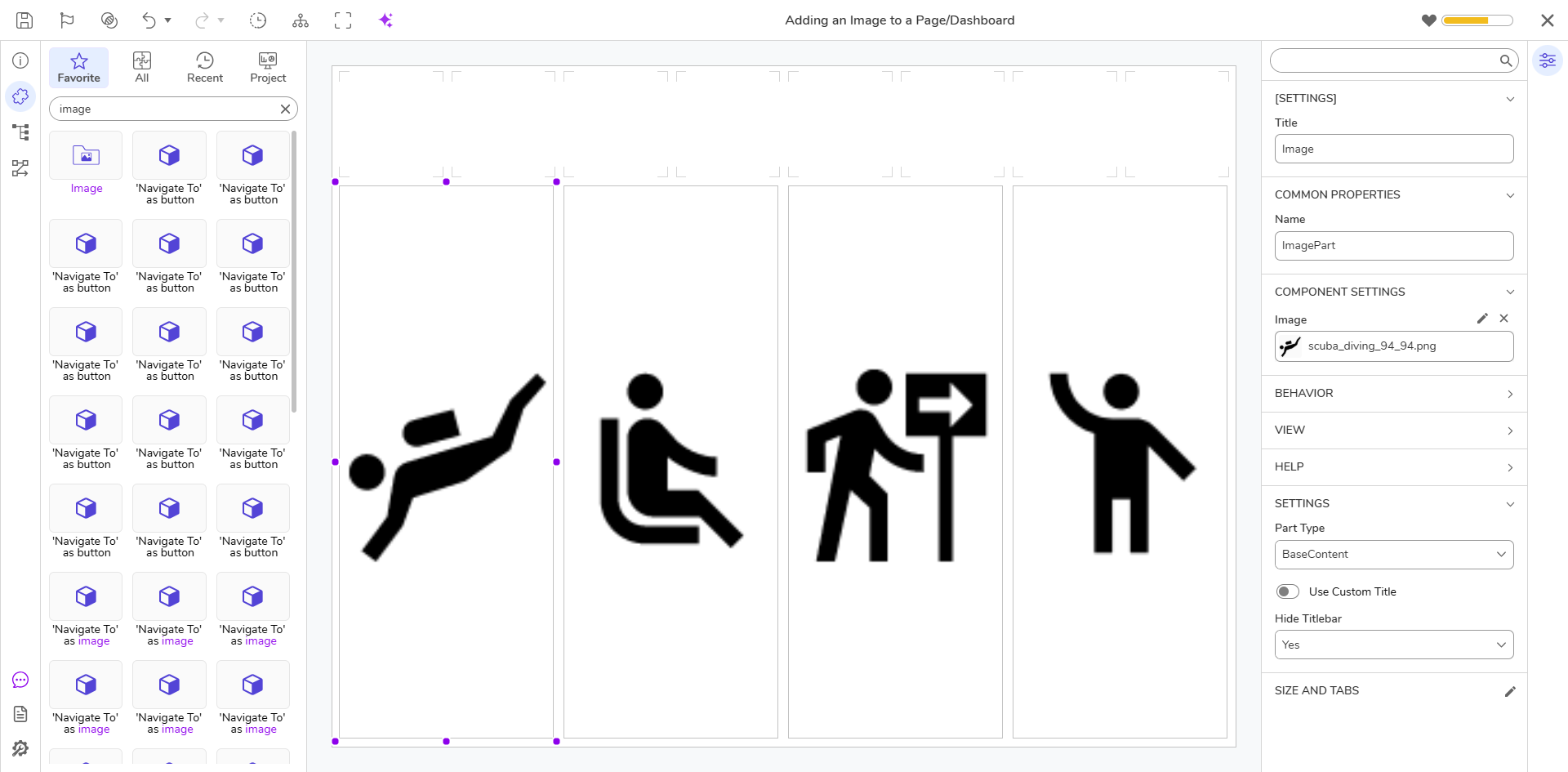
- Once the Image is added, the Image may be stretched and expanded by selecting one of the purple dots and moving the dot in the desired direction of expansion. Additional Information on Adjusting Image SizeAdjusting the size of the Image via this method expands the Image across cells in the direction of the arrows. If desired, users may click the arrows in the opposite direction to decrease the Image size.
- Once desired configurations have been made, Save the Page, then close via X.