Overview
Within a Report, Series are sets of data made from the subtotals of grouped data fields within that report. When more than one data set has been grouped, a Multi-Series can be used on certain views of the Report. This data can then be added to a Multi-Series Chart that will display the subtotals of multiple data fields within the selected chart type. This is best used when visual representation is needed for multiple pieces of data that are related to a single object.
Not just any type of chart view can have multiple series. Multiple Series are available for Areas, Bars, Bubbles, Columns, Dots, Lines, and Stacked Bars. To add multiple series to the chart view, several Report Subtotals should be defined.
Example
This tutorial demonstrates how to add Multiple Series to the Chart views on the Report. This example uses a User-Defined Data Structure with test Data; this project and accompanying data are available to download below.
- Create a Report. Add Data Sources and Columns to populate the Report with data. Group the Report.
- In the Properties panel, expand Results, then select ADD under Sub Totals.
.png)
- Add the Chart by selecting the Views > Add button. Then, select the Stacked Bars type from the Charts category.
.png)
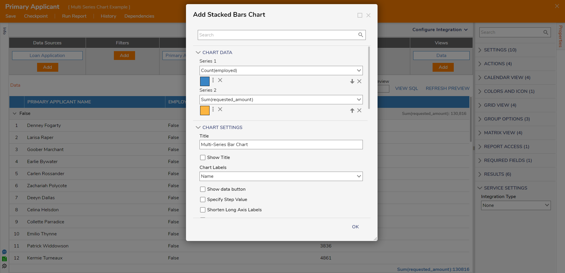
- In the Add Stacked Bars Chart dialog, provide a name for the Title. Under CHART DATA, Series 1 will be prepopulated with the grouped Column. Select ADD SERIES and select the desired series for Series 2. Add custom colors if desired. Select OK to save and add the Chart.

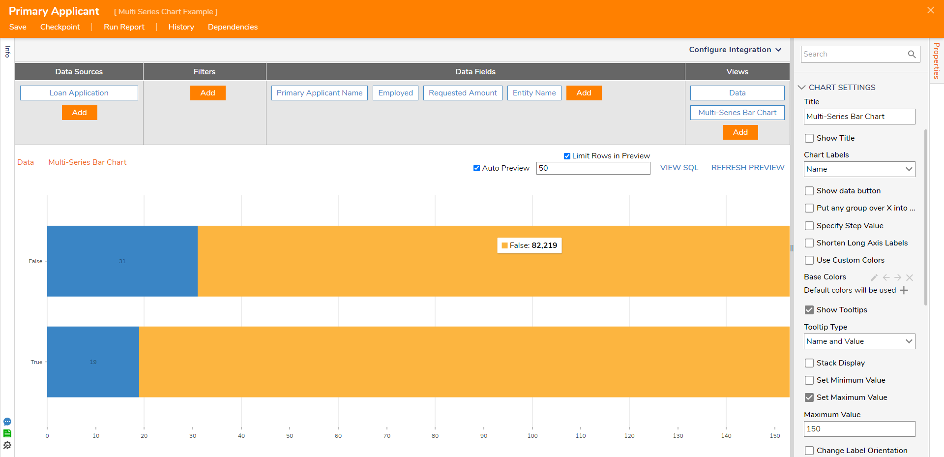
- The Multi-Series Chart will display the two series selected. The Chart and be configured as desired in the Properties panel. Refer to the Adding Charts to a Report Chart Settings information.

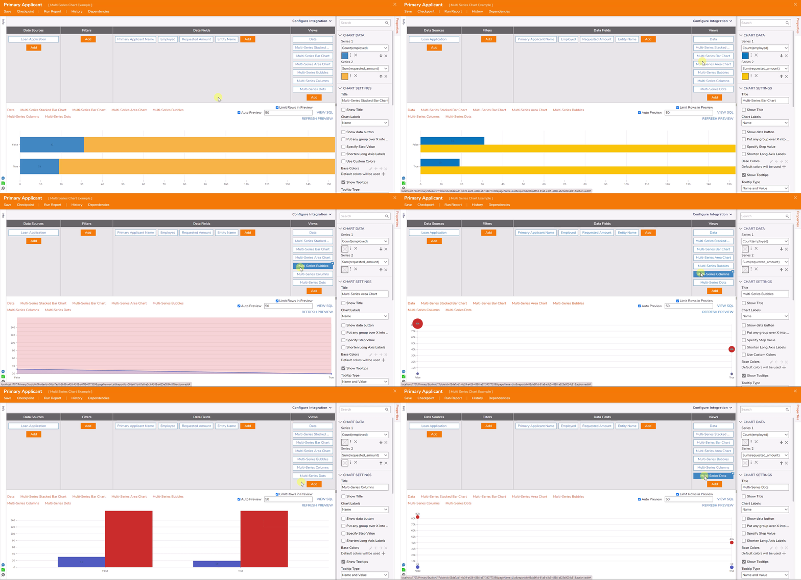
The following .gif displays other Multi-Series Charts using the same data.