| Feature Details | |
| Introduced in Version | 7.0 |
| Modified in Version | 8.12 |
UI Elements can be utilized in mobile format on a Mobile device or Tablet. It is crucial for developers to design with the Mobile Portal in mind, especially if the project being built is expected to have a lot of mobile end users. This ensures a seamless user experience and maximizes usability. When it comes to Forms, developers have the flexibility to either use the Form as it appears on the desktop version or create an alternate Form optimized for mobile display. This allows users to interact with forms on their mobile devices conveniently. While creating pages, developers need to consider the intended use of the Page and build it accordingly. There is no difference in terms of sizing, but it is essential to keep the mobile user experience in mind to provide a consistent and intuitive interface.
By designing mobile-friendly forms and keeping the Mobile Portal in mind, developers can cater to the needs of mobile users and deliver an enhanced user experience.
Create Mobile/Tablet Form
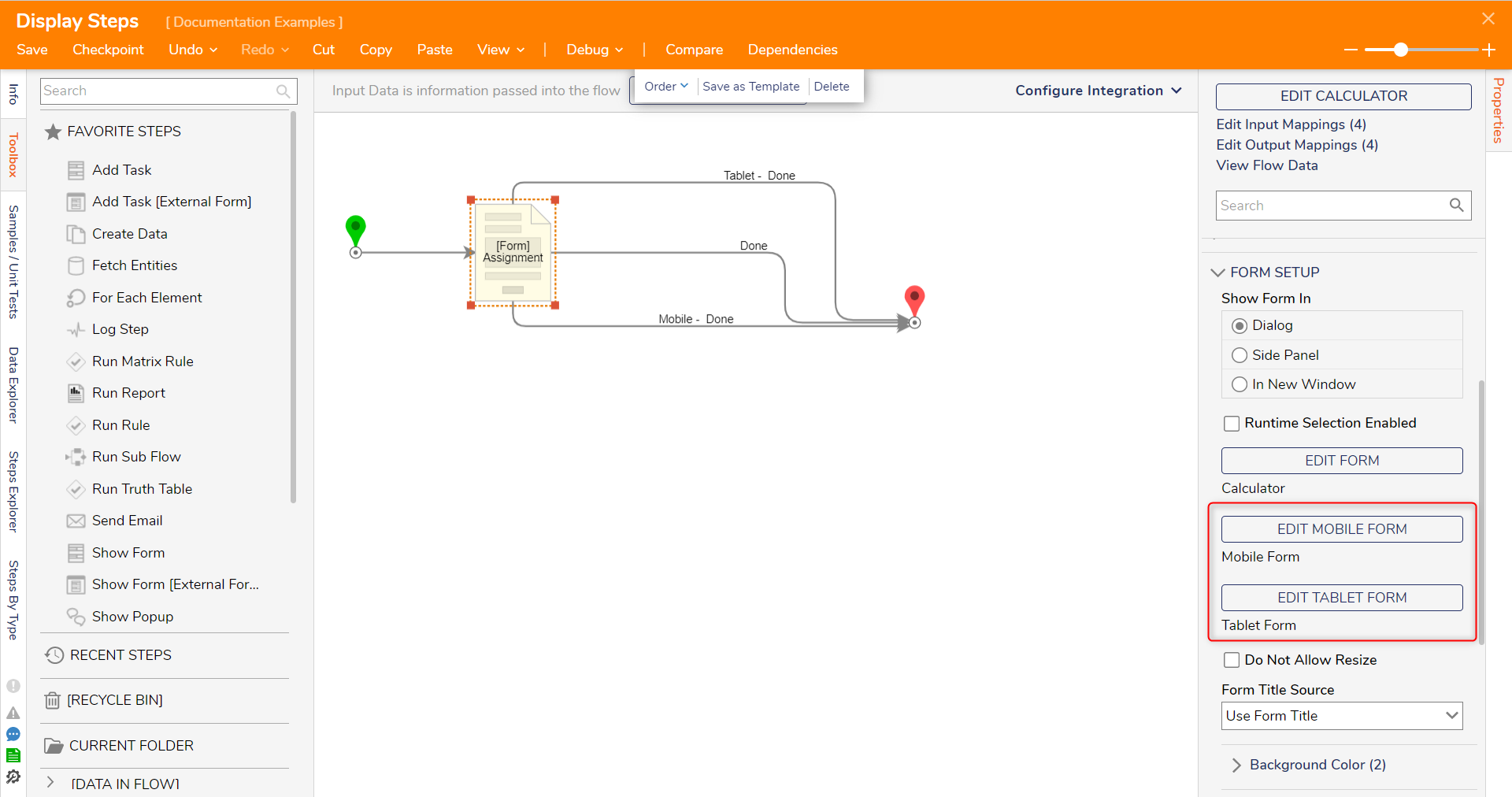
The Show Form step provides the capability to attach separate Mobile and Tablet Forms. These specialized Forms are built independently from the original Form but can be linked to the Show Form step. When users access the Form from their mobile or tablet devices, the optimal Form for their specific screen resolution will be displayed. Additionally, each Form's outcome paths will be labeled as Mobile or Tablet, allowing for tailored interactions based on the user's device type.
To configure these specialized Forms, select the Form step and access the Properties panel. Choose from existing Mobile and/or Tablet Forms within the Form Setup category or create new ones.

Mobile
Forms can be formatted to display on mobile devices/tablets using the default Designer Height and Width within the Form Designer.
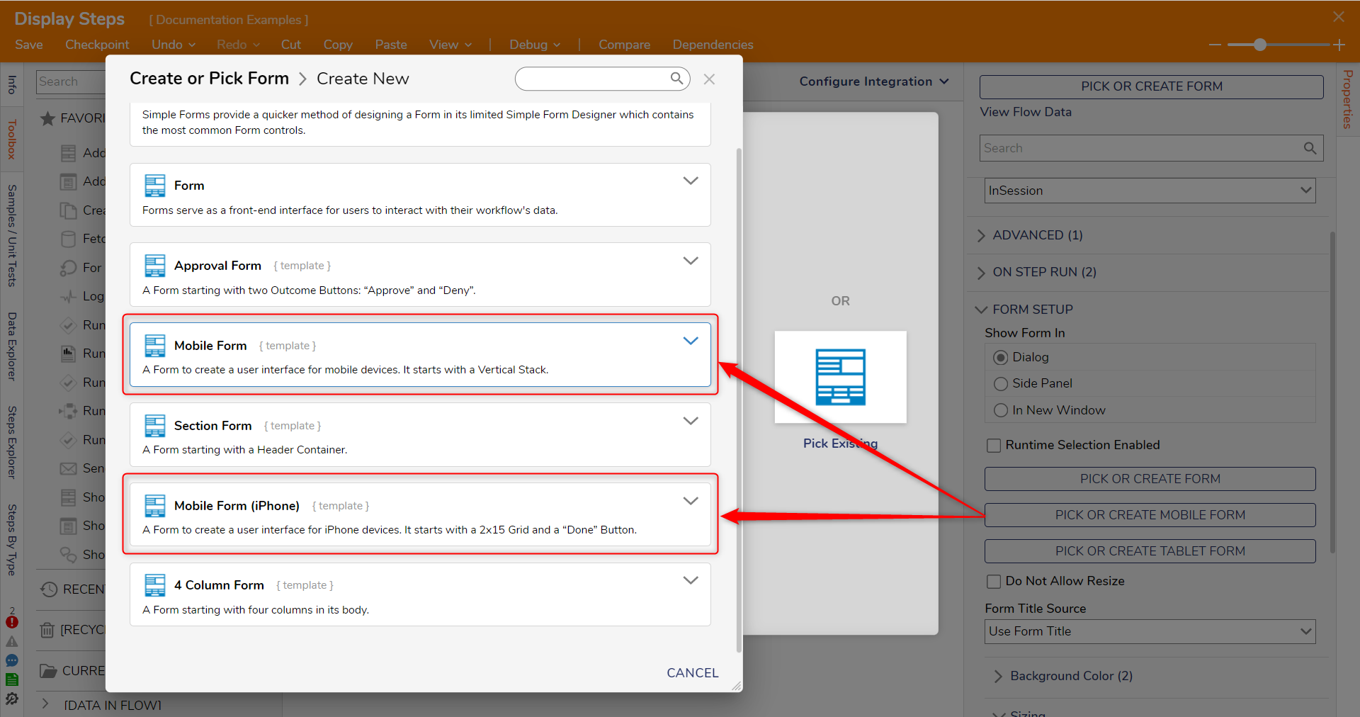
There are two Form Templates for creating Forms sized for Mobile devices, Mobile Form and Mobile Form (iPhone). They are sized slightly differently, and the iPhone template also has a Grid Layout and a Button pre-configured.
| Form Template Name | Default Width x Height | Screenshot |
|---|---|---|
| Mobile Form Template | 300 x 550 |  |
| Mobile Form (iPhone) Template | 350 x 640 |
Tablet
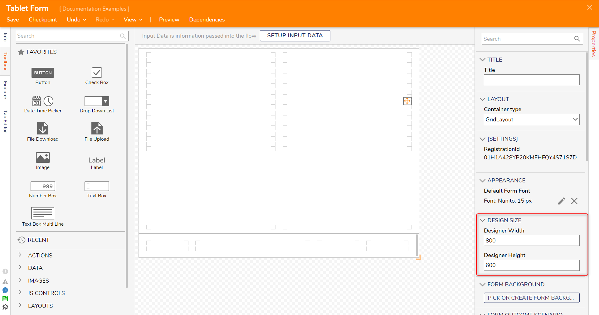
There is currently no Form Template specifically designed for tablets. However, developers can create a Form and adjust its size within the Properties panel under Design Size. To cater to tablet users, developers can create a Form set to the desired size and then designate that Form as a template for tablets. For detailed instructions on how to set a Form as a template, please refer to Creating Reusable Templates from Designed Elements.
| Common Tablets Sizes | Screenshot |
|---|---|
| 768 × 1024 |  |
| 800 × 1280 | |
| 1280 × 800 | |
| 601 × 962 | |
| 820 × 1180 |
Viewing Mobile UI Elements in Mobile
Select the Workflows tab to view Forms and other UI elements from a mobile platform. Attempting to view the element as a page or dashboard will result in a blank screen. If the UI element references a page or dashboard, the user will see a blank Page with the name of the Flow at the top. An example of this error is below..png)
Supported and Not Supported Controls
The following sections discuss the different Form and Page Controls that are and are not supported. Navigate to the Glossary of Supported Form and Page Controls for Mobile Portal article for a full list of controls.
Not Supported Form Controls
The following table provides a comprehensive list of Form Controls that are not supported in the mobile app. These controls may have limitations or functionalities that are not compatible with the mobile environment. It is important to be aware of these unsupported controls when designing Forms intended for mobile use. Refer to this list to ensure a seamless user experience by avoiding using controls that cause usability issues in the mobile app. It is important to note if a Form Control is NOT on this list, it is supported within the Mobile Portal.
| Not Supported Form Controls | |
|---|---|
| Input Controls | |
| Calendar | |
| Tag Editor | |
| Image Gallery | |
| Compact Merge Editor | |
| Navigation Tree | |
| Tree Editor | |
| List Controls | |
| Account and Group List | |
| Multi Select Drop Down | |
| Display Controls | |
| Document Viewer | |
| Vertical Timeline | |
| Horizontal Folder Timeline | |
| Advanced Data Grid | |
| Diagram Tile | |
Supported Page Controls
The following table provides a comprehensive list of Page Controls that are supported in the mobile app. It is important only to use the following controls while designing Pages intended for mobile use. Refer to this list to ensure a seamless user experience by avoiding using controls that cause usability issues in the Mobile Portal.
| Supported Page Controls | |
|---|---|
| Reports | |
| Report Viewer - Data View | |
| Actions | |
| Service Catalog As Button | |
| Service Catalog As Image | |
| Service Catalog As Link | |
| Run Current Folder Action' as Button | |
| Run Current Folder Action' as Image | |
| RunFlowButton | |
| RunFlowImage | |
| AsRunFlow | |
| Data | |
| SilverCurrentTime | |