Overview
Creating a Custom Process Dashboard allows Users to track KPIs by dragging and dropping a combination of Dynamic and Static Dashboard Components.
How to Create a Custom Process Dashboard
How to Create a Custom Process Dashboard
- Open an event log in Decisions Process Mining and navigate to the Dashboard tab.
- Select the plus icon to the left of the Standard tab on the Process Dashboard.
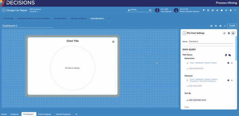
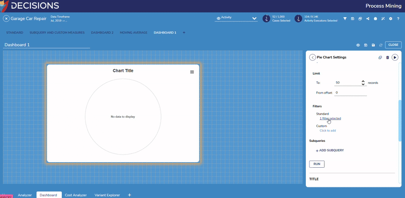
- Select CREATE A NEW DASHBOARD. This will automatically open the new empty Dashboard named 'Dashboard 1'. Clicking on this name allows the users to edit it.
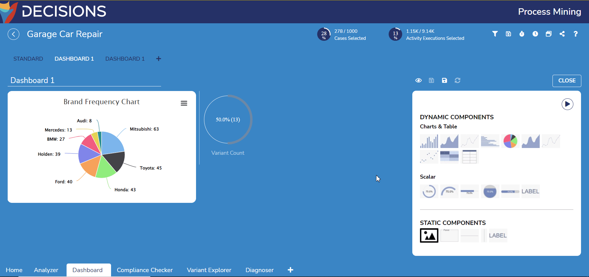
Examples
Creating a Column Chart
- Drag a Column Chart component from the Component Palette on the right to the empty workspace on the left. Its setting will automatically replace the Component Palette once added.
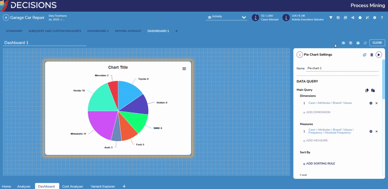
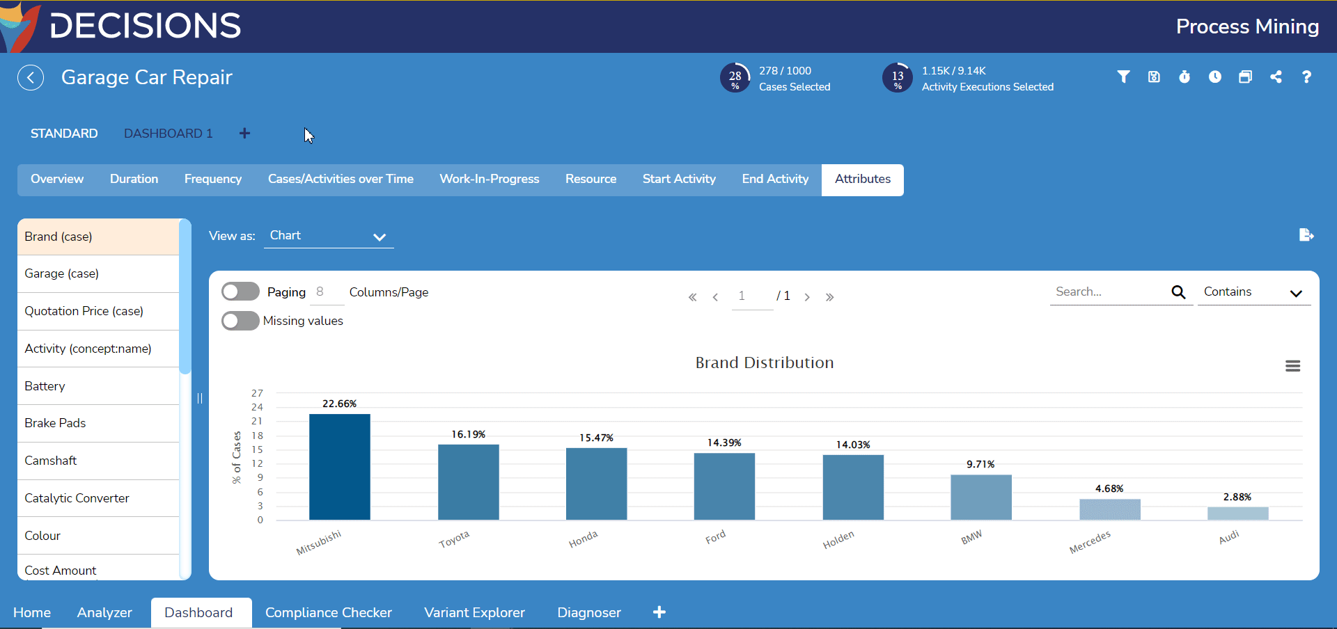
- Under Column Chart Settings, change the Title to a more data-descriptive name. For this example, this chart is named Brand Frequency Chart.
- Under Dimensions, click on Add Dimension, then Click to Select Data to open the Query Builder to select the Dimension of the chart.
For this example, select the dimension Case > Attributes > Brand > All Values to capture all car brand attributes present in the event log. Select OK to confirm..gif)
- Adding multiple dimensions is currently supported on Column Charts.
- Under Measures, click on Add Measure, then Click to Select Data to open the Query Builder again to select the Measure for the chart. This time, navigation is automatically set to All Values with two new options available: Frequency and Duration.
- Select Frequency > Absolute Frequency to display frequency by count. Select OK to confirm.
.gif)
- Users can also create queries on numeric dimensions that include multiple measures of different types.
- In the following example, two Dimensions (Duration and Length) are added for a Measure (Case > Count):
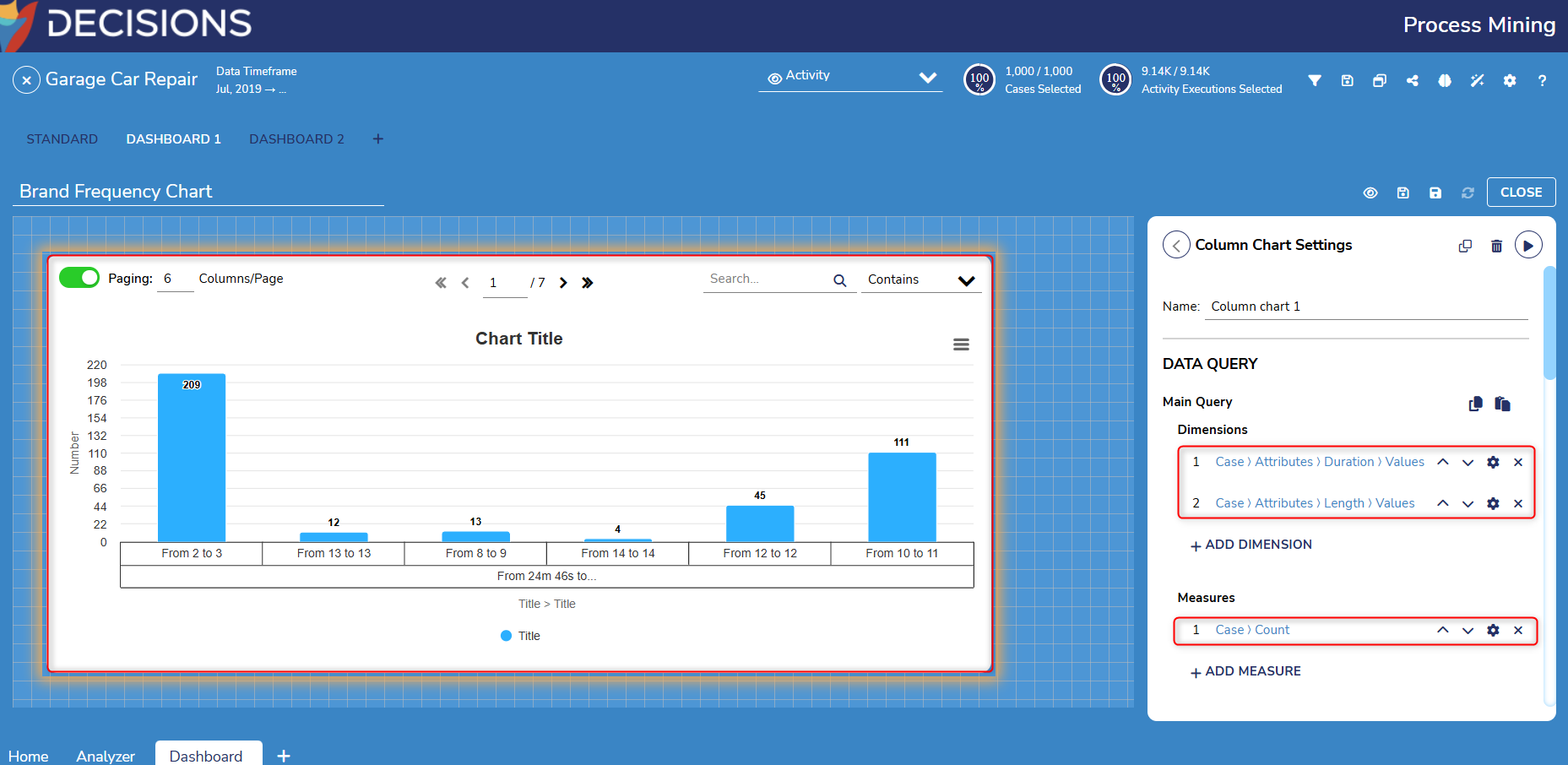
- Select Frequency > Absolute Frequency to display frequency by count. Select OK to confirm.
5. Scroll down and select RUN to generate the chart based on its configuration.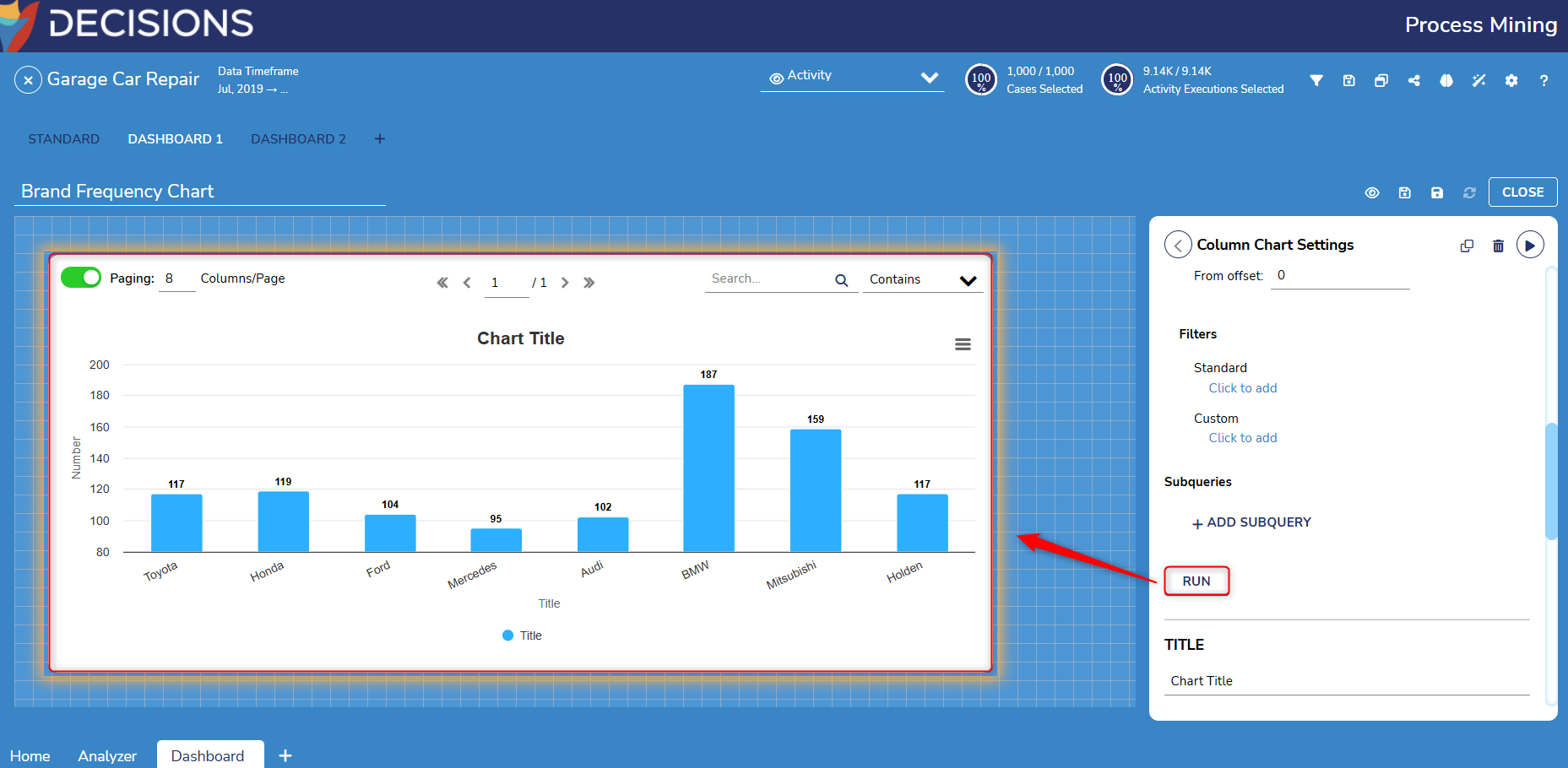
6. To preview the Custom Process Dashboard, select the eye icon above the Component Palette. Select Fit to Width and Center to alter the view further.
.gif)
Creating a Percentage Circle
- Deselect the chart by clicking on the empty workspace or by clicking on the back arrow at the top left of the window to return to the Component Palette.
Drag Percentage Circle under the Scalar category. Like before, its settings will override the Component Palette.
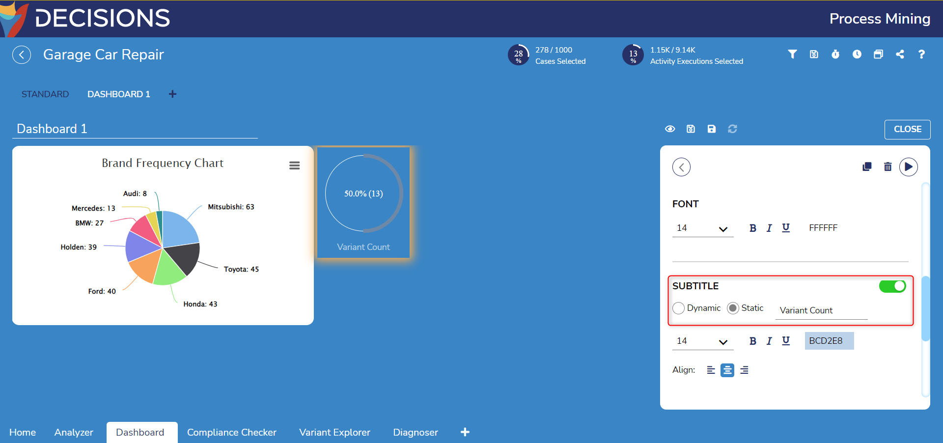
- In the Percentage Circle's settings, select Click to Select Data to choose a KPI. This example will display the number of variants in all cases found via Case > # of Variants. Select OK to confirm.
- For the Show As dropdown menu, select % (Abs.) Scroll down to the Subtitle settings, select Static, and then enter 'Variant Count' in the new textbox. Select RUN to generate the percentage circle.
- In the Component Palette, drag a Vertical Separator from the Static Components category. Place it between the Pie Chart and the Percentage Circle.

- To preview the custom Process Dashboard, select the eye icon above the Component Palette. Reformatting toggle buttons Fit to Width and Center are available to alter the view.

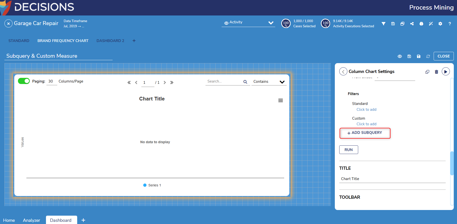
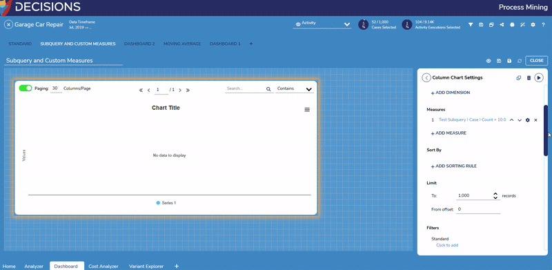
Creating Subqueries and Custom Measures
Users can create Subqueries and Custom Measures for more advanced Data retrieval.
- Subqueries enable Users to create multiple levels of nested queries.
- Custom Measures can be created by combining existing Measures and Dimensions using Function blocks built into Process Mining.
To create a Subquery:
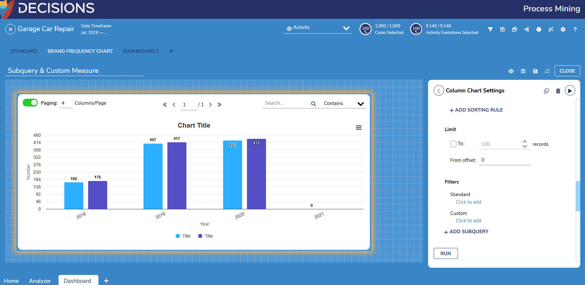
- Drag and drop a Column Chart onto the workspace and scroll until Add Subquery appears, and click the button.
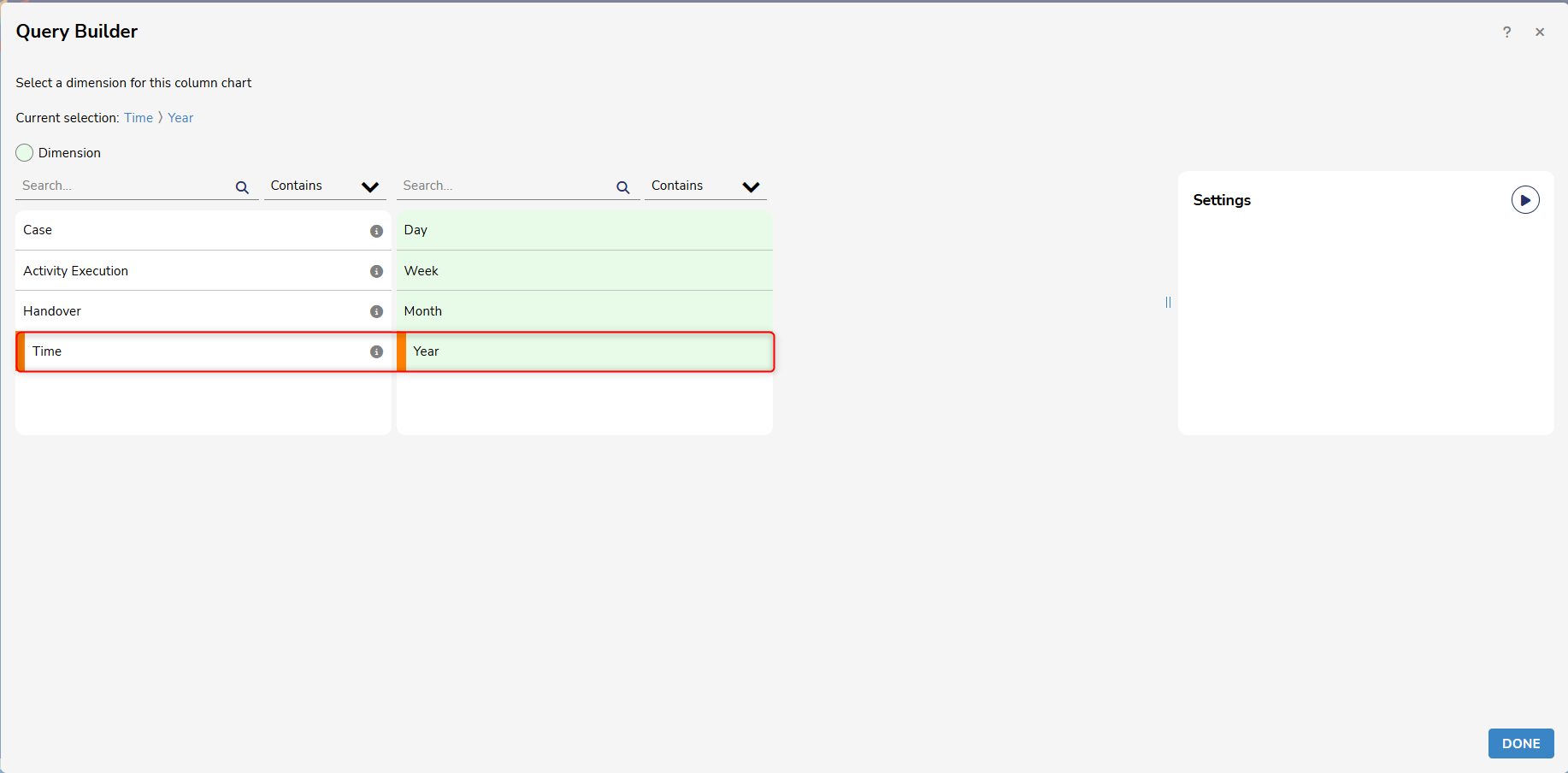
- From here, click on Add Dimension and enter desired values. For this example, Time > Year is used.
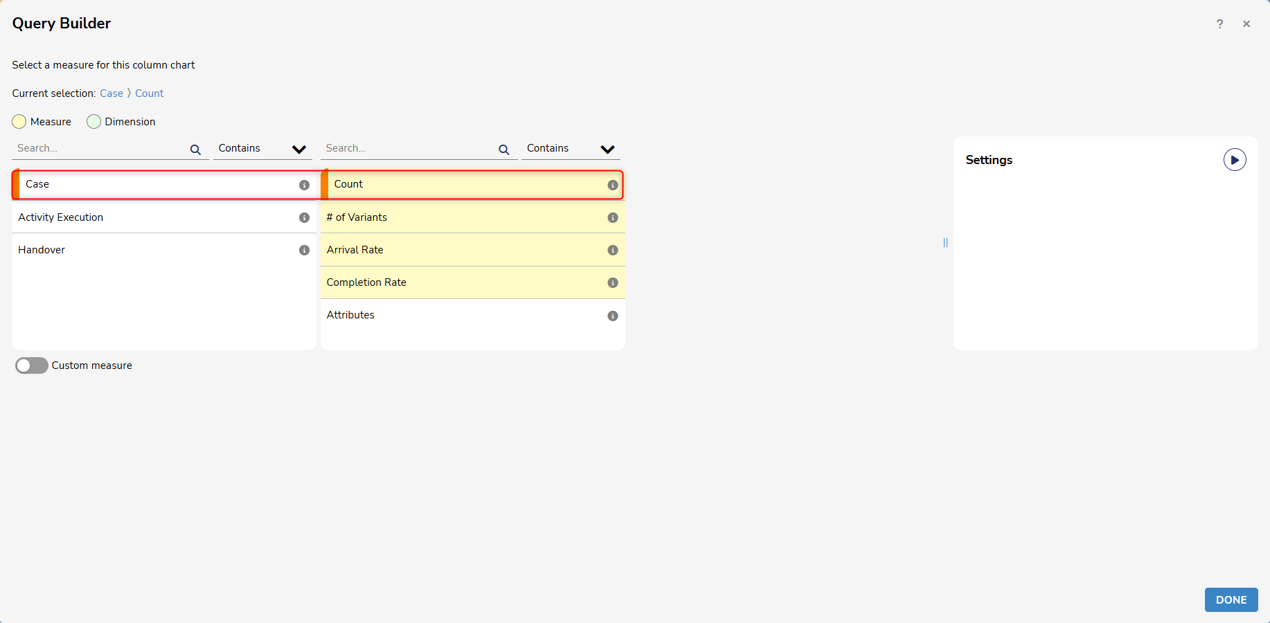
- Then, select Add Measure and enter desired values. For this example, Case > Count is used.
- From here, click on Add Dimension and enter desired values. For this example, Time > Year is used.
To create a Custom Measure:
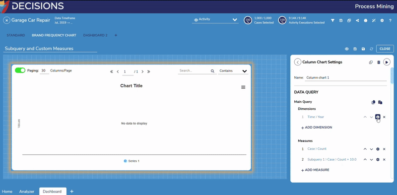
- Once those values are entered, toggle on Custom Measure and drag and drop the Add function block under Math.
- Next, drag and drop the Count value onto the same workspace and insert it into the first part of the function block.
- Next, select the Constant tab and drag the zero value into the second part of the function block. In this example, the value was changed to 10.
- Users may need to drag values onto the workspace before adding them to a function block.
- Once the values are added, click Done to save the Measure and exit the window.
- From here, scroll up to Dimensions and enter desired values. For this example, Time > Year is used.
- Then, select Add Measure and enter the following values: Subquery 1 > Add(Case)Count, 10.0. This value may change depending on the specifications set when creating the Query and Custom Measure.
- Once these values are added, Users can click the settings icon next to Dimensions, Subqueries, and Measures to set a name for the values.
- Users can also click the following icons to customize Subqueries:
- Edit: Enables Users to edit the name of a Subquery.
- Copy: Enables Users to copy an existing Subquery (This also applies to Main Queries).
- Paste: Enables Users to copy queries from one component to another.
- After the desired specifications have been made, click Run to populate the Column Chart with the selected values.
- Users can also click the following icons to customize Subqueries:
Applying Filters
Users can create standard, custom, and results filters to, for example, retain specific resources from a measure.
To apply a standard filter:
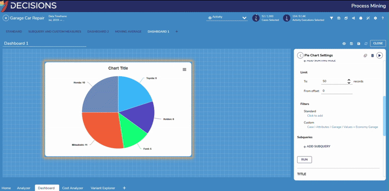
- Drag a Pie Chart and select values for Dimension and Measure, then click Run.
- Scroll down to the Filters section and select Click to Add under Standard.
- This will display the Select Filtering Criteria window. Users can choose any of the desired filters. In this example, Attribute is used.
- Modify the provided values as desired and click Done to save the changes.
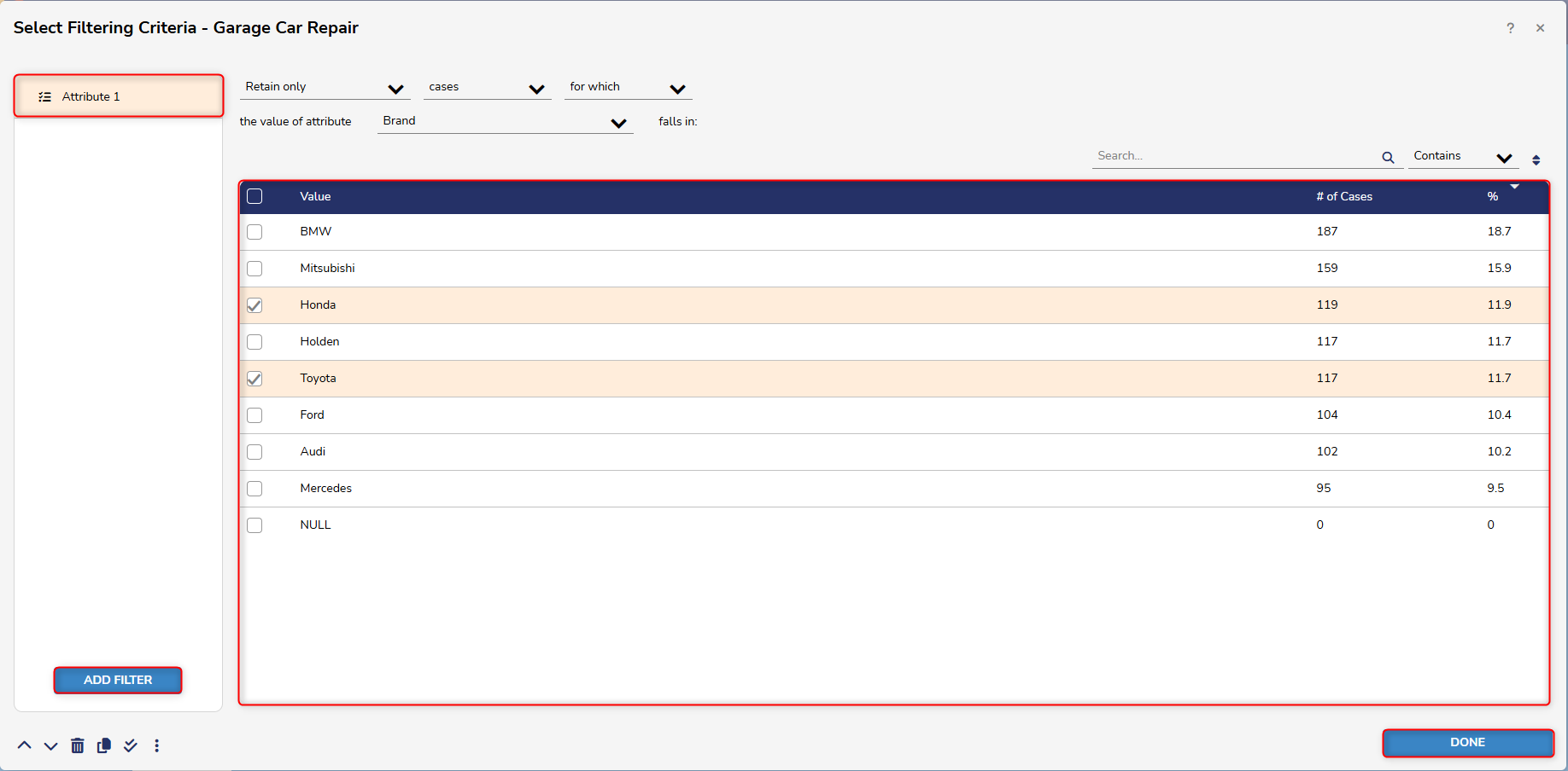
- Modify the provided values as desired and click Done to save the changes.
- Once the changes have been saved, click Run to populate the Chart with values specified in the filter.
- This will display the Select Filtering Criteria window. Users can choose any of the desired filters. In this example, Attribute is used.
To apply a custom filter:
- Follow the same steps to create a Standard filter, but instead of clicking Click to Add under Standard, select Click to Add under Custom.
- From here, use the Query Builder to create a formula. This formula will be utilized as the custom filter.
- To start, navigate to the Comparison tab and drag the Equals formula to the Workspace.
- Then, click on Values and drag it directly on the workspace, before dragging it into the first position of the formula.
- Lastly, navigate to Constants and drag a Text formula to the second position of the formula. In this example, Economy Garage is used.
- Please note that formulas will vary depending on desired specifications.
- After the formula has been created, click Done to exit the Query Builder. Then click Done to see the Chart with the specified values from the custom filter.
- From here, use the Query Builder to create a formula. This formula will be utilized as the custom filter.
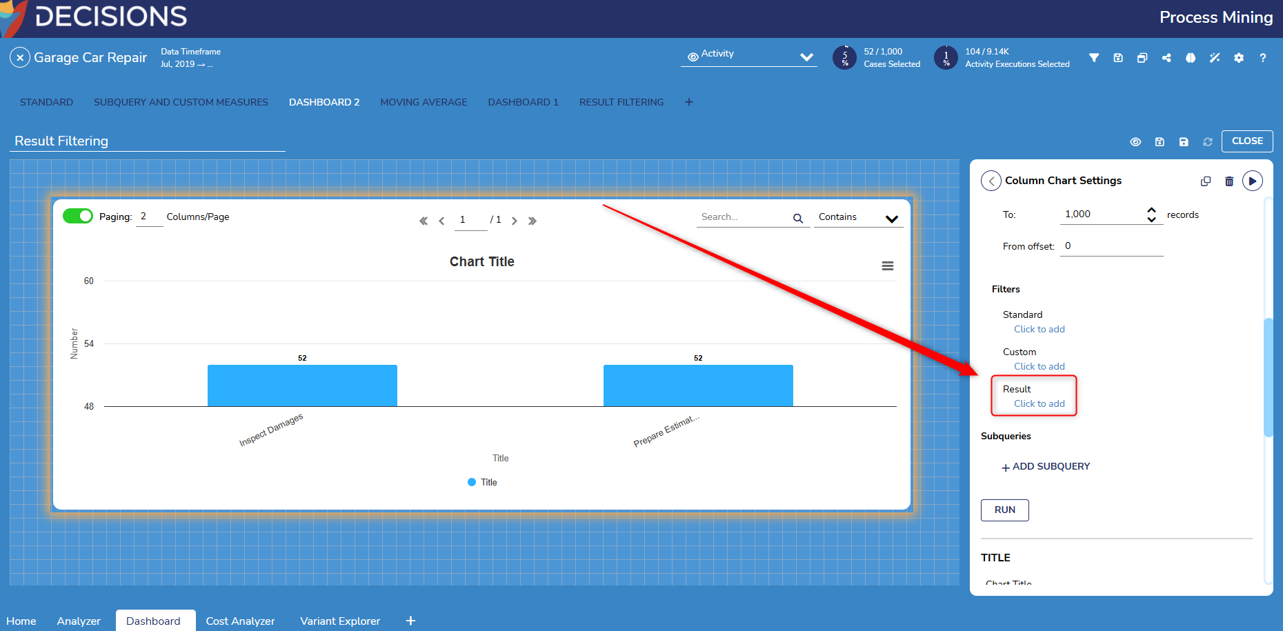
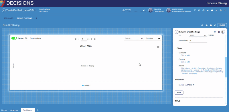
To apply a post query result filter:
The following example demonstrates how to add a Post Query Result Filter on a Column Chart with the following parameters:
- Dimension: Activity Execution > Attributes > Activity > Values
- Measure: Activity Execution > Count
- Result: "Main Query > Activity Execution > Attributes > = "In Testing" OR "Main Query > Activity Execution > Attributes > = "Reopened"
- Create a Custom Dashboard and drag and drop a chart/table from the Dynamic Components section.
- Add a Dimension and Measure with the parameters mentioned above.
- Scroll down to the Filters section and select Click to add under Result.
- From here, use the Query Builder to create the Post Query Result.
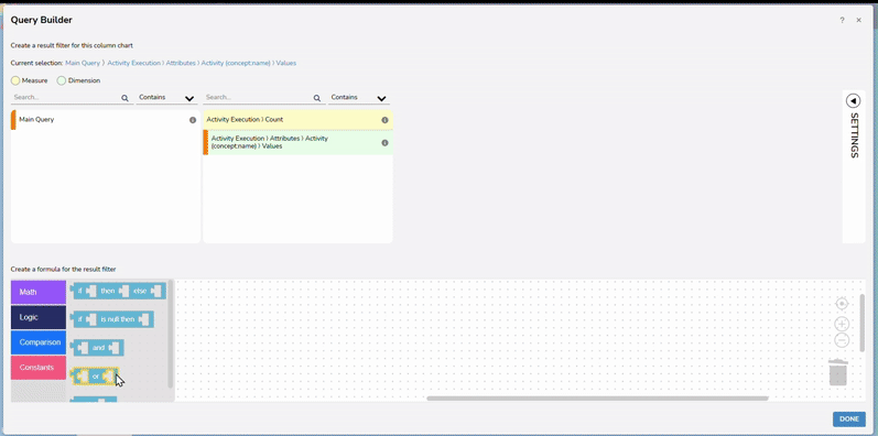
- Once the Post Query Result has been created, select Done to navigate back to the chart.
- From here, click Run. The Column chart will now display data with the Post Query Result filter.
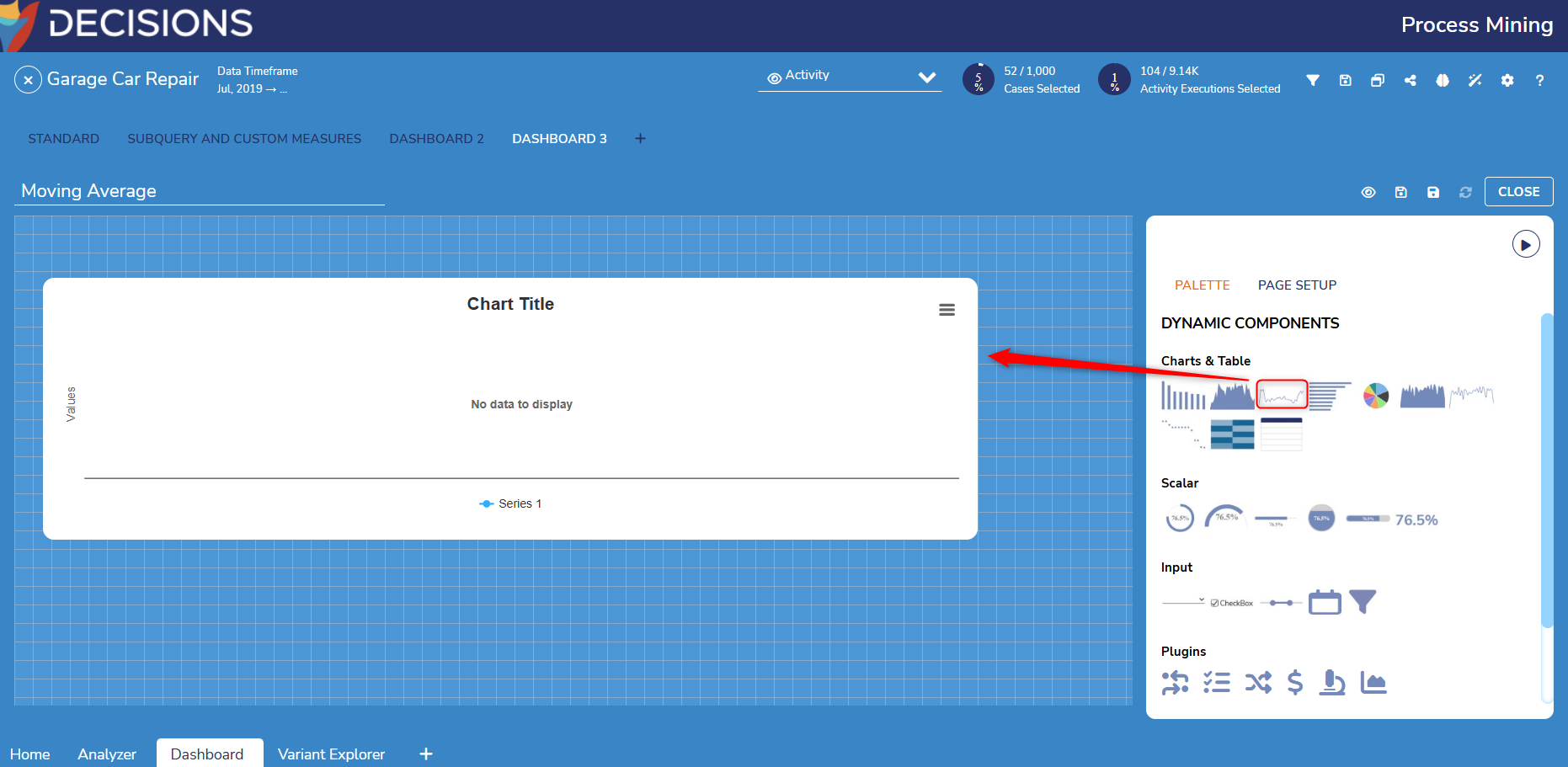
Creating Moving Averages
Users can create a Moving Average to get a clearer estimate of a trend.
To create a Moving Average:
- Drag a Line Chart onto the Custom Dashboard.
- From here, choose a title for the Line chart and add values for Dimensions and Measures. In this example:
- Time > Year is used for the Dimension.
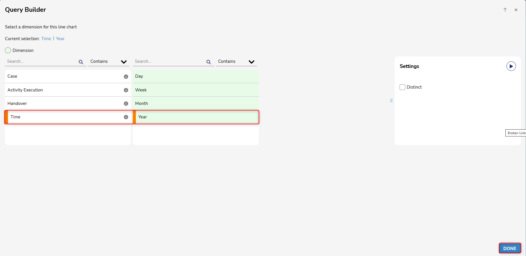
- Case Attributes > Duration > Averageis used for Measure.
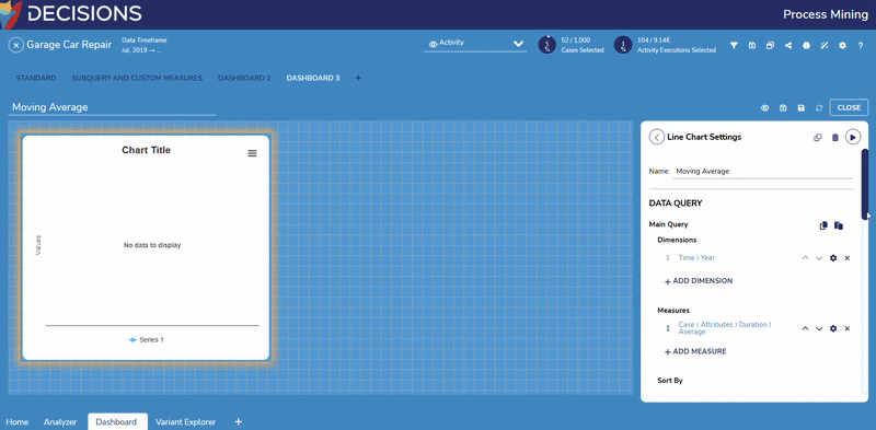
- Once values for Measure are added, check Compute as moving average under Settings, on the right-hand side of the Query Builder. Users can specify desired values in the populated Dropdown menus.
.gif)
- Once values for Measure are added, check Compute as moving average under Settings, on the right-hand side of the Query Builder. Users can specify desired values in the populated Dropdown menus.
- Time > Year is used for the Dimension.
- From here, choose a title for the Line chart and add values for Dimensions and Measures. In this example:
- Once the Dimensions and Measures have been added. Click Run to populate the chart with the selected values.
- The Line Chart will now display a Moving Average.
- The Line Chart will now display a Moving Average.
Dynamic Components
Dynamic Components enable Users to quickly display statistics from an Event Log.
The following are dynamic components that Users have access to when creating a custom Process Dashboard. Users can minimize and maximize these settings by selecting the play button above Palette on the right-hand side of the Dashboard.
.gif)
| Category | Function |
|---|---|
| Charts and Table | These components enable Users to visualize multi-dimensional data through a Pie chart, graph, etc. |
| Scalar | These components are used to visualize scalar values as a percentage, count, etc. |
| Input | These components enable Users to provide inputs as filters on the Dashboard, such as Dropdown, Checkbox, and Dual Range Slider. |
| Plugins | These components can be used to insert plug-ins, such as Analyzer or Compliance Checker, into a Dashboard. |
| Static Components | These components display fixed values that are manually set by Users. |
 This example displays the Input Components.
Example
The following example demonstrates how Users can utilize the Date-Time Range Input Selector on a Custom Dashboard. The Date-Time Selector allows Users to apply timeline filters directly to the Dashboard.
- Users can start by opening a Custom Dashboard and dragging an element from the Charts and Table section. In this example, a Pie Chart is used.
- Configure the settings in the Pie Chart to the desired specifications.
- After the Pie Chart is configured, drag and drop the Date-Time Range Input Selector and place it under the Pie Chart.
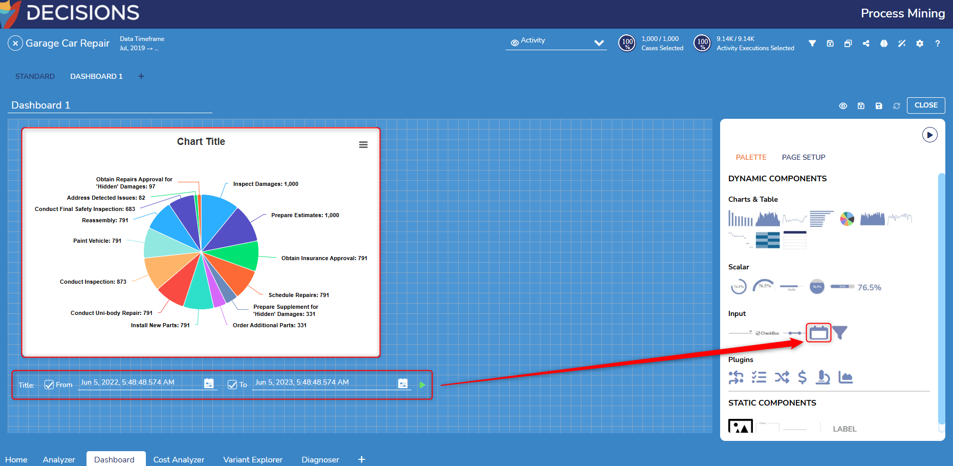
- From here, select the Date-Time Range Input Selector and choose values for the From and To fields.
- After the dates have been selected, click the green play icon to run the component. The Pie Chart will update with the specified values.
.gif)
- After the dates have been selected, click the green play icon to run the component. The Pie Chart will update with the specified values.
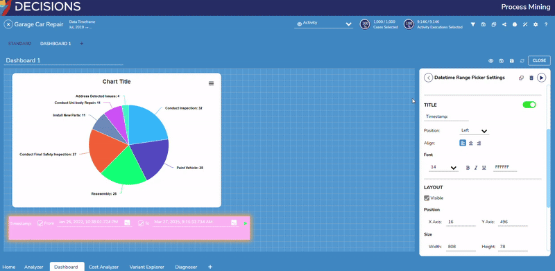
- Users can adjust the Layout, Background, and other settings for the control by editing the available fields in the Datetime Range Picker Settings.
Page Setup
- Users can set the Dashboard canvas size by navigating to the Page Setup tab and editing values for Width and Height.
- The default values for Width and Height are 1377 and 614.
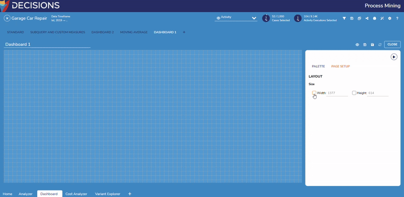
- Users can also use the Fit to Screen Width and Center buttons to customize the view of a Custom Dashboard, for example.
- To access these settings, click the Preview icon.
- To access these settings, click the Preview icon.
Tracking Data Over Time
Tracking Data Over Time
To view how data, such as KPIs, have changed over a time frame, make sure to select a start and end point under Data Timeframe.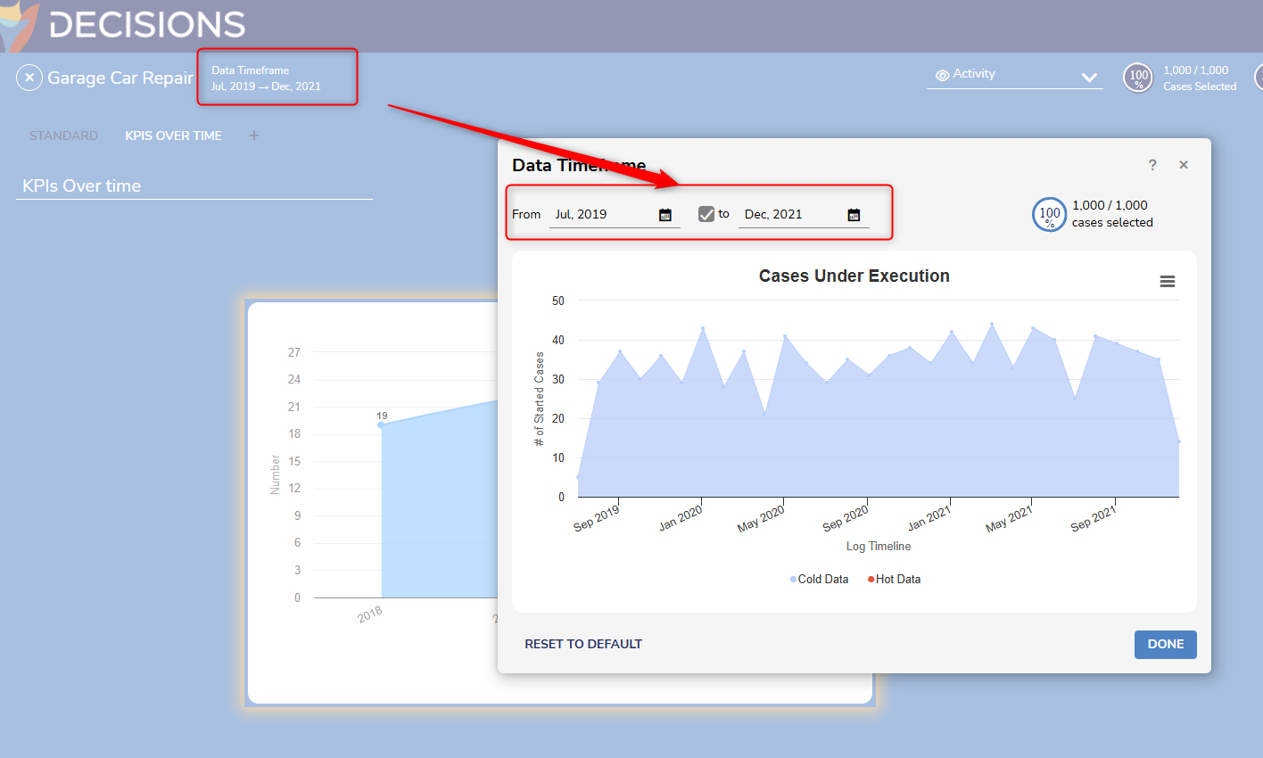
Saving a Custom Process Dashboard
To save the Dashboard, select either of the two save icons above the Component Palette.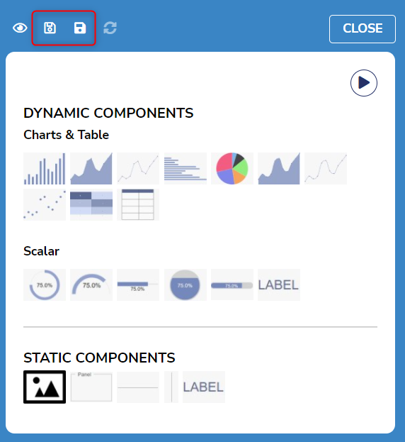
| Icon | Function |
|---|---|
| Outlined Save | Saves the filters currently in the Filter Log |
| Filled Save | Save the current filters as a new file in the Process Miner |
Updating a Custom Process Dashboard
When using one Custom Process Dashboard in multiple event logs' Dashboard tabs, it is a best practice to update the Custom Process Dashboard once viewing it to account for any edits.
- Select the CLOSE button to exit the default Edit mode.
- Select the cycling arrows icon to refresh the Dashboard and its components.
- A pop-up message occurs underneath the icon to confirm that the Dashboard is now up-to-date.

Loading a Custom Process Dashboard
- Select the plus icon next to the Standard Dashboard tab.
- Select OPEN AN EXISTING DASHBOARD.
- Navigate to the Custom Process Dashboard file location in Process Mining via the Tree dropdown menu. After selecting the file, it will automatically open in a new tab.
Deleting a Custom Process Dashboard
- Select the CLOSE button to exit the default Edit mode.
- Select the trashcan icon to delete the Custom Process Dashboard.
- A confirmation window then pops up. To delete the Custom Process Dashboard's file in addition to it current tab, enable the Full Delete option. Regardless, select YES to confirm deletion.

Printing a Custom Process Dashboard
To print the Custom Process Dashboard, open the Dashboard in Preview Mode via the eye icon next to the save icons. Select the print icon.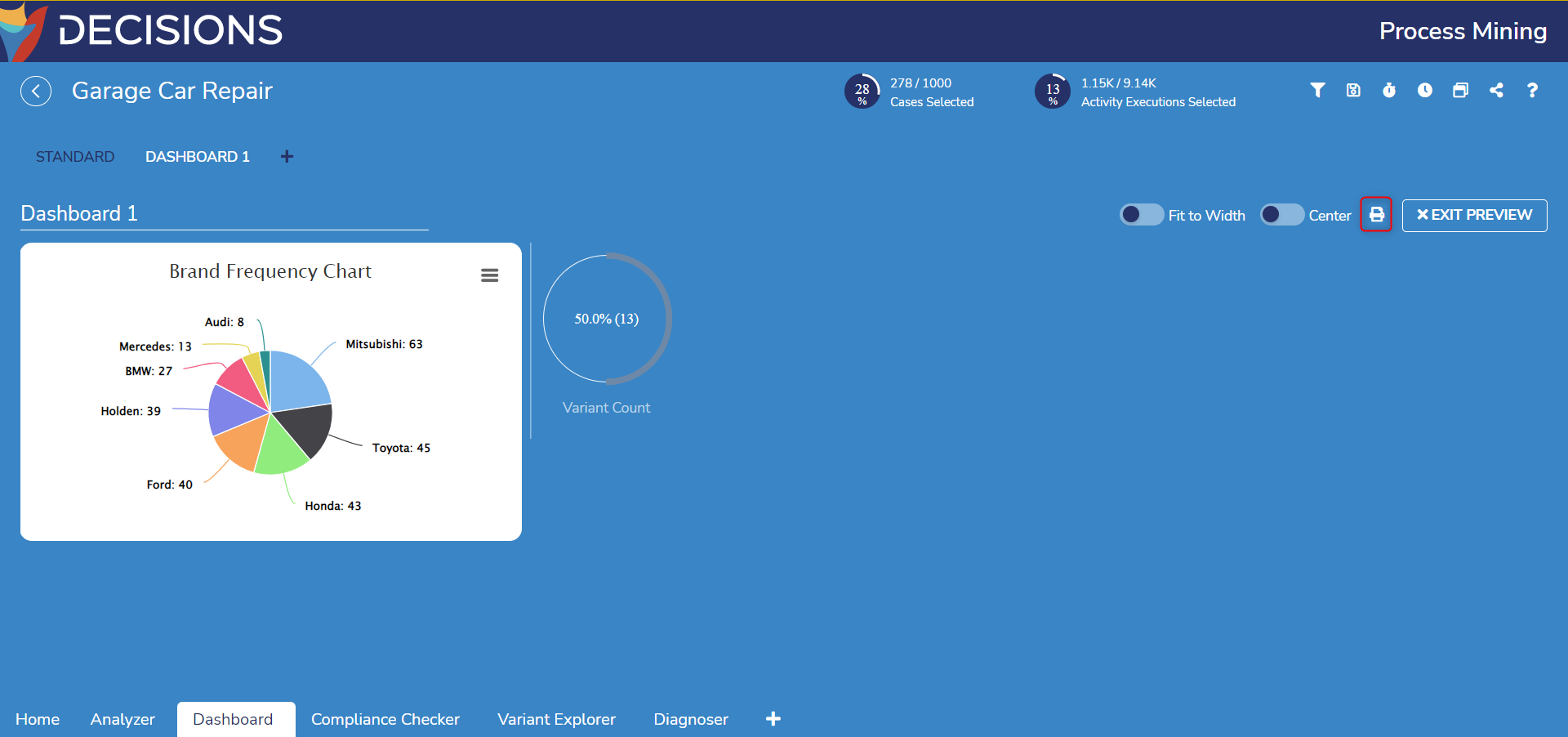
Alternatively, select CLOSE to exit the default Edit mode and then select the print icon there.
Feature Changes
| Description | Version | Release Date | Developer Task |
|---|---|---|---|
| Users can add filtering selectors in the custom Dashboard, which will act as global filters for the components on the Dashboard. | 2.5 | October 2023 | [DT-037645] |
| The Custom Dashboard Palette has a new component- Date-Time Range Input Selector. Using this will allow Users to apply timeframe filters directly to a Dashboard. | 3.0 | April 2024 | [DT-040076] |
| Numeric Dimensions are no longer limited to frequency measures. | 3.4 | January 2025 | [DT-042807] |
| Subqueries and Custom Measures have been added to Process Mining. | 3.5 | March 2025 | [DT-042668] |
| User experience improvements when creating Dashboards. | 3.6 | May 2025 | [DT-044094] |
| Possibility to filter based on standard measures, custom measures, and subquery measures. | 3.6 | May 2025 | [DT-044093] |
| A results filter has been added to custom dashboards to apply filters on query results. | 3.7 | September 2025 | [DT-044718] |