Overview
This tutorial demonstrates how to use Form Control Behaviors that were implemented in Decisions 3.2. Form Control Behaviors include different options to configure for appearance and functionality.
Example
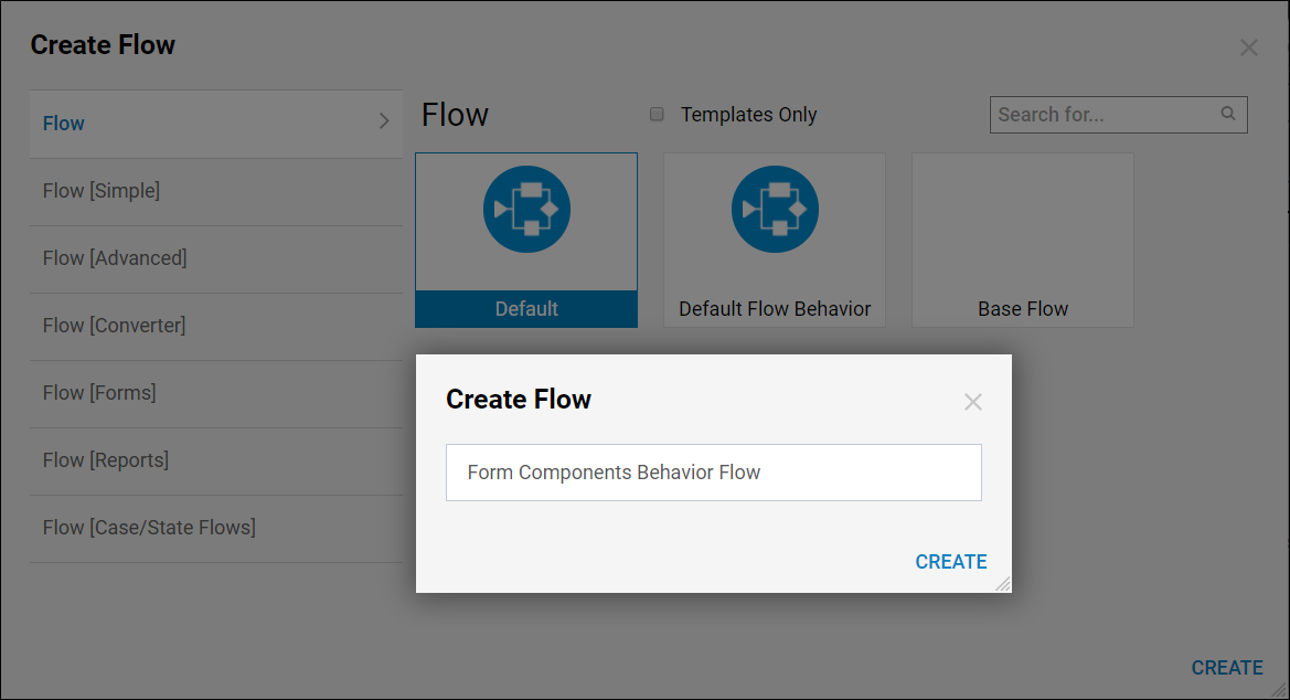
In a Designer Folder, select the Create Flow button from the bottom Action Bar. Select the Default Flow template and click Create, provide a name for the Flow then click Create again.
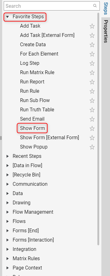
In the Flow Designer, open the Steps tab on the right side and drag a Show Form step into the workspace, then connect the Done path from the Start step to the Show Form step.
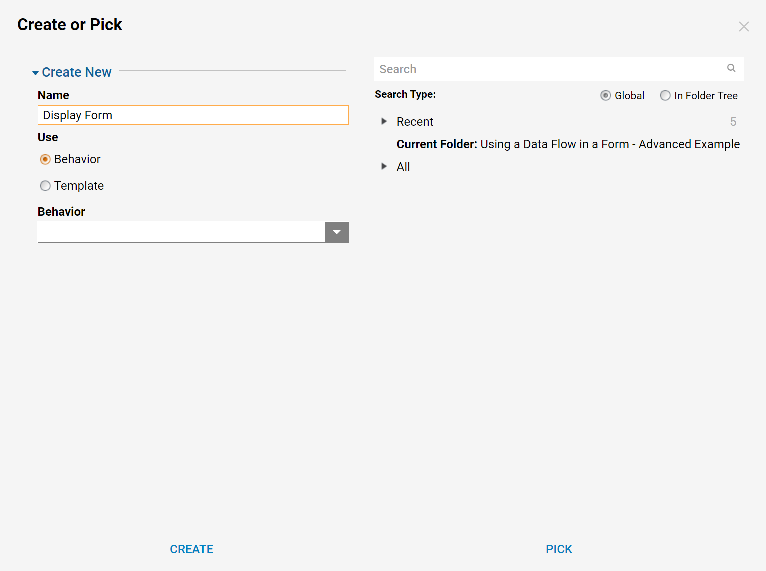
Select the Show Form step and click the Pick or Create Form button at the top of the Properties panel for this step. When the Default Editor appears (unless it appears automatically), provide a Name for a new Form on the left, then click Create.
In the Form Designer, navigate to the Favorite Components section of the Form Controls panel on the right and drag a Button to the position shown in the screenshot below. Select the button in the Form to show the Properties of this Form Control on the right.
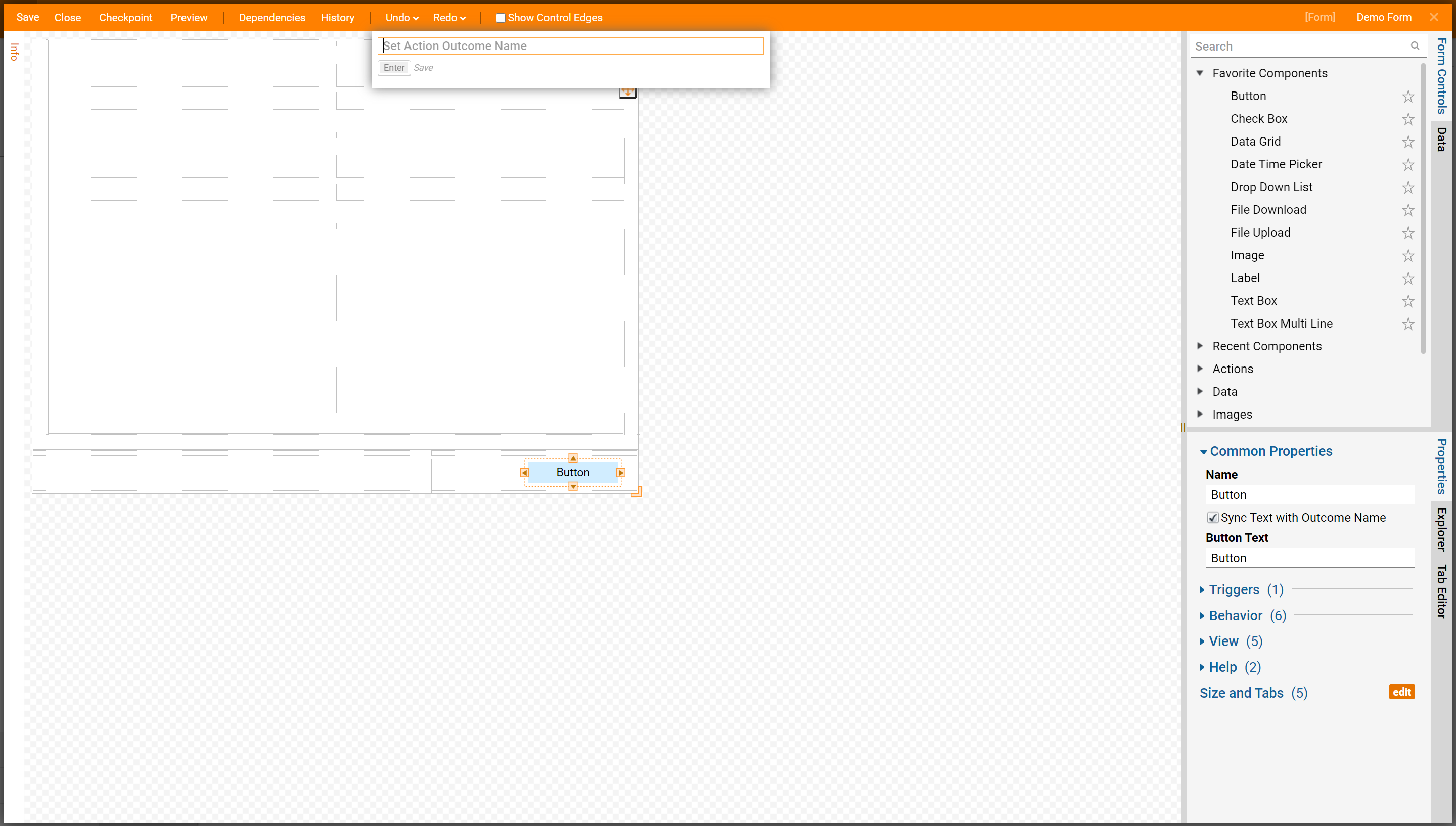
View
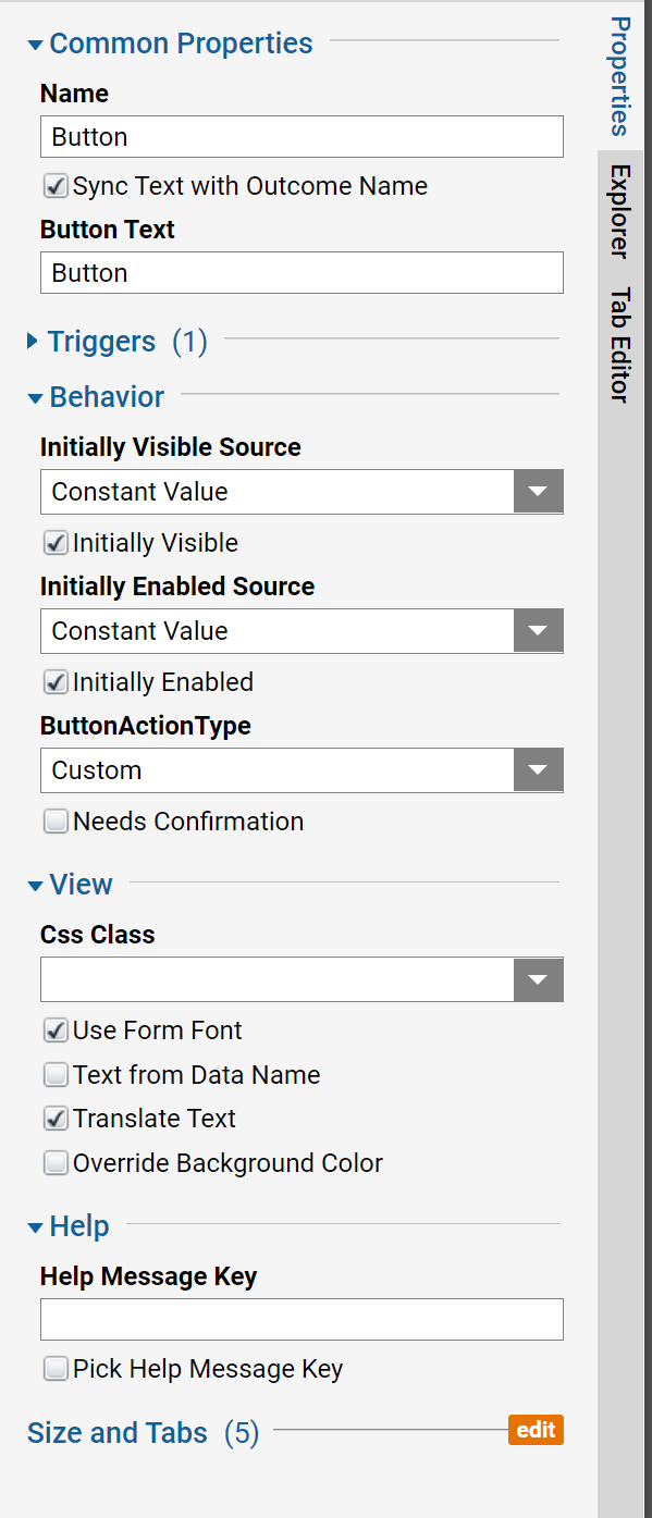
- Use Form Font: Check this setting to use the same font that is set for the entire Form. If the box is not checked, Button Font Attribute settings will appear to be configured. In these settings, the Designer can define the font, font size, and standard typographical emphasis options to be used for the Button text.
- Override Background Color: Check this setting for a Background Color picker to appear in the Properties tab. This color picker will allow the Designer to change the background color of the button from the standard blue.
- Text From Data Name: Check this setting to allow the configuration of a String Variable pulled from the data in a Flow to be used as the text name for this button.
Behavior
In the Properties panel for the Form Control the Designer can set Initial Visibility and Initially Enable parameters for whichever component is selected. Moreover, by changing the Data Source in the dropdown from Constant mapping type to From Flow Data, the Designer can configure this control to be visible and enabled depending on the Flow execution and where the incoming Flow Data is reached. When set to the From Flow Data mapping type, a Variable Name will need to be provided to this configuration. The variable would be a Boolean and will serve as a switch for the Control depending on what data we send to it from our Flow.
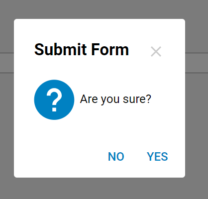
- Needs Confirmation: If checked, a popup message with ‘Yes’ and ‘No’ buttons will appear when a user clicks the Button on the Form.
Form Properties
To set the Default Font for the Form, click into checkered space and locate the Appearance section of the Properties panel. Click the three-dot icon to change the default font style and size.
.png)
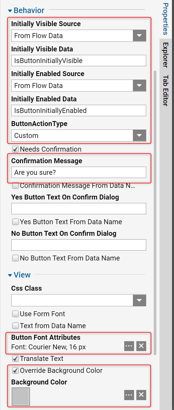
Next, select the Button control on the Form to make some configurations. The Font on the control changed because it is configured to use Default Form Font. Check the Override Background Color checkbox and select a desirable color. Next, check Needs Confirmation and create custom Confirmation Messages. In the Behavior section, set Visibility and Enabled Data Source to From Flow Data and provide corresponding Variables with Names.
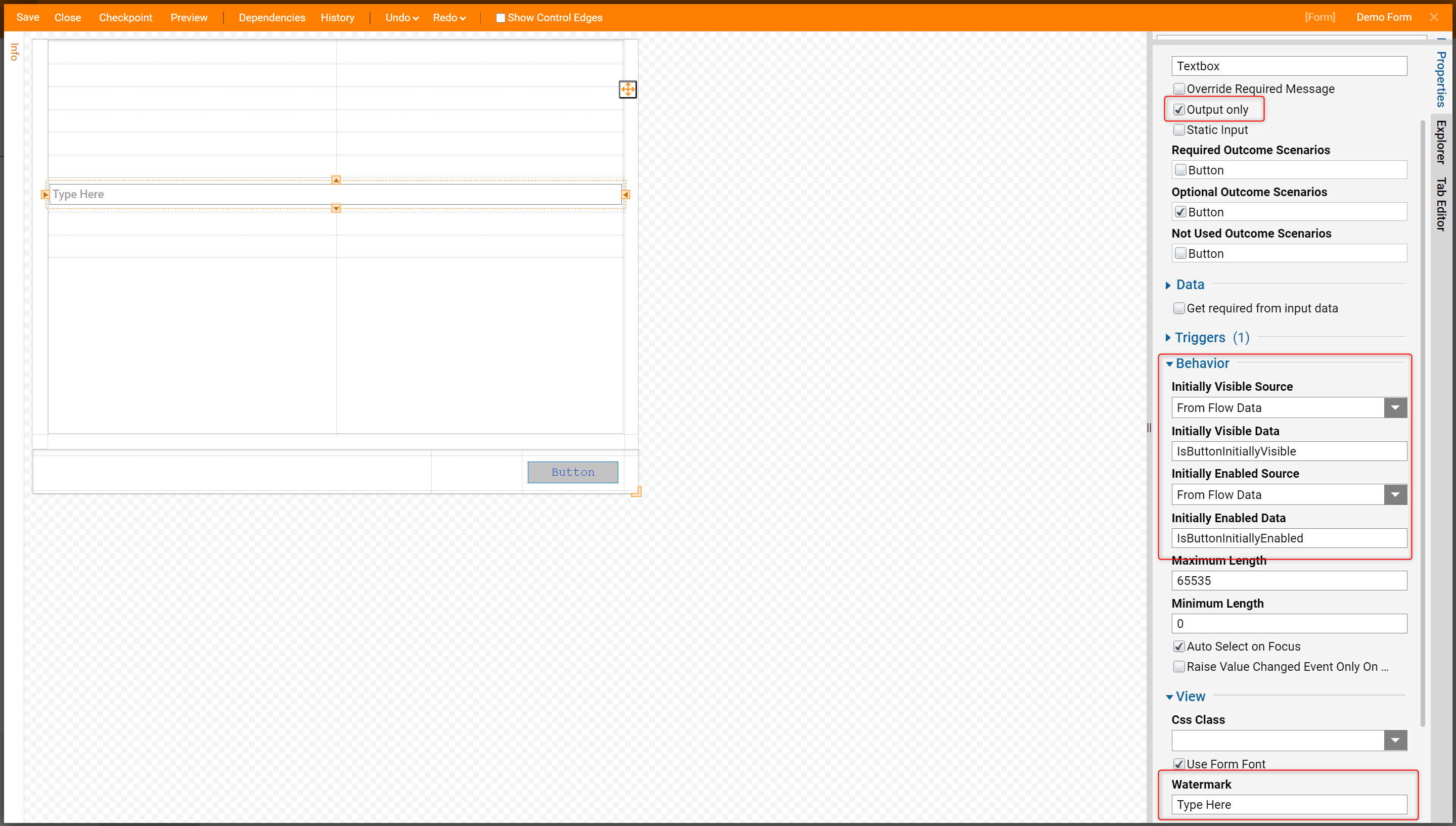
Drag a TextBox Form Control from the Data category in the ToolBox to the workspace, then configure the Form Control as shown in the screenshot below. Use Form Font, configure Behavior section in the similar manner as the Button control. There is a Watermark configuration for the TextBox control. With this feature users create a custom text that will be reflected on the TextBox in the form of a watermark.
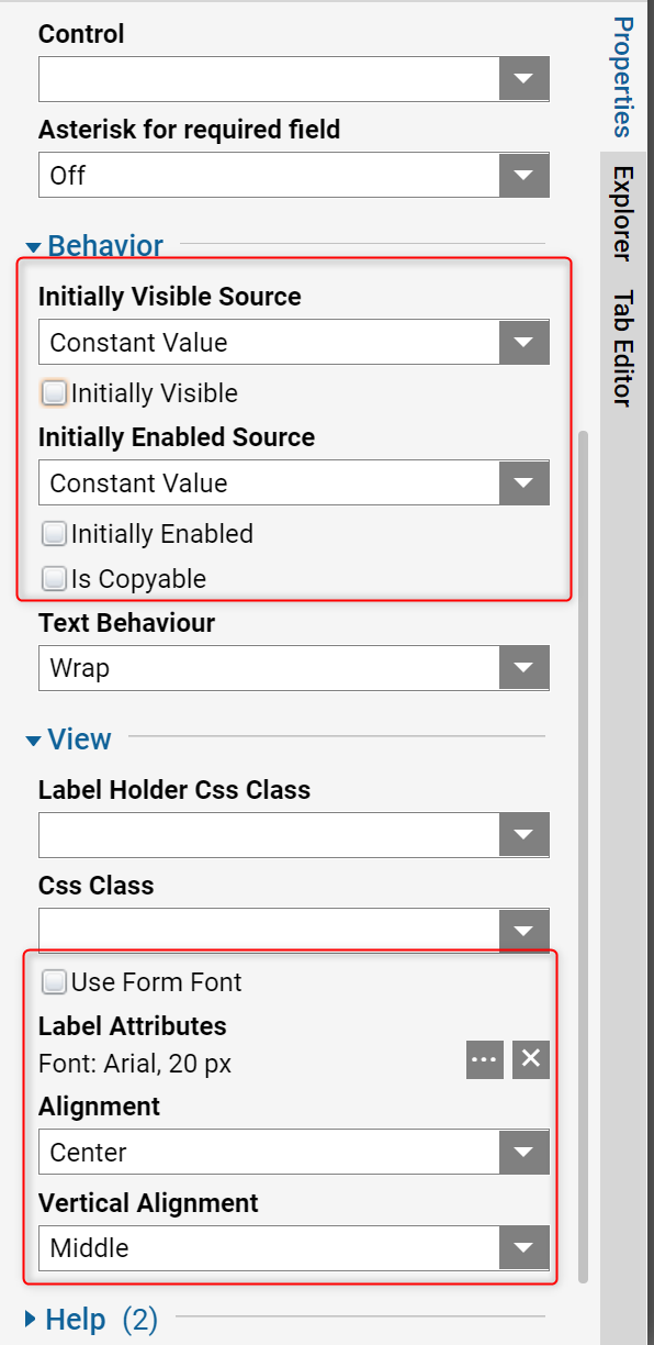
Finally, drag Label component from the Data category in the ToolBox on the workspace. Do not Use Form Font and instead define the custom Font Style for this Label. In the Behavior section, configure Constant Initial Visibility and Enabled with False Values.
To test Form Control behaviors that were created in this tutorial, save the Form and close Form Designer. In our Flow Designer connect the outcome from our Form to the End step in our Flow. Then, select Show Form step on the workspace and select Show Mapping Editor option in the Step Information layer.
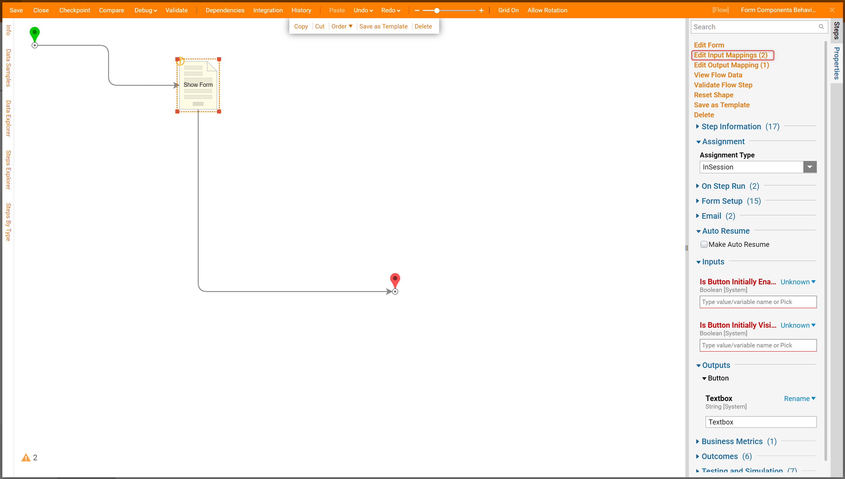
In this example, define all fields using Constant Mapping Type. First check all checkboxes for the fields and close Mapping Editor.

In the Flow Designer select Debug Flow link on the top panel of the Flow Designer test. Note that in Decisions version 3.5 and above, select Test Flow to access the Debugger.
.png)
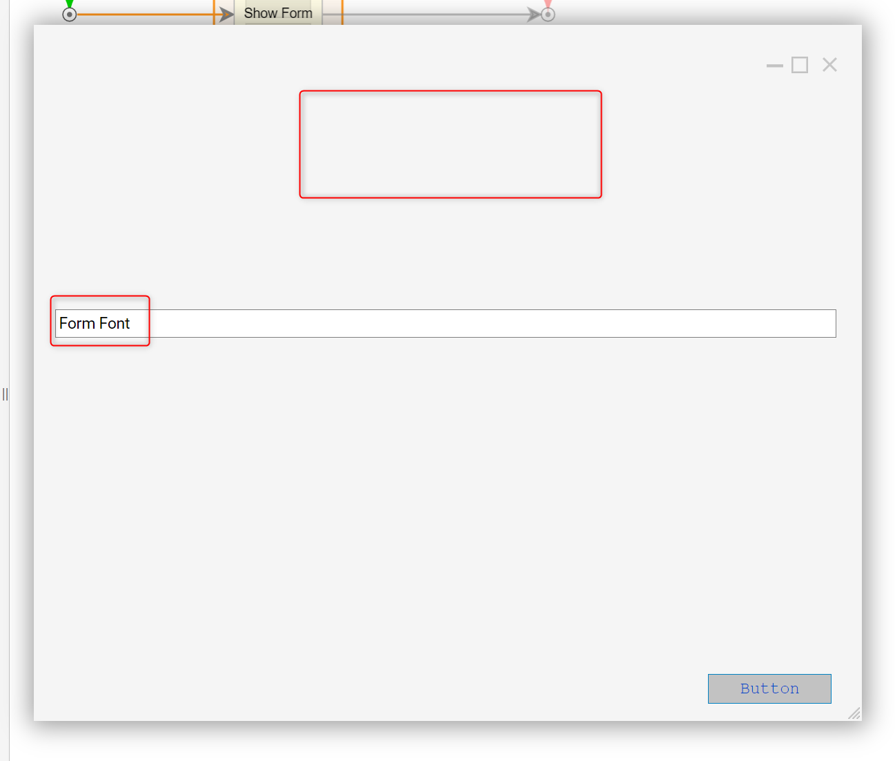
The Form opens in the Debugger and renders as designed. The Label is not visible, the Textbox has a watermark and uses the default Form font, the Button is visible and enabled with default Form font and custom background.
The confirmation window dialog as designed for the Button control, select Yes.
Map the inputs as shown in the screenshot below.

The Form would look like this on the following figure. All Form controls are invisible.
Finally, if set Visibility to True and isEnabled to False in the Mapping Editor.

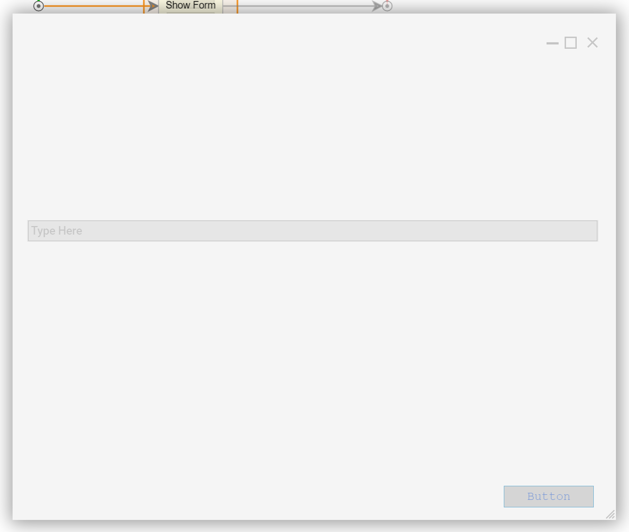
Users would be able to see Form Controls in the faded style because they are not able to be used.
