Overview
There are several ways to customize a Page or Dashboard. When creating a Page or Dashboard, there are several prebuilt layout options to choose from. This example uses a default Page layout to explore three sections of the Page or Dashboard properties that can be customized to accommodate the project's scope.
Prebuilt Layout Options
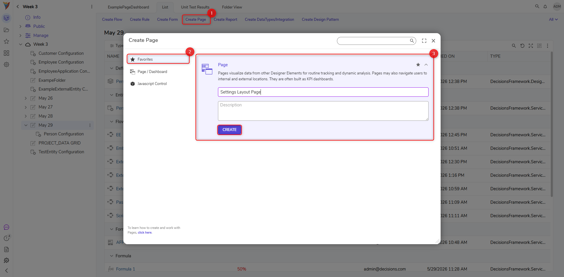
- Select the CREATE PAGE button in a Designer Project from the top Action Bar.
- Select the Page/Dashboard tab on the left when the Create Page dialog appears.
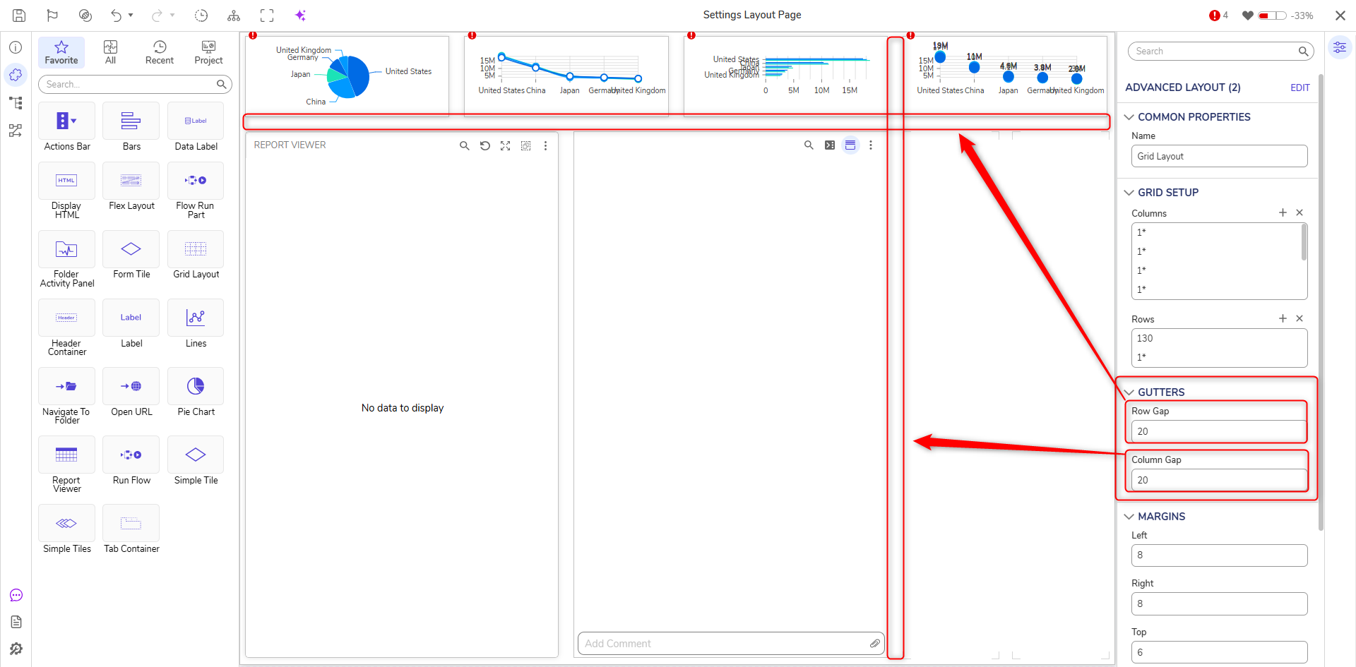
This Page has been configured with some components from the FAVORITES section of the Toolbox for example purposes; these components have not been configured. The Properties sections configuring the layout are ADVANCED LAYOUT, GRID SETUP, GUTTERS, and MARGINS. 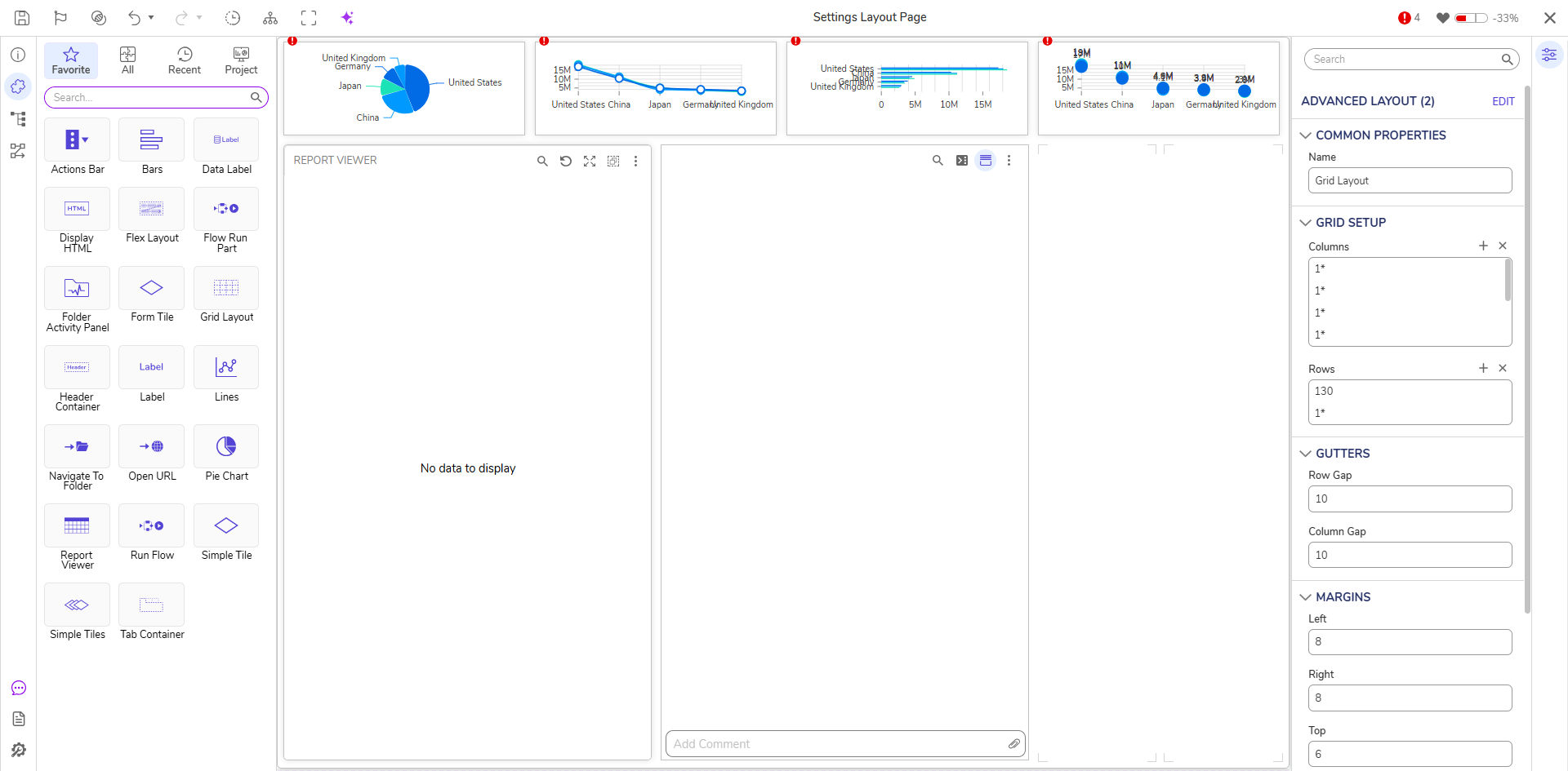
Grid Setup and Advanced Layout
In the Page Designer, columns are set up as vertical lanes, and rows are set up as horizontal lanes. The amount and size of columns and rows will affect the size of the space where a component can be placed. Each space created by the base columns and rows can contain even more columns and rows (as shown with the four charts at the top). This example modifies the base Page properties, which is why the components are compressed together as base columns, and rows are added, then expanded as they are removed.
The default Page layout has one column and two rows at the base. Other columns/row layouts can be expanded or modified within those two rows. The top row of the base Page is sized with enough columns and rows to fit four small components. The bottom row of the base Page is sized with enough columns and rows to fit two large components.
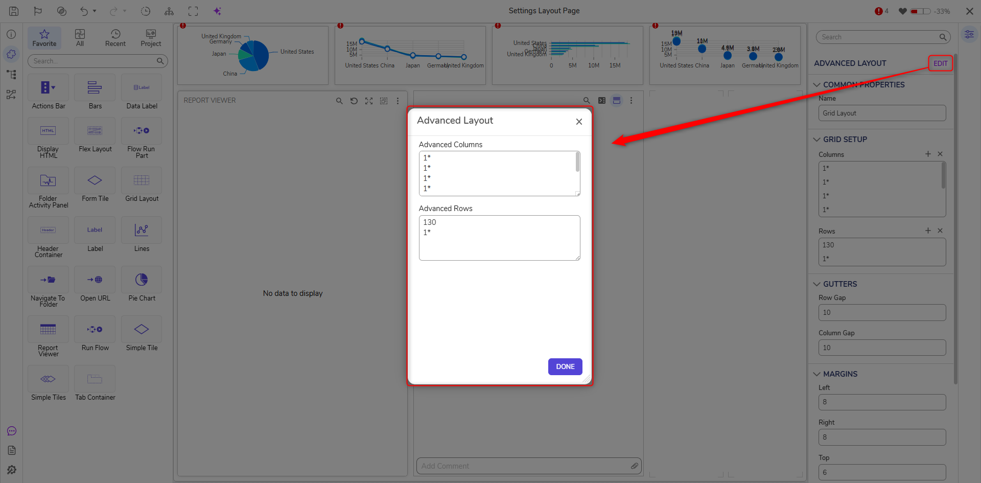
The ADVANCED LAYOUT section can add/remove multiple rows or columns. Providing an asterisk next to a number indicates whether or not the column/row is resizable. Fixed measurements do not have an asterisk and can be sized by pixel count (130 as a row size instead of 1*). The grow measurement Any changes made in the advanced layout section is updated in real-time and can be removed by deleting them.
Gutters
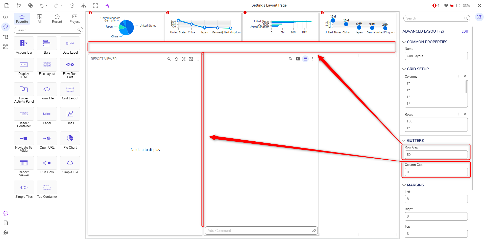
This section is used to indicate the size of the row and column gap. Since this example contains one column at the base, changes with that measurement would be unnoticed. The Row Gap is changed to 50 in the animation below, and the space between the rows reflects this change; this would apply to columns in the same way.
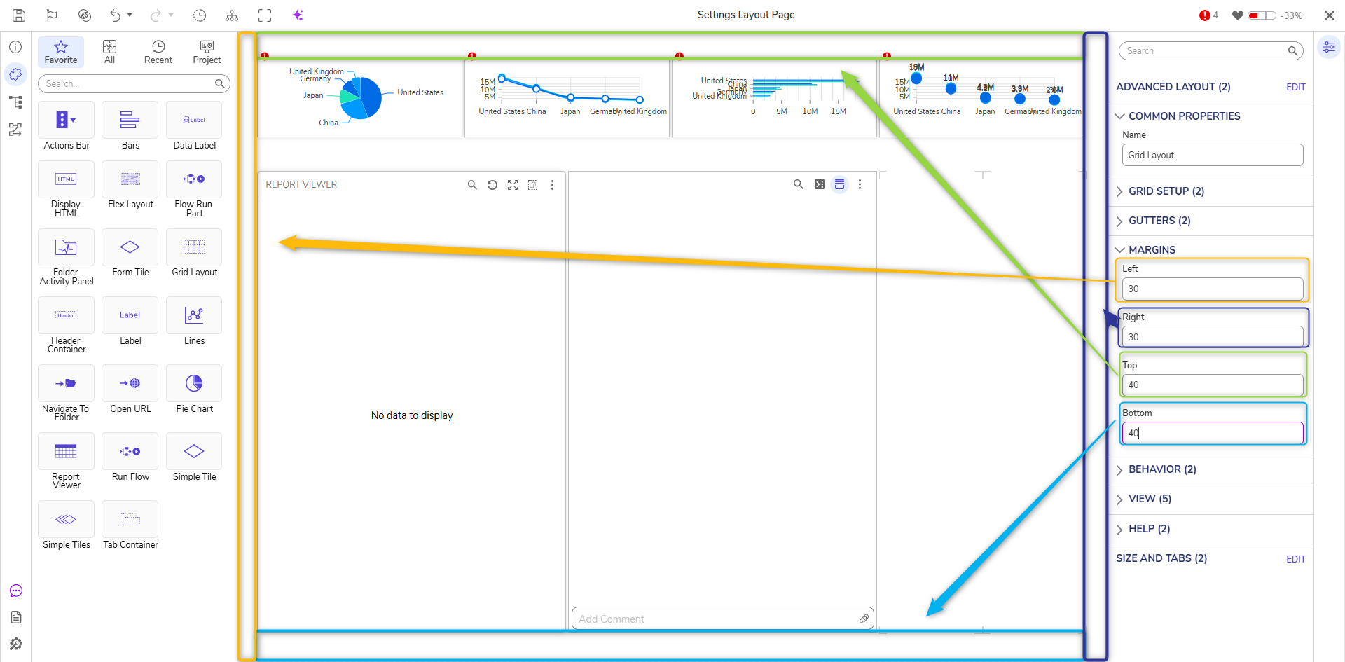
Margins
Margins determine the spacing between components and the edges of the space they encompass. Since the base Page is used in the example, changing the margin of each direction squeezes the enclosed space to accommodate the new measurements. The inside components will scale to fit the Page (this could include the appearance of scrollbars).
If a different section of the Page is selected and these settings are modified, the changes will only apply in that specified section, as shown in the animation below. This applies to all of the sections covered in this article; they can all be modified in their individual spaces based on the grid layout and tiles of space available.