Overview
Decisions have a default styling over all types of validation across the portal. Decisions allow users to customize the styling for validation. This customization can be done Globally through Designer Studio Settings or Locally through Forms and Form Controls. The following is a detailed explanation of all the validation styling configurations in Decisions.
Validations on Forms
Global Settings - Designer Studio Settings
As the name suggests, Global Settings, this setting will be used to set a default validation styling across all the Forms in Decisions. This can be configured in the Designer Studio Settings. The Designer Studio Settings is a category under System > Settings that can adjust Designer Studio features and their configurations.
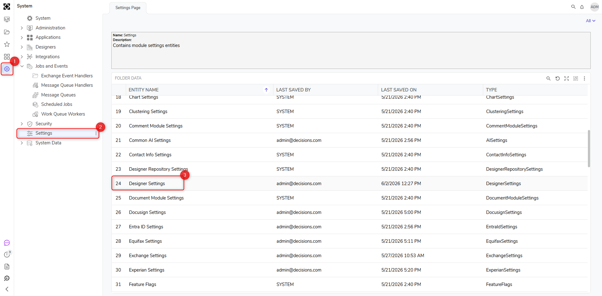
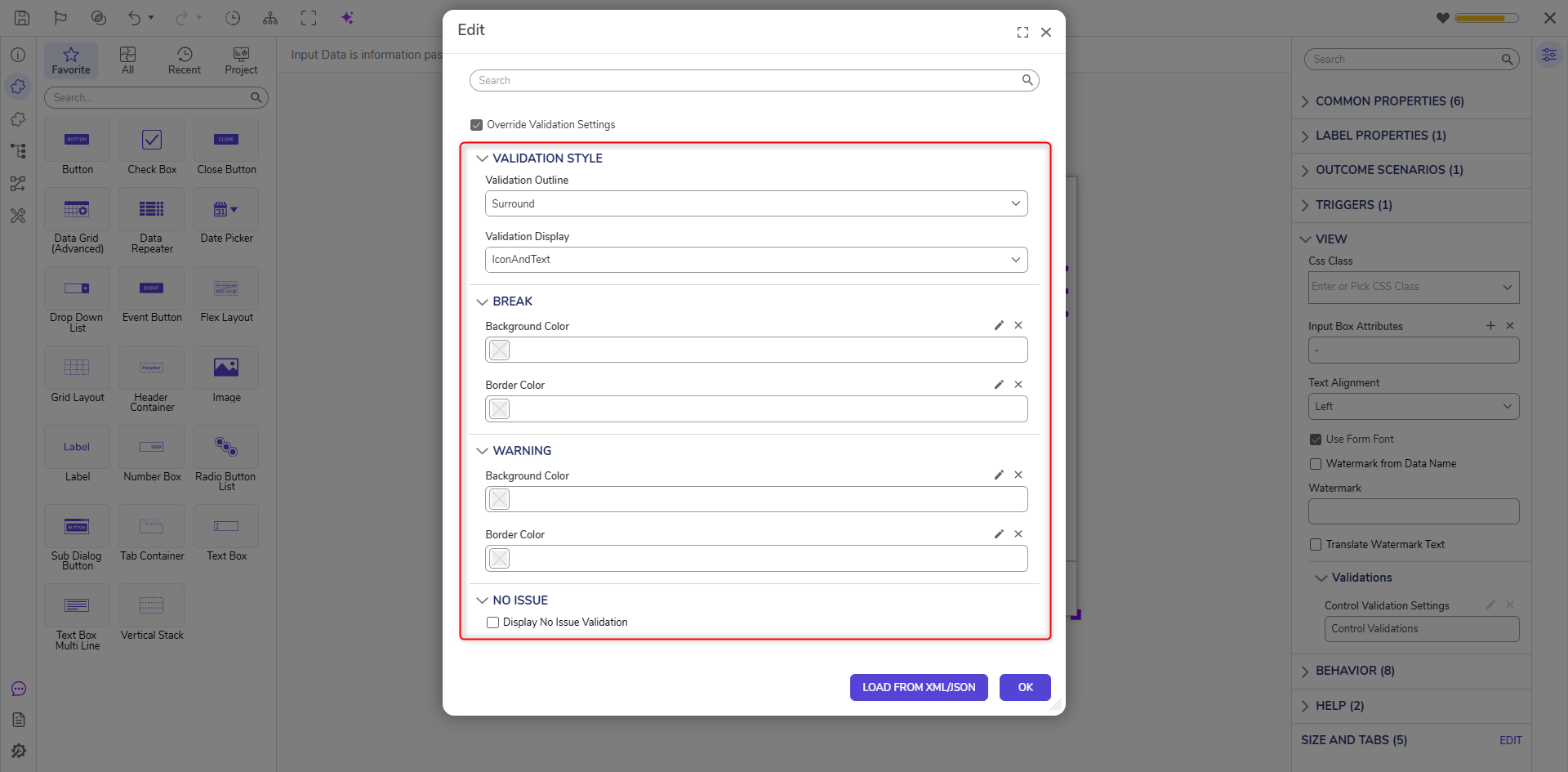
Navigate to System > Settings > Designer Studio Settings. Settings Dialog Box appears. Search for Form Validations in the search bar at the top.
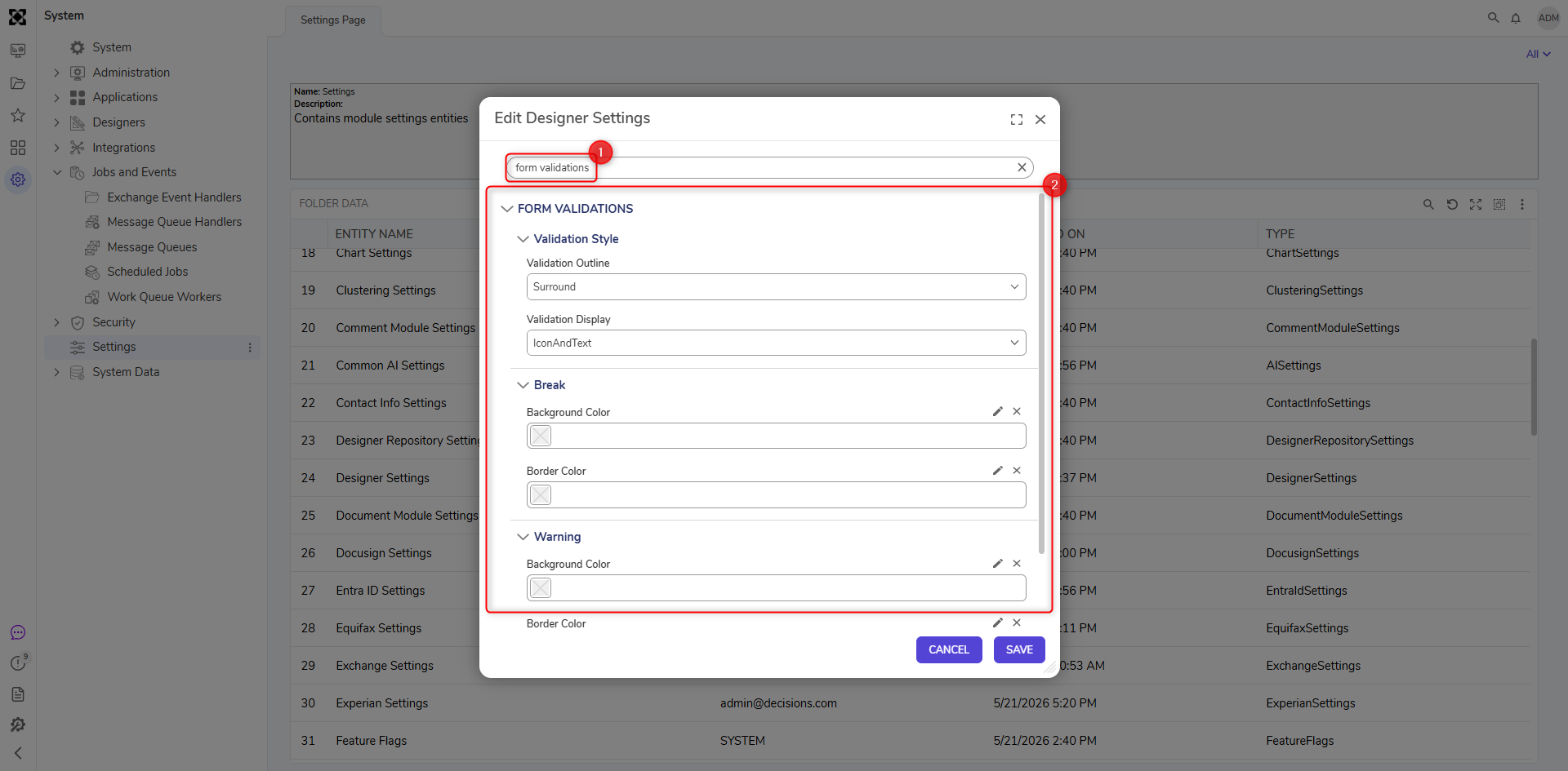 Below is a detailed explanation of the sub-categories under the Designer Studio Settings for validations.
| Validation Outline | Surround | It will highlight all borders of the Form Control. |
| Underline | It will highlight the bottom edge of the Form Control. | |
| Off | It will not highlight the Form Control. | |
| Validation Display | IconAndText | It will display the Icon and Text for Validation. |
| Icon | It will only display validation Icon. | |
| Text | It will only show validation Text. | |
| Background Color | Changes the background color of the form control when validation is triggered. |
| Border Color | Changes the border color of the form control when validation is triggered. | |
| No Issue | Is valid Message | Text entered in this field will be shown as a validation message. |
| Only Show valid Message When FilledIn | When enabled, this will not throw a No Issue validation message if the Form Control is Empty. |
Local Settings - Form Validation
Form Designer has settings to override the Default validation setting. Each form can be configured with its own validation settings.
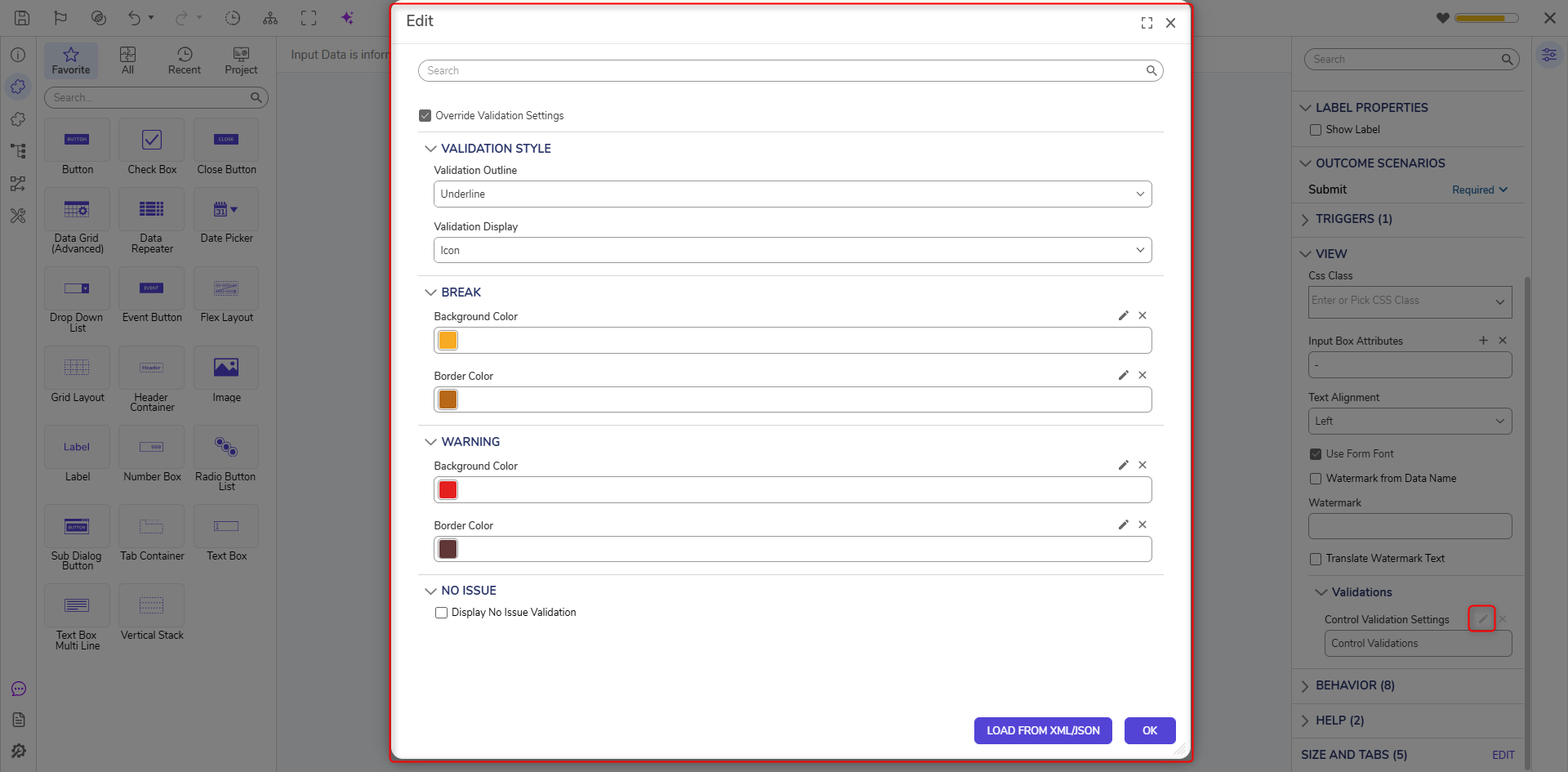
To configure this setting navigate to the Form's Properties Panel > Appearance > Override Validation Settings.
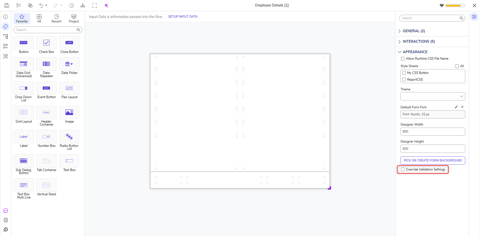
Enabling Override Validation Settings will expose to additional Settings.
These validation settings are similar to the ones present in Designer Studio Settings. It has one additional setting to configure the Validation Icon.
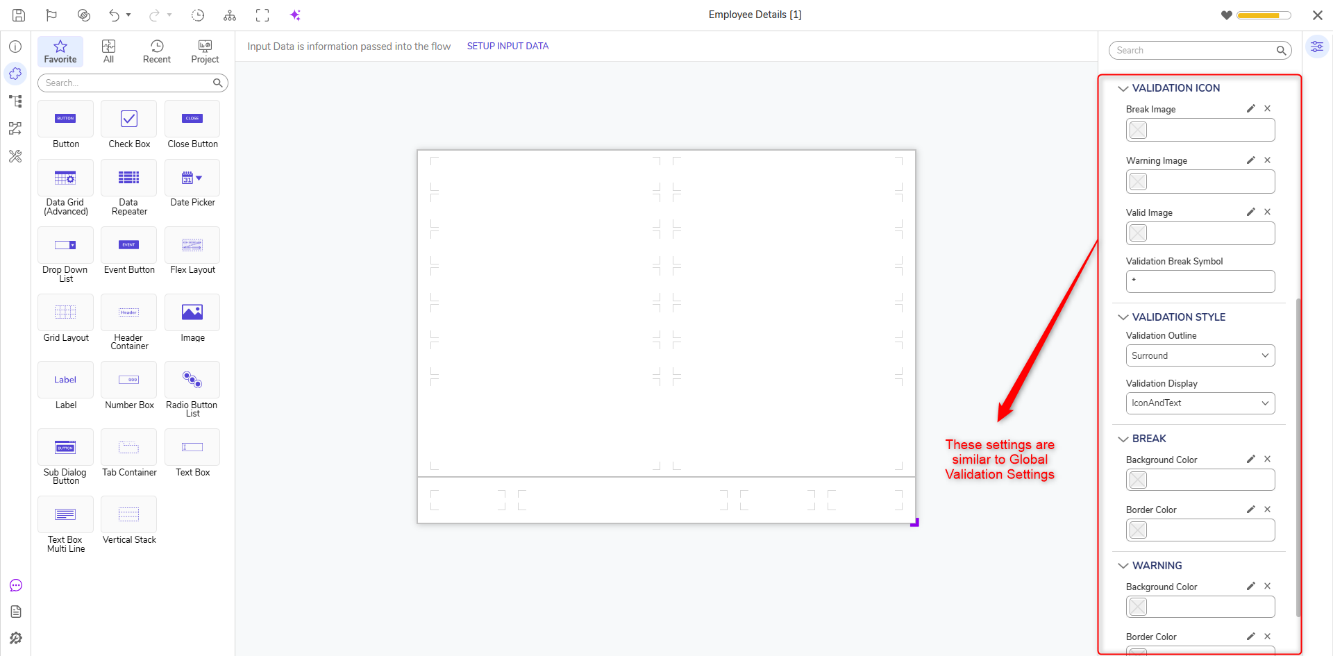
| Validation Icon | Break / Warning / Valid Image | Used to Configure the validation icons. Icons can be selected from the Decisions Library, or a custom image can be uploaded and used as a validation icon. |
| Validation Break Symbol | Text entered in this field will override the Asterisk for Required Field. |
Local Settings - Form Control Validation
Form Control has settings to override the Global and Form validation settings. Each Form Control can be configured with its own validation message and styling.
Customize Validation Message on Form Control
Form Controls can be configured with custom messages for validations. Messages can be customized on multiple Form Control within the same Form.
In the Form Designer, click on the Form Control > Properties Panel > Override Required Message. Enabling Override Required Message will Expose the Required Message field. Text entered in this field will Override the Default Validation Message.
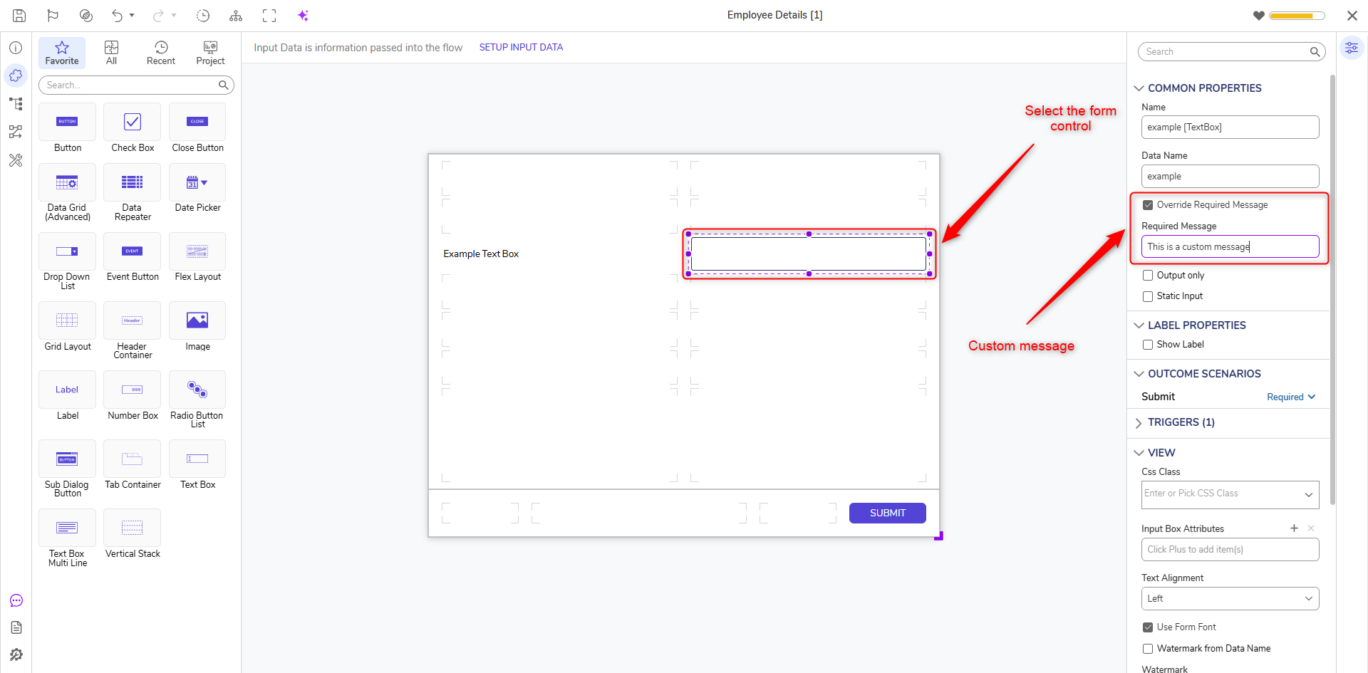
In the above example, we have entered "This is a Custom Message" in the Required Message field.
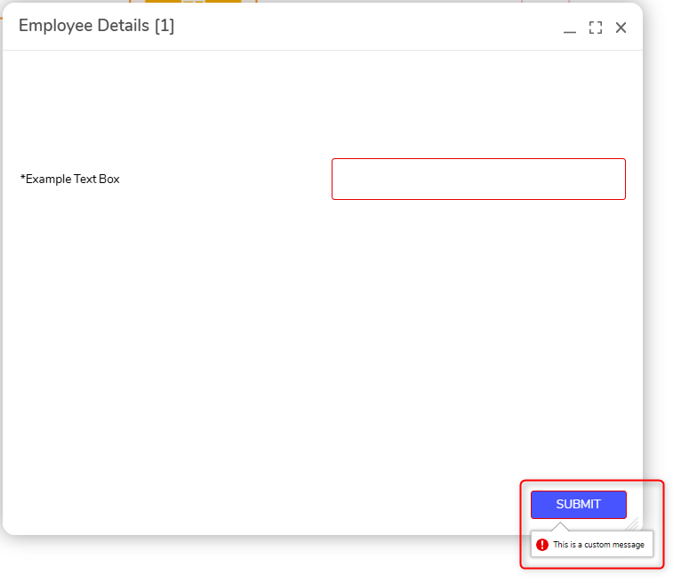
During Runtime, as soon as the Submit button is hit, the text entered in the Required Message will be displayed as a validation.
Customize Validation Styling on Form Control
Form Controls can be configured with custom styling for validations. Styling can be customized on multiple Form Control within the same Form.
In the Form Designer, click on the Form Control and navigate to the Properties Panel > View > Validations > Control Validation Settings.
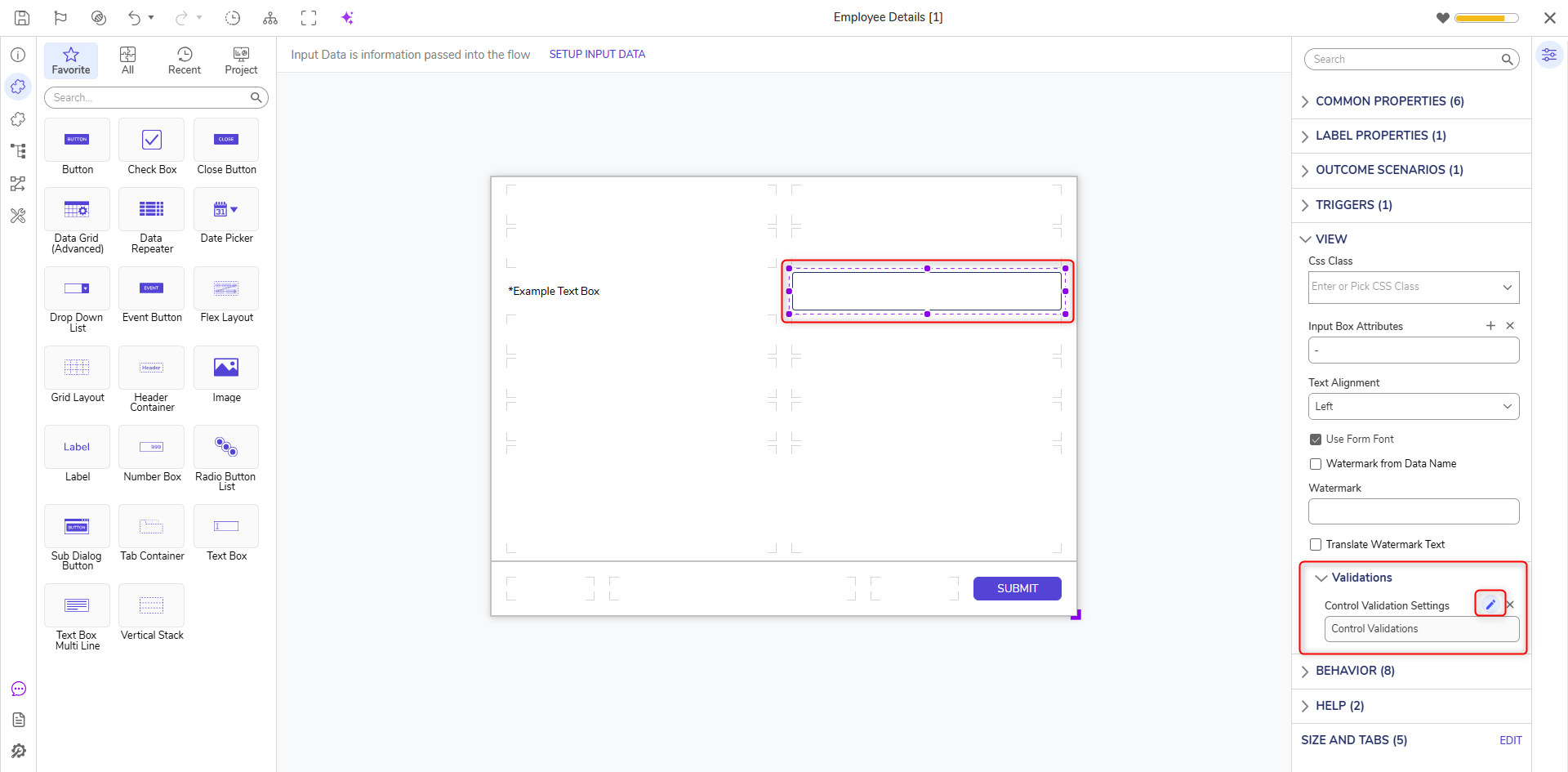
Click on the Edit Icon. Edit Dialog Box appears.
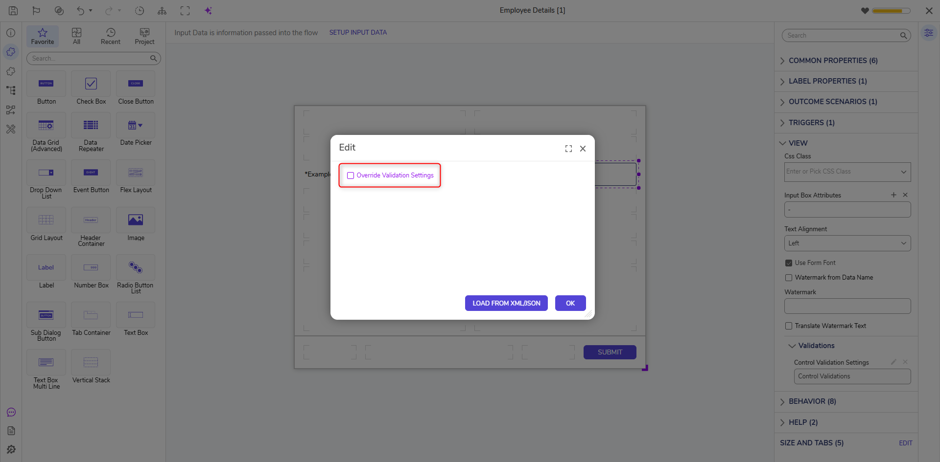
Enabling Override Validation Settings will expose to additional validation settings. These validation settings are similar to the settings present under Designer Studio Settings.
Example
In the following example, we will configure a validation styling through Local Settings.
In this example, we have created a Flow with a Form. The form is titled to Employee Details which includes Employee Name, Employee ID, and Email Address. All the Form Controls are configured as Required under Properties > Outcome Scenarios.
- Navigate to Form Properties > View > Control Validation Settings.
- Break > Background Color is configured to Orange, and Border Color is configured to Brown.
- Run the Flow where the Form is added and submit the Form.
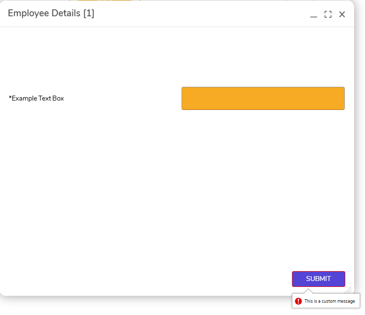
Without entering any values, Submit button is clicked. The Form will throw validation with configured custom styling, but it will throw a predefined validation text because it is set to Required.